PhysicianWebsiteDesign.com
My UX / UI thoughts and design process, as the Lead UX / UI designer, in refurbishing
a medical marketing company's desktop and mobile presence.
a medical marketing company's desktop and mobile presence.

Overview
This project shows the development process of a detailed prototype of a new responsive
website for a physician website development and marketing company. The company needed to revamp their entire business model to account for new competition into their vertical (physician website design and marketing), as well as refresh their online presence, in both their own user experience and user interface design.
website for a physician website development and marketing company. The company needed to revamp their entire business model to account for new competition into their vertical (physician website design and marketing), as well as refresh their online presence, in both their own user experience and user interface design.
My Role
For this project, I was designated the Lead UI / UX designer. My responsibilities included:
- implement and encourage a human-centered design approach to the entire UX/UI process
- initial research, affinity mapping and consolidating data into a coherent information architecture and design direction
- user research, in coordination with volunteering practice managers, and creation of user personas
- the user experience (UX) design (including personas, user-flow, and paper and low-fidelity prototyping)
- user interface (UI) design, including development of hi-fidelity prototypes
- deploy mobile and desktop website using Wordpress as the underlying software
Affinity Diagram & Card Sorting
I started the user experience research process by brainstorming with key stakeholders and roughing out an affinity diagram. I sketched out random notes and loosely organized thoughts, strategies, personas and user experience directions, based on the key stakeholders comments and feedback.
This was a mental exercise that was designed to flesh out key attributes of the UI / UX process. On the notebook paper below I worked in sprint mode, writing down ideas and thoughts without worrying about details, spelling or other items that may hinder the thought process.

Personas
From the affinity diagramming and card sorting, I began to develop user personas. I worked in conjunction with a number of physicians (MDs) and practice managers (PMs), of small and mid-sized physician groups, who were generous in helping me research and develop user personas.
It was extremely important to stay oriented with a human-centered design approach, not make assumptions and let the research subjects speak to their needs and perspectives.
The MDs and PMs provided great feedback and answers on (1) what their goals were in having a website, and (2) what pain points and frustrations they experienced in seeking out a new website design. The persona research also began to reveal what solutions were most attractive to MDs and PMs, as a whole.
There were three (3) primary personas developed:
1. Practice (or Office) Managers - These are non-doctors in charge of office management and/or marketing.

2. Solo Physicians - Doctors who make most or all decisions affecting their marketing. These doctors often have a staff of one or more administrative help.

3. Physician Groups - This is the most difficult persona to develop, since most major marketing decisions - which includes website design and development for most offices - are made by committee. There is usually one point person, but that voice can often be overtaken later in the decision making process.

Card Sorting
With the personas worked out, I refined our thoughts by taking the affinity diagramming notes and personas, and created a card sort layout with selected volunteers. Here, I further defined what the needs are, what pain points exist and some initial thoughts on solutions. There are also thoughts on what call-to-actions should exist, as well what content should probably be on the website.
The client already had a great deal of great content, and it was determined that it will be important to showcase that content for inbound marketing purposes. In the card sorting phase, it looks like the content should have a prominent place in the site layout, as it will cultivate the persona journey.

Unique Value Proposition
It was at this point that a unique value proposition (UVP) was developed. Together with the stakeholders, it was determined that a design and maintenance subscription model, with two pricing tiers, was most desired by our personas and represented the client's UVP.
The UVP fit the personas' needs by meeting these criteria: 1) pricing was modest and flexible, 2) the model alleviated maintenance and support headaches for persona and persona's in-house staff, and 3) there are no long-term contracts.
Information Architecture (IA)
IA is the foundation of efficient user experience (UX) as well as user interface (UI). Here is where I started blending the concepts of UX and UI, since the information on the site needs to be organized visually.
The company possessed alot of content, including detailed parent services and child services, as well as blog articles, landing pages, ebooks, infographics and testimonials.
I reviewed the (above) affinity mapping information, the expected user journey and created an initial information architect layout. This IA layout was tweaked and finetuned after MD and PM testing. The resulting IA layout was then used as the framework to begin wireframing and prototyping.
While working through the IA process, it was critical to always keep in mind the goals of each persona, and what users expect from the website or mobile application.
This was also a phase where we could see what content may be missing that would help the persona journey along. This was also helpful to see what content, if any, was now obsolete and no longer needed and may confuse the persona's journey.
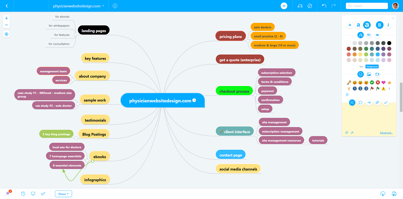
My IA process is usually two-step. 1) using the affinity map and card sorting information, coupled with user persona information, work through a mind map session, and 2) then clarify it further through creating low-fidelity wireframes, using Adobe XD.
(update: I am enjoying Adobe XD more and more. It remains minimalistic, but is packed with little time-saving features that can enhance and allow me to evolve the wireframe quickly to low and then high-fidelity mockups)
The mind mapping session's goal was to further sort out the information gleaned from the affinity mapping and card sorting sessions, and establish a better content inventory, placing information in what will best represent personas' expectations and persona journey.
It was also here where we began to see which IA structure would be most effective (Hierarchical, Sequential or Matrix) and it was determined that a hybrid model would work best with the targeted personas - Matrix, allowing users to make meaningful choices on content and quickly drill down to their goal).

The determination to use a hybrid model was based on the fact that personas will want to browse and be educated on the product (i.e., content marketing), but at the same time be able to always make a purchasing decision from anywhere on the site/app. A hybrid model was also seen as the best way to help personas actually use site content and how the structure should function to support their goals.
It was noted that visual hierarchy is important to organize and prioritize content for an effective IA layout. I periodically referred to Dan Brown's eight principles and other favorite sources to be sure I stayed on track.

This IA blueprint was then used as the basis to generate low-fidelity wireframes and sitemaps of the project.
Wireframing & Prototypes
The first round of wireframe/prototype iterations I started developing a user journey, site layout principles, and as I developed further versions, I started to flesh out some style guidelines. The wireframes were developed using Adobe XD, to allow for a somewhat interactive experience. Paper prototypes were passed on, as the use was limited in this instant. In addition, I felt that the Card Sorting exercises, along with the creation of the Information Architecture layout was sufficent to jump to a mid-fidelity prototype.
An Adobe XD wireframe prototype was also helpful in User Testing, as I was able to send a private link to MDs and PMs, who were kind enough to volunteer in user testing.
The link for the final mid-fidelity wireframe/prototype can be seen here.

Style Guide
At this point, the site's style guide was established. The final round of lo/mid-fidelity prototypes incorporated some of the style guide previously, but here it was finalized.

Hi-Fidelity Prototypes
The last stage I was involved with was in creating hi-fidelity mockups. At this stage, I was involved in establishing the style guide for colors, selected the typography and worked on creating the site, using Wordpress and Woocommerce as the underlying software. Images were also researched and we used an internal mood board to store and catalog images for the site.
It was important to retain consistency for certain site elements (call-to-actions, navigation, phone, chatroom prompt, etc.) throughout the final site design. It was, however, important to revisit the site with our volunteers for additional feedback and insight as to their user-experience, and there were some tweaks and adjustents made, based on such feedback.
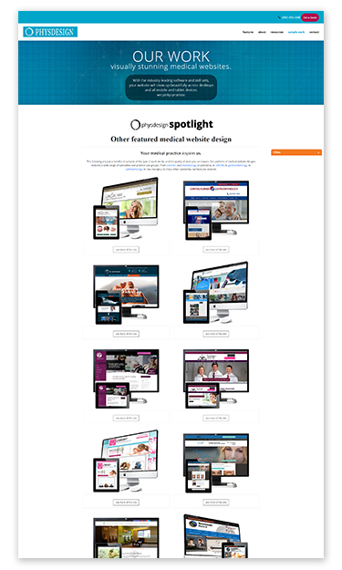
The refurbished site can be seen here.


Thanks for checking out my process :)


