Series designed for books by the early 1900's Russian author, Mikhail Bulgakov.
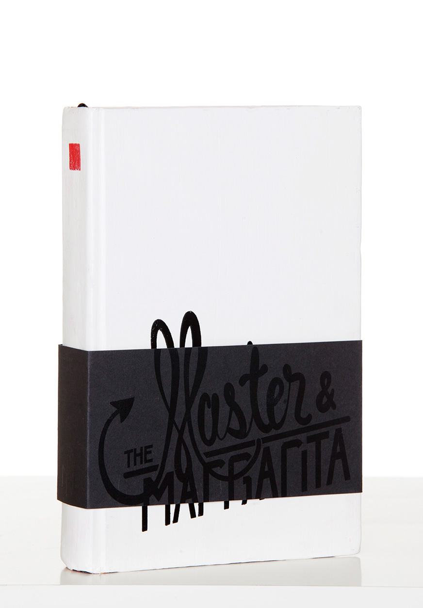
There are a few concepts at work here. First of all, the very clean white, black and red look is meant to portray the ideals of Russia during the time frame when Bulgakov was writing. The majority of the cover being in white is representative of the page the author would have written his novels on. The black band around the book is an unbroken belly-band wrapping all the way around which covers the title and keeps the book sealed. This was done because much of Bulgakov’s work was censored by the government because it dealt with a lot of things such as god and the devil in a very atheistic country. The title is custom lettering is printed in English with black ink on the black band and then re lettered in Russian and screen-printed onto the white cover of the book (to spell it out, the original Russian on the “page” is being censored).
There is a custom monogram for the authors name on the spine of the band using English characters which I then recreated in Cyrillic and screen printed on the white, back cover.
The red square on the spine is an invented publisher; Red Square Publishing (very clever, I know).
To address some of the detail in the lettering; the book The Master and Margarita is about the devil (the Master) visiting Moscow and a young woman (Margarita) selling him her soul in exchange for the happiness of the man she loves. The Master is described as being a well dressed man who is very suave so I designed the lettering to represent that while the word “Margarita” is done in a condensed, san-serif fashion to represent her as a Russian citizen.
The page end patterns have the Cyrillic logo repeated along with a symbol specific to the book (The Master and Margarita is about the devil in Moscow and therefore there is a devil’s tail in the shape of a six).