


valid.
valid. is a fictional quarterly magazine that focuses on the Canadian LGBTQ+ community. The magazine aims to provide a safe space for all individuals to express themselves, be vulnerable, valued, inspired, and celebrated for their diversity.
Client
Self-directed (School project)
Roles
Editorial Design, Branding, Typography, Copywriting, Photography
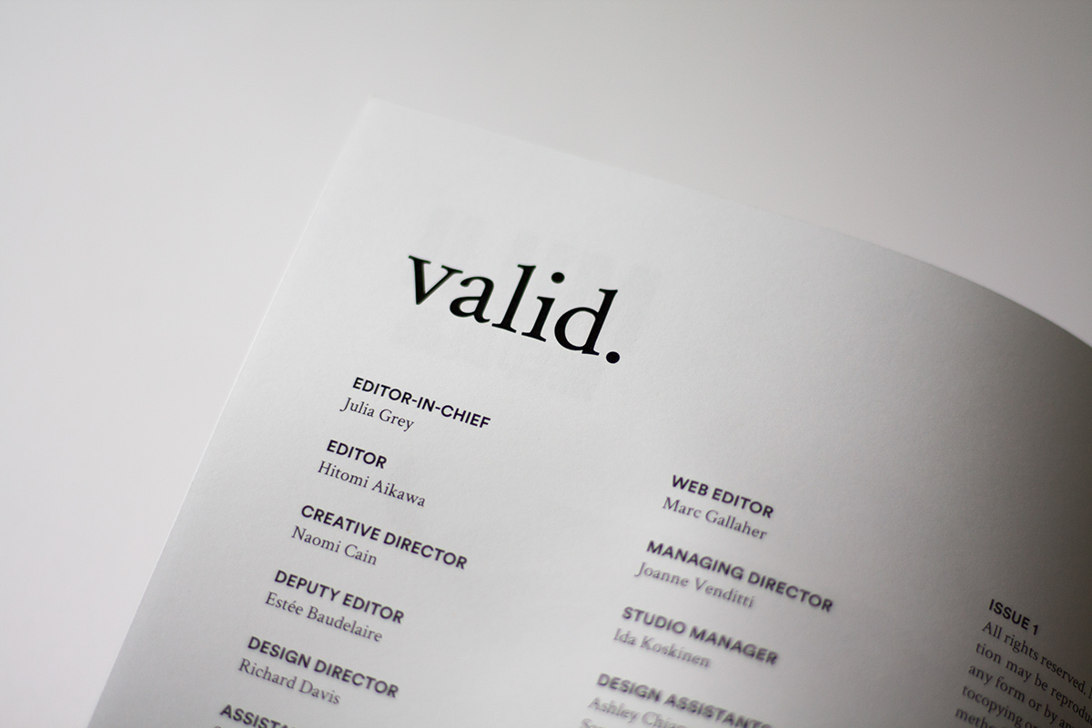
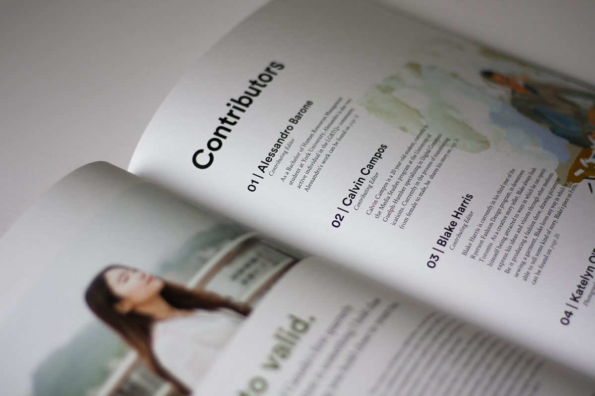
Contributors
Alessandro Barone (Writing), Calvin Campos (Writing & Model), Blake Harris(Writing), Katelyn O’Brien (Photography)
_______________________________________________________________________________________________________________________
The Challenge
To create the first issue of a magazine of our choice, centred around a specific theme. Spanning an entire semester of our Editorial class at Humber College, we were also expected to create a visual identity for our magazine, a cohesive grid system, as well as source advertisements, copy, and photographs.
The Outcome
The creation of the Winter 2018 issue of valid. which includes content reflecting topics such as self-love, transitioning, redefining gender, and pride (Specs: 76 pages | 8.24” x 11.7”).
When briefed with this project, I knew that I wanted to create something unique and special. The LGBTQ+ community has been a topic I’ve always been passionate about and interested in. The Canadian LGBTQ+ community is special, and one that should be celebrated. It is a community that is a very prominent and accepted in Canada, filled with diversity, culture, love, and life.
The Goal
The goal for this project was to create a magazine that focuses on the Canadian LGBTQ+ community. This topic encompasses a very niche community, that deserves to have their own platform to share their hardships, accomplishments and everything in-between. I found that the LGBTQ+ community in general has more of an online presence, so with this magazine, I strived to establish and grow their presence in print. I hope that this magazine resonates and inspires readers, and it becomes a unique and special publication that adds growth to this progressive community within Canada.
Research
This project included numerous stages of research, which excited me, as I thoroughly enjoy immersing myself in the research and brainstorming stages of any project.
An important part of my research included purchasing several magazines that shared a similar style that I had in mind for my own magazine. Some of the magazines that I constantly used for reference during the process were: Kinfolk, esse arts + opinions, Applied Arts, Frontier, National Geographic, and Fast Company. I used these magazines as resources for numerous layout ideas, different photography styles, type treatments throughout the magazine, as well as an idea of the size I wanted my magazine to be. When looking, I made sure to reflect on aspects I liked from each magazine, and also on certain aspects that I felt wouldn’t match the strategy I had in mind for my magazine.
The grid is the most important part of any magazine, so it was crucial to begin creating numerous grid variations that could potentially be used throughout my magazine, in order to have a sturdy foundation for rough layouts which included type and imagery. I was able to measure by hand the grid systems used by these magazines that I purchased, and adopt some of these systems for this project.


Spending some time browsing though Unsplash to get an idea of the style of imagery that I was looking to use throughout my magazine was also very helpful. Mainly focusing of portrait imagery, here are some of my favourite references:
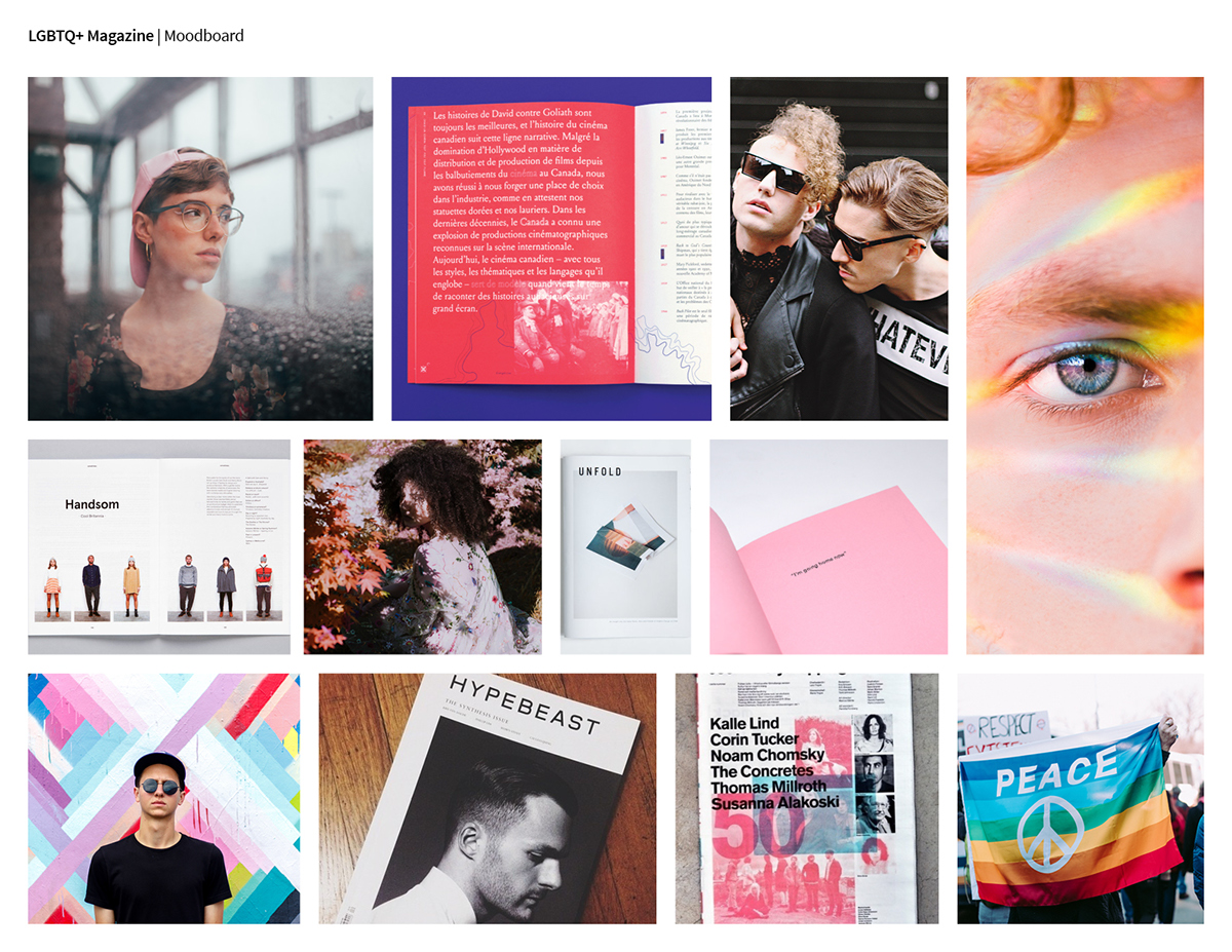
Along with collecting editorial layout inspiration, I created a mood board to help guide me throughout the process.
After I chose my topic, I began to research competitors in my market. This includes print and online publications that focus on the LGBTQ+ community, as well as arts and culture publications. Conducting this research analysis between competitors, allowed me to have a better understanding of how to create an effective strategy for my magazine, and allow it to stand out in the market.


I noticed common themes that make all of these magazines successful were, that they cover a variety of topics to attract a wide audience, they strive to inspire and relate to the reader through this diverse content, and that most specifically target only gay and lesbian individuals.
After gathering this information, I asked myself a few questions in order to create a unique strategy:
1. What makes my magazine different than the competition?
2. How will my content differ from the content that already exists in LGBTQ+ publications?
3. In what ways will I make the content resonate and inspire individuals?
Strategy
To create a magazine only focusing on the LGBTQ+ community across Canada, that provides a safe space for all LGBTQ+ individuals to express themselves, be vulnerable, and are celebrated and valued for their diversity. This magazine will be targeted towards inspiring and helping other LGBTQ+ individuals, and give them a sense of comfort that they are not going through situations alone.
The primary target market are Canadian individuals who are part of the LGBTQ+ community, aged 16–26. My secondary target market are individuals aged 16–26+ who are not part of this community, but are interested in gaining more insight and knowledge into the community.
The style that I was achieving through this magazine was similar to the style of most current arts and culture magazines, however, I did not want to make my magazine “trendy.” I wanted the design to be very current, yet timeless and adaptable for future publications. I aspired to create a magazine that is very welcoming and engaging to readers through the use of stunning photography. Some other features include, lots of white space, use of large images and numerous photo galleries, artistic photography, and bold typographic treatments.
I created a list of some rough content ideas I had in mind, but I also decided to contact some of my friends who are part of the LGBTQ+ community to help me brainstorm some ideas as well.


Once I had a strong strategy and plan, I began to create a magazine map using the online program Blinkplan. This allowed me to visually see the content laid out in my entire magazine, and the order in which content will appear. I also used the magazines that I purchased to help me determine the order in which certain elements should be placed in, such as the table of contents, imprint page, as well as advertisements. Throughout the process, I went though 15 versions of my magazine map, as I kept adding, removing, and changing the content in my magazine. Here is the first map that I created, in comparison to my final map.


Digital Grid Systems
After sketching a variety of layouts, I created various grid systems in InDesign that I could use for my magazine. I did about five different variations for my Q&A spreads, and although not all were used, doing this exercise allowed me to experiment more, and to potentially use some of these layouts for other sections of my magazine. Throughout the whole process, the grid was tweaked many times with the critique of my colleagues as well as my professor, until I finally created a set of master grids that would be the driving force for all of my layouts. Using these grid systems, I began to test various type trials to see which typefaces would best suit my strategy.


Typography
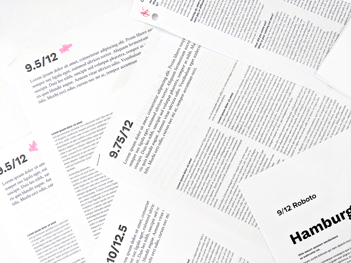
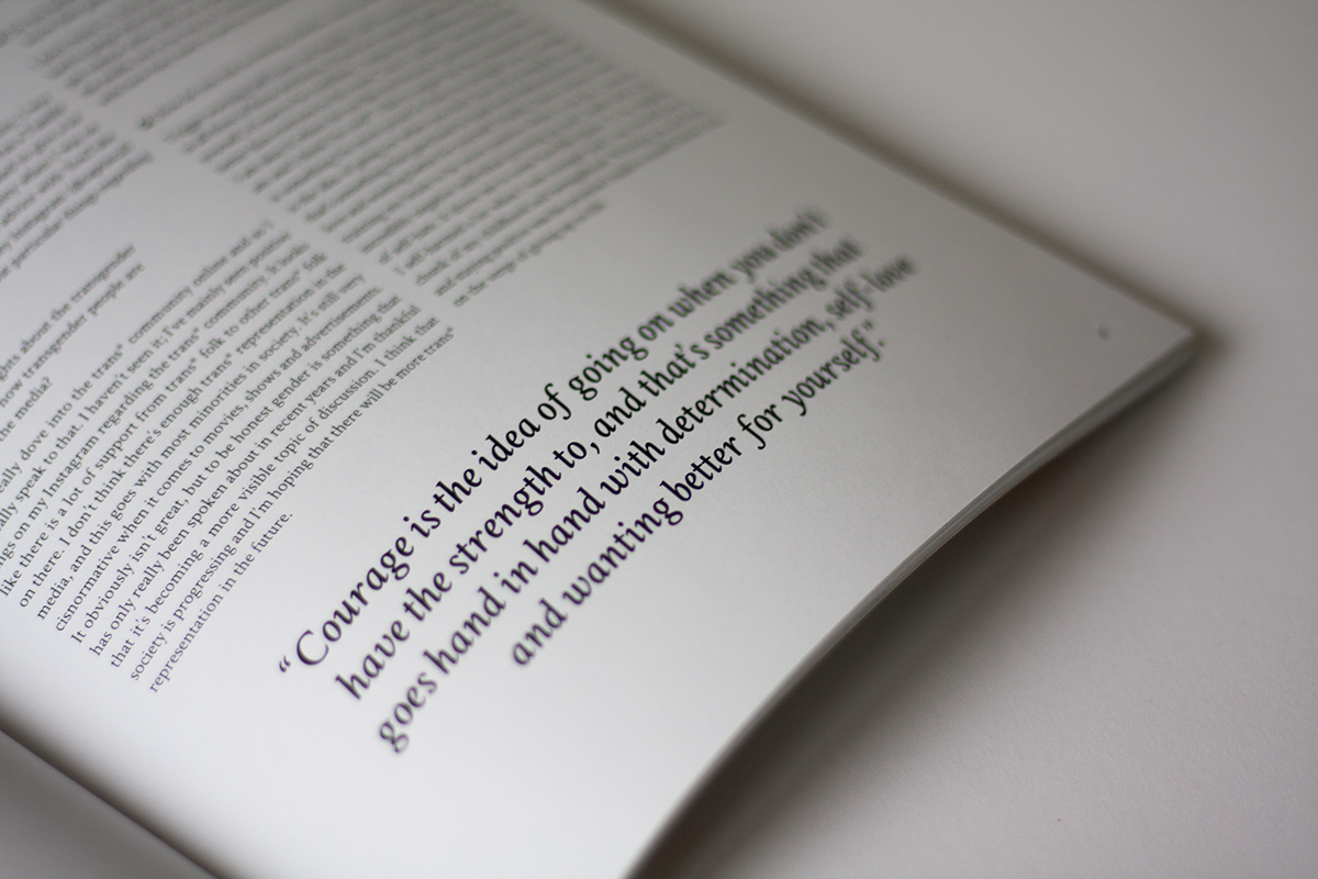
Throughout my magazine I used the typefaces: Circular, Playfair Display, and Crimson Text. In the early stages, I did many type trials to figure out the suitable size and leading for headings and body copy, based off of my grid system.
Initially, I was using Work Sans instead of Playfair Display, and did in fact end up doing almost half of my magazine using Work Sans. However, I realized that as I continued my magazine, I felt that it didn’t pair well with my body copy font, and no longer reflected the tone that I was trying to achieve through my magazine. I decided to used Circular instead, as the font is a grotesque font, and the characters are also more narrow which added a more welcoming and modern feel.
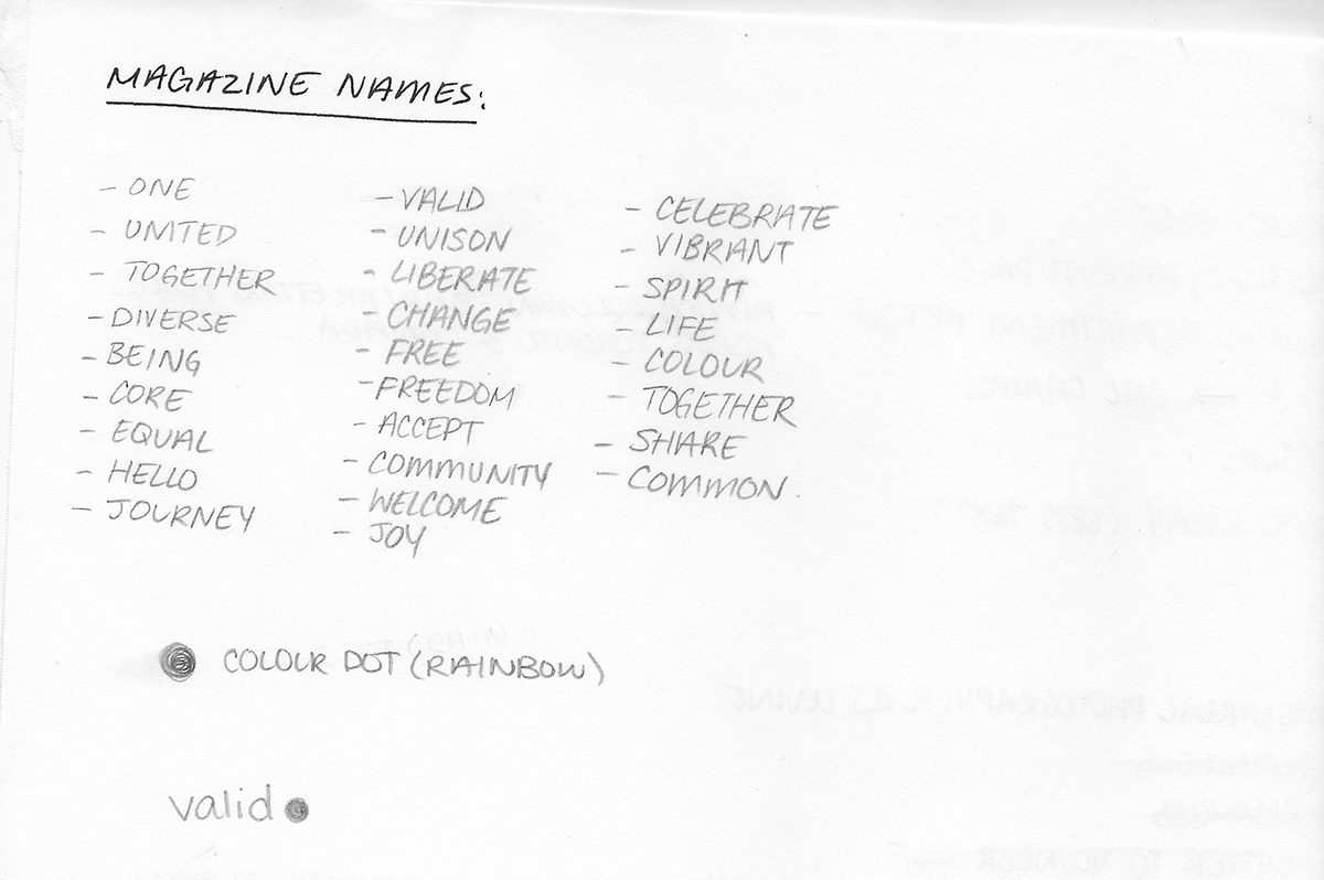
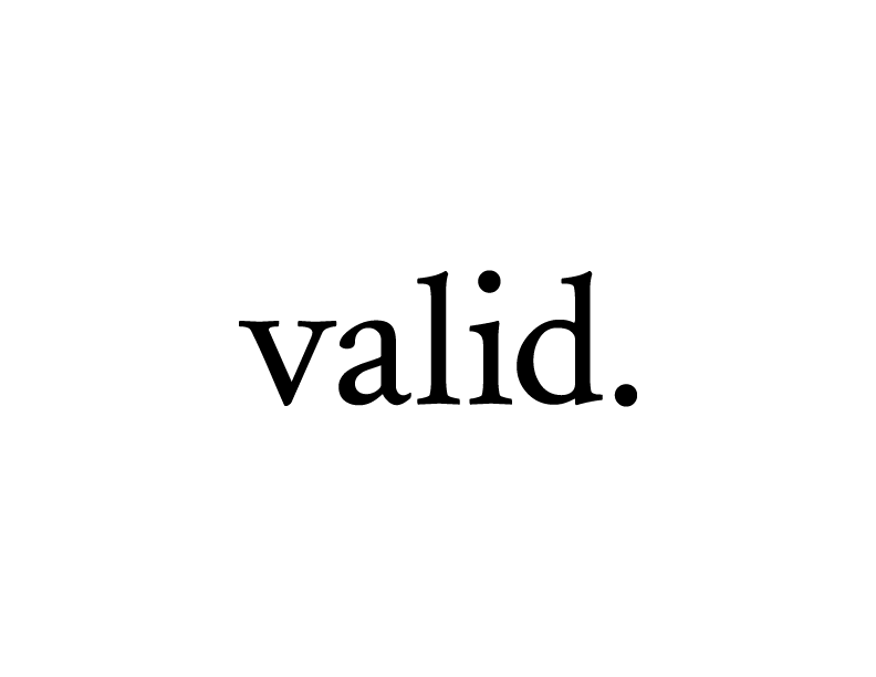
Name and the Logo
Strived to achieve a short, yet powerful name for my magazine, that connects with the LGBTQ+ community. After brainstorming a list of possible names, I decided to go with valid. Individuals part of the LGBTQ+ community struggle accepting themselves and figuring out exactly who they are. Choosing the name valid. is a constant reminder that you should be proud and accepting of yourself as a human. Individuals part of this community are humans who are deserving of just as much love, happiness, and acceptance as anyone else, regardless of how others perceive them.
I experimented with the fonts used in my magazine to create a logotype. I was aiming to achieve a classic, yet modern feel to the logo, that would stand out from pre-existing logos of arts and culture magazines.

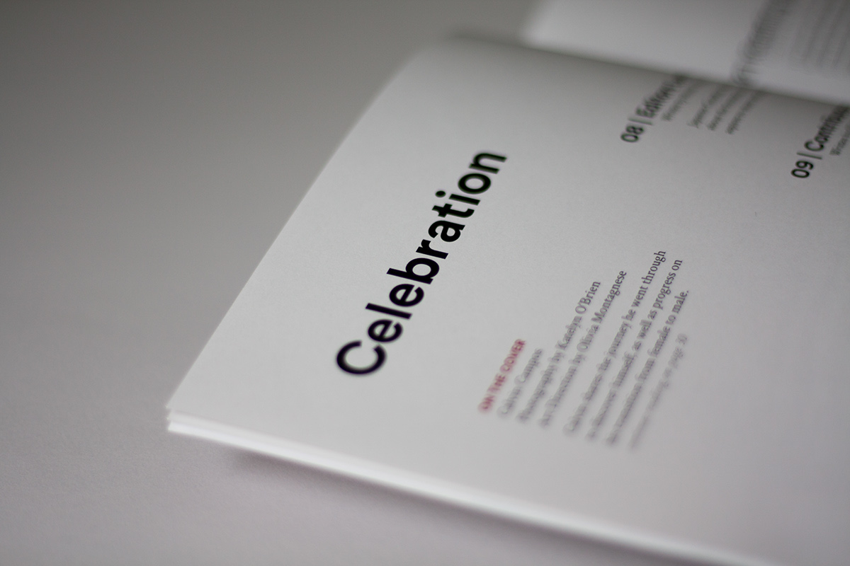
valid. issue 1
The first issue of valid. focuses on celebration, of not only the first publication of this magazine, but also of the great accomplishments made by individuals in this community. As a community that is constantly evolving, individuals who are part of this progression, deserve to be recognized and appreciated. This magazine is a celebration of you. It’s a celebration of your journey, a celebration of your progress, a celebration of your life, and a reminder that you are valid.
These are some of the spreads that I am most proud of from the final magazine. Here is the full magazine if you are interested!


Cover Design
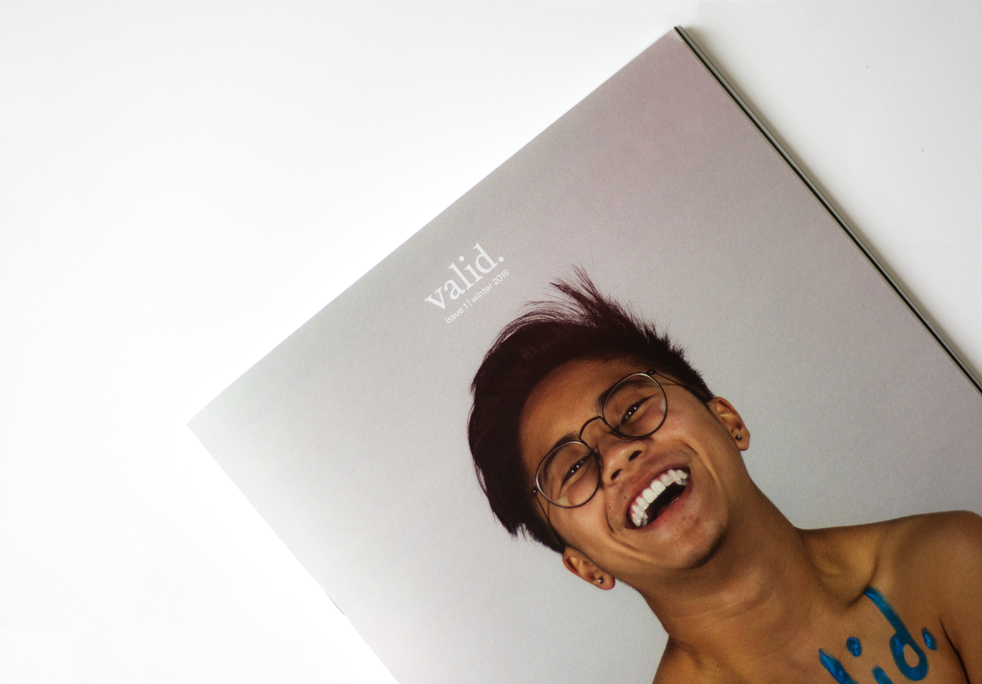
For the cover, I struggled with choosing an image that reflects the theme of the issue. I researched a variety of covers of arts and culture magazines, and I felt that the cover should be very artsy and ambiguous.


My idea was to just place a very nice picture on the cover, just so that it looked “nice” and appealing to consumers when places on the shelf. However, after reflecting, the cover should be meaningful and strive to communicate a larger idea that is presented throughout the magazine, instead of just being an intriguing photograph. I decided that using a photograph of Calvin Campos, who is featured in my magazine, would be reflective of my strategy by conveying idea of love and celebration, while also being appealing.
Writing
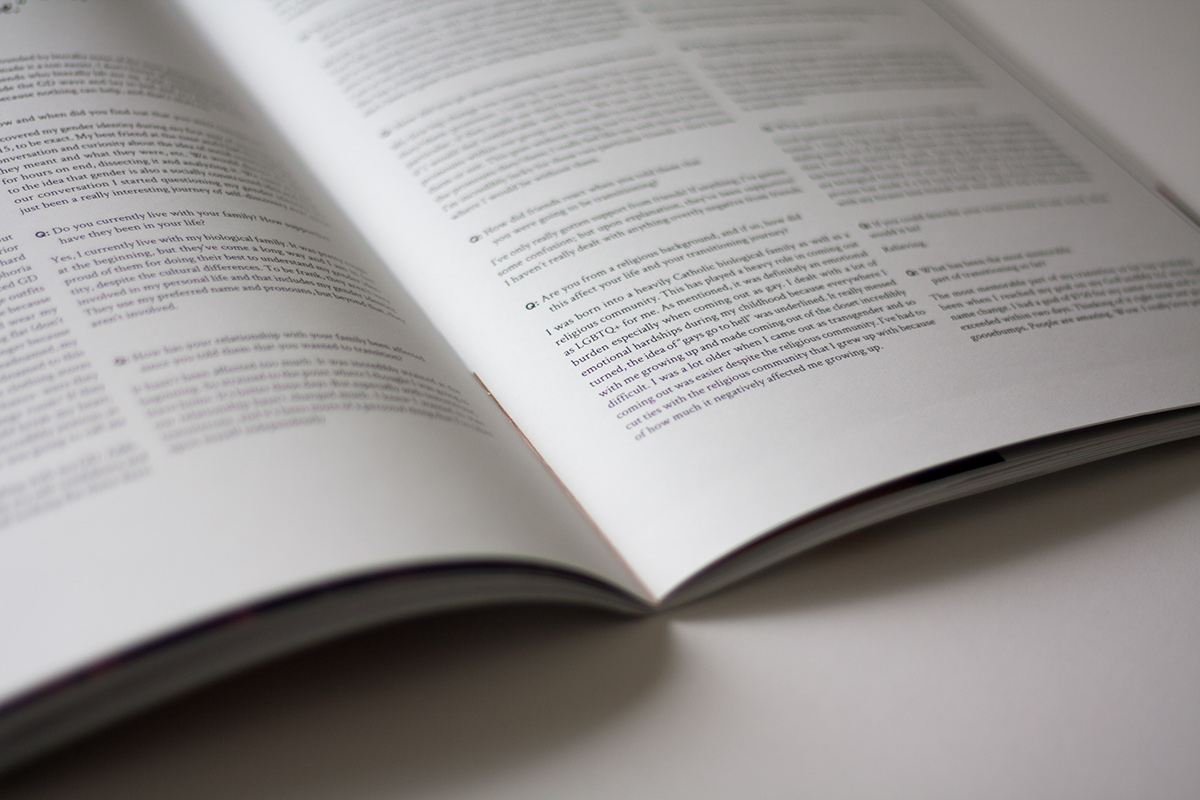
Most of the copy in my magazine was written by me, or by my contributors. These contributors who shared their ideas and perspectives are friends of mine who are part of the LGBTQ+ community. For other sections of my magazine, the copy was sourced from online articles, or compiled from numerous online sources (credits provided). Specifically for the Q&A feature on Calvin Campos (page 30), I watched a variety of videos of individuals going through their transitioning journey, which helped me to formulate a list of questions for Calvin to answer.
I have known Calvin since high school, through social media. Although we never got the opportunity to interact in person during high school, I became aware of his transitioning journey through social media and I was very intrigued. I had so many questions that I wanted to ask him, in order to learn more about his childhood, family life, and transitioning journey this far. It was very inspiring for me to read about Calvin’s life, and I thank him for being so open and vulnerable.
Photography
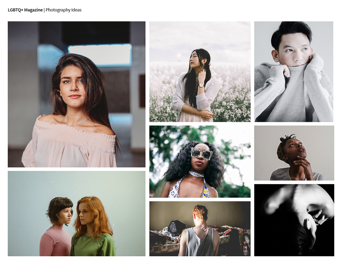
Most of the images in my magazine were taken off of Unsplash (credits provided). However, this project gave me the opportunity to art direct a photoshoot for the first time with Calvin Campos, and his friend Katelyn O’Brien for my Q&A feature. It was a great experience to be part of the photoshoot. Here are some of my favourite images from the shoot:


Creating this magazine was both a very stressful, yet rewarding experience. It was the first time I was able to really dive deep into the world of editorial design, and gain a better understanding about layout design, the visual flow of elements on a page, as well as the importance of the overall unity of a publication. Not only to look to ensure that each section is unified, but to also look at the publication as whole to ensure styles are unified and cohesive throughout.
_______________________________________________________________________________________________________________________
Thank you for viewing! ☺️👋


