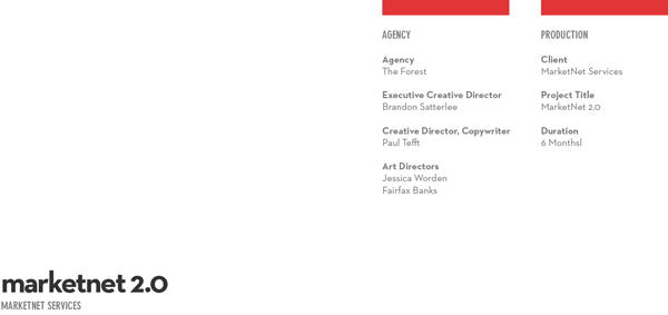

overview
Giving numbers a human face.
We reimagined what the MarketNet brand meant; on screen and off. By extending the companies distinctive thinking, innovation, and services into an experience that was more engaging, relevant, and ultimately
more human. When MarketNet Services, a lead management firm based in Spring Lake, Michigan, chose us to help them redesign their website, we asked them to help us rethink their brand.
We did so because there were many gaps in the brand identity. That, along with a tone of voice that was a little too loose for comfort, left us no choice but to rethink, update, and solidify the MarketNet brand while we rethought, updated, and solidified its new website outlets.


research
A routine game of 20 questions.
We knew there would be a hefty learning curve involved with our research, as our creative backgrounds haven’t garnered enough lead generation or marketing knowledge as needed to wholly understand just what it is that MarketNet Services does, or further more, what it does so well. So we met regularly with their staff to ask a routine game of 20 questions. We also kept a close eye on the top competitors, their web presences, and their engagement with their clients, prospects, general public (based primarily on social media).

challenges
Humans versus robots, go.
After spending time with MarketNet, and key stakeholders, we knew what the problem was. No humanity. Nothing says robots, like 1010101010. Many challenges arose during this project. Namely, many of the aforementioned dilemmas; including the brand identity update, the learning curve, the back and forth file transfers, conversations, conference calls, etc. With that said, many members of the project had a busy travel schedule, and scheduling was a real task.
We believe in incorporating brand persona and brand story exercises at the onset of many (if not all) of our projects, however, we had no idea the amount of brand improvement we were facing. We knew that MarketNet’s previous assets were dated, less human, off-brand, etc., but we had to work double-time rethinking or defining the brand, while proceeding with the website redesign.


strategy
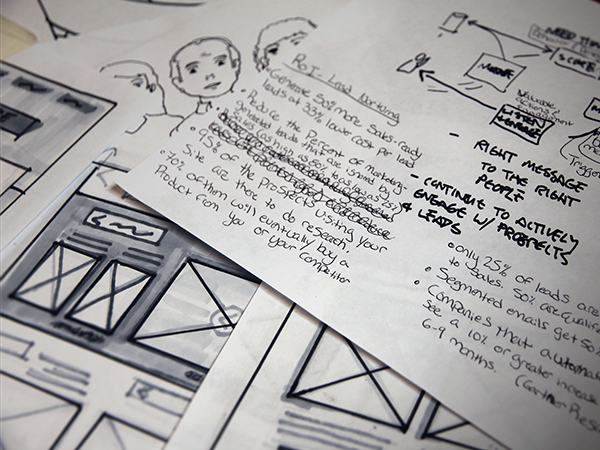
Input and the output.
Once we felt we had a common knowledge of the business, including the ins and outs, lingo, processes, formalities, competition, and the company itself, we proceeded to rescale the scope of work. We adjusted milestones, added deliverables (such as logo mark update, color palette update, iconography, white papers, etc.), and adjusted the timeline of the project. We knew that this would push our launch date back several weeks, but both MarketNet Services and The Forest agreed that the delay was for the best.
After this realization, we got busy working through ideas, concepts, sketches, photography, iconography, and copy. We worked closely together, sharing mere thoughts and ideas on BaseCamp. This generated a strong working relationship with MarketNet, along with a sense of urgency, and their understanding of the brand’s importance, in addition to its web presence.
We fulfilled the rest of the project accordingly, completing the deliverables and launching the site.


effectiveness
The numbers say, um yeah.
The new MarketNet Services website launched August 1 of 2012 - eight weeks later than the initial timeline. Though late, the website proved to be more definitive of the MarketNet brand. It was more unique; it told a stronger brand story; with more users, more leads.
Visit marketnetservices.com for more info.


