


Les Anagnou | Photographers
The motive behind the renaming Studio Paul photography was the inclusion of the owner’s wife in the business. The new name, ‘Les Anagnou’, is inspired by the French roots of photography and it aims to showcase the new image of the family business.
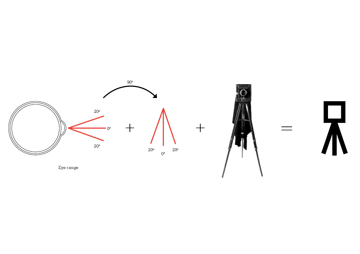
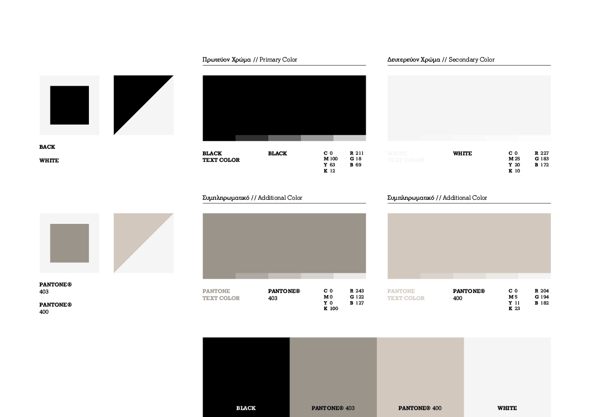
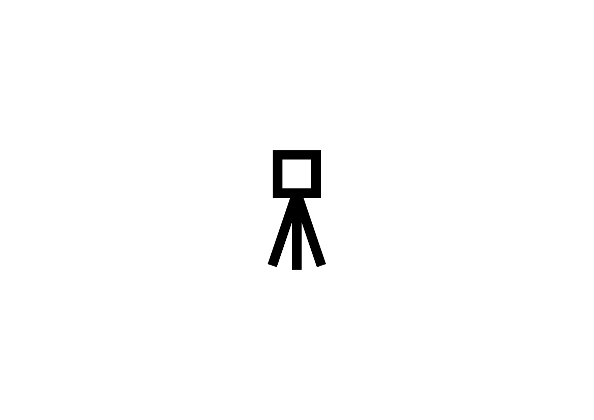
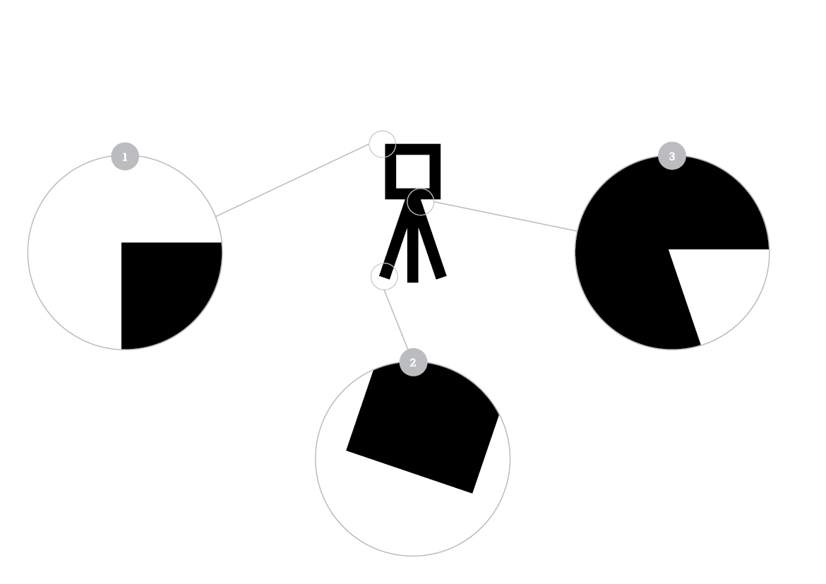
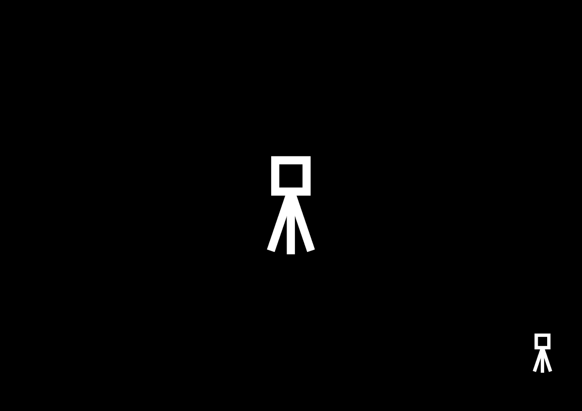
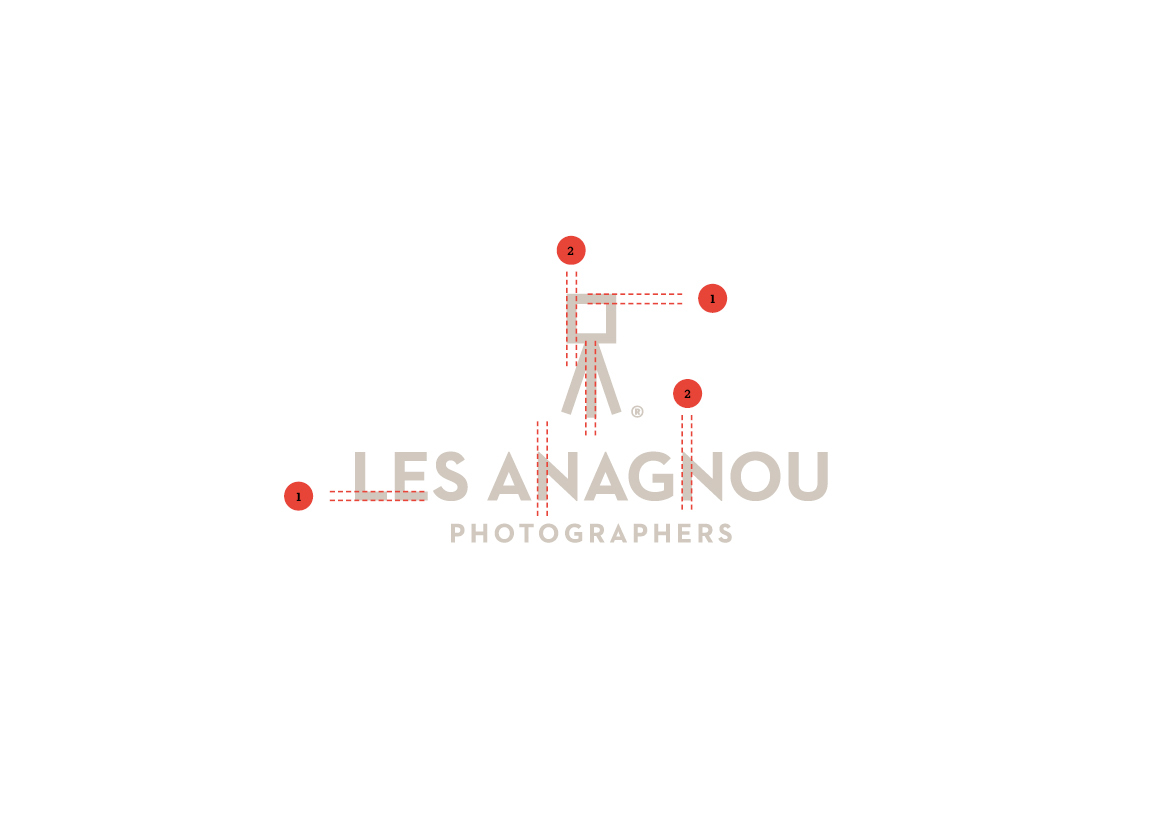
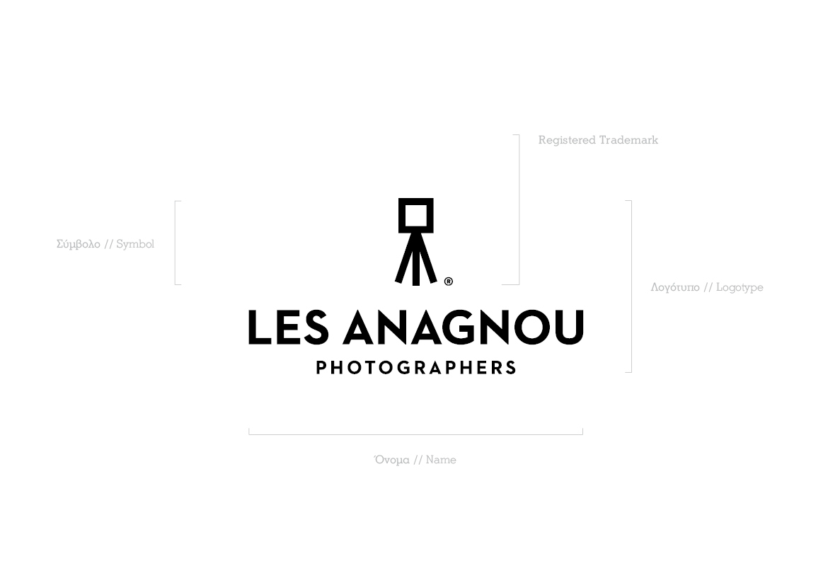
The symbol of the logo is inspired by the vision span of the human eye (at an angle of 90◦) and by the classic camera tripod. The symbol’s thickness, which is equal to the logo’s typography, enhances the logotype homogeneity, whereas the capital letters and choice of black as the dominant color reinforce the esteem and professionalism of the studio.
--------------------------------
Η μετονομασία του Studio Paul photography σε les Anagnou έγινε λόγω της ένταξης στην επιχείρηση της συζύγου του ιδιοκτήτη. Το νέο όνομα είναι εμπνευσμένο από τις γαλλικές ρίζες της φωτογραφίας και έχει στόχο να αναδείξει την νέα εικόνα της οικογενειακής επιχείρησης.
Το σύμβολο του λογοτύπου είναι εμπνευσμένο από το εύρος της όρασης του ανθρώπινου ματιού (σε γωνία 90◦) και από το κλασικό τρίποδο της φωτογραφικής μηχανής. Είναι, επίσης, ισόπαχο με την τυπογραφία, δημιουργώντας ομοιογένεια στη λογοτύπηση, ενώ τα κεφαλαία γράμματα και το μαύρο ως κυρίαρχο χρώμα, απορρέουν κύρος και επαγγελματισμό.


Before/After


CLIENT Les Anagnou
CONCEPT & DESIGN Chris Trivizas
NAMING Harry Tzannis
EDITOR Sissy Caravia
TYPEFACE Cannibal
PAPER Perrakis Papers
PRINT Kontorousis Bros.
TYPEFACE Cannibal
PAPER Perrakis Papers
PRINT Kontorousis Bros.
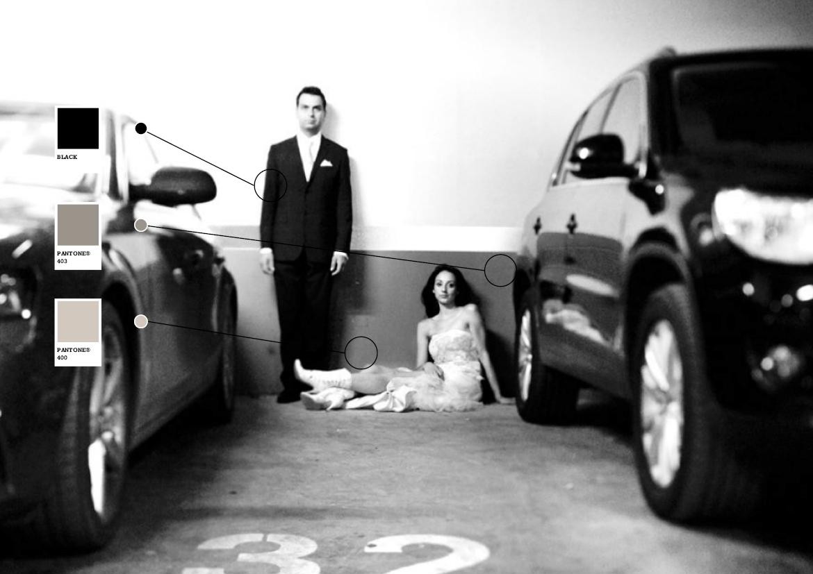
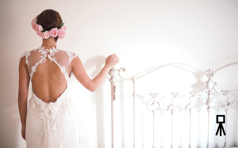
PHOTOGRAPHY Math Studio
MODEL Dimitra Papadimitriou
© 2012


