Fundado por Hend Almatrouk, uma arquitecta Kuwaiti e o seu colega indiano Gijo Paul George, o Studio Toggle encontra nas diferenças culturais dos seus fundadores a sua maior diferenciação e no exercício do equilíbrio entre essas diferenças, a sua identidade.
O nome “toggle” (interruptor) já fala deste conceito de on/off, de emocional/racional, mas mais do que falar sobre o que os diferencia, procurámos ilustrar a relação entre dois pontos de vista diferentes e o que se pode criar de novo quando ambos se relacionam.
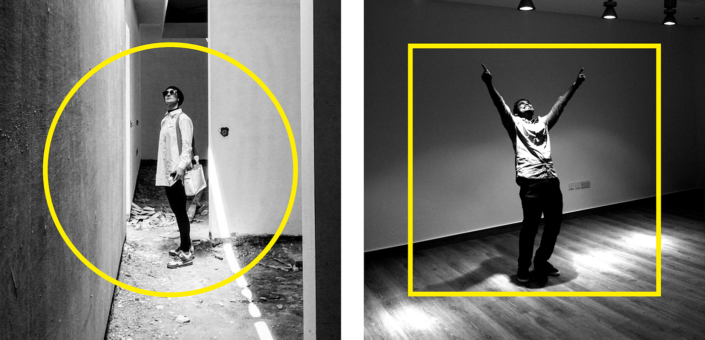
A nova marca ilustra esta diferença através de duas formas concorrentes - o círculo e o quadrado - e duas cores antagónicas - o branco e o preto - e o o resultado maior que se pode obter da aproximação de visões inicialmente distantes.
O símbolo dá corpo a esta relação entre opostos e o amarelo simboliza a vibração da atracção entre os extremos e a emoção de um resultado inesperado.
·· ·
Established by Hend Almatrouk, a Kuwaiti architect, and her colleague Gijo Paul George, from India, Studio Toggle is founded on the belief that cultural differences can be the trigger for creativity and, with the right balance, achieve results otherwise impossible to obtain.
The name "toggle" already had the concept of on/off, emotional/rational, but we wanted to underline the magic that can occur when opposites touch, more than what sets them apart.
The new logo starts from two different shapes - the circle and the square - and two antagonistic colors - black and white - to generate a new structure, half cube, half cylinder. The yellow represents the energy produced in this relationship between simplicity and complexity, form and function, reason and emotion.
Photo Credits: Gijo Paul George