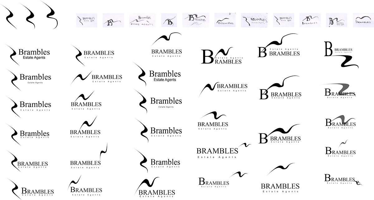
Creating a logo for Brambles Estate Agents
(Work in progress)
Main intent is to connect the logo with the Brambles Bank in Southampton, UK (from which the name of the company is originally taken).
*The Brambles Bank is an arrowhead-shaped sandbar in the central Solent which is uncovered at low water spring tides.
I'm using a wavy shape to symbolize the water.
I like the ones where the "water" shape is over the text as it's direct link to the Brambles bank - which is underwater for most of the time.
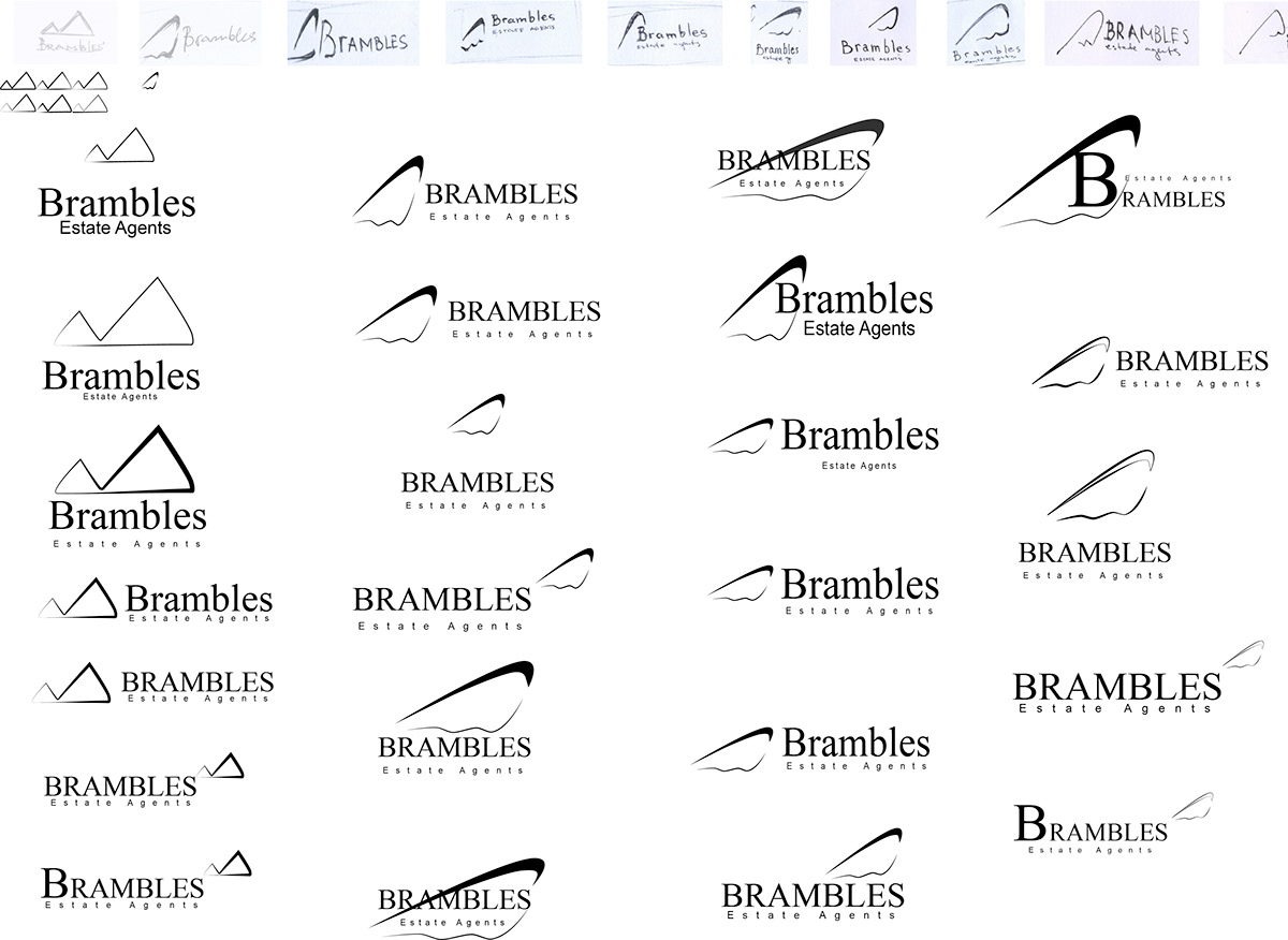
In the second part the focus is on the shape of the Brambles bank itself and the insertion of part of a "B" letter in the bottom part.
This shape also can resemble a more abstract shape of a house - making connection with the company business.
(Work in progress)
Main intent is to connect the logo with the Brambles Bank in Southampton, UK (from which the name of the company is originally taken).
*The Brambles Bank is an arrowhead-shaped sandbar in the central Solent which is uncovered at low water spring tides.
I'm using a wavy shape to symbolize the water.
I like the ones where the "water" shape is over the text as it's direct link to the Brambles bank - which is underwater for most of the time.
In the second part the focus is on the shape of the Brambles bank itself and the insertion of part of a "B" letter in the bottom part.
This shape also can resemble a more abstract shape of a house - making connection with the company business.

The Old Logo of Brambles Estate Agents

The final logo chosen by the client
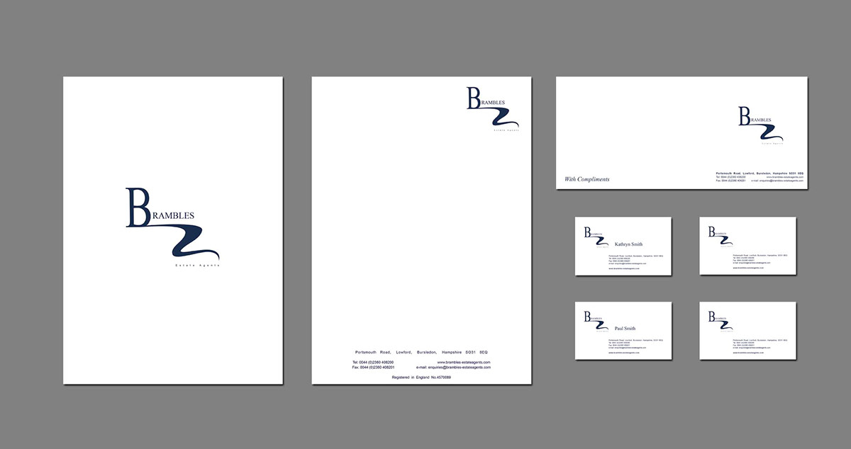
Application
