In my recent Branding 2 class, students were given a brief to explore and experiment visual strategies to establish an identity for Taylor's Design Society.
This is my proposed design concept.
The concept behind the logo is inspired by aztec patterns. The lines connecting a triangle to another speaks of The Design Society. A society whereby students are connected with one another sharing a common interest, design.
Sustainability could be seen throughout my identity. Instead of going for bright neon colors, I decided to go for something traditional. Classic. Authentic. Using only black as the primary color. Everything is hand-crafted. Nothing too fancy.
The material used is kraft recycled paper, a natural 100% biodegradable product.
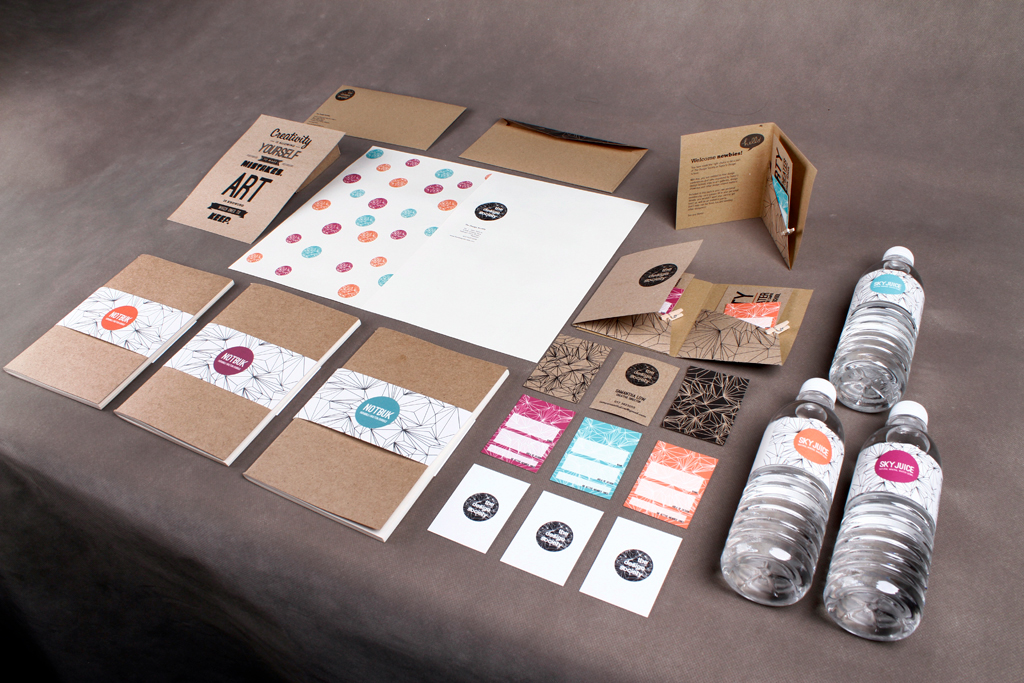


Student's membership name card comes in three different colors.

Welcome pack for newbies. - Comes with an invitation party and membership card.


Letterhead + Envelope


Welcome pack


Sketchbook/Notebook for personal use.


