
The brief: write and illustrate a 1000-word essay on a type family.
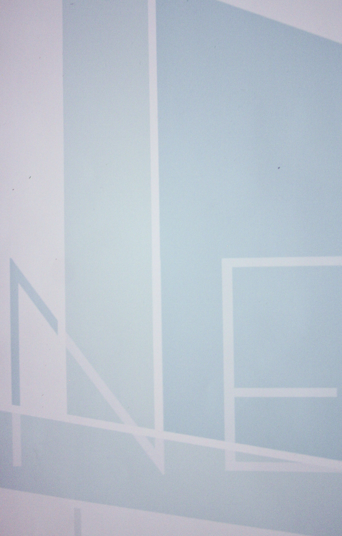
This 16 x 24 in. poster is a celebration of Neutraface and an homage the groundbreaking modern architecture of Richard Neutra.
I wanted to maintain the spacious feel of his homes in the poster design, and so used the famous Kaufmann House, completed by Neutra in 1946, as a grid.
This 16 x 24 in. poster is a celebration of Neutraface and an homage the groundbreaking modern architecture of Richard Neutra.
I wanted to maintain the spacious feel of his homes in the poster design, and so used the famous Kaufmann House, completed by Neutra in 1946, as a grid.
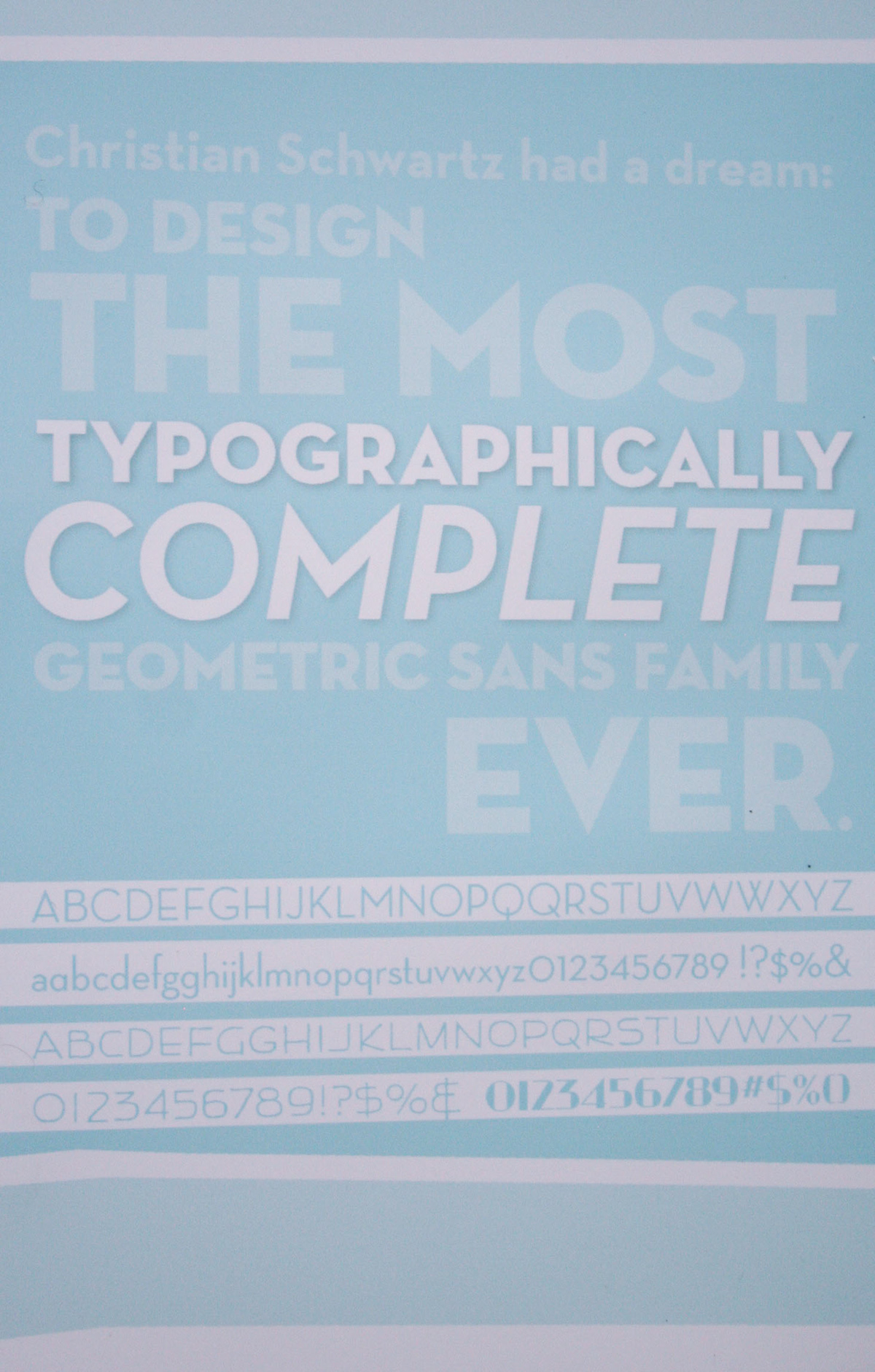
What a face The Carnegie-Mellon schooled designer and typographer graduated to work prestigious jobs at MetaDesign Berlin and The Font Bureau, Inc., before setting off into the great type sunset in 2001 in search of creative freedom and better design as a lone wolf. Collaborations with Dino Sanchez, Village, FontFont and Emigre showcased the obvious fact that 24-year-old Schwartz was no ordinary typographer. As the worldwide design community would come to see, Schwartz had something even bigger up his sleeve. House Industries was up to the challenge. A not-so-typical design company started by three letter-loving dudes in 1994, House Industries grew the reputation of developing commercially approachable yet impeccably hand-crafted type. The skateboarding, punk-rocking, Mad-reading tendencies of their youth, the repeatedly redrawn logos of Iron Maiden and Judas Priest, all came together to create an aesthetic so hip that it looks effortless. Obviously, it’s not so effortless, and their love love for the craft is apparent. This company stands above other mediocre type foundries in that development remains largely done by traditional methods, and though aided by current technologies, they just love the ease of a brush and some ink. House Industries rejected the uptight, inward-looking and sometimes arrogant attitude of the design community and, gathering images from all the unappreciated little corners of commercial illustration and fringe culture, created a fresh aesthetic reminiscent of hot rods and half-pipes, fun, unapologetic and purely their own.
Together these two giants of type created a cool, clean and confident typeface whose open and unobtrusive forms recalled in the revolutionary modernist design of architect Richard Neutra. Inspired by sign lettering Neutra created to complement his beautiful buildings—and using Julius Schulmann’s photographical archives as reference—Schwartz and House got down to business. They called up Neutra’s son Deon, who was his father’s business partner until death in 1970 when Deon assumed control of the influential architecture firm. The collaboration between House, Schwartz and Deon Neutra assured that this new typeface would not only reproduce the deceased architect’s letterforms, but also use the conceptual, holistic process developed by Neutra to invoke the harmonious and luxurious feel found in his modern buildings.
Neutra’s letterforms combined thin lines, low crossbars, and geometric shapes for a strong yet understated feel. There was only one little problem. Richard Neutra only created uppercase letterforms for his signs, so Schwartz turned to geometric Futura, serifed Novel and sans serif Tempo as muses to hand-draw a complete lowercase alphabet.
And in 2002, Neutraface was born.

A whole year after drawing began, and about 100 font files later, the large geometric sans serif Neutraface family was released. Schwartz was thorough. He included five different weights: thin, light, medium, bold and tilting. He also included a drafting style for display purposes along with book and demi styles for text. He included both small caps and alternate italic small caps. He included six different kinds of numerical figures plus fractions. And if that wasn’t enough, he even included characters for the obscure language Esperanto.
But even after all that work, Schwartz and House Industries were not finished with Neutraface. In 2004, they released Neutraface Condensed, a slimmer version of its wider brother. And in 2009, they released Neutraface Slab, a less geometric type designed by Kai Bernau and Susana Carvalho, which included display styles in thin, light, medium, bold and tilting and text styles in light, book, demi and bold. Together, these styles made a huge impact on the general design community and became pervasive fixtures in commercial design.
But even after all that work, Schwartz and House Industries were not finished with Neutraface. In 2004, they released Neutraface Condensed, a slimmer version of its wider brother. And in 2009, they released Neutraface Slab, a less geometric type designed by Kai Bernau and Susana Carvalho, which included display styles in thin, light, medium, bold and tilting and text styles in light, book, demi and bold. Together, these styles made a huge impact on the general design community and became pervasive fixtures in commercial design.
Survival through design Richard Neutra was born in 1892 to a wealthy Jewish family in Leopoldstadt, Vienna back when the Austro-Hungarian Empire was still a thing. His father was the owner of a metal foundry. Not sure if that’s completely relevant, though Neutra later used his knowledge of metals to engineer light, easy-to-carry steel structures that revolutionized the process of building in hard-to-reach areas.
At 18 years old, Neutra graduated from the Sophiegymnasium to study at Vienna University of Technology under Adolf Loos, an Austro-Hungarian architect whose essays shaped the development of European Modern architecture. Loos disliked superfluously elaborate ornamentation in design, supporting instead the use of organic and practical decorations. As an artist, Loos had a passion for all aspects of design, and his holistic and pragmatic principles became formative tenets for young Neutra.
Richard Neutra’s lasting legacy goes much farther than some nice-looking, modular buildings. Neutra felt that “man-made environment has become an irritating, increasing threat to the vitality and soundness of mind and body,” so he yearned to consider the needs of both individual and environment in his art, bringing them together to create a solution that brought harmony and balance to both the person and their surroundings.

