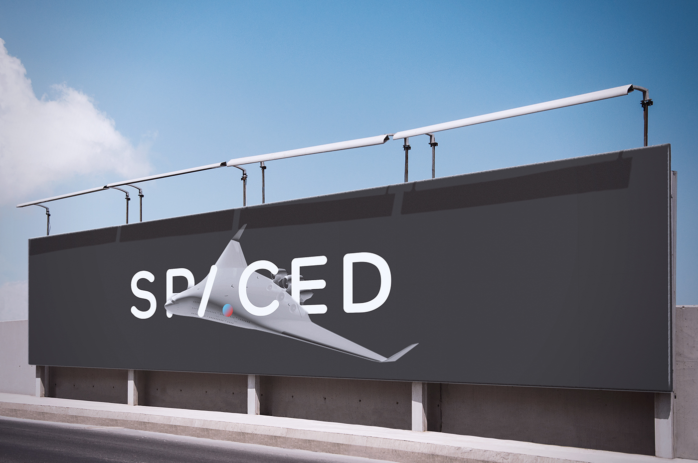

SPACED is a newcomer in the space tourism business. The company was aware of it's tough competition and wanted to establish itself as trusted and safe but also as bold and trendy. The large target audience (humans age 25-45) forced me to find a meaningful solution that will appeal to everyone.

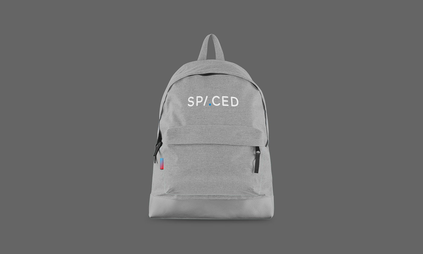
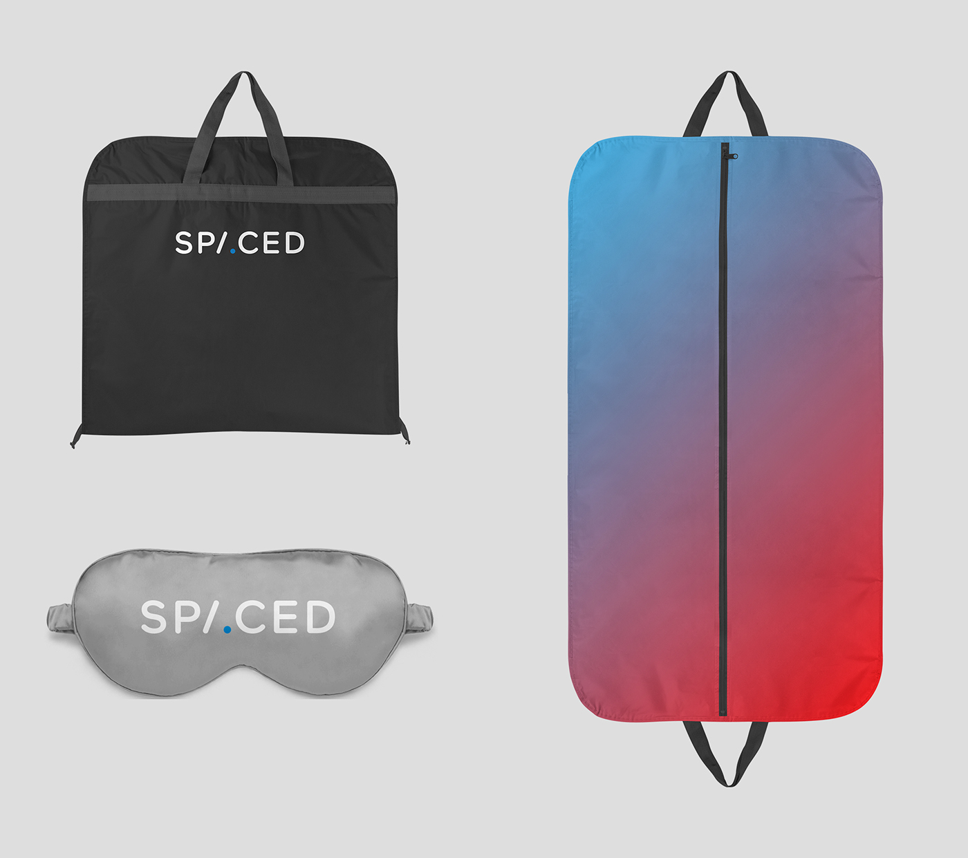
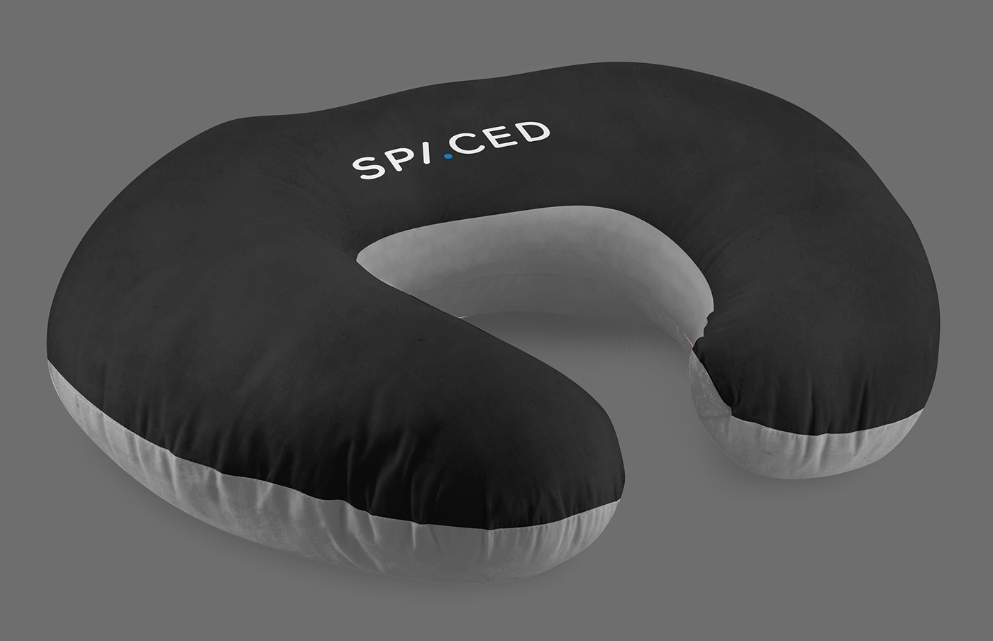
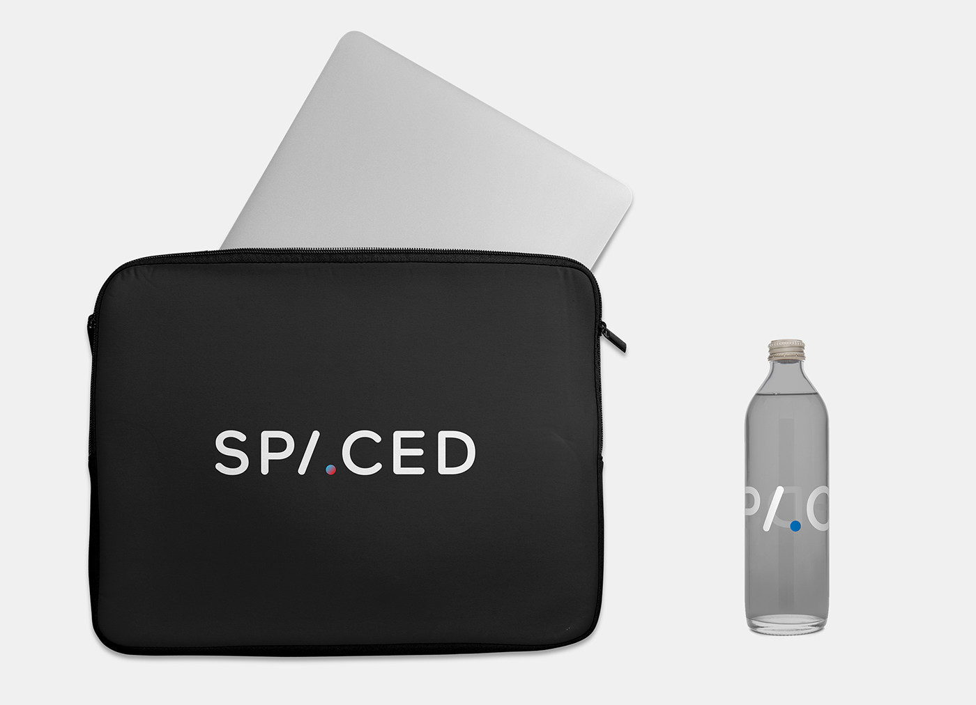
My approach towards designing the logo was to keep it elegant and cool while still friendly and inviting. The typeface was carefully chosen. It had to evoke freshness but also to position SPACED as a trusted and established company. The rounded corners are friendly but restrained, the kerning was meticulously dealt with, and finally the A was reduced just enough to be playful yet legible, with the circle referencing a planet.


My main focus was to find the balance between positioning SPACED as a confident, serious player in the space tourism game, but still friendly, fun and welcoming while maintaining a high end feel of a lifestyle brand.