


Ezetap.
Trust + Energy + Empathy = Security
Ezetap is a global leader in the rapidly growing Mobile Point of Sale (MPOS) market based in Singapore and Bangalore. The company was founded in 2011. The Ezetap solution turns a
merchant’s mobile device into an intelligent point of sale or ATM that is able to complete any type of financial transaction from a credit card sale to a real-time bill payment, to a cash withdrawal or deposit.
merchant’s mobile device into an intelligent point of sale or ATM that is able to complete any type of financial transaction from a credit card sale to a real-time bill payment, to a cash withdrawal or deposit.
We at Define were asked to develop a comprehensive brand experience for Ezetap. The goal was exigent. The experience had to encapsulate what made Ezetap different, reflect it’s vision and encapsulate it’s values. With this in mind, we embarked upon our journey to define the Ezetap brand.
Do have a look at our process documentation on Medium.


With the keywords security and growth in mind, we ventured into our prototyping stage. We began with putting together a mood board that helped us ideate on the brand mark that led us to several possible routes. There was one that resonated the best with the brand. The values of trust, energy and empathy were represented with three overlapping circles. The overlapping area formed a shield, which represented security.
The shield shape combined with three concentric rings representing growth formed the basis for Ezetap’s brand mark.


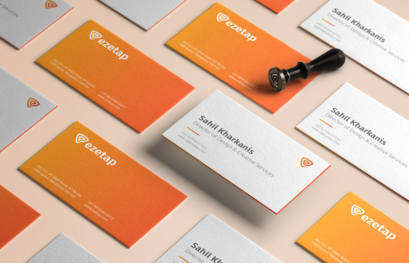
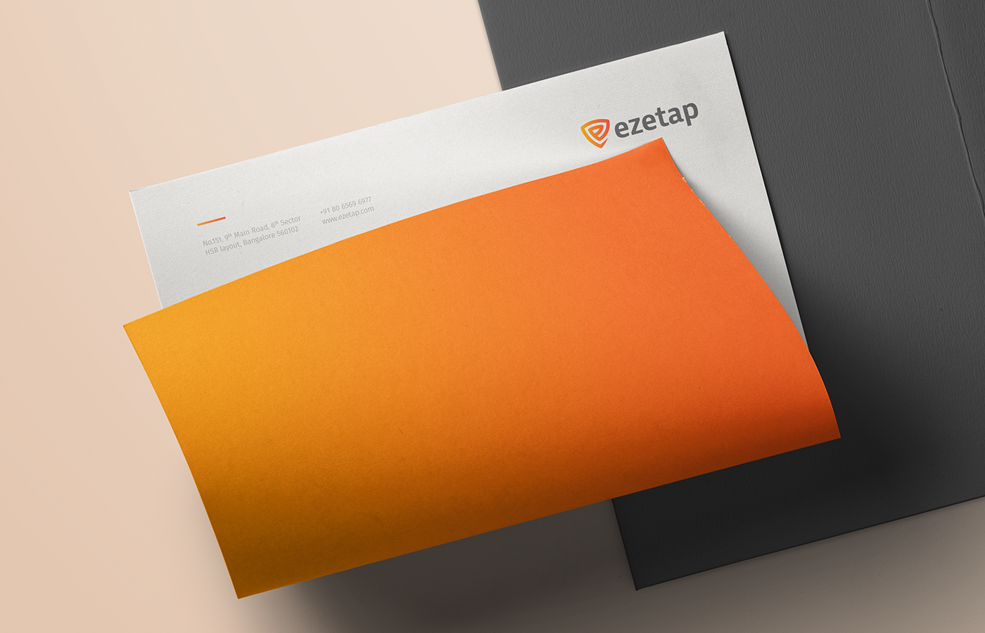
The spiral shield symbol formed the basis of designing brand elements such as the icons & secondary illustrations. The curvature of the shield unit formed the basis for secondary elements
that were used in the stationery.
that were used in the stationery.


Thank you for viewing!
If you would like us to under-take such design projects for your organisation,
write to us at work@wedefine.co
write to us at work@wedefine.co
Follow our work on instagram.com/define_co


