


PressReader
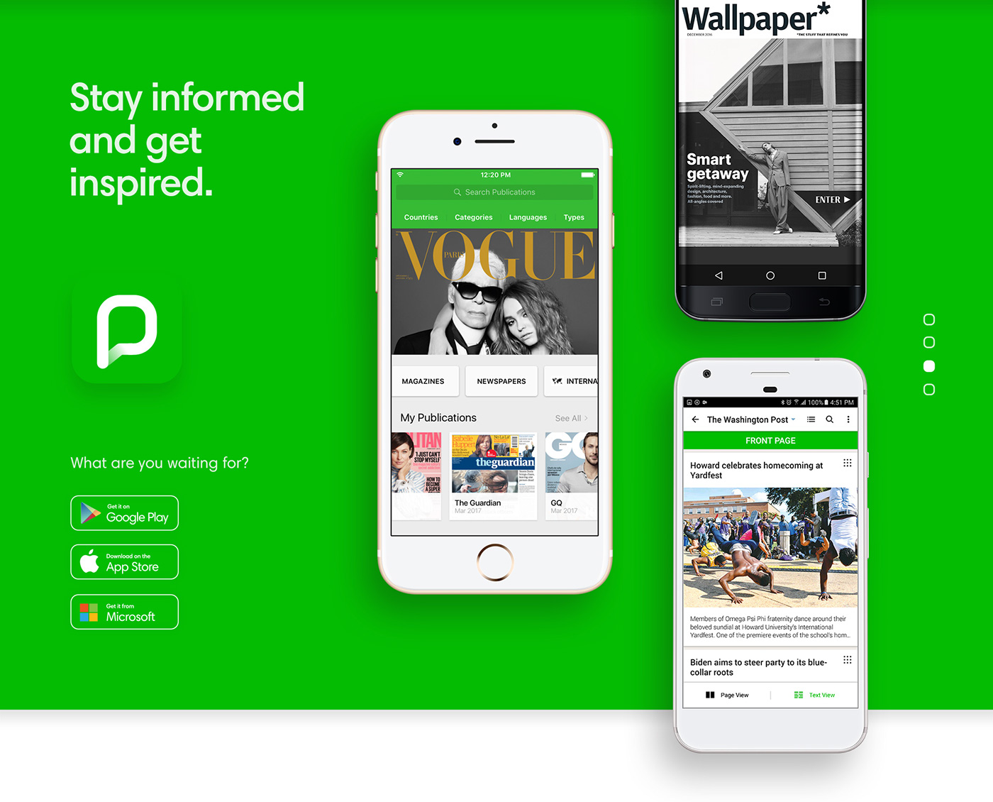
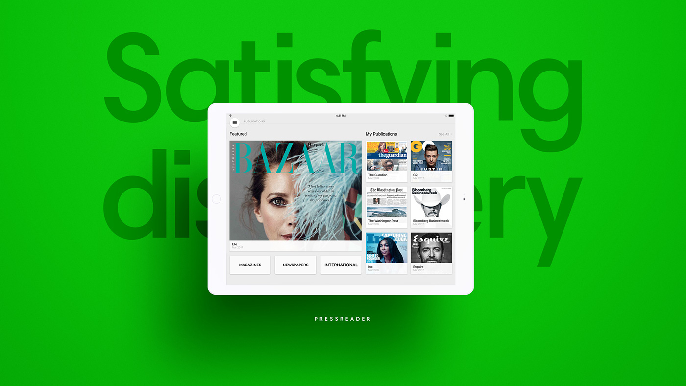
PressReader is a digital platform that gives customers unlimited access to the magazines and newspapers in over 60 languages, issued by over 7000 publishers across 120 countries. The platform allows users to sign up for free, and pay varying mounts depending on downloaded publication. Business can buy subscriptions for their customers, and publishers can customize the platform to feature their content. These B2C and B2B models make PR the largest platform of its kind to date.
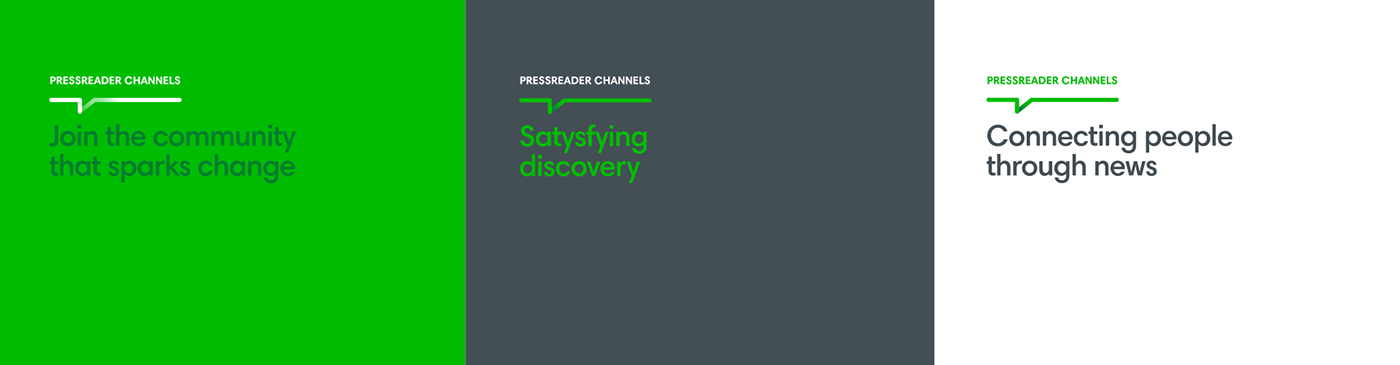
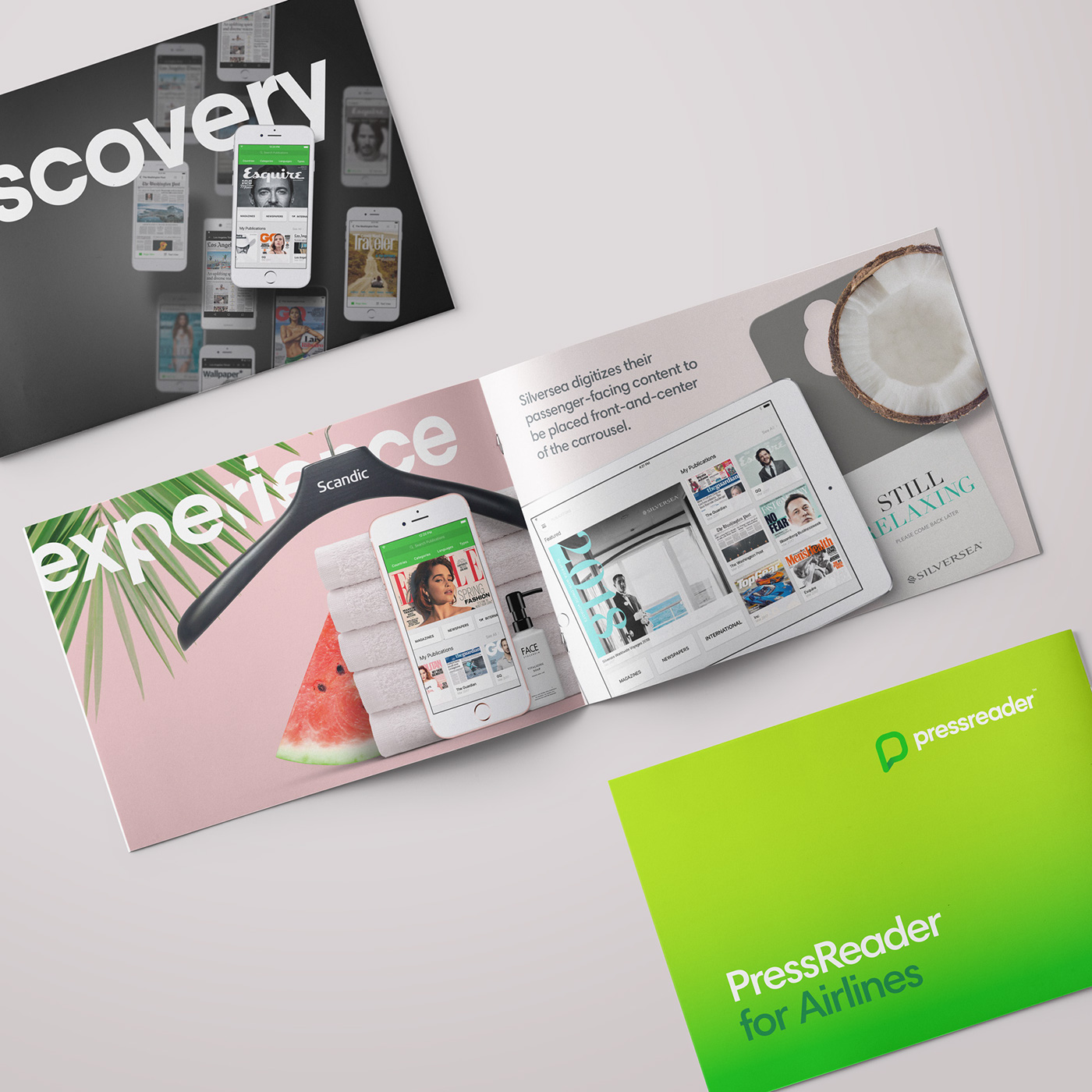
The key objective was to elevate the design as part of PR’s business strategy. New brand identity was launched in 2017. Among key deliverables were branding guidelines, brand voice manual, new website, brand launch campaign, updated collaterals and B2B presentations.
The rebranding was carried out in-house in Vancouver, DC.
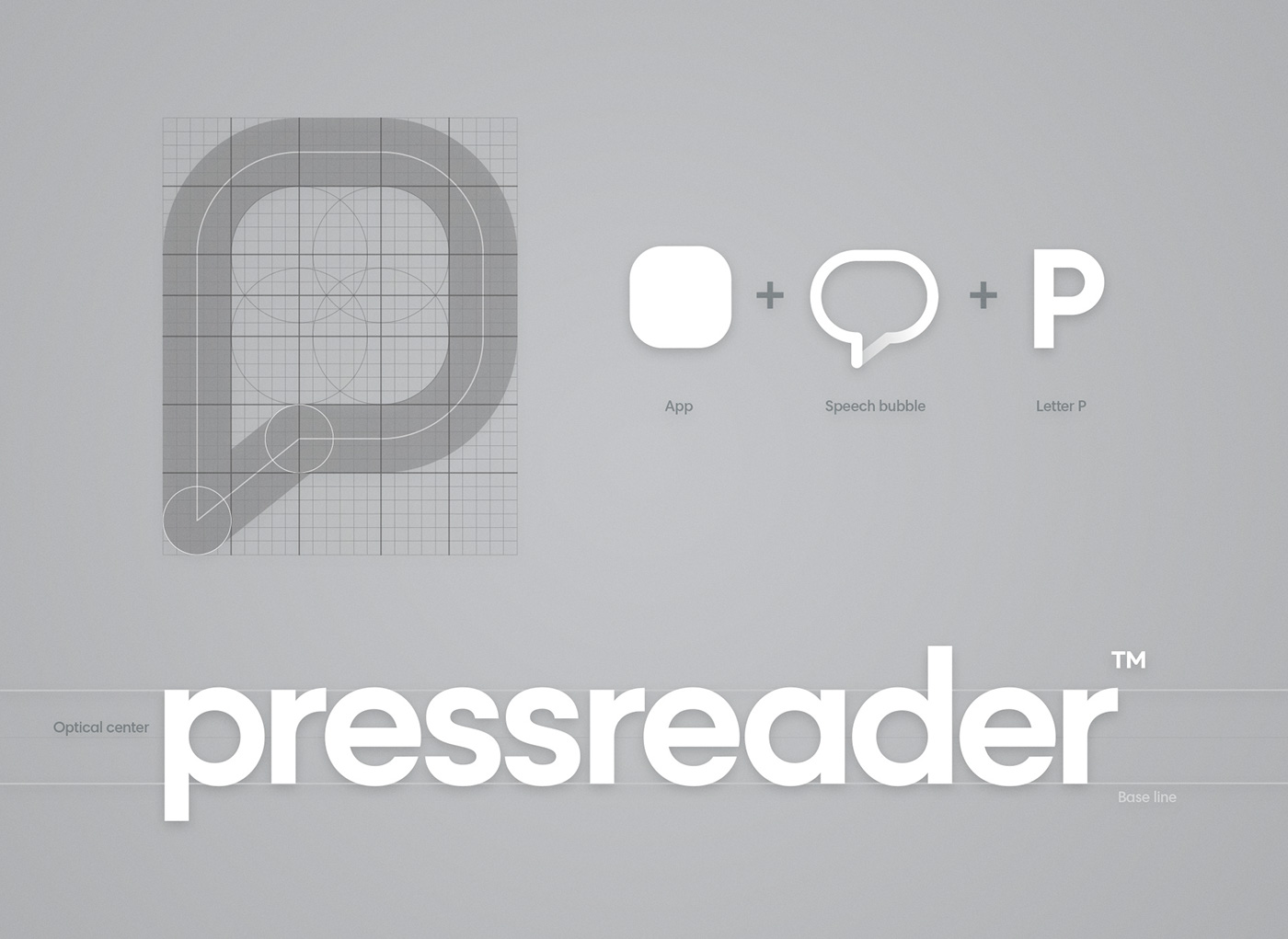
With new geometrical logo that utilised a bespoke geometrical grotesque and by styling its name as a compound noun, PressReader has strengthened its identity as balanced and relevant. The wordmark is complimented by Harmonia Sans type face, which is used for all visual communications.
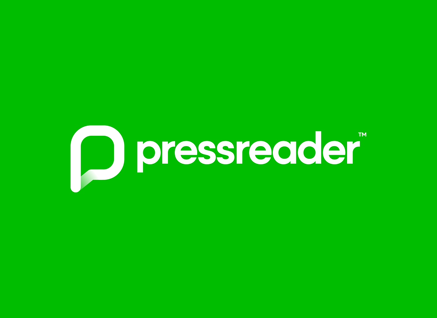
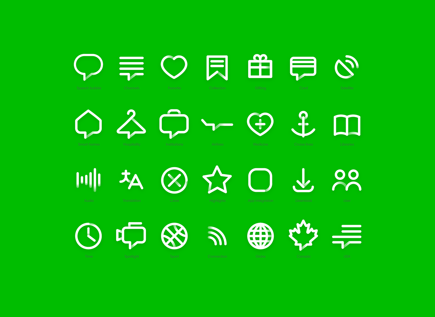
Adjusted green palette supported by the set of pictograms is used throughout PressReader collaterals to compliment the logomark. Transformation of the old speech bubble into a recognisable app shaped ‘P’ with a slight gradient shift at the base makes a nod to the actual service PressReader is offering.


learn more at
about.pressreader.com


