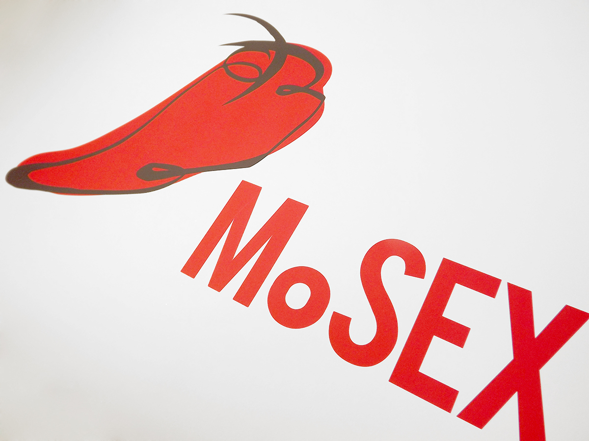
The red pepper: an unusual, funny, indirect identifier sets the tone for the new identity. The red was chosen as the new institutional color because of it's relationship to the human body, it's visceral values, color of action and spiciness.


The Business Card for the Rebranded Mosex would also be a condom holder. The concept behind this joke is to create awareness for the museum by providing the client everything he needs to be sexually active.


The stationary it's simple and modern. The museum pattern is on the back of the letter, and the interior of the envelope. A joky red pattern illustrates the back of important documents


Envelope + Invitation letter for events. The envelope comes in a shape of a bra. In order for the client to read the message, he needs to untie the envelope the same way he would do with a woman's underwear.


The entrance ticket for the museum can also become a "Do no disturb" sign. You simply de-attach the dashed square and put it on your door. Again, the concept is to bring the museum of sex into the client's sexual life.

The box is intended to be the recipient for presents and gifts bought on the Museum's gift shop. It has dozens of funny facts about sex written all over the place. It also is wrapped by a "fake" zipper printed in red.


The match box brings to life the famous saying.


The bag plays with it strings by creating a corset being dressed.


An easy to assemble 3-piece candy bowl for the gift shop.
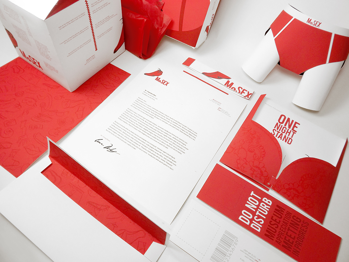
All the printing material together. Consistency on the use of typography and specific graphic elements, humor and respect to the institutional colors.

Bus stop poster.

Clean, direct, objective website. Few text, easy to get information, very visual. Extra space to the exhibitions and events the museum is currently hosting. A photograph of a naked "Barbie" doll is mysteriously displayed on the back of the website, each section of the website shows a different part of the picture.


The entrances desks would have interactive projections that track the ticket officer and show a funny and nasty leg to create an playful illusion.

Bathroom signs, as well as all the signage of the museum would always have two interpretations.