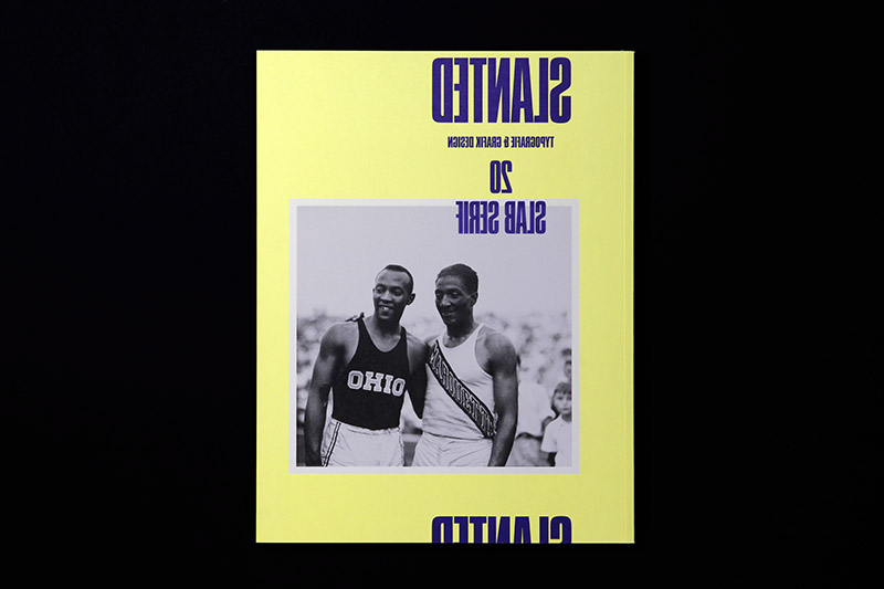
Slanted Magazine #20 – Slab Serif
Winter Issue 2012/2013
Winter Issue 2012/2013
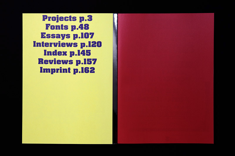
SLAB!
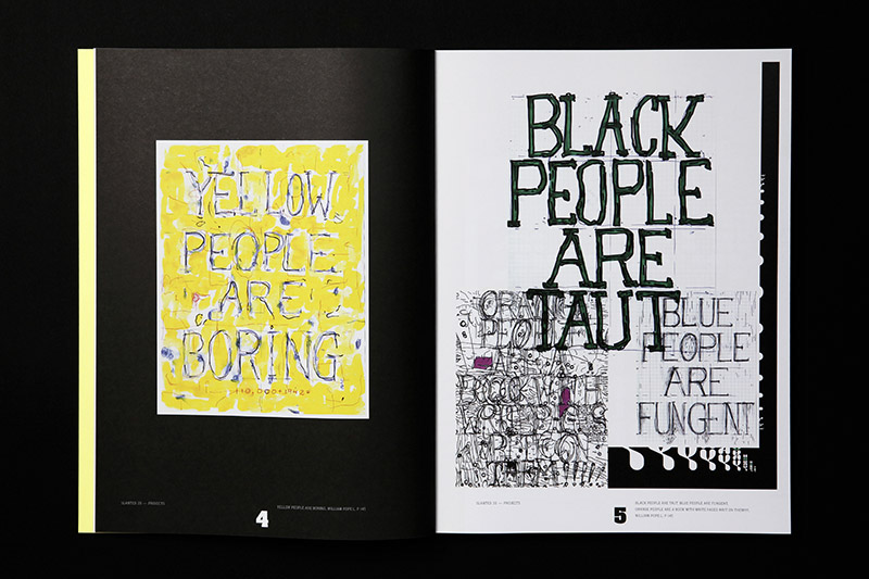
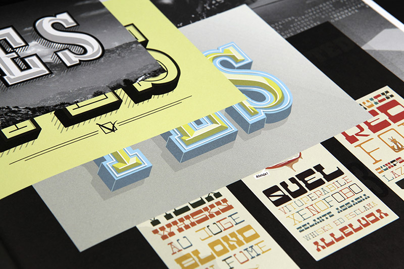
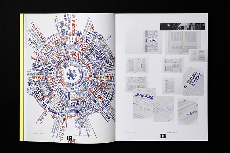
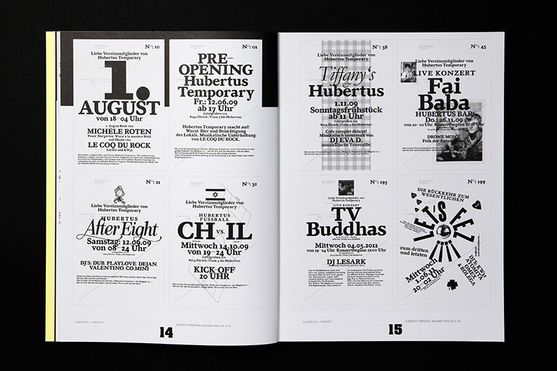
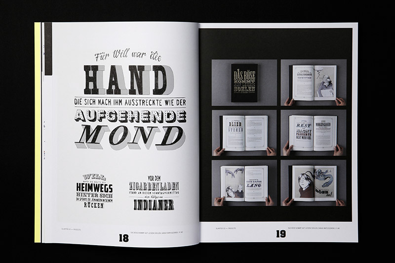
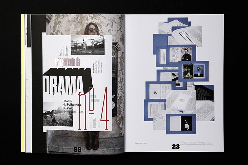
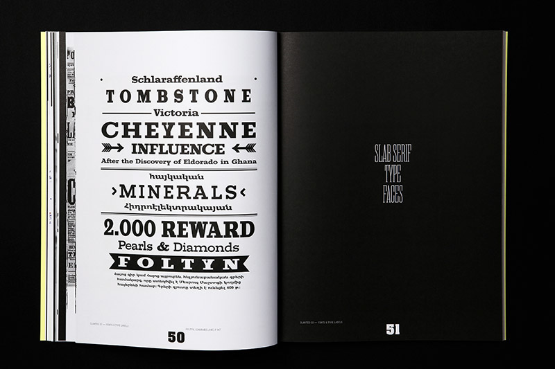
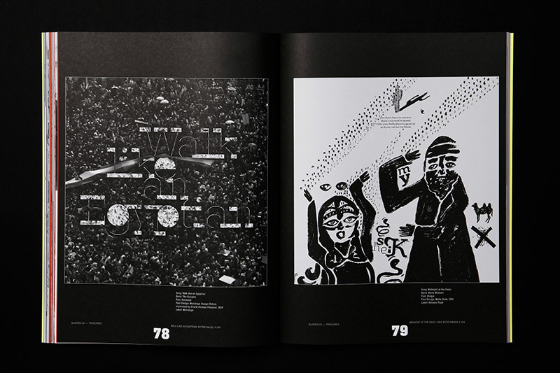
Slanted Magazine #20 – Slab Serif is entirely dedicated to the early 19th century born »serifenbetonte Linear-Antiqua,« broadly known as Egyptienne, Slab Serif, Square Serif or Mécanes outside German classification. Developing during Industrial Revolution in Great Britain, these typefaces fastly spread on advertising posters and flyers. Back in these days it was the main purpose of the slab serifs to attract attention by their strong visual expression. In this issue we want to bring back some of this (at least in Central Europe) rather gone attention to the often striking slab serifs.
We are pleased to present a number of essays and reports: Form folgt Architektur – Deutsche Egyptienne-Schriften des frühen 20. Jahrhunderts und ihre Schriftproben (Mathieu Lommen, Amsterdam, NL), Artistic Printing (Angela Voulangas & Doug Clouse, New York, NY, US), The Zeitgeist is always right! (Maurice van Brast, Weimar, DE), Über Gefühle (Frank Wiedemann, Berlin, DE), Candid Thoughts on the 2020 Olympic Logo (Ian Lynam, Tokyo, JP).
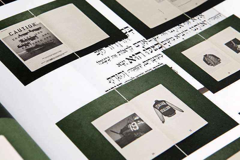
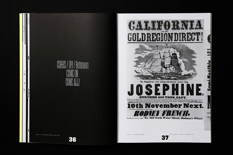
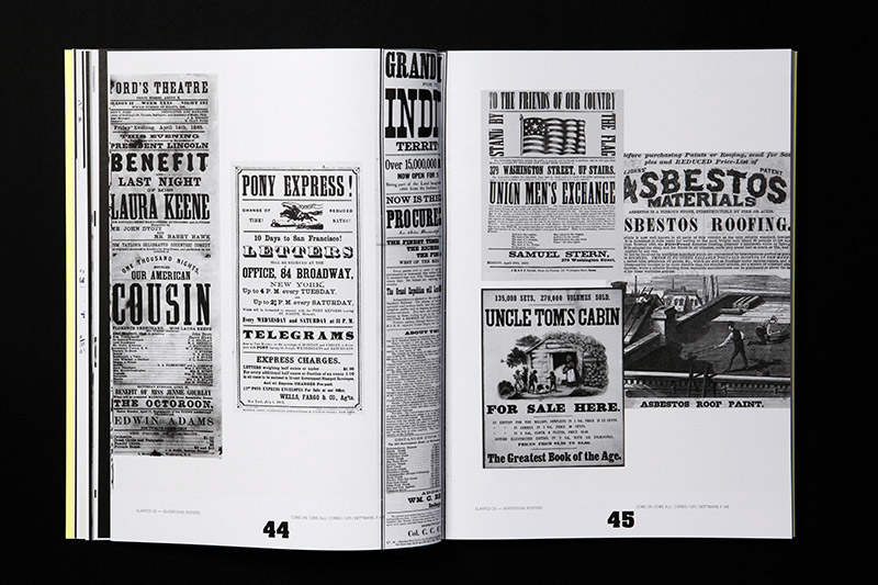
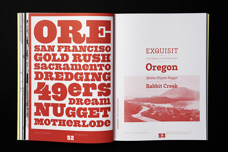
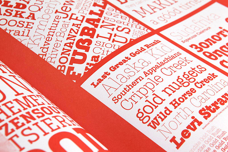
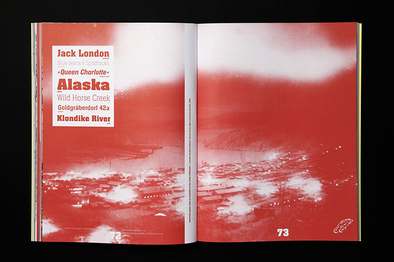
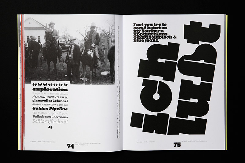
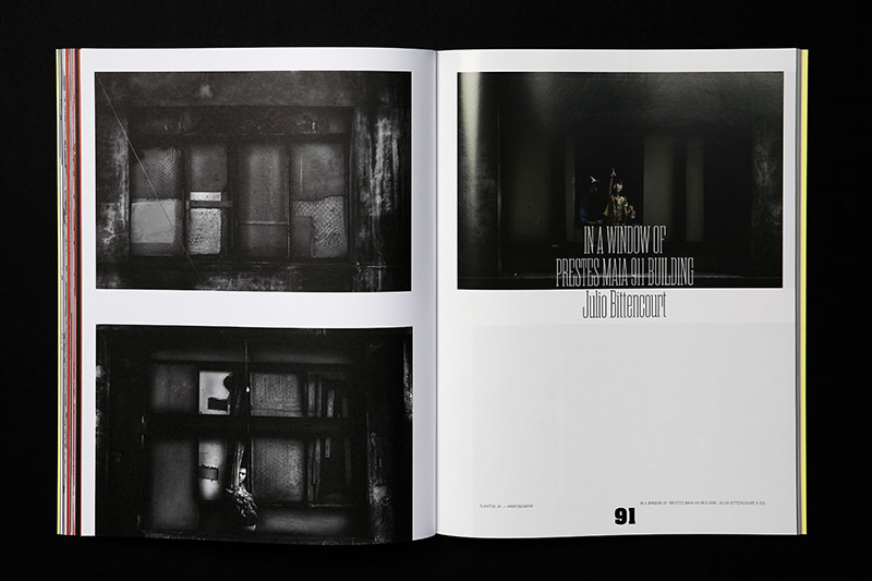
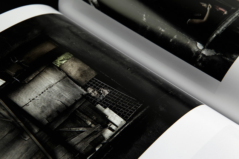
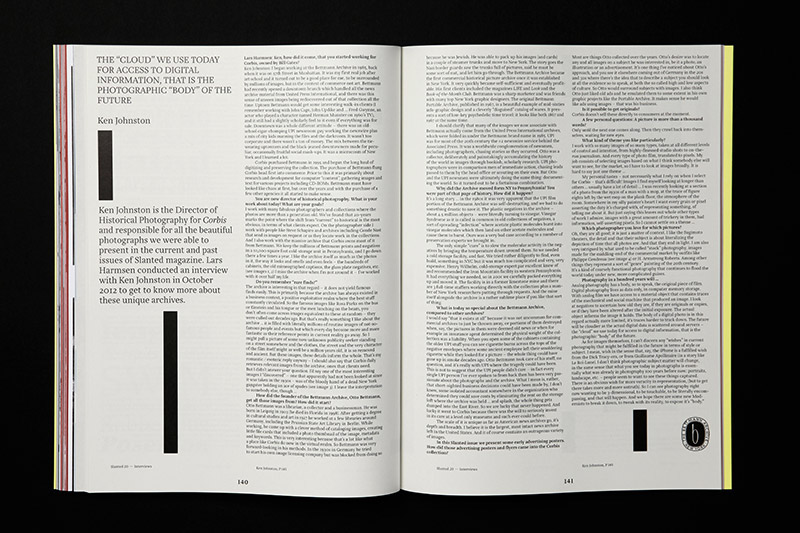
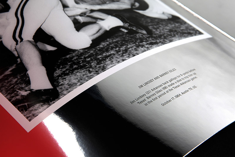
The photo collection “Come On, Come All!” (thanks to Ken Johnston, Historical Corbis NY) shows historical posters and photos during the time of the American Goldrush. The series “In a Window of Prestes Maia 911 Building” by Julio Bittencourt (São Paulo, BR) documents people who are living in poverty and are inhabiting a abandoned tower building.
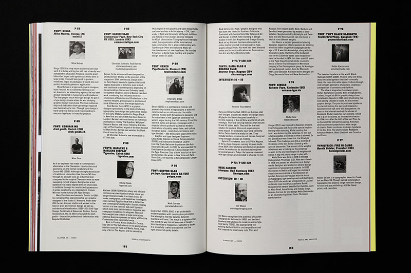
In our interview format (10 10) 10 international type designers gave answers to 10 questions about slab serifs – Ray Larabie (Typodermic Fonts Inc., Nagoya, JP), Cyrus Highsmith (Font Bureau, Boston, MA, US), Michael Hagemann (FontMesa, Naperville, IL, USA), Jos Buivenga (exljbris Font Foundry, Neede, NL), Daniel Hernández (SudTipos, Buenos Aires, AR), Nina Stössinger (FontFont, Berlin, DE), Jonathan Hill (The Northern Block, Newcastle Upon-Tyne, UK), Jeremy Dooley (Insigne Design, Chattanooga, TN, US), Ryoichi Tsunekawa (Dharma Type, Nagoya, JP) and Jim Wasco (Monotype Imaging, Woburn, MA, US).
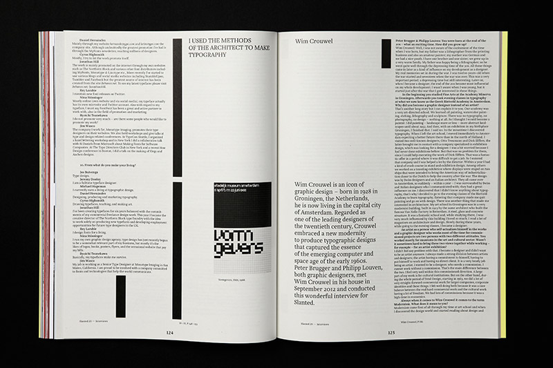
Furthermore, we spoke with Wim Crouwel (Amsterdam, NL), about his life as a designer, professor and director, with Ken Johnston (Brooklyn, NY, US) about his work in the historical archive of Corbis, with Bo Berndal (Stockholm, SE) and Dieter Hofrichter (Oberschleißheim, DE) about their life long experience in type design, with Morag Myerscough (London, UK) about her colorful and typographic work, and also with Sylvia Lerch (Munich, DE) about her passion for materials and production.
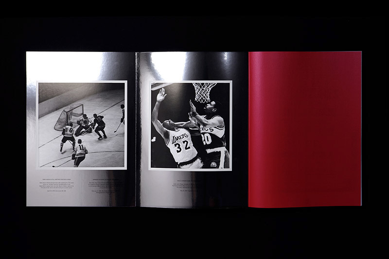
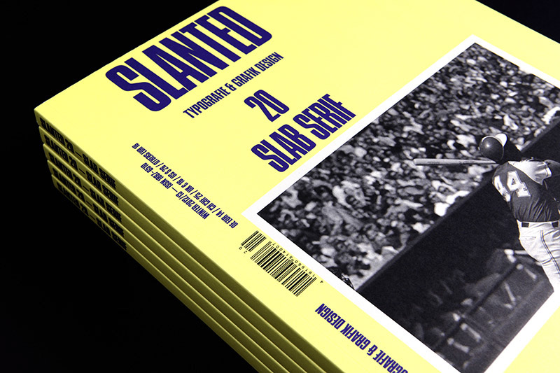
The cover shows Hank Aaron in full batting position after his famous 714 career home run. The other pages of the fold-out cover are featuring other athletes and disciplines in American Sports. A popular choice and common to see on their jerseys and shirts: Slab Serifs.
Slanted Magazine #20 – Slab Serif
Editor: MAGMA Brand Design
Release: November 22nd, 2012
Volume: 164 pages
Format: 24 x 32 cm
Language: English, German
Price: EUR 14,- (DE), CHF 25 (CH), GBP 16 (UK), $ 26 (US), EUR 16,- (others)
Review at slanted.de
Buy Slanted #20
Subscribe to Slanted