


Rebranding a Governmental Company
In spring 2017 we got an invite by the head of communications of the official governmental organisation that shelters homeless people in Vienna. For a better positioning and to gain new inner strength, a better culture and solidarity they were looking for a strategical rebranding.

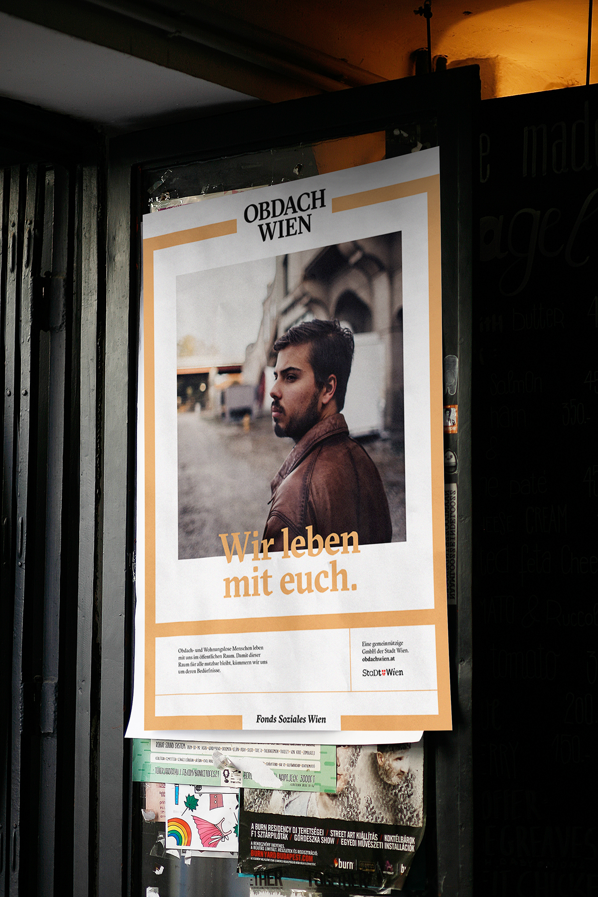
The core message for our work with the company was that homeless people are not a derived parallel society. They are us. We wanted people to know that becoming homeless is not a cause of neglect. It can happen to anyone. Sometimes people are home- or shelterless for a short term. Sometimes most of their lives. Sometimes you don't even notice that a person does not have their own home. Showered, educated, well dressed, homeless.
Homeless and shelterless people are allowed to be in public places. But there is a balance to keep and/or create. The core message was "Wir leben mit euch!" – We are living with you.
We are you. You are us. We are one society.
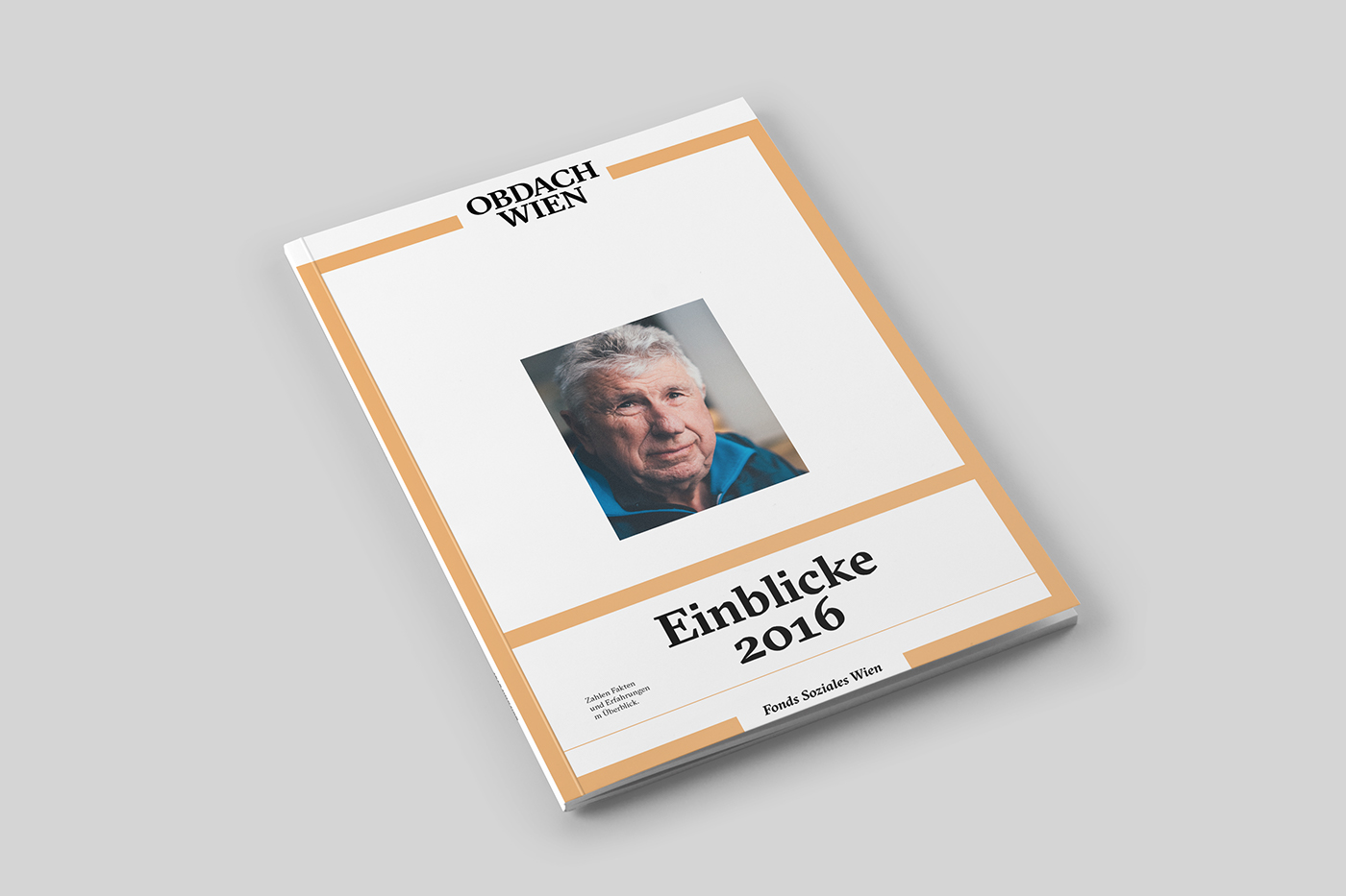
This branding does not have a classical logo, nor did it start with the creation of a logo, like we were asked to start our approach "First we need a new logo".
In this case the strategy showed that we have to create a strong dialogue and awareness with citizens of Vienna to tell them that there is no such thing as a parallel society of homeless people. They belong to us. They are us.
Getting homeless is not a lack of power or a following of being irresponsible in life. It can be two or three coincidence or strokes of fate that can lead to living in the streets. We wanted to show that oftenly you can't even tell homeless people from people that are living in their own homes.
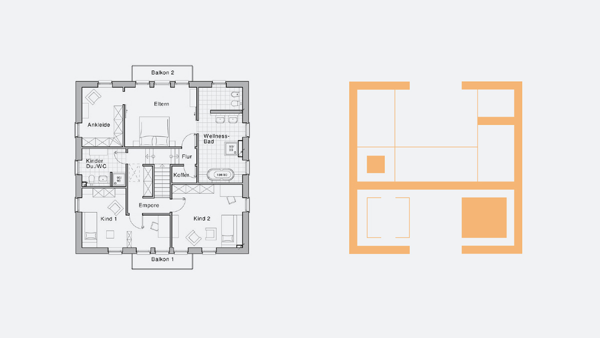
For this strategy we introduced the element of an abstract real estate figure. It's symbolic. Instead of fixated icons it plays with the idea of closed and open spaces for dialogues, privacy or the general idea of being in a space.


The company loved this idea and felt it would give the whole communication new meaning and power.
However the city of Vienna did not approve a holistic 360 degree approach. Their way was more of "Identity consists of Logo, font, done!" — They felt that the marketing strategy, and the designs are fragments that don't influence one another.
Eventually we were asked to create a classical logo that mostly looked like the old logo. Quote: "The rest could be just decoration elements." — How do you feel about this judgement in comparison of the project?
We feel it's time for branders to stand up and educate people of how media and design should create meaningful dialogues instead of being decoration.


Thanks for watching. If you liked our project please leave a "LIKE"
and follow us on our media.
www.kr8burea.at
www.facebook.com/kr8bureau
www.instagram.com/kr8bureauvienna


