Here’s my suggestion for rebranding the visual identity of Akhbarak.net
Akhbarak is the most popular Egyptian news aggregator (founded 2003). Millions of users rely on Akhbarak.net for their daily news from all sources.
Akhbarak is the most popular Egyptian news aggregator (founded 2003). Millions of users rely on Akhbarak.net for their daily news from all sources.
Concept
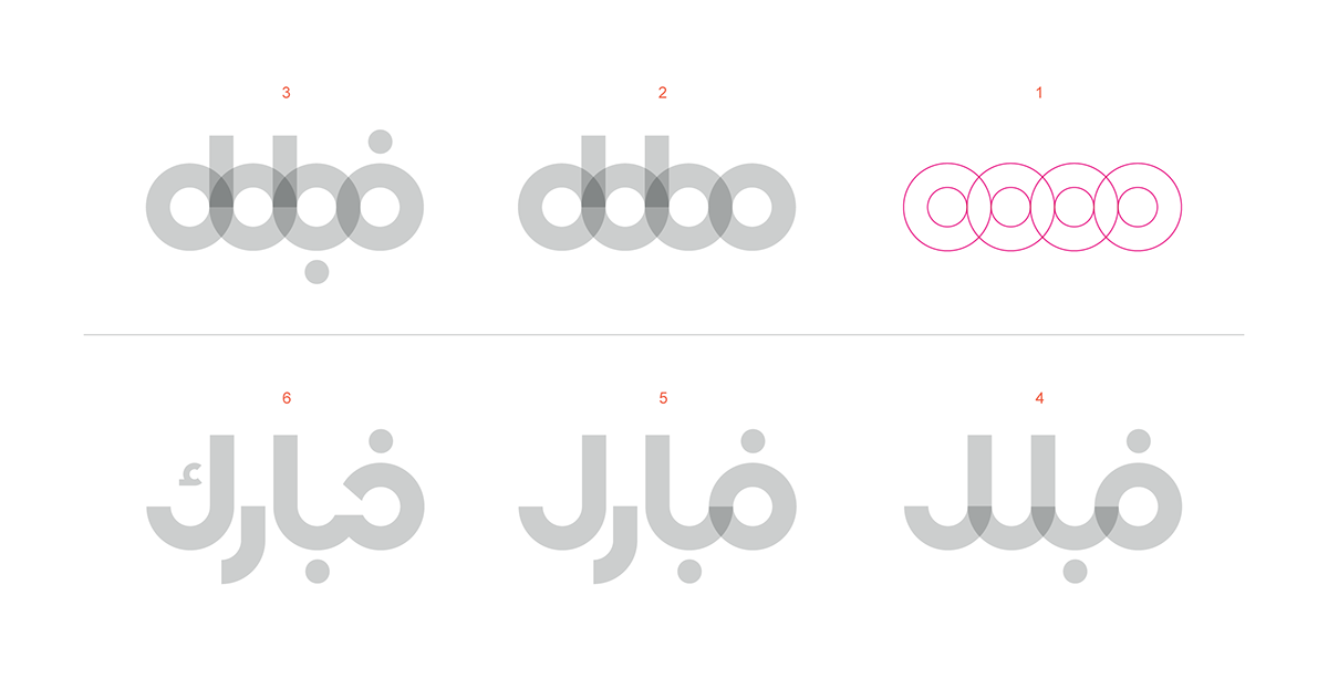
I found that most of the news agencies logos used the normal rounded world map shape. also it had a sharp look in icon and typeface and mostly using these symbols (eye, the circular shape of the map, square and rectangular lines as we see ... etc.

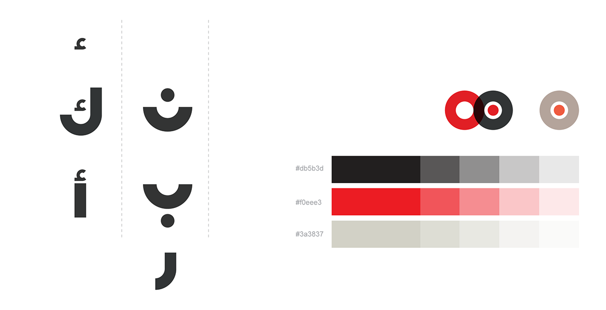
as i said most of the news agencies use the plain shape of the Earth globe as their logo until it became some sort of tradition for most of them to use this straightforward shape, here I was determined not to do the same plain idea over and over again but to use the same shape in a different and unique way. As you can see I've simplified the Earth globe shape turning it to simple circular lines

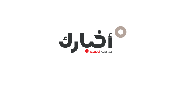
by simplifying this shape i will produce a readable,unique arabic typeface named " Your news " in English or اخبارك "" in Arabic , As well as combining these lines with the idea of the " One " or " Person" to add a personal identity to the art work , and you can see that in the last letter "ك" for it to be more reasonable and understandable as if your logo is really saying " Your news " or " اخبارك انت " .
Typeface Developed According To Fibonacci Number
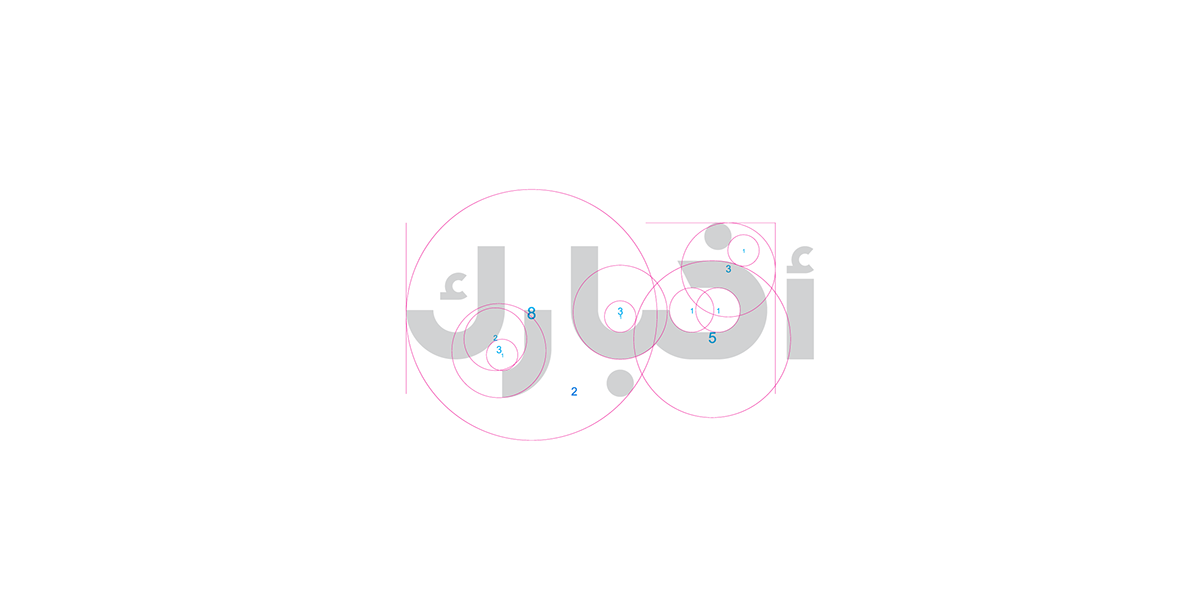
Sample alphabet for Typeface