Rethink concept:
ESA is the European Space Agency and its mission is to shape the development of space exploration. Less known than it's American counterpart NASA, but just as strong in its achievements. ESA is part of the elite in space exploration.
Icon Magazine asked us to rebrand any possible thing for their rethink section. As we've been in love with the idea of rebranding the European Space Agency since a long time, we knew we had to go for it.
Our rethink goal was to awaken the curiosity of people to space & understand the achievements of a united Europe in exploring the universe. Union makes force.

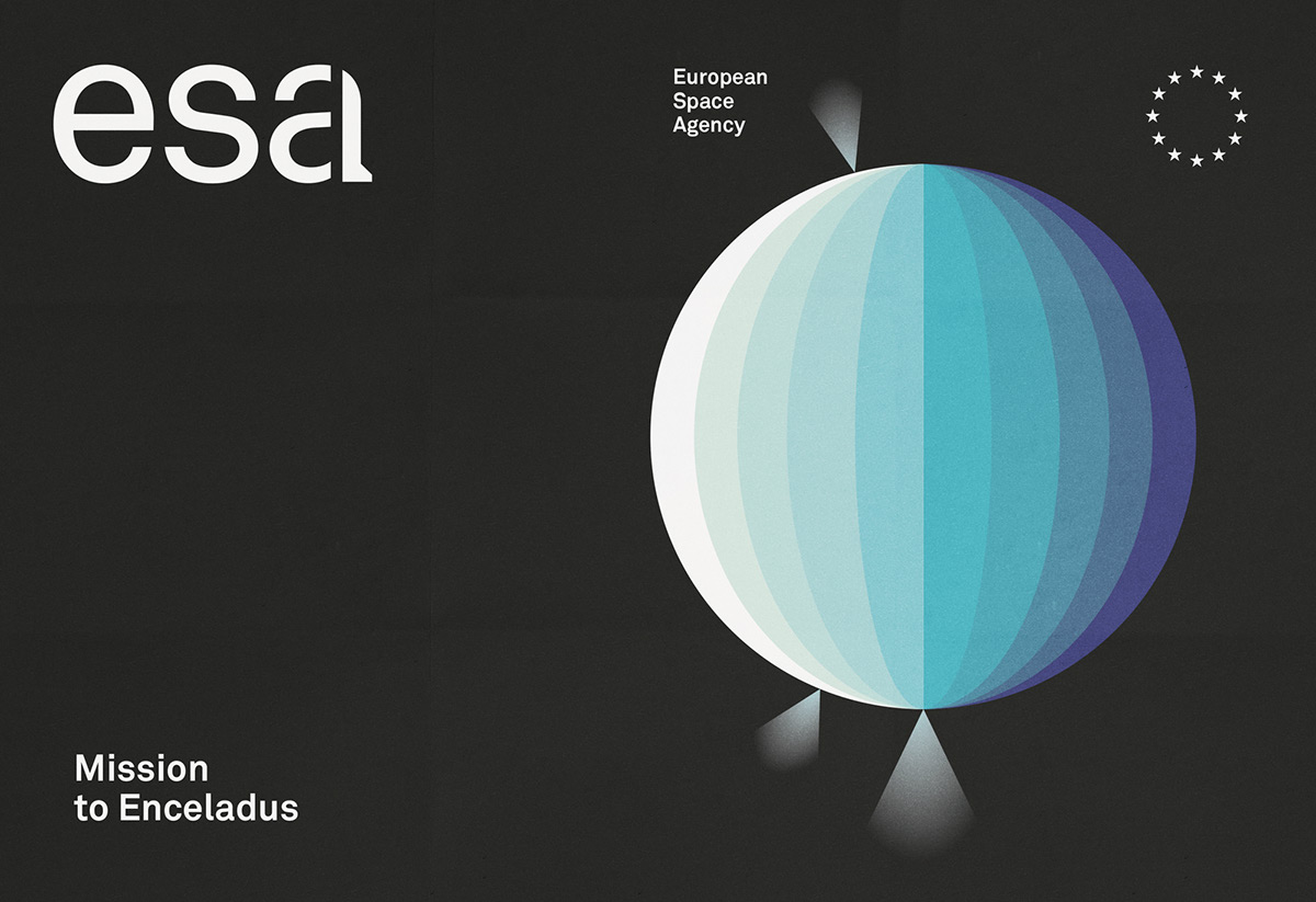
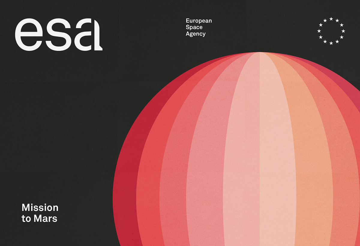
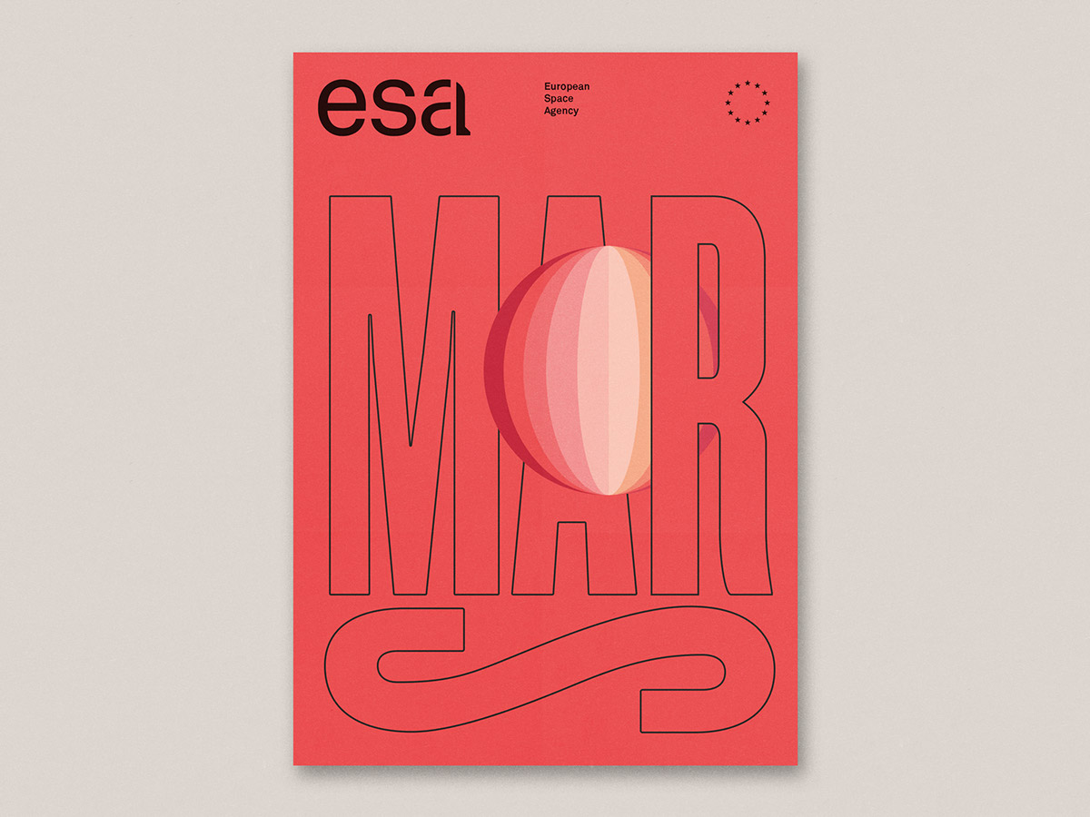
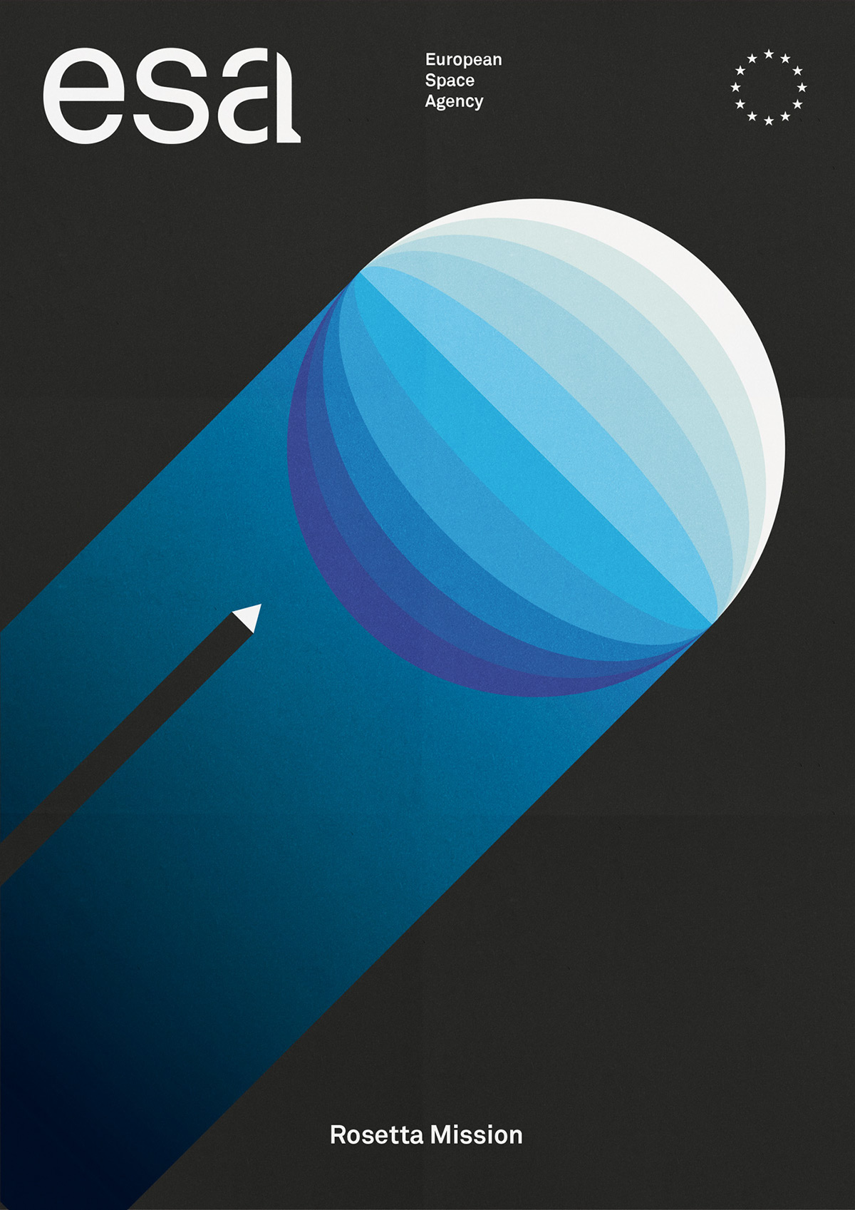
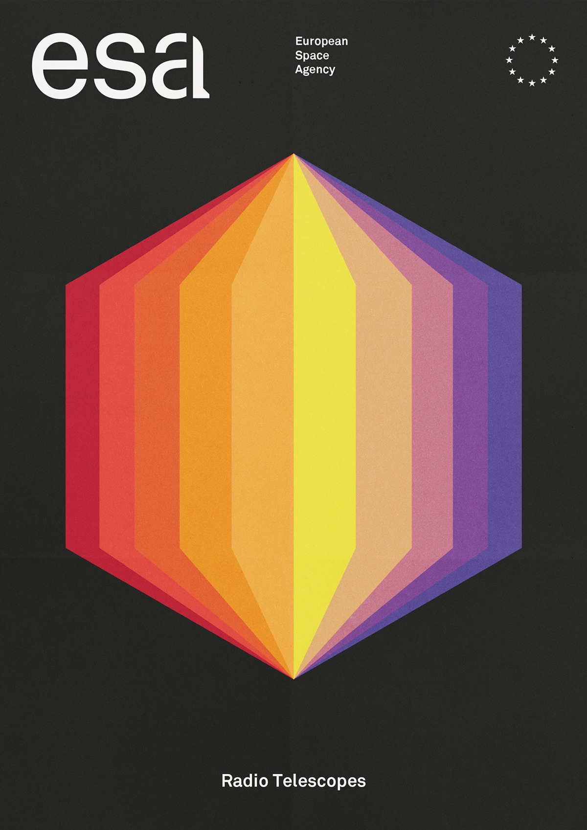
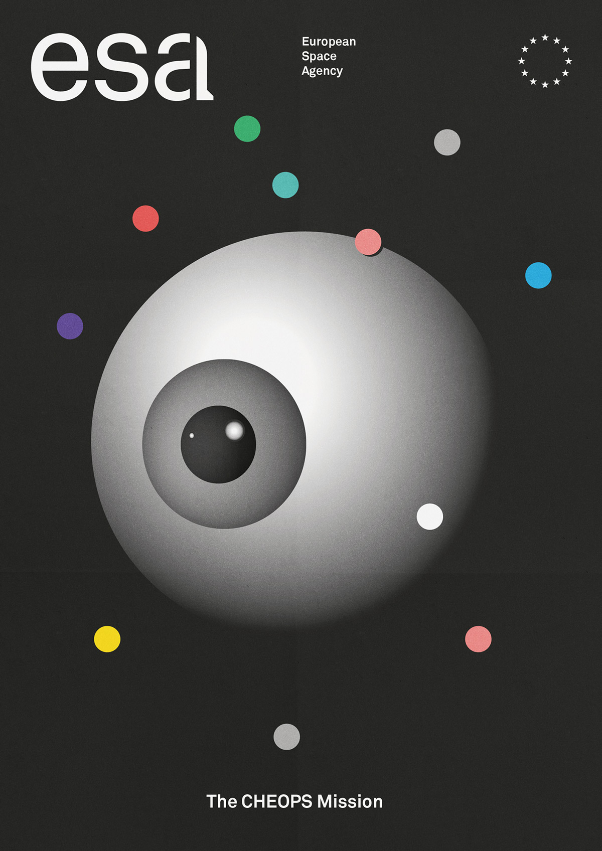
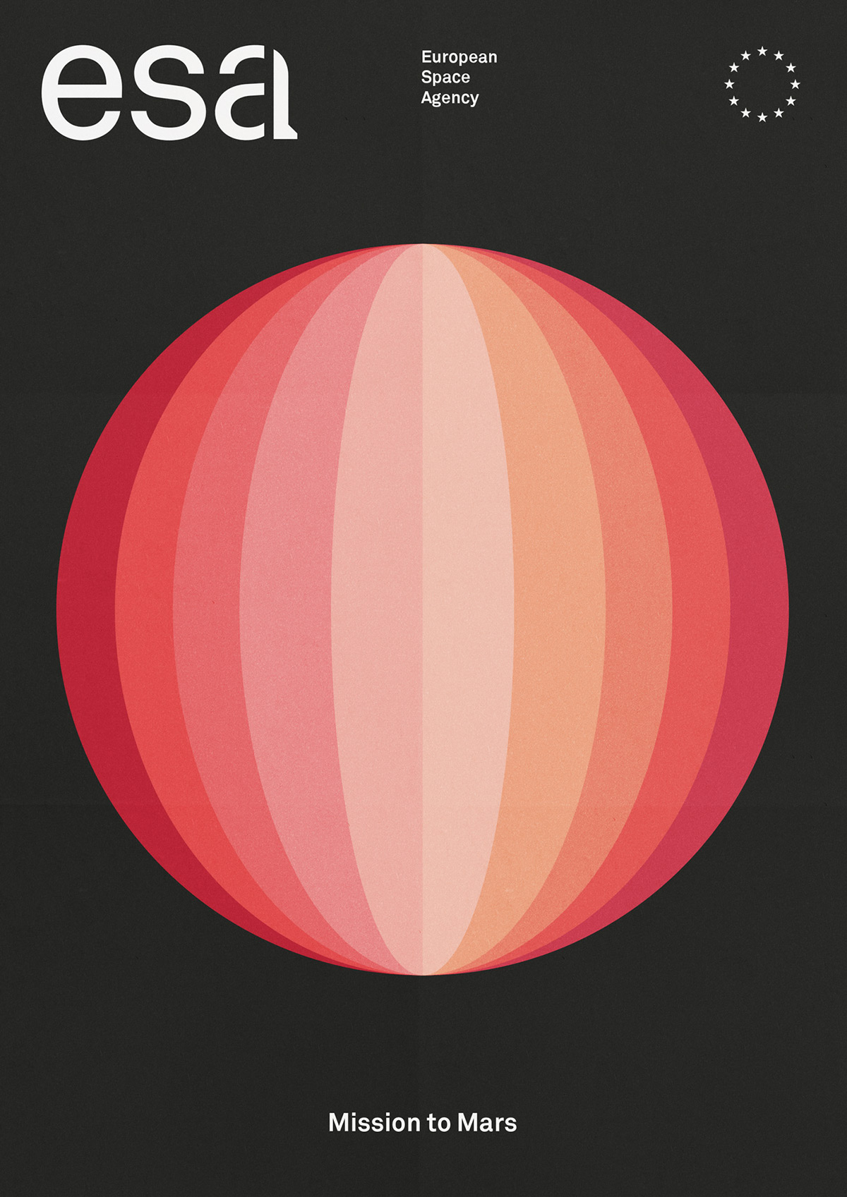
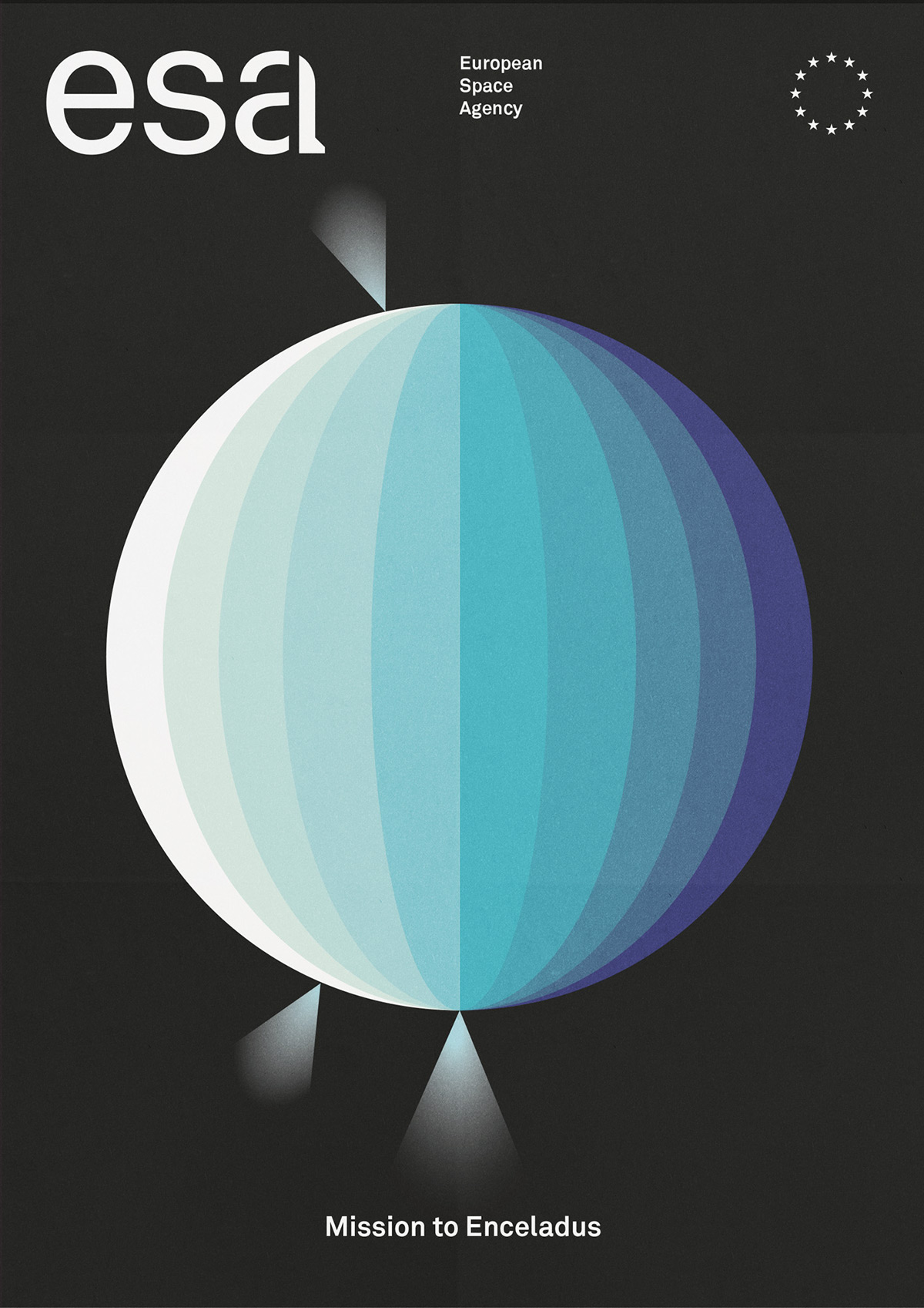
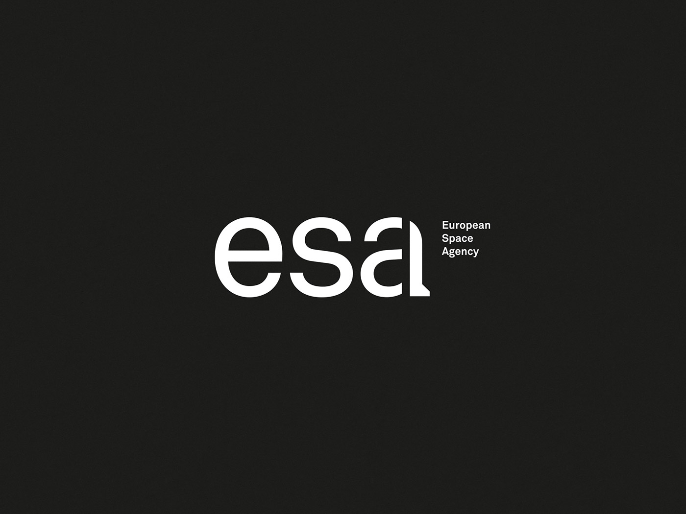
The concept logotype is built and inspired by the launch of a rocket, integrated directly in the letter a. In order to communicate these concept identity, we created these posters to commemorate some of ESA's greatest achievements.
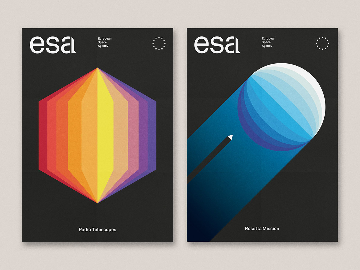
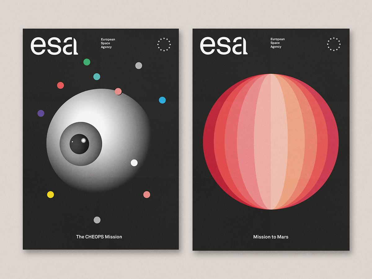
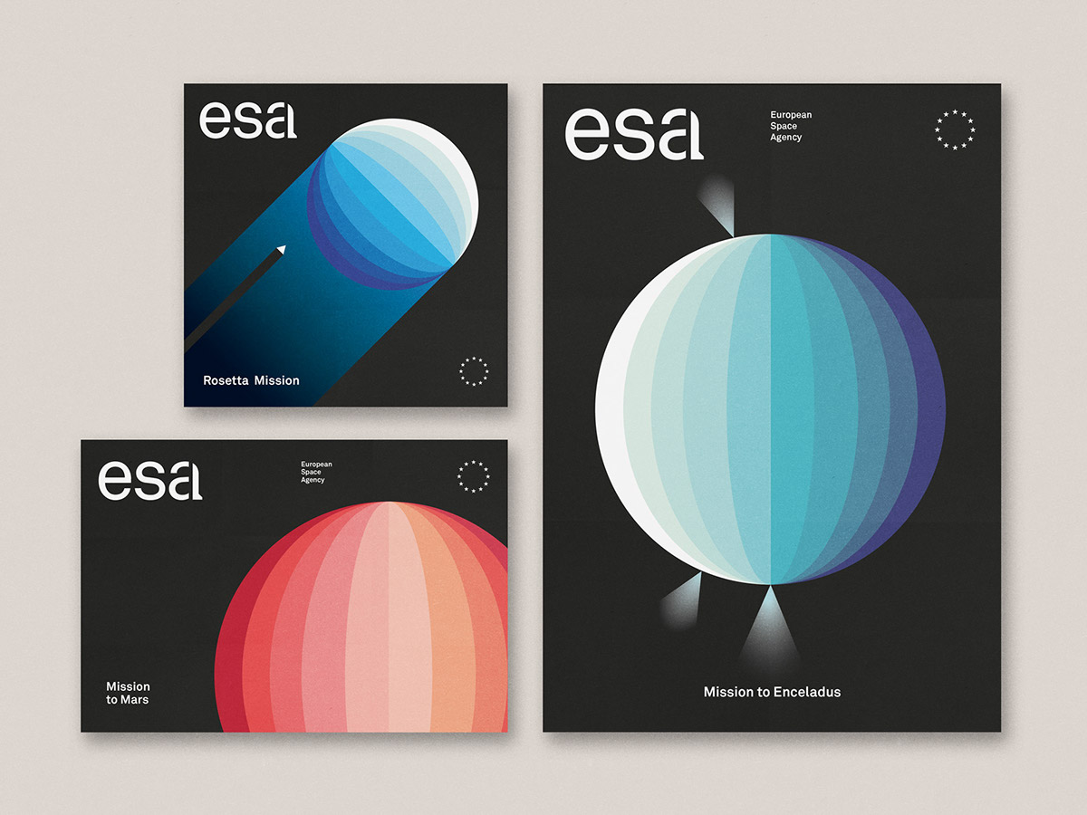
This new approach brings a memorable branding that fits with the modern and futuristic ideas of ESA – helping to reach interest in new generations.
