Evolution or revolution?
When the the TeleMadrid project arrived at Mucho and Comodo Screen, this was, without any doubt, the key point that needed to be addressed.
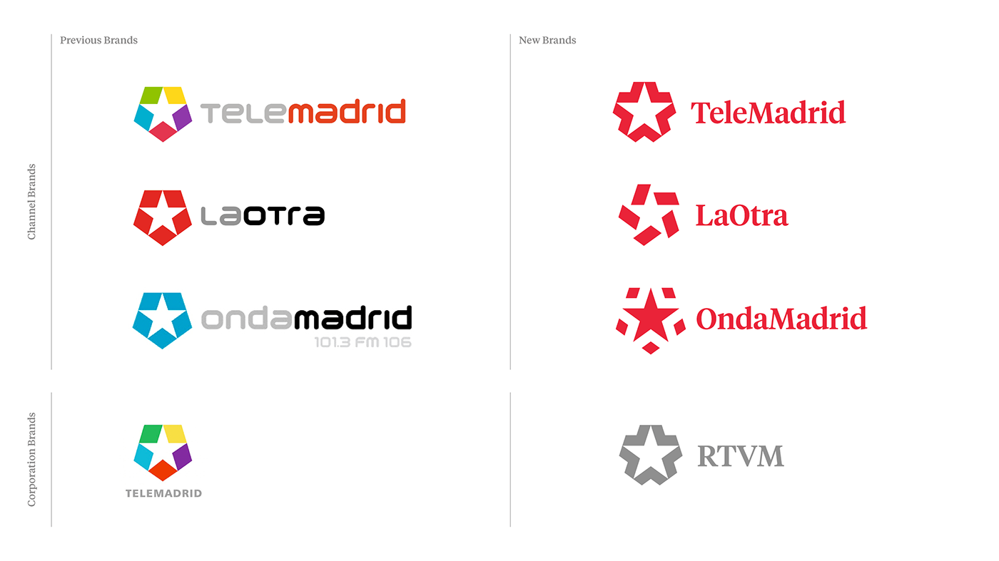
When a symbol already has strong graphic foundations the correct approach is to build on them. The star of TeleMadrid, something that is instantly associated with the Community of Madrid’s flag, was the key element to retain and develop. We decided to emphasize the relationship between these symbols and to take it further: right to the heart of every citizen because the real star of TeleMadrid ought to be the people of Madrid. They are the reason it exists so we put the star at the very centre of the visual language.
The challenge was to make TeleMadrid the point of reference for everyone in Madrid. To do this, we identified a series of values that the brand ought to reclaim and make its own. These had to be clearly communicated: openness; community focus; collaboration; interactivity and, inviting co-creation. It also needed to be evolved across a multimedia network which required the visual language to be both flexible and digital.In the new visual language, the three brands within the group all have the star in common, but each one has it own personality.
The one for TeleMadrid brings the people of Madrid together (the arrows point to the centre). The star of LaOtra reflects its young and dynamic nature. OndaMadrid is expansive and spreads out (like pulsing waves). As each has its own symbol they also work perfectly as the on-screen watermark logos.
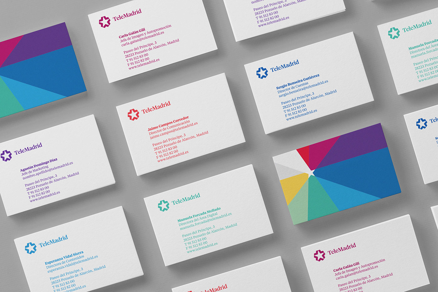
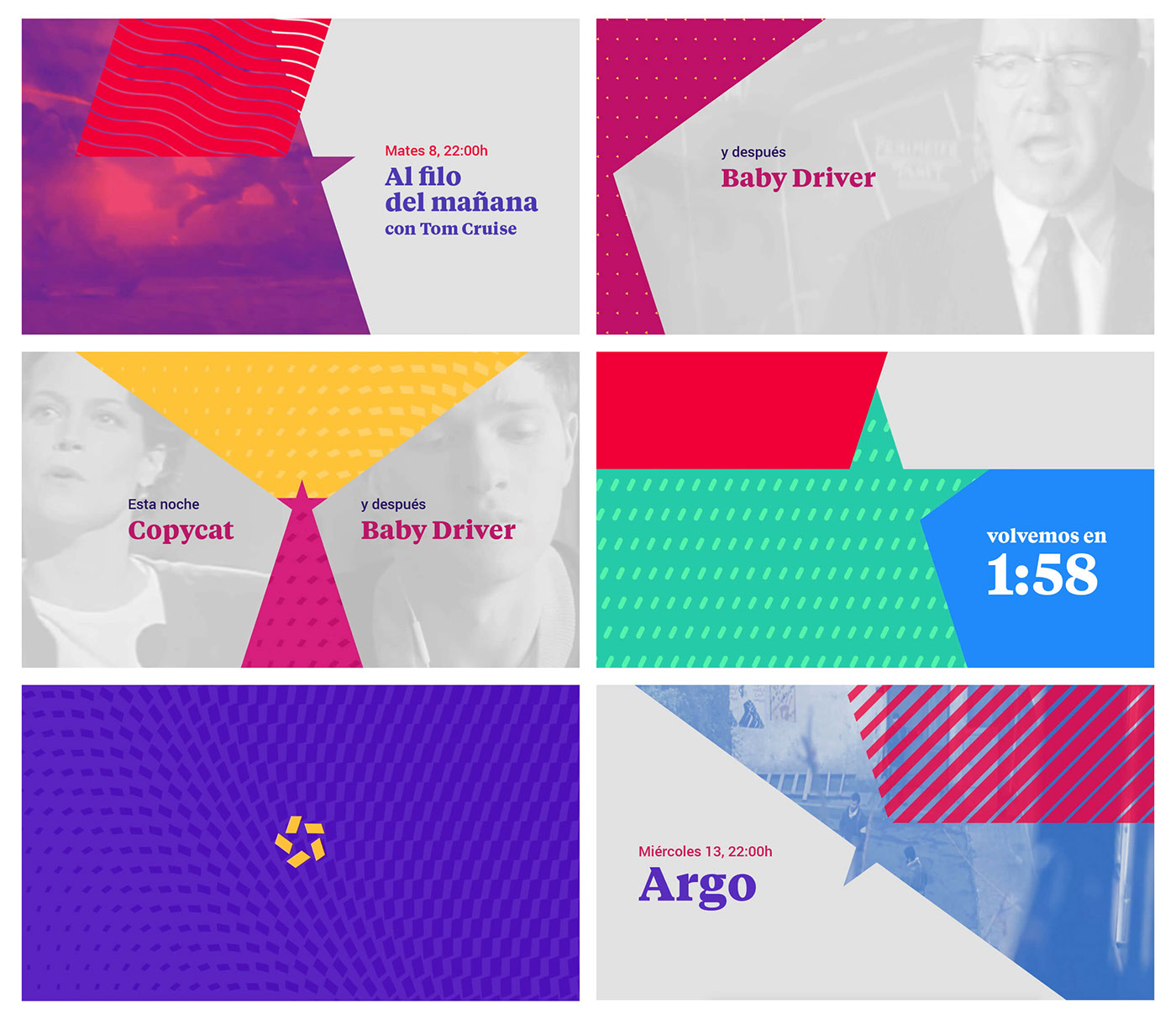
The way the colours are used has also been changed. They move from the star to the background which brings more variety and colour. The 8 new colours have qualities that enhance their specific uses on-screen which makes them more topical. The red, which is used when only a single colour can be applied, is the red of the Community of Madrid.
We also made TeleMadrid into one word but kept the M of Madrid capitalised. This gave the logotype more of the brand’s personality without affecting the prominence of the word Madrid.
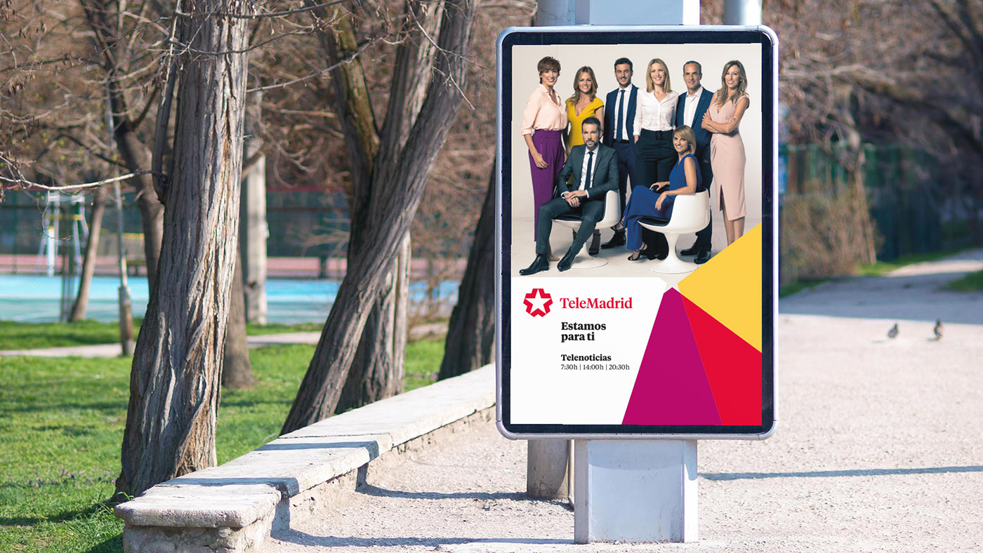
TeleMadrid has strong journalistic values and places great emphasis on informing the public. For this reason, we used the Tiempos typography. It is modern and was designed for newspapers and this gives it a seriousness appropriate to this new chapter in the network’s story.
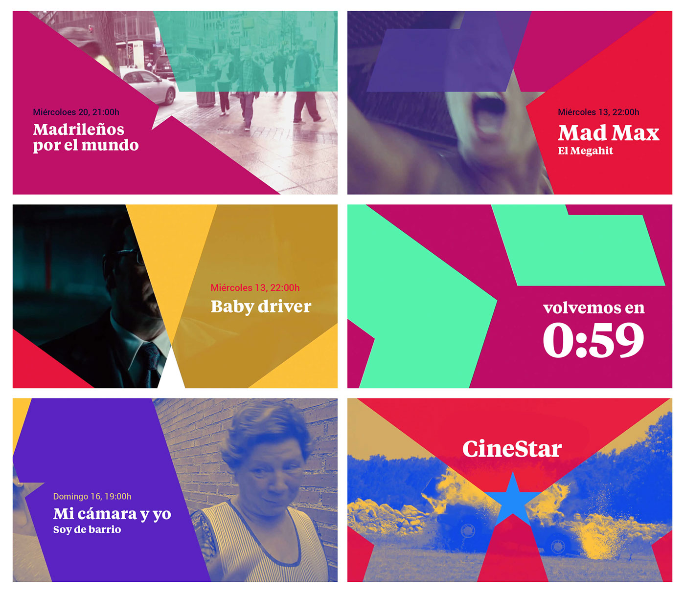
The visual language of the network starts with the star. However, it is the polygons that form the star in negative, as well as the flat colours, that give this language its voice through a system that is both vibrant and simple. Animations twist or turn the shapes, zoom in on parts of them, or change their positions. This creates a language that is virtually limitless but, at the same time, still easy to recognise.
The tagline “Estamos para ti” (We are for you) reflects the public service nature of the station and highlights the brand’s reason for being: to serve the people of the community of Madrid. Furthermore, it is adaptable allowing the way it is used to be played with depending on the circumstances.
The tagline “Estamos para ti” (We are for you) reflects the public service nature of the station and highlights the brand’s reason for being: to serve the people of the community of Madrid. Furthermore, it is adaptable allowing the way it is used to be played with depending on the circumstances.
The audio-branding, created by Banjo Music, is a succinct soundscape. It simply and fondly evokes the acoustic character of Madrid: the ‘chotis’ and the street organ. These distinctive sounds and melodies have been reworked to make them more contemporary giving the audio-branding a memorable and familiar feel.