MOVISTAR + REBRAND
The brief
Movistar invited Mucho and Cómodo Screen to work on the creation of their new TV brand Movistar+. This brand was the result of the integration of Canal+ in Movistar. In other words, the addition of the best technology –capacity and innovation of Movistar- plus the greatest pay per view TV became the new brand Movistar+. It was a huge project, probably the biggest corporate identity job in Spain in 2016. The key issues in the brief where how to generate a distinctive identity which would include the ethos of the two mother brands, and also how to produce a TV brand identity situating the audience at the center of the action, engaging the viewer in a multichannel digital ecosystem.
Movistar invited Mucho and Cómodo Screen to work on the creation of their new TV brand Movistar+. This brand was the result of the integration of Canal+ in Movistar. In other words, the addition of the best technology –capacity and innovation of Movistar- plus the greatest pay per view TV became the new brand Movistar+. It was a huge project, probably the biggest corporate identity job in Spain in 2016. The key issues in the brief where how to generate a distinctive identity which would include the ethos of the two mother brands, and also how to produce a TV brand identity situating the audience at the center of the action, engaging the viewer in a multichannel digital ecosystem.
A Community
Sharing makes us human. But how could we invite the viewer to share his life with Movistar+? Our initial strategic approach was to understand how individuals feel represented in a group and develop a sense of belonging. Sharing individual moments and emotions with the group generates a recognition response which brings people together. The brand could no longer just listen and ask for the viewer’s opinion and content. The brand could and had to become a follower of its audience, a super fan using a big content machine directed at watching and coproducing content with the audience, and continuously sharing coproduced moments. Recognition was the key to share the viewer’s creativity and engage him in an authentic way. That is the key strategic approach for the brand. Now Movistar+ is your follower. And by putting the viewer on tv (and across all the media in the platform), the brand is a space for community. That is the idea behind the corporate identity.
Sharing makes us human. But how could we invite the viewer to share his life with Movistar+? Our initial strategic approach was to understand how individuals feel represented in a group and develop a sense of belonging. Sharing individual moments and emotions with the group generates a recognition response which brings people together. The brand could no longer just listen and ask for the viewer’s opinion and content. The brand could and had to become a follower of its audience, a super fan using a big content machine directed at watching and coproducing content with the audience, and continuously sharing coproduced moments. Recognition was the key to share the viewer’s creativity and engage him in an authentic way. That is the key strategic approach for the brand. Now Movistar+ is your follower. And by putting the viewer on tv (and across all the media in the platform), the brand is a space for community. That is the idea behind the corporate identity.

Basic identity
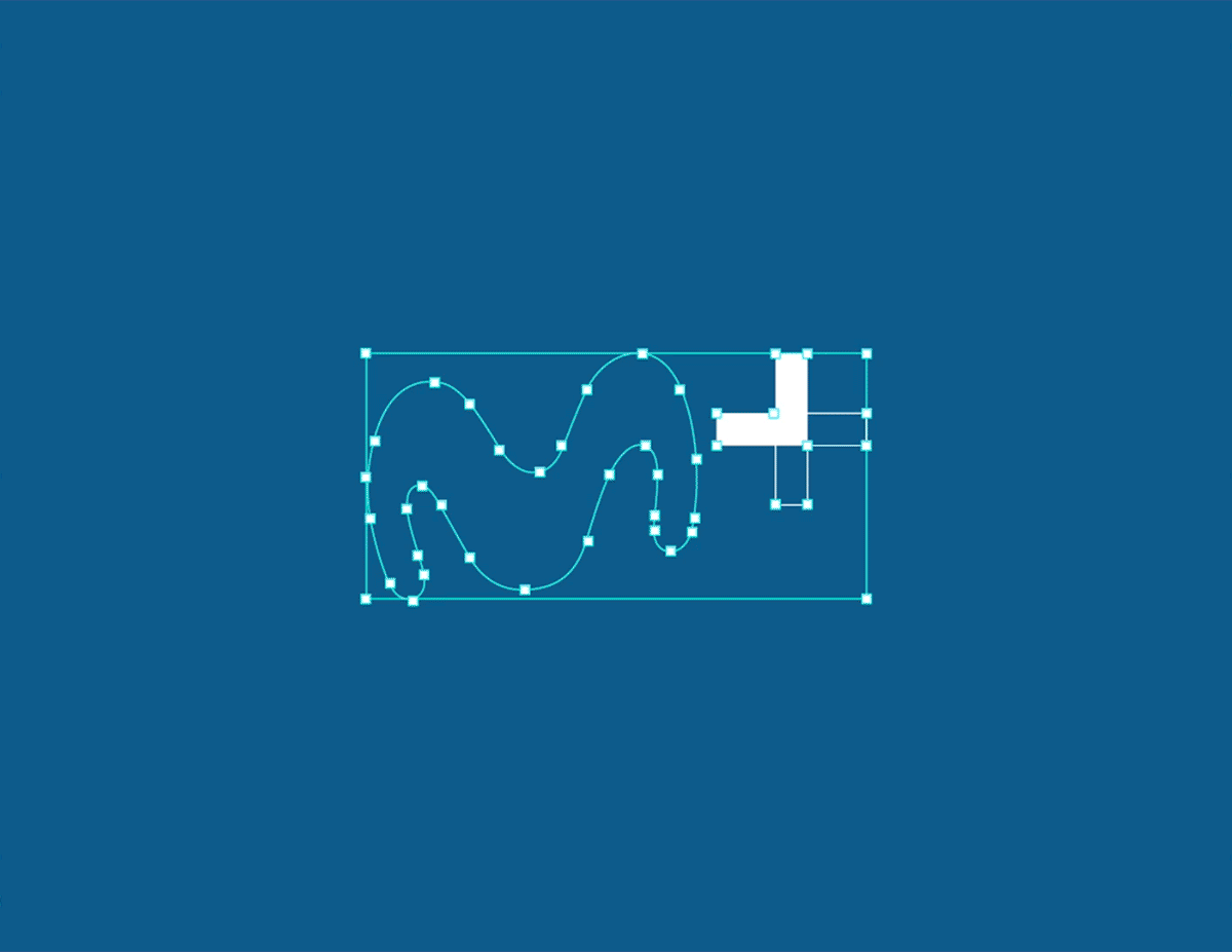
The Canal+ and MovistarTV logos come together to create the new Movistar+. The M+ symbol is a new way of understanding a corporate icon. Instead of functioning as a corporate sign-off, the symbol becomes a talking avatar which embodies the brand values and engages directly with its audience in an everlasting conversation. The icon is the symbol of a superfollower, of recognition and relation with the viewer, of a reposting multiplatform. The ‘movistar+’ logo then signs communication at the bottom. With this structure in mind we developed a consistent and organized brand architecture. The corporate identity also uses a new typography which produces a corporate visual voice, the vehicle of the conversation. The new brand comes to life with emotion through a real conversation with the user, talking about the shared content, becoming creative, expresive and close, and ultimately generating a community for the brand to live with.
The Canal+ and MovistarTV logos come together to create the new Movistar+. The M+ symbol is a new way of understanding a corporate icon. Instead of functioning as a corporate sign-off, the symbol becomes a talking avatar which embodies the brand values and engages directly with its audience in an everlasting conversation. The icon is the symbol of a superfollower, of recognition and relation with the viewer, of a reposting multiplatform. The ‘movistar+’ logo then signs communication at the bottom. With this structure in mind we developed a consistent and organized brand architecture. The corporate identity also uses a new typography which produces a corporate visual voice, the vehicle of the conversation. The new brand comes to life with emotion through a real conversation with the user, talking about the shared content, becoming creative, expresive and close, and ultimately generating a community for the brand to live with.

Graphic language
The graphic language is inspired by the multiscreen culture which surrounds us. We are always connected through different devices such as smartphones, laptops, tablets, televisions, or printed matter… The multiscreen language allows the brand to reflect this on/off reality, and also express itself through a myriad of channels. The multiscreen graphics develop a rich moving image and photographic language. By combining different pictures in various ways it produces different meanings, different versions of the same stories or jokes, told in different ways. Images are connected, constructed, reflected, related or antagonised making the conversation fun and entertaining, and effectively transforming the corporate identity into a layer of visual content in its own right. In addition, the ‘emovicons’ where produced based on the proportions of the ‘M+’ icon, to further develop an emotional voice for the brand, and a sense of human appearence. The sum of the graphic language elements enhances the conversation, to back up and connected with content which is produced by the viewer, making him the center of the identity.
The graphic language is inspired by the multiscreen culture which surrounds us. We are always connected through different devices such as smartphones, laptops, tablets, televisions, or printed matter… The multiscreen language allows the brand to reflect this on/off reality, and also express itself through a myriad of channels. The multiscreen graphics develop a rich moving image and photographic language. By combining different pictures in various ways it produces different meanings, different versions of the same stories or jokes, told in different ways. Images are connected, constructed, reflected, related or antagonised making the conversation fun and entertaining, and effectively transforming the corporate identity into a layer of visual content in its own right. In addition, the ‘emovicons’ where produced based on the proportions of the ‘M+’ icon, to further develop an emotional voice for the brand, and a sense of human appearence. The sum of the graphic language elements enhances the conversation, to back up and connected with content which is produced by the viewer, making him the center of the identity.
Application one: on-air
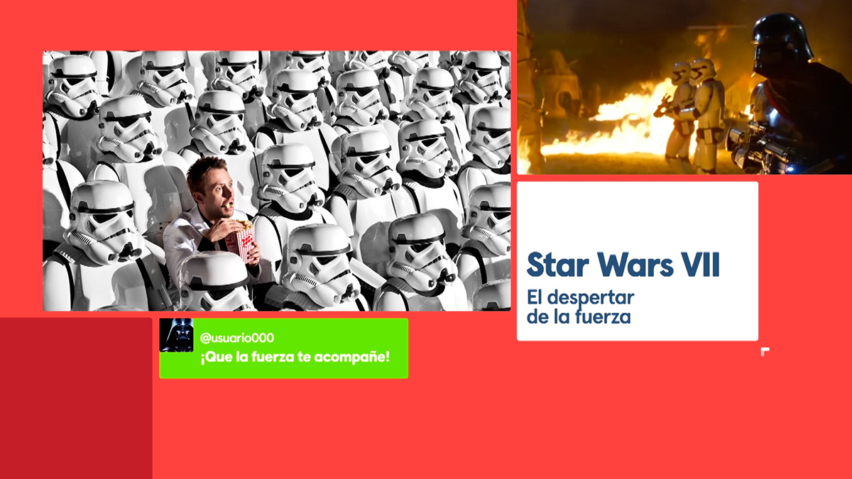
The new Movistar+ identity reaches its full potential on air, behaving as an expressive tv multiplatform language. The on air avatar logo comes to life with the ‘M’ acting as a visual narrator, and the ‘+’ sign becoming a cursor. The avatar sets the pace and introduces the ‘emovicons’. The multiscreen language develops into an endless canvas of scalable content boxes. The combination of these elements creates a seamless identity system, easy to use and to integrate texts, pictures an videos, with chanel information and user content.
The identity pieces use social media codes, using popular internet content or the platform’s own content to generate a fun and surprising language, aimed at talking with the viewer in a natural way. In the ids, the divide between on and offline is blurred by a series of visual metafors. Finally the audiobranding has been concieved as a puzzle of interchanging sounds. This generates an open system, which can grow along with the future communication needs of the platform.

Application two: interfaces
The use of different platforms (IPTV, DTH y OTT) demanded an identity able to adapt to the needs of different environments, ensuring navigation and user experience, base on the multiscreen language. This then extended on to the web and app interfaces for navigation
The use of different platforms (IPTV, DTH y OTT) demanded an identity able to adapt to the needs of different environments, ensuring navigation and user experience, base on the multiscreen language. This then extended on to the web and app interfaces for navigation


Application three: social networks and website
The Movistar+ indentity was created to connect with the viewer through a sense of community and recognition. This makes sense and acquires full potential in the digital and social media space. Through a system of bumpers which work simultaneously on air, on line and on social media, movistar+ follows people, generates likes, memes, comments, photos, screenshots. And obviously the Movistar+ content is a vehicle for the stories and events of daily life, being it a new movie, the latest chapter of a series or a football match. In this way, a social communication is acquired through all the channels of the multiplatform
The Movistar+ indentity was created to connect with the viewer through a sense of community and recognition. This makes sense and acquires full potential in the digital and social media space. Through a system of bumpers which work simultaneously on air, on line and on social media, movistar+ follows people, generates likes, memes, comments, photos, screenshots. And obviously the Movistar+ content is a vehicle for the stories and events of daily life, being it a new movie, the latest chapter of a series or a football match. In this way, a social communication is acquired through all the channels of the multiplatform

Application four: print
The multichannel graphic language uses its full composition and photographic potential to translate the brand’s on air energy to print, making the most of each medium. Print material mixes communication needs with an editorial use, allowing ads and billboards to became content channels for the audience’s creativity. The ‘emovicons’ extend this community ethos through the merchandising products.
The multichannel graphic language uses its full composition and photographic potential to translate the brand’s on air energy to print, making the most of each medium. Print material mixes communication needs with an editorial use, allowing ads and billboards to became content channels for the audience’s creativity. The ‘emovicons’ extend this community ethos through the merchandising products.


Credits
This is a project by Comodo Screen and Mucho.
This is a project by Comodo Screen and Mucho.
Comodo Screen team:
Project direction: María Borrás
Executive creative directors: Abel López and Pep Prior
Creative direction: Maria Ochoa
Edition and animation: Sergi Comabella, Mariane Paoletti, Jordi Fernández
Junior edition: Sergio García, Jordi Juan Llamas,
Graphic design: Silvia Trull
Production: Elena Labandeira, Mónica Puig
ITV and web design: Albert Coberó
Ident production company: Grayskull
Ident script support : Usted
Audio Branding: Banjo Music
Awards
_______
*Finalist Promax Europe 2017 – General brand desing package
_______
*Finalist Promax Europe 2017 – General brand desing package


