


eduDAU: A Bitcoin-based fundraising platform
Beginex Fellowship UX Team
Where it all started
eduDAO is a fundraising organization who want to create a platform for educators and education nonprofits to raise funds instead of going through the traditional (slow) grant application process. Their focus is blockchain based donations.
Our team of four spent eight weeks researching the current state of crowdfunding websites and some traditional fundraising methods, interviewing users, and synthesizing that information before wireframing and designing eduDAO’s campaign creation process. This process will help recipients easily create their campaigns and gain access to resources faster.

Team
We divided responsibilities equally in our team, rather than defining clear roles - such as project manager or visual designer. Each member worked on every step of the project, although some carried a bigger role in the various processes.
My Roles:
- Research
- Writing Interview Material
- User Interviews
- Ideation
- Wireframes
- User Testing
- Style Guide
- High Fidelity Mockups
Problem
Educators and nonprofits face many struggles to gain access to resources that can help students achieve more. Grants take months or even years to get approval, and many crowdfunding websites take a chunk of the funds for administrative fees and credit card companies take an additional percentage in fees. Educators need a simple and clear way to raise funds quickly. Our team was tasked with designing eduDAO’s campaign creation process to enable recipients to launch fundraising campaigns.
Research
The team dove into research about the potential users: recipients and donors. As part of this, we ran some competitive/comparative analysis on current crowdfunding websites, evaluated our assumptions about users, formulated what we needed to know from user interviews, and conducted user interviews over the course of several days. We had a limited amount of time to dive deep into users' feelings and create personas based on our interviews.

User Interviews
During the discovery phase of the project, we conducted User Interviews to answer some questions we had about users' feelings about Bitcoin, as well as gain some background on what leaders in education are looking for in a fundraising platform.
The team interviewed potential recipients and potential donors. We chose to interview donors, despite the fact that we were designing a campaign creation process for recipients, because we hoped to learn what information they would most need from recipients to be influenced to make a decision to donate.
Our assumption was that the recipients would be familiar with the crowdfunding process. We found that they knew of crowdfunding platforms, but few had actually used them. Recipients want to tell their story and put the students front and center. They want to empower people and encourage donors to get involved in their cause.
Donors want to feel connected to the story and need feedback on how their money is working and where it goes. Something that we heard often was a need to feel a sense of trust in the story and mission of the recipient. A sense of urgency is important. Donors also put a lot of weight on social connections when choosing where to donate.
Transparency and trust is vital for both. Initially, we thought that there would be a little more familiarity with cryptocurrency. It turned out that most were really only familiar with Bitcoin, and that only by name. Based on that, we decided that there should be some kind of onboarding about the benefits of donating via cryptocurrency vs. traditional methods.

UX Team discussing research methods.

The team used Trello to stay organized and establish our roles and focus.
Synthesizing Research
After researching and conducting user interviews, we began finding common themes and needs.
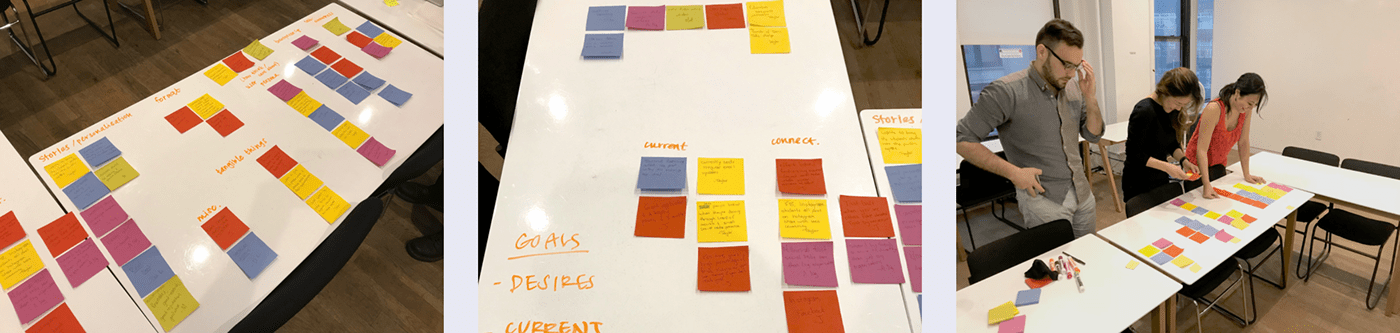
Personas
Based on research and interviews, personas were created to represent both recipient and donor groups. The personas helped us to get to know our users and personalize the experience.
- We used our user interviews, research, and client insight to develop personas.
- We evaluated some of their motivations and wants/needs and included those items.
- We used these personas as well as the user interviews to influence the design to serve the user better.

User Journey
We prepared some initial ideas for the user journey based on user interviews, and research of similar platforms. We created two different journeys, one of the recipient, and one of the donor, because we felt that the donor’s journey should inform the recipient’s campaign creation.
Based on the research and findings we had up to this point, we created a “how might we” statement for the project:
“How might we create a campaign website for fundraisers and donors so they can promote their vision and share it in their communities in an intuitive, effective way that compels others to give.”


Ideation
We chose to do some rapid ideation to get as many ideas as possible as quickly as possible and to break away from potentially boring ideas and think of some random and bad ones as well. We focused on four branches of ideas:
“How to build trust between eduDAO and the donor”
“How to build trust between the recipient and the donor”
“How to assist recipients in creating a successful campaign”
“How to communicate the sense of transparency of the eduDAO business model.”
We then shared our ideations with the team and with the client to discuss which ideas were most in line with our user and client needs.
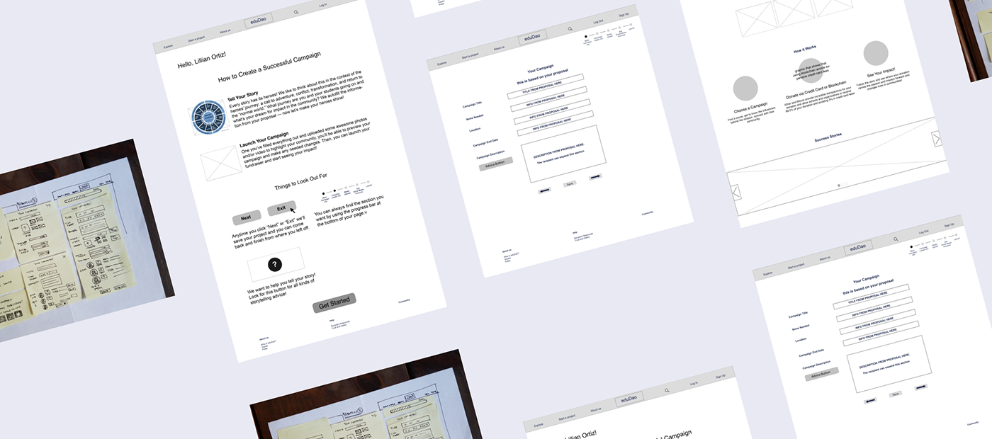
Wireframes
We sketched wireframes individually based on the user flow. During this time we also met with the other teams who were working on other parts of the fundraising process to share ideas and plan a smooth flow from one team’s designs to the next.
One thing that emerged from our wireframes was that we included a donor feed on the campaign page. This stemmed from comments that trust is built when you see that others have donated.
Later in the wireframing process we decided to include a timeline that shows updates on the campaign from the recipient so that donors and potential donors can see the impact of their money. There is also a portion of the campaign page that shows where the money goes. We implemented a funding thermometer at the top of the campaign page to remind donors of the urgency of the campaign. We merged the most useful ideas into one combined wireframe.

User Testing
Testing was conducted mostly remotely using Zoom. Through testing, we were able to identify a number of issues that tripped up our users, such as confusion about the "Pro Tips" in both placement and name.
Our tasks for testing went through several iterations as we planned basic tasks, developed our prototype, received mentor advice, and further developed our tasks based on feedback and research.
- We tested wording options and where advice buttons/windows show up when the recipient needs help.
- Our site was tested with a mid-fidelity mockup on InVision.
- Users targeted were people who have donated to fundraising campaigns, or are involved in fundraising in some way.
- User Testing was conducted through Zoom.

Style & Hi-Fidelity Mockups

High Fidelity
Once we tested our mid-fidelity prototype with users and learned from some of our mistakes (users had no idea what "pro-tips" meant, etc.), we moved into designing our UI.
Based on our client and interview feedback, comparative /competitive analysis, and general design guidelines from style guides such as material.io, we looked at what these adjectives might look like visually in terms of style.

The Solution
We developed a campaign creation platform that helps the recipient tell their story while using donor research to inform what and how the recipient shares about their mission.
From initial research and ideation to high fidelity prototypes, we incorporated user needs, goals, and client feedback to develop a simple, clean form process and campaign preview/landing page.
Because trust and transparency were main themes, in the campaign page, we later included pricing breakdowns of items recipients will receive at the end of the campaign, so donors could see exactly where their money would go (and integrated with the blockchain process, they would be able to actually check if the money was used properly and the organization received their items.
Reflection
The initial “How might we” statement” changed as we realized we didn’t include key topics of trust and transparency. Our updated statement:
“How might we create a campaign website for fundraisers so they can promote their vision and share it in their communities in an intuitive, effective way that compels others to give through storytelling, showing transparency and imparting the feeling of trust for donors.”
Challenges: There was an 8-week time constraint for this project. We would have loved to spend more time talking with users and testing our prototypes with them so we could iterate more.
If We Could Start Over We Would:
Do more testing
Explore more in specific features
Further develop the main campaign page to appeal to donors
Better integrate with teams working on other elements

CASE STUDY: Full Case Study can be accessed here>


