


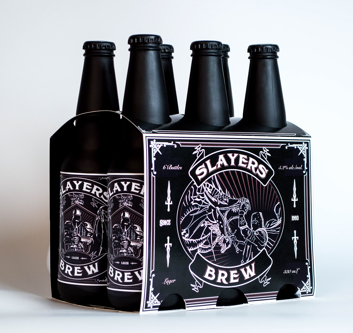
Slayers Brew is marketed towards the young male demographic ages 19-25. The name Slayers Brew plays along with the idea that brave men who have the courage and strength to slay a dragon are worthy enough to drink this lager. Everything in this design was chosen specifically to project a traditional style with hints of medieval tones. The main font is a highly stylized serif typeface while the secondary fonts displaying the Lagers alcohol contents are traditional cursive typefaces. Sunbursts were utilized behind the illustrations on the box to highlight the action that is taking place in the scene as well as on the bottle label to reinforce the traditional style. Both the box and label illustrations have low vantage point perspectives to give the illustrations power and to strengthen the brand's majestic identity. Sword imagery was also utilized throughout the design to tie the dragon slayer theme together.