
This is final installment of a 4 part post on the logo graphics I created for a huge new candy emporium in Hollywood, California called “Sweet!”
It was unanimously felt that this logo should resemble a classic theater marquee. I had an image in my head of what that might look like for this logo. But for something like this I always need do some research, to help me get the right attitude and not to just rely on my memory. There are some fantastic theater marquees in downtown Los Angeles (where I now live), but I found one that really was going in the direction I was visualizing in, of all places, Erie, Pennsylvania—The Warner:
It was unanimously felt that this logo should resemble a classic theater marquee. I had an image in my head of what that might look like for this logo. But for something like this I always need do some research, to help me get the right attitude and not to just rely on my memory. There are some fantastic theater marquees in downtown Los Angeles (where I now live), but I found one that really was going in the direction I was visualizing in, of all places, Erie, Pennsylvania—The Warner:

Although this marquee was a bit too intricate for my taste, and there was no neon (I must have the neon look in a marquee design!), I loved the whole sun-ray thing going on behind the letters, and decided that this marquee—although it would not be my only point of reference—would be my main inspiration point. So I started puttin my thoughts to paper:

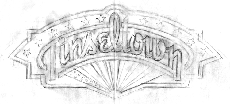
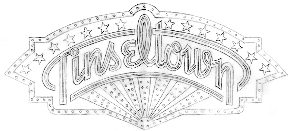
In the first rough above, I was heading in a direction, but still groping around for specifics. By the second rough, I was firmly on my way to solving the problem. And by the third rough, more or less nailed the basics of the design:
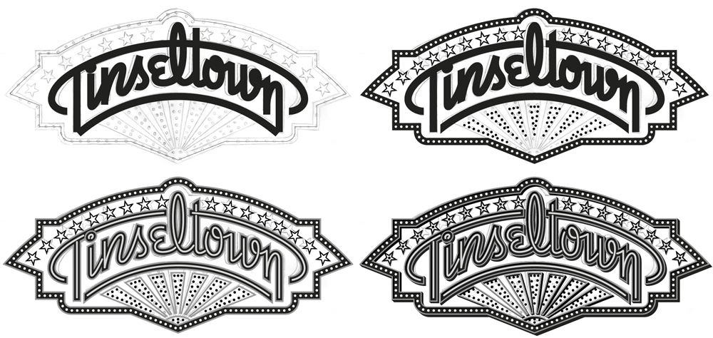
At this point, the design was approved, and I went on to build the design in Illustrator. I do it in values of gray before assigning color, just so I know that certain shapes are separating from others properly. Below I’m building the graphic over a template of the rough pencil drawing (above). To be honest there were many, many more steps than what you see depocted below, but it would be impossible to show them all, and very difficult for a viewer to decipher exactly what’s going on. Suffice it to say that I built this art in layers, and in many ways it may have been similar to building an actual neon sign:
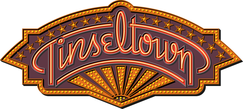
I didn’t want to literally appropriate the color from the Warner marquee, so I started doing my own color solutions, but I didn’t think they worked the way I wanted them to:

So I pretty much went back to a color palette more reminiscent of that Warner marquee:
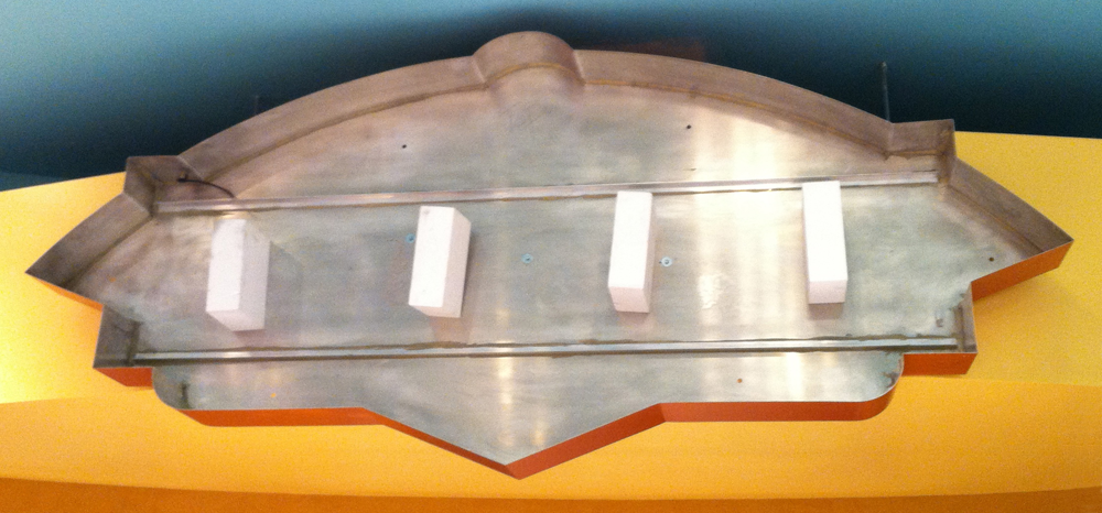
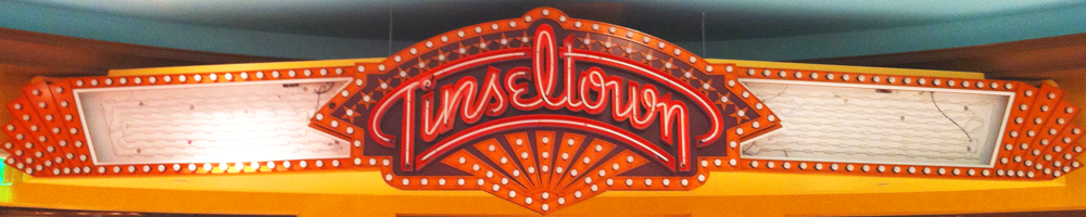
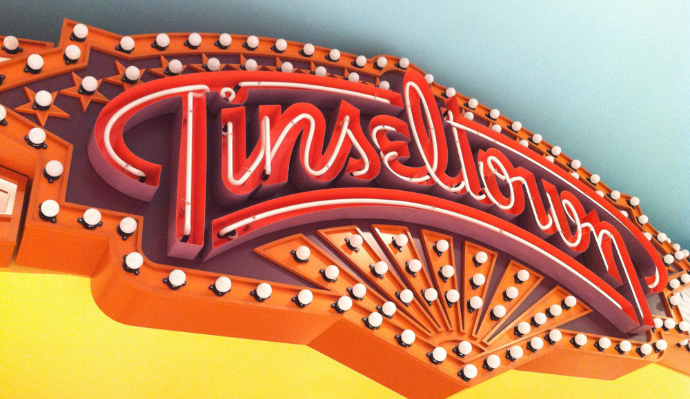
This design was so well received that it was decided to fabricate an actual neon sign that would be installed inside the store. Following are photos of the fabrication of this sign and of it’s installation in Sweet! For more info on this installation please visit my BLOG.


Award-Winning Typeface Designs for every taste from Alphabet Soup Type Founders


