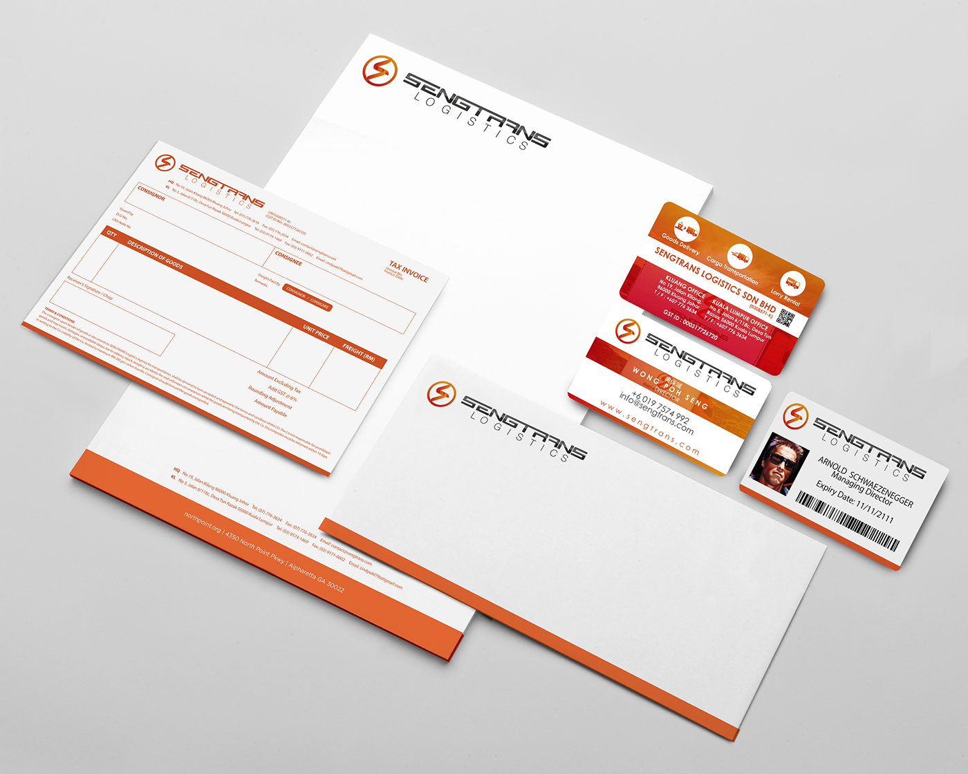
SENGTRANS
SENGTRANS is formerly known as TP TRANSPORT AGENCY, a transportation company founded in 2003. In order to serve the customer better, the company had rebranded as SENGTRANS in 2016!
Website: http://sengtrans.com.my


TP Transport Sdn Bhd's rebranding project is targeting to reach a bigger market in Malaysia. Its logo is lacking a clear identity and approach to the market they're targeting. They approach JYD studio for creative and identity solution.

The project won't be started without a proper planning and objective setting. We spent several weeks to discuss with the client, in terms of their company vision, mission, target market, audience's demography and core services.
All the values and key terms are highlighted after the discussion. This session is to establish fundamental understanding and further task direction with the client. During the meeting, we found that the client has concern for the company rename and didn't have a specific idea or direction to go. We suggest focusing the direction on the founder's name, the process went smooth and agreed by the client.
With the information gathered in the meeting, we suggest the client to change the name to SENGTRANS
SENG (Founder's name, has the meaning of success in Chinese) + TRANS (the short form of Transport)

Once the name is confirmed, a visual mockup and sets of mood board are prepared and presented to the client. The objective of this session is to create a clearer image for the client how the logo is going to be.

Color convey the mood of a logo, it has to be somehow emotionally related to the client; and furthermore, it needs to reflect its real personality. We suggest using orange color as the main color for the logo.
The Chinese 珹 (the founder's name) has the same pronunciation with Orange's '橙'. At the same time, it also associates with meanings of joy, warmth, passion enthusiasm, success, freedom, and fascination. The clients are happy with the color suggestion.
The logo has 2 main key issues need to take note:
1. It can be easy to be identified from far distance, and easy to recognize
2. the symbol has to include the elements that reflect client's passion to serve and work efficiency
The symbol has design with the letter S (first letter of SENGTRANS) , and further apply the element of:
1. Focus - The circle that covers the letter S is firstly to representing the scope which reflects the element of Focus
2. Promise - The circle that covers the letter S is also signified the ring that representing the element of 'Promise'
3. Efficiency - The letter S has designed to appear as the shape of thunder to represent the element of Efficiency
4. Passion - Use different shades of gradient to represent the flame of Passion

The completed logo is double checked to make sure the logo is well-balanced,look great and identifable in all kinds of media.