This project exhibited in Gallery 31 of the Corcoran Museum in October 2012.
Our Home: Strength in stories is a collaborative voting campaign created by a group of designers at Corcoran College of Art and Design. The goal of the campaign is to increase voting among the Asian-American demographic within Northern Virginia, and then within the entire United States.
Each person in the group was responsible for a part of the campaign. Personally, I was responsible for the brand identity. Other team members handled some of the print collateral, the website, social media, motion graphics, the events, and video.
For more information about the campaign, visit the website at: www.ourhomeourvote.com
Design team included: Maribel Gray, Passent Saad, July Ospino, Gaby Bonilla, Daniel Redfern, and Ceile Yann.
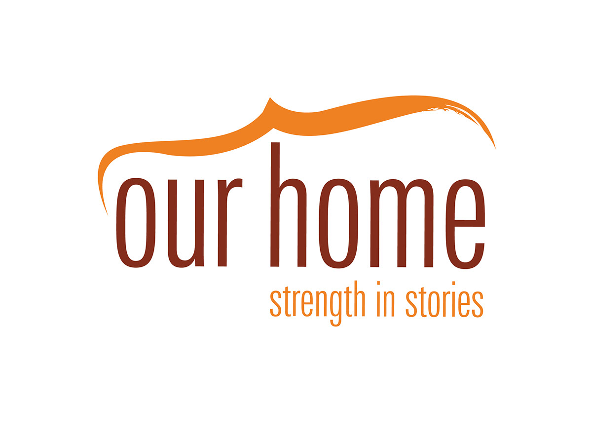
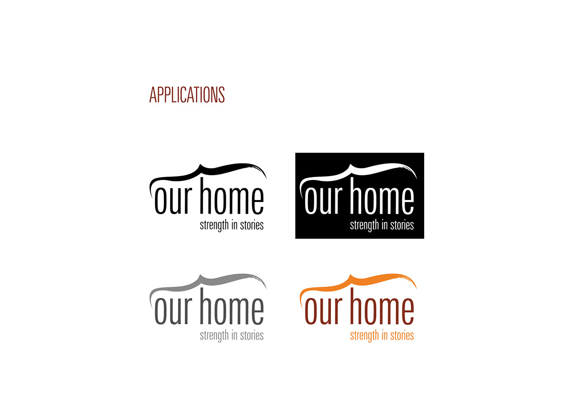
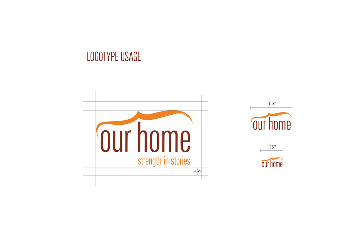
The logo is the visual identity for the Our Home campaign. The logo combines a contemporary vector feel with a traditional calligraphic mark. The element of the brush stroke is incorporated into our logo to represent the calligraphic traditions of Asian art. The condensed font holds together as a unit, reinforcing our message that there is power when people come together. The logo will be applied to all print and web materials to uphold a visual consistency of the Our Home brand.
The Our Home logo was inspired by calligraphic traditions in many different Asian cultures. The form is based on a section of the Chinese character for home. The words “our home” are set in Univers Compressed, which holds together as a unit under the shelter of our mark. The logo combines a contemporary vector feel with a traditional calligraphic mark in order to target our demographic.
The Our Home logo was inspired by calligraphic traditions in many different Asian cultures. The form is based on a section of the Chinese character for home. The words “our home” are set in Univers Compressed, which holds together as a unit under the shelter of our mark. The logo combines a contemporary vector feel with a traditional calligraphic mark in order to target our demographic.
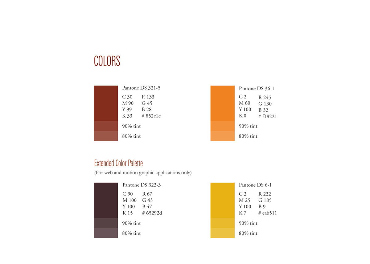
The colors for the Our Home campaign were chosen for their usage in many different Asian cultures. Our research showed red and orange to be prevalant in different celebrations and religious applications. The extended pallete was created for web and motion graphic application to allow for more dynamic compositions.
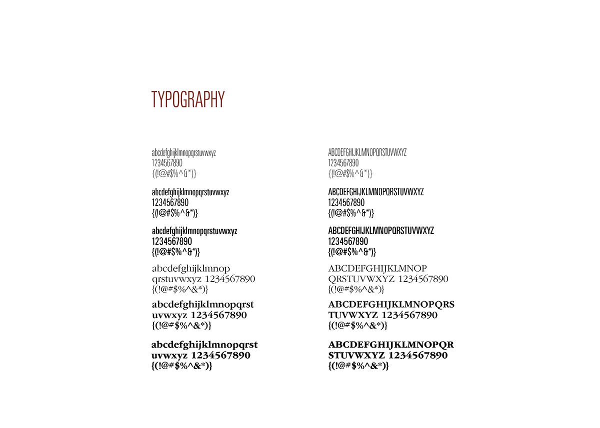
Typefaces for the Our Home campaign were chosen because of their compatibility and versatility on different deliverables. Univers Compressed evokes the feeling of a unit, reinforcing our idea that people are powerful
when they come together for a common goal.
Garamond was chosen as a body copy font to compliment the compressed headline font. The web applications of the typography is outlined in the editorial guidelines, on page three.
when they come together for a common goal.
Garamond was chosen as a body copy font to compliment the compressed headline font. The web applications of the typography is outlined in the editorial guidelines, on page three.
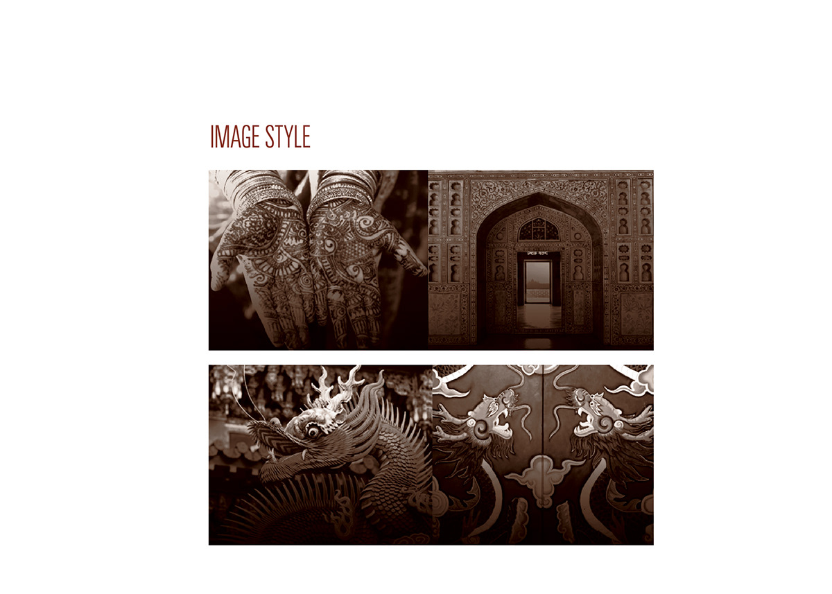
The imagery for this campaign will bridge the gap between various Asian cultures and communities here in the United States. We will connect landmarks and events here in the United States to similar ones that are located in different countries. The decision for each landmark or event will depend on which ethnicity of Asian-Americans are in each community.
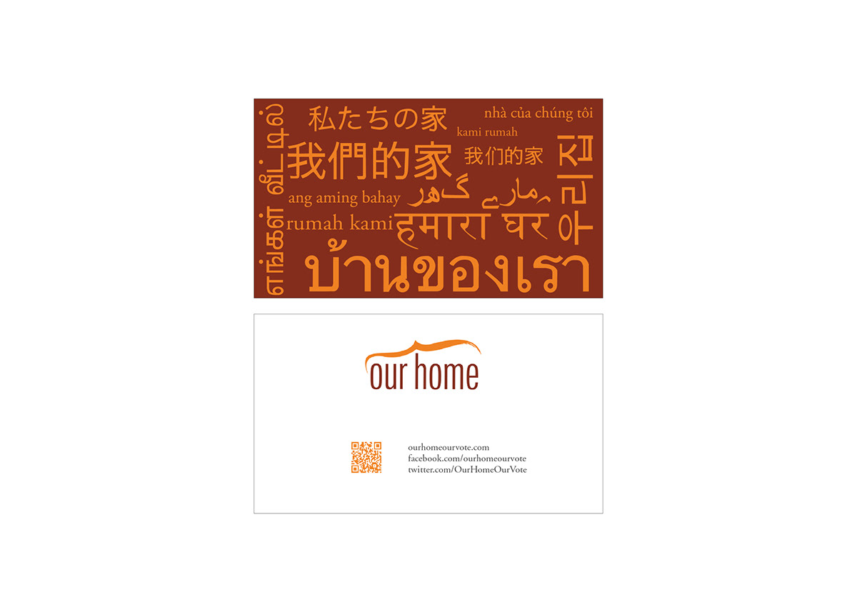
General business cards used for the campaign.
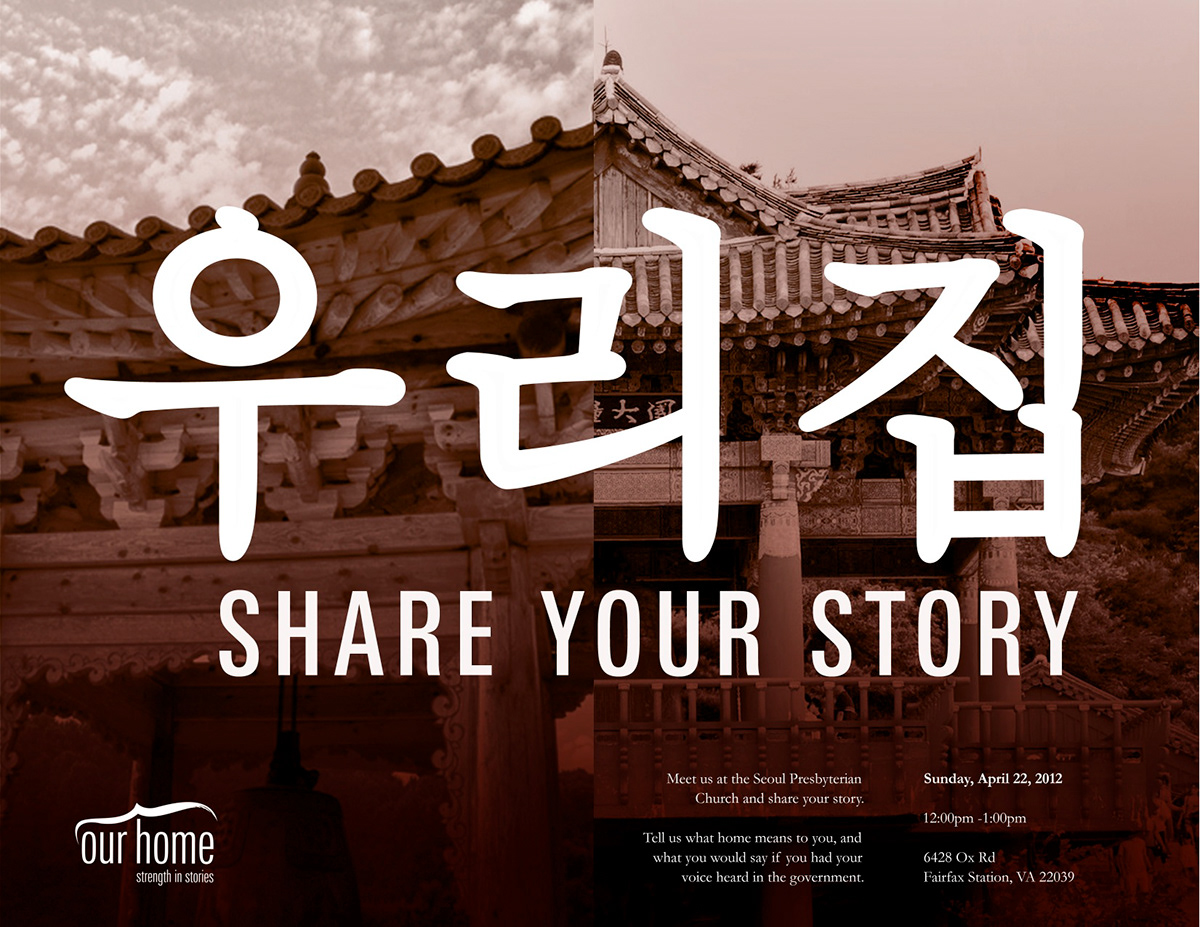
Flyer that was printed and distributed via email in order to promote our event at a local church.
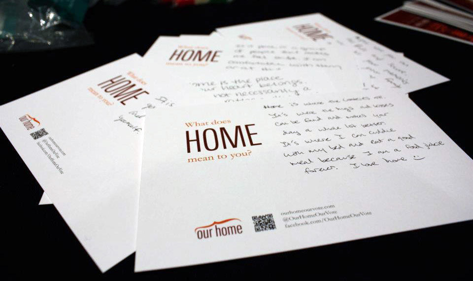
Cue cards were designed and printed in order to get conversations started at our events. On one side it asked "What does home mean to you?" and on the other it asked "If you could change something in your community, what would it be?"
The cards contained our website and social media so if participants took them home, they'd still be able to interact with the campaign.
The cards contained our website and social media so if participants took them home, they'd still be able to interact with the campaign.
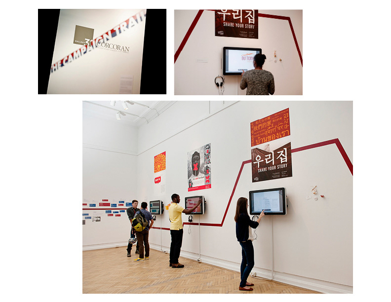
Project exhibited in "On the Campaign Trail" Gallery 31 at the Corcoran Museum.
Photo Credit: Maggie Winters Photography
Photo Credit: Maggie Winters Photography
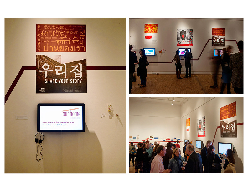
Project exhibited in "On the Campaign Trail" Gallery 31 at the Corcoran Museum.
Photo Credit: Maggie Winters Photography
Photo Credit: Maggie Winters Photography

