


KENCKO
Branding / Packaging / Website / Juices / Apr. 2017
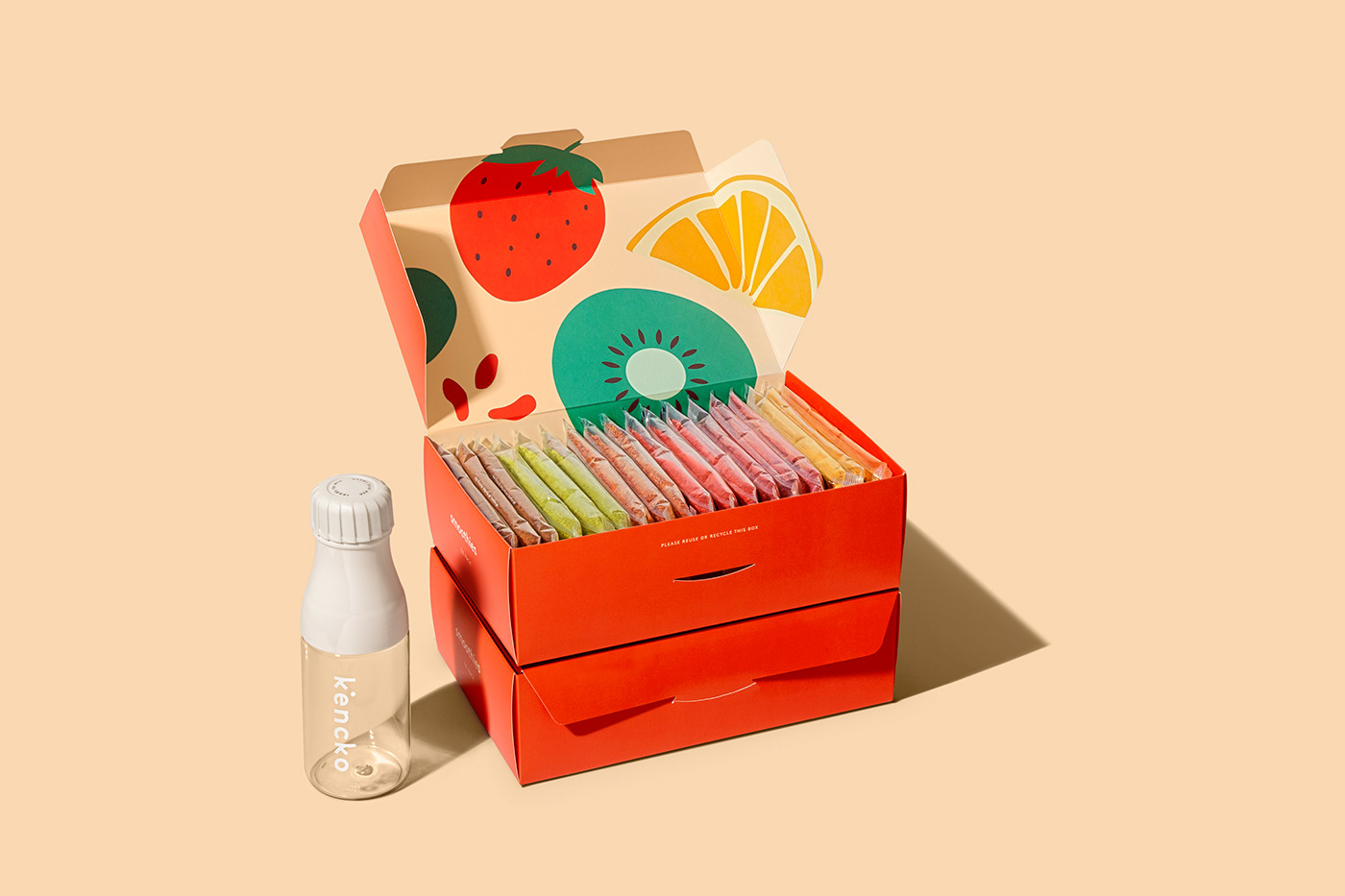
Kencko is a brand devoted to reinvent convenient organic fruit & vegetables products. It means healthy in Japanese, so we developed an identity where the letter K is inspired by its japanese character (Kenkó - 健康 ). The logo looks to emphasise the organic powder that defines the final product. The chromatic universe came from the authentic ingredients.
Photo credits: Diogo Alves


