
In part, the initial drawings for Gardner Sans were inspired by a blog post on spitalfieldslife.com. The post featured a series of sales tickets drawn and used at Roy Gardner’s shop, located on the Commercial Road, in the early 20 century.
Gardner's letters are occasionally inconsistent and contain no numerals or a lowercase, but are nice examples of ‘home-made’ lettering duplicated from an original stencil. They are warm, friendly and functional as pieces of signage. And despite the casual and idiosyncratic execution of the tickets there is quite a clear intention in his work.
Gardner's letters are occasionally inconsistent and contain no numerals or a lowercase, but are nice examples of ‘home-made’ lettering duplicated from an original stencil. They are warm, friendly and functional as pieces of signage. And despite the casual and idiosyncratic execution of the tickets there is quite a clear intention in his work.
The basis for the typeface came from Roy Gardner's attempt at a small caps. It would appear, given the disparity of weight in these CAPS-small caps combinations, that Mr Gardner had several stencils of different sizes but similarly weight proportions. So, for example in ‘King Edward SPLENDID’, the ‘K’ and ‘E’ are much too bold. However, given their ‘square’ proportions, this effect is not so jarring as too look absurd. Typically, in a small caps, the letters are slightly broader than their uppercase equivalents. In the case of Mr Gardner’s work the uppercase has simply proportionally ’shrunk’ and works as a suitable small capitals (weight problems aside). This was the starting-off point for the face as a whole.
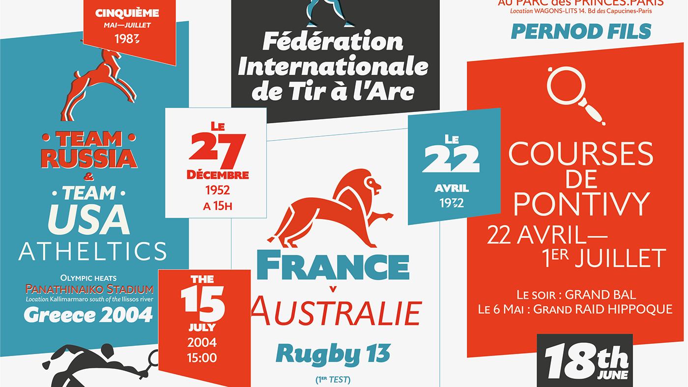
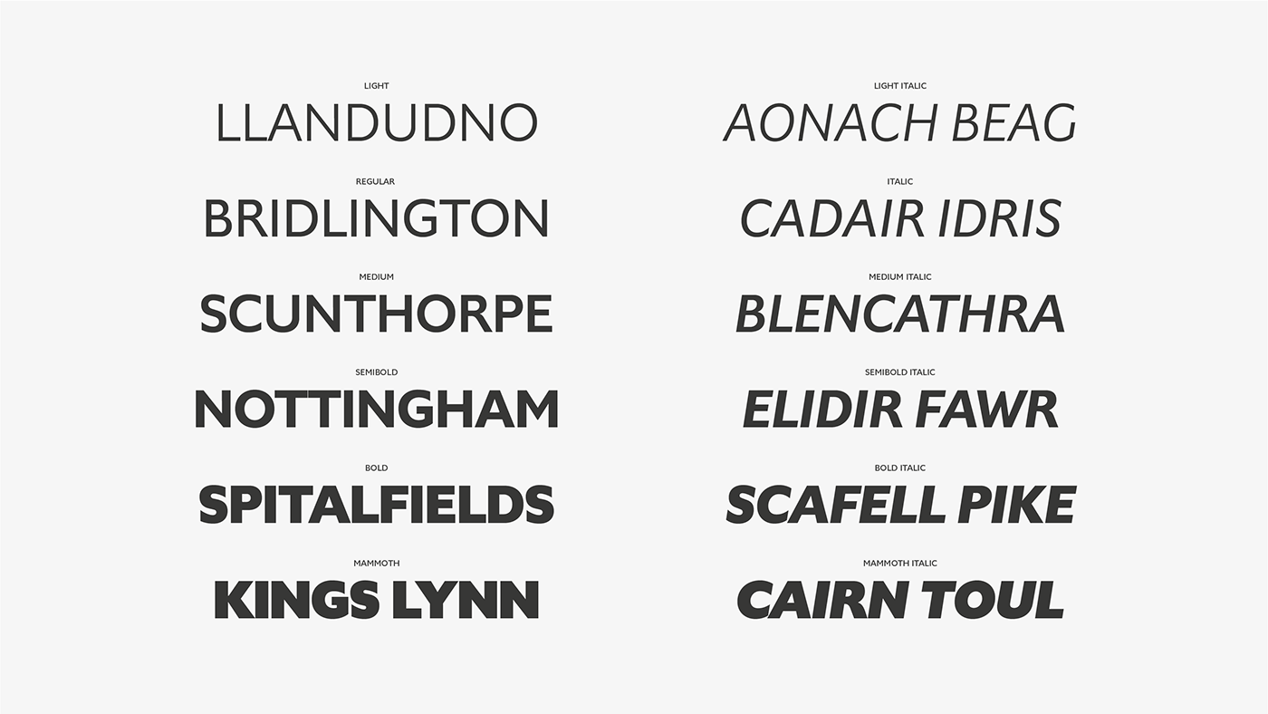
Gardner Sans is not a recreation of any particular early 20th century British humanist face, but its influences are an amalgam of sources from that period. Also included are a set of ornaments in an bauhaus-art deco style. I tried to make a humanist face that did not look dated but still retained a touch of its history and location, which could be suitable for headlines and be readable at smaller sizes.
Special thanks goes to Indrek Mesi for his help drawing the ornaments. Cheers Indrek!


