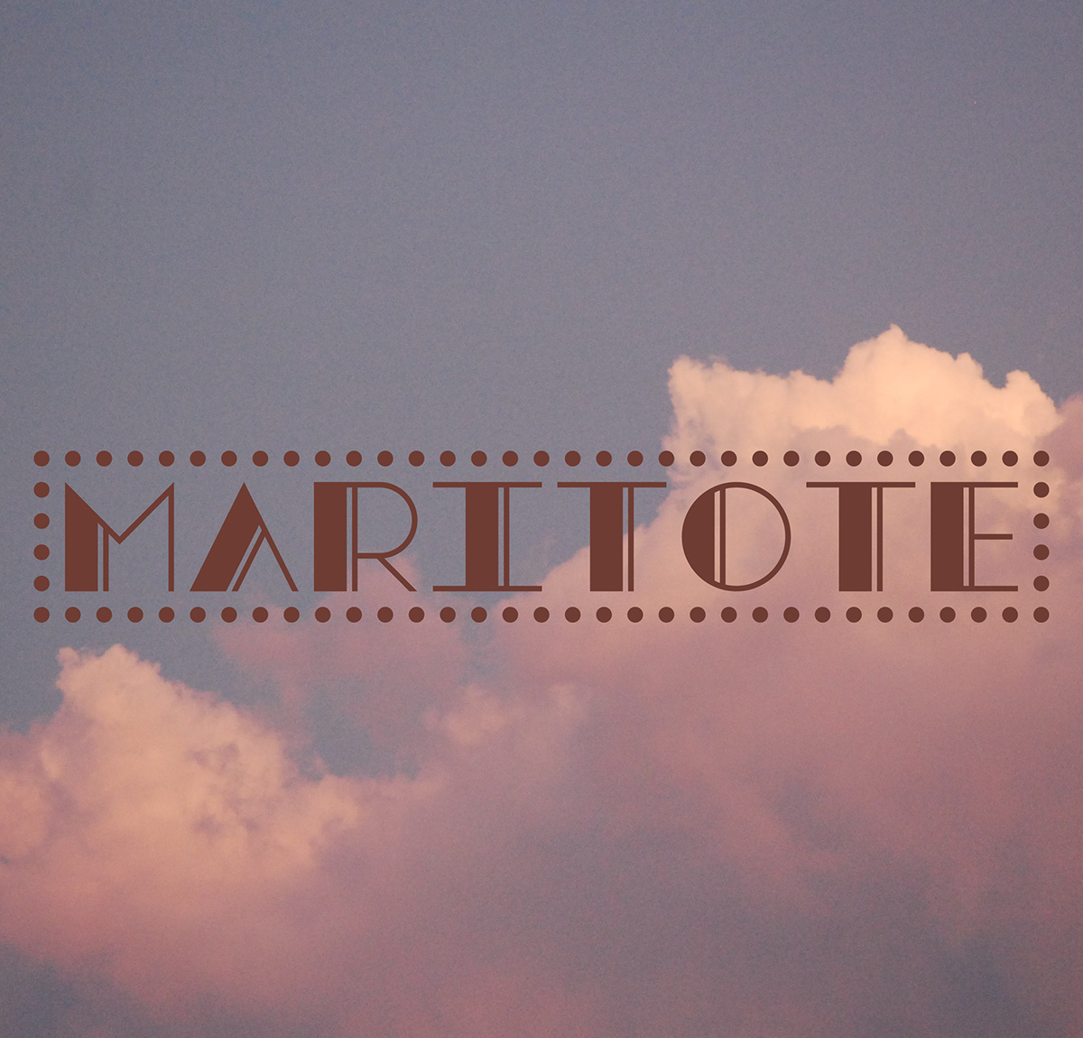
While designing a logotype for a client I decided to extended the brand into a full typeface. While designing the logotype she described herself as “loud and colorful”, so I based it around the “roaring 20s” and the most memorable font from that time is Broadway. The name comes from the client’s last name, who has family history connected to the Italian mafia in Chicago, so naming the typeface after her felt apropriate to the style of the prohibition era when the mafia ruled the bars and streets.


