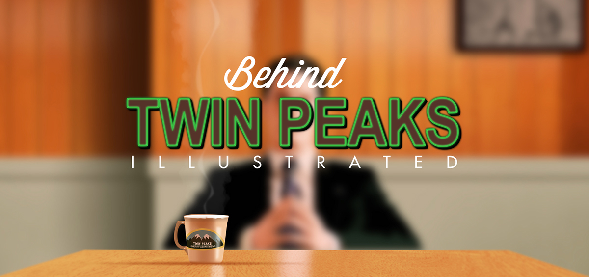
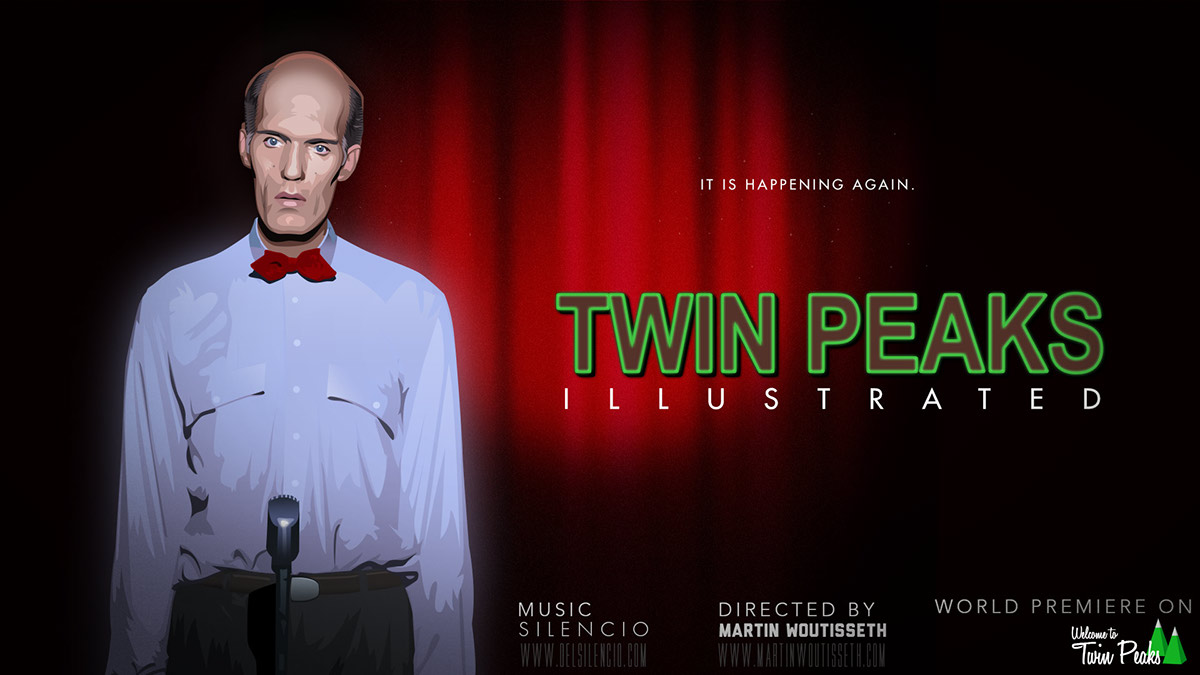
The Starting
Ever since completing my first animation, I wanted to do something with David Lynch's filmography. So after finishing Breaking Bad illustrated last year, I focused on another one of my favorite TV series: Twin Peaks.
First step: there were many characters to draw, about twice the number of those in Breaking Bad! It took me around three months to recreate 33 characters. After that was done, I had to work on a big music festival event and soon after spent three months in Japan for personal and professional reasons. While In Tokyo, I worked 72 hours every week with no time left to work on Twin Peaks Illustrated. In July, I returned to France and had to find work to pay the bills, which delayed this personal project even more.
Ever since completing my first animation, I wanted to do something with David Lynch's filmography. So after finishing Breaking Bad illustrated last year, I focused on another one of my favorite TV series: Twin Peaks.
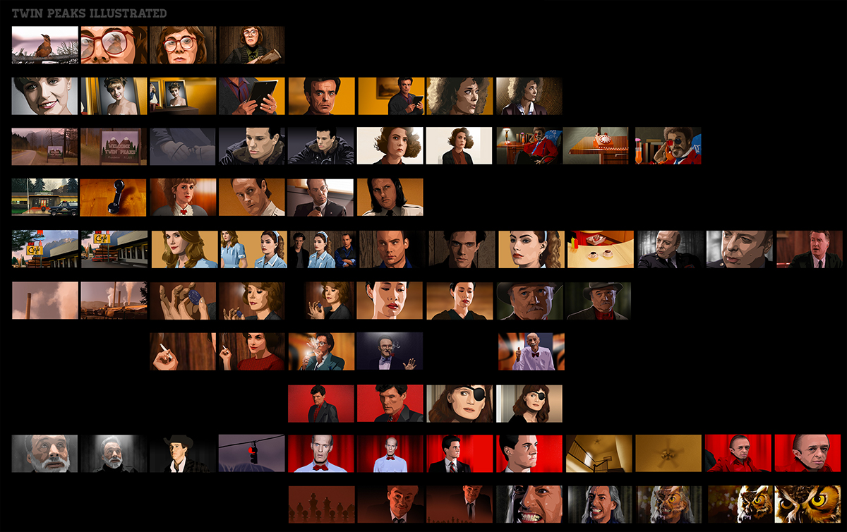
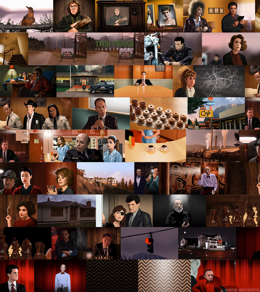
First step: there were many characters to draw, about twice the number of those in Breaking Bad! It took me around three months to recreate 33 characters. After that was done, I had to work on a big music festival event and soon after spent three months in Japan for personal and professional reasons. While In Tokyo, I worked 72 hours every week with no time left to work on Twin Peaks Illustrated. In July, I returned to France and had to find work to pay the bills, which delayed this personal project even more.

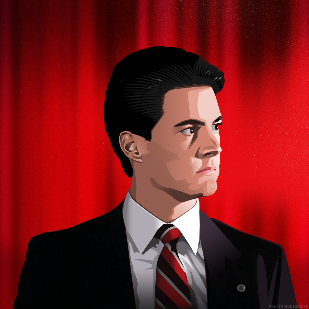
Who killed Laura Palmer ?
The universe of Twin Peaks is so rich that I always wanted to add more symbols, transitions, details... I based my character illustrations on pictures found on the Internet, and put them in a different backgrounds with different light. Kind of like the opening of The Simpsons, I wanted to introduce the viewer to the town of Twin Peaks and its residents by going from one place to another place with soft transitions, instead of the famous Twin Peaks opening titles.

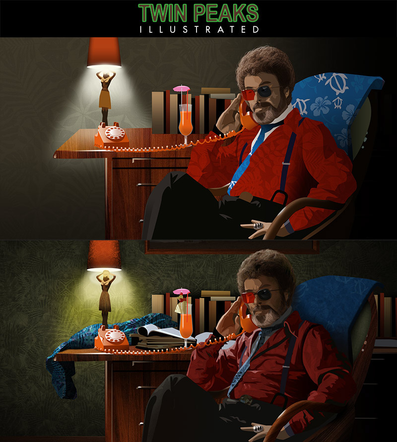
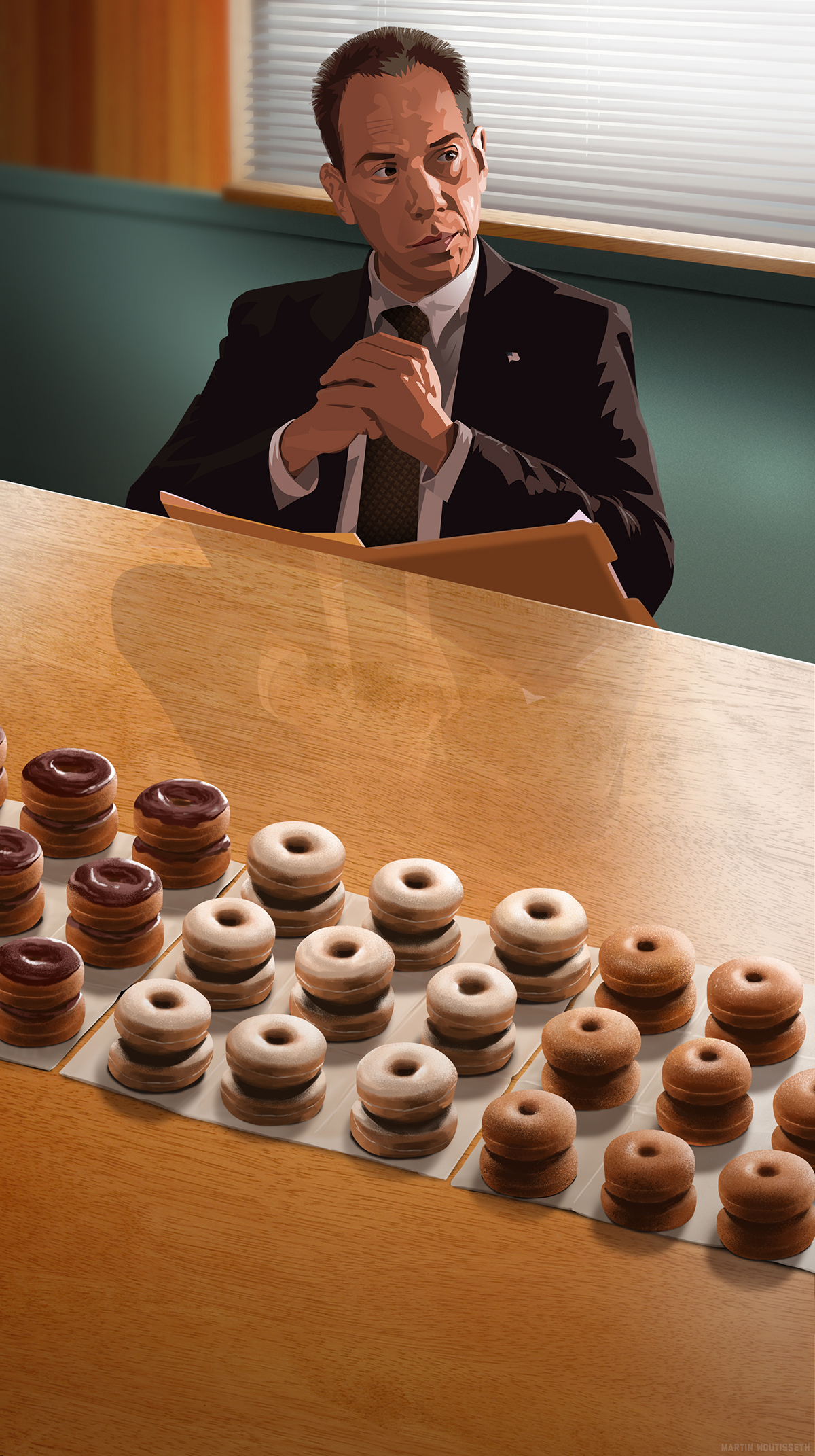
"Do you agree Mr Cole?
- THAT'S THE KIND OF PROJECT THAT MAKES YOU WISH COULD SPEAK A LITTLE FRENCH"
I was feeling quite alone on this project, because I spent all my free time working on it, doing less social activities outside the house. Fortunately, I sent a mail to the community manager of the biggest and friendliest community of Twin Peaks fans: WelcomeToTwinPeaks. Pieter quickly showed his interest in this project and we started swapping ideas back and forth.
For the music, I originally wanted to work with Romain Trouillet (who did great work on my Stanley Kubrick and Tim Burton animations) but he was moving and starting university, so unfortunately, he didn't have the time. Because Romain was unavailable to compose the score, Pieter introduced me to a band from Pittsburg playing wonderful music with a Twin Peaks mood: Silencio. I fell instantly in love with them from the first song I listened to, and bought their album on iTunes. Listening to the album over and over, I got inspired and motivated to finish this big project! The band leader of Silencio was happy to collaborate and he allowed me to use any of their songs! I would like to thank both of them!
From September until mid December, I worked on Twin Peaks Illustrated even harder than "Tokyo/Japanese style": 12 hours every day with no day off. For the closing titles, instead of using a typical black background like my previous animations, I used an old idea to make it something more original !
Sometimes people comment on my illustrations that they're just photos with an instant Photoshop filter applied to it. That's not true. It takes hours to make them and portraits have between 100 to 250 layers! I wanted to show up how many layers I use in something more original and graphic design.
"All men in the world should be taken to a desert island and forced to eat sand!"
It seemed appropriate to launch Twin Peaks Illustrated on a "mirror" date: 21/12.
I would love to work more with cinema, illustration, animation, and make more title sequences. Feel free to contact me for about your projects! Thanks for reading.
I would love to work more with cinema, illustration, animation, and make more title sequences. Feel free to contact me for about your projects! Thanks for reading.
"! kcor s'teL"
The animations
Final animation
Little trailer, online two weeks before the big launching
First storyboard from the exisiting illustrations to make a story and an animation. August 2013
Compare with the final results, 4 months of works and animation since the previous storyboard.
On the weakest illustrations, I spent more to times to arrange them in equal level. Here an example with the Dr Jacoby
Project's covers
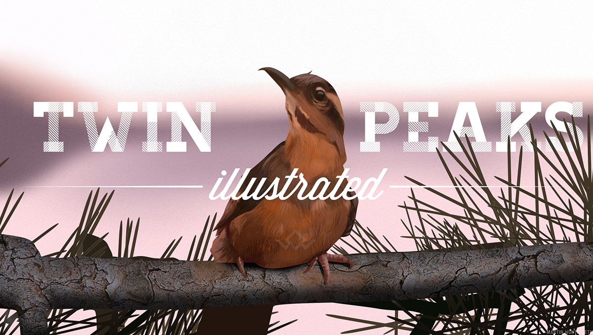
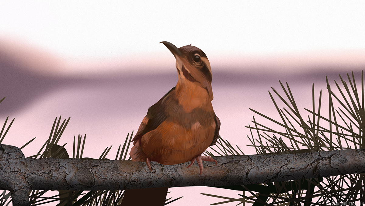
The original idea of the bird, introducing the original Twin peaks opening like it will tell us a story. Last plan of Blue Velvet too.
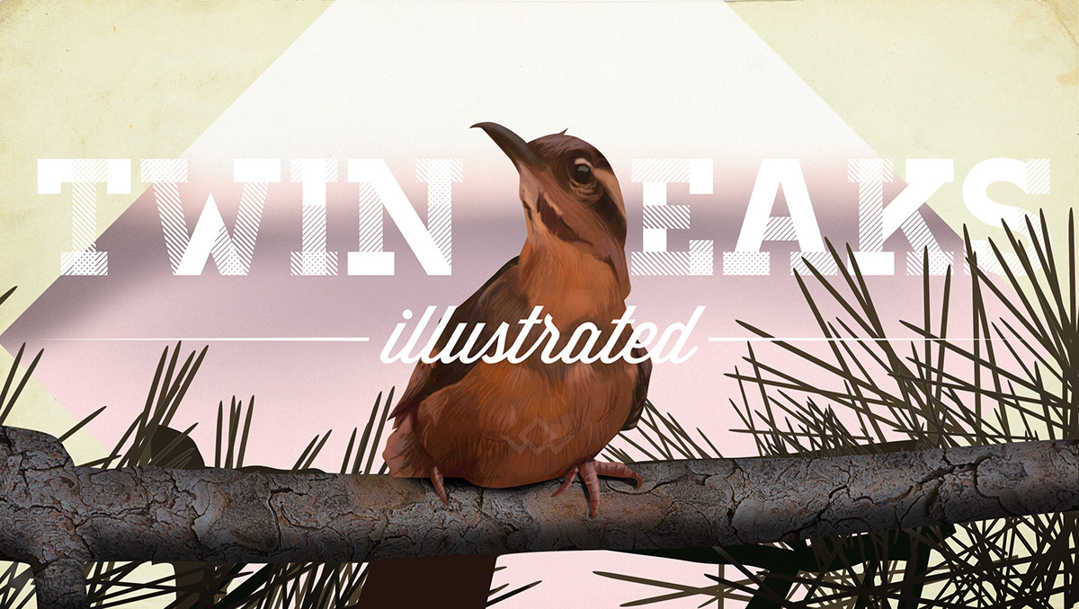
In another style.
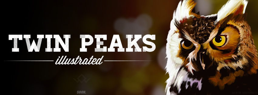
Facebook banner, but the style of the owl, made with brushes instead than with vector shapes is too much different of the whole illustrations. I didn't use it in the end.
The Man from another place with recents fonts (Homestead and I forget), with the owl cave symbol.

After made a try with the original neon lights, it was much more familiar with complemenatary colors.
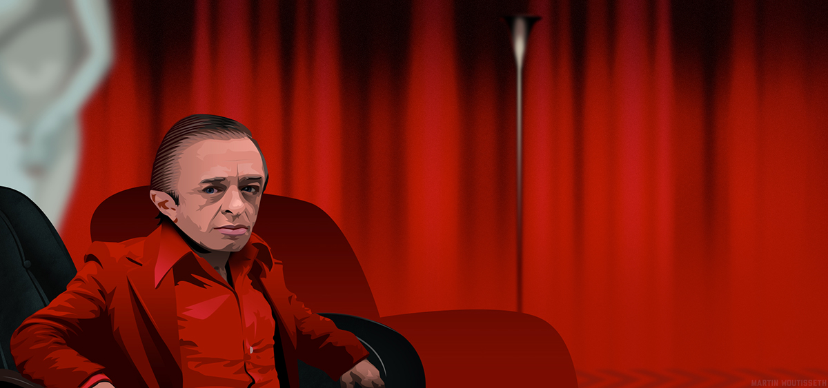
Dark wood, red whool with pattern smoke, glamourous, mysterious, neon typo, what else ?
Kinda glich art for the final end sequence.
For me, this is my favorite poster in the end. I found it in the last days. It's looks classic but with a modern regard. The puzzle pieces are matching, but not yet making something consistant.
A more classic poster with the giant announcing: it is happening again. Red velvet curtains and titles.
The transitions backgrounds

Palmer stairs, with the fan giving a pressure impression.
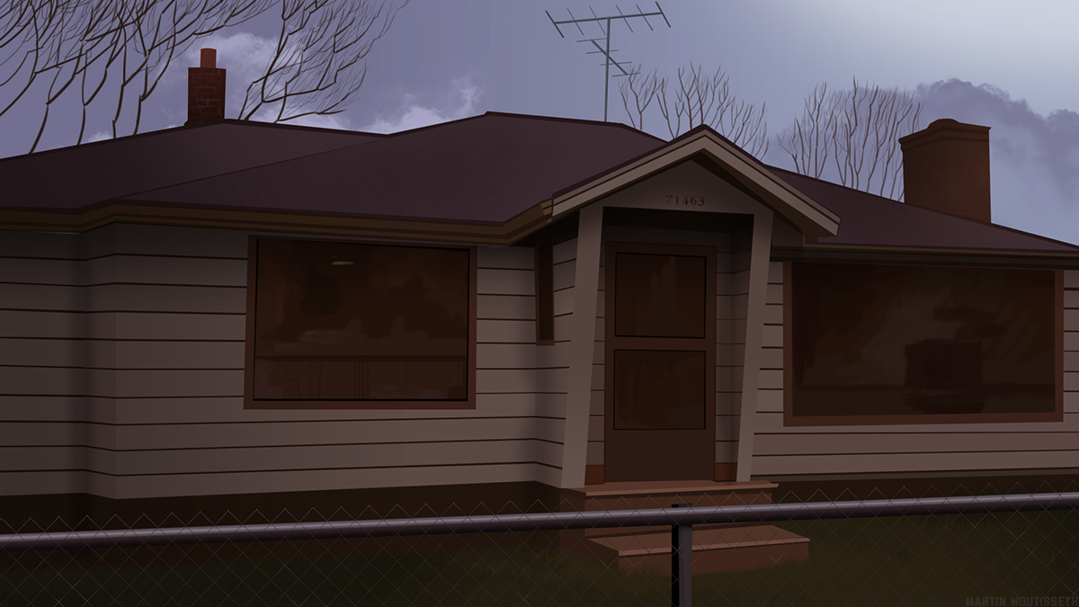
The Hurley house, even the antenna is whipping slowly under the wind. Remind you maybe the White house in my previous animation.
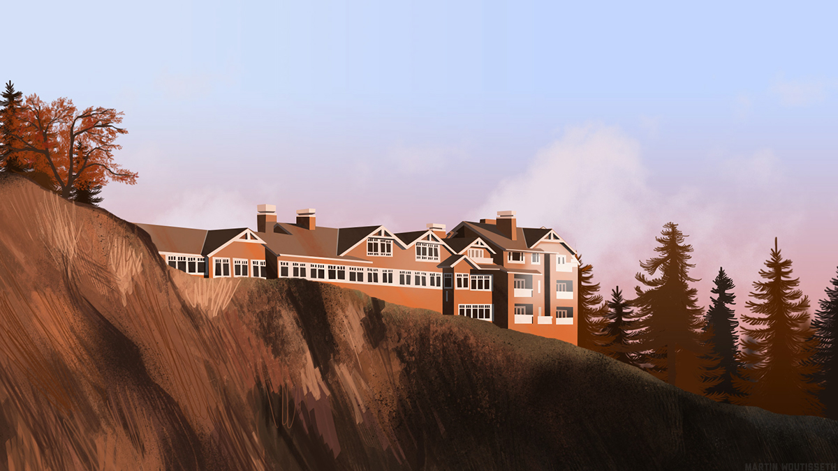
The Great Northern Hotel - the leaves were added in after effects with trapcode particular
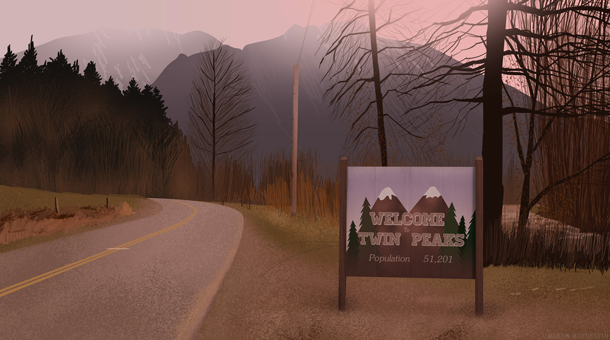
The entrance of Twin Peaks, did you notify the tree are slowly moving under the wind ?
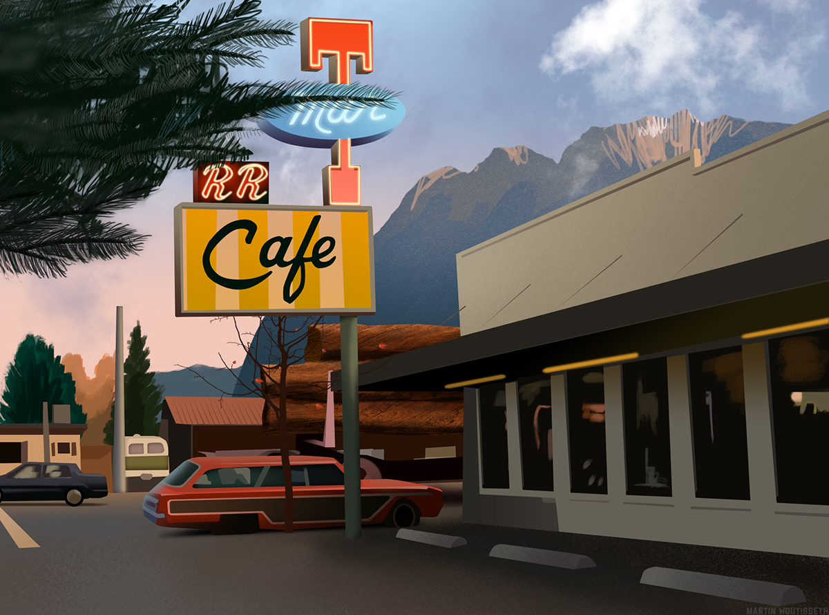
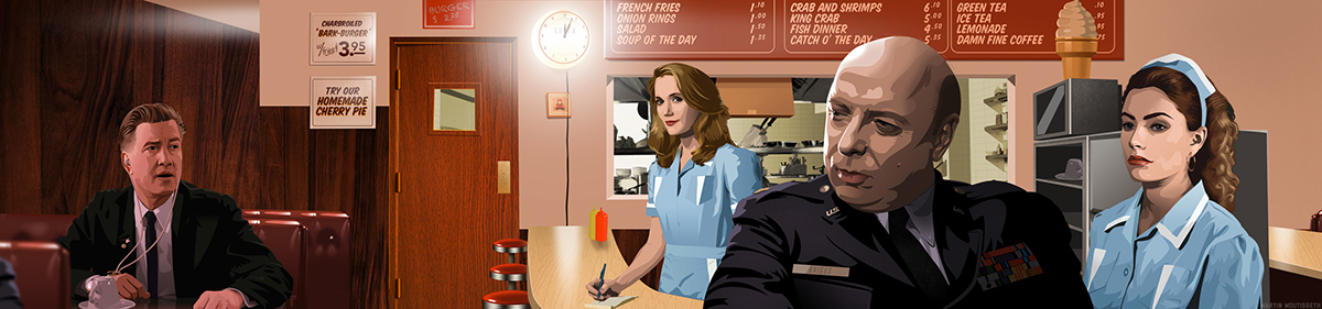
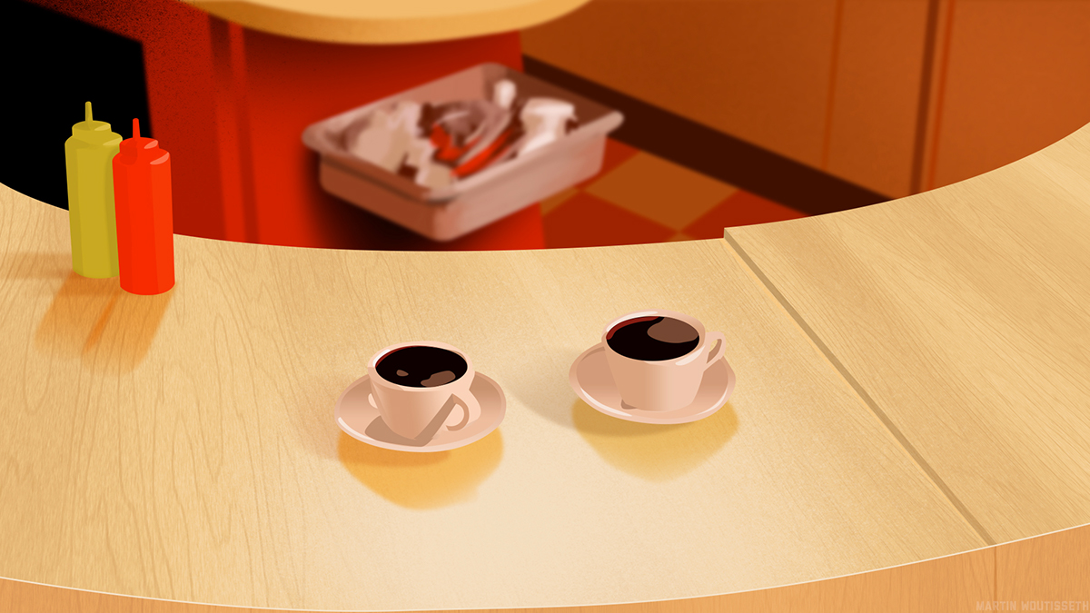
Double R Dinner, time for a cherry pie. Even if it was the day, I bring more life with the neons, steam of the pipe, cars are moving, the red leaves of the trees too, and the pine in front while a lazy cloud move in the sky.
In that sequence, the Douglar fir are moving too while red leaves are falling. Autumn is the best season to watch Twin Peaks.
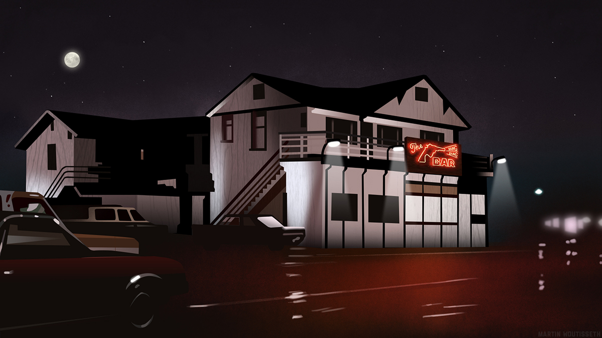
The roadhouse - night is darker, rain heavier. At first, the neon was more colorfull but ugly. Because it was an important and catchy element, I spend one more day to do it properly from other pics found on internet and to animate like it would does with the right amount of light on the concrete.
At first, there was not this idea tv. But I thought, it might be a good transition between the log lady and the Laura frame. I use for this a blurry snapshot of tv in TP with of course 'Invitation to Love' . That's also the meaning of the TV inside internet and the roots of Twin Peaks.
The fire is also the symbol of Laura, her life. Fire dance with her. The candle means she is still living.
Not very original, but for match with the song, the background turn in blue. Like a lynchean effect. I like the idea of the stump lines, so I kept it lightly.
In the beginning, there was another backgound, in another color. But to bring more unity, I used the same one than the entrance, blurry with James behind. Rain and leaves start to fall in a sad and nostalgic mood. Did you notifiy the hair of Donna moving under the wind ?
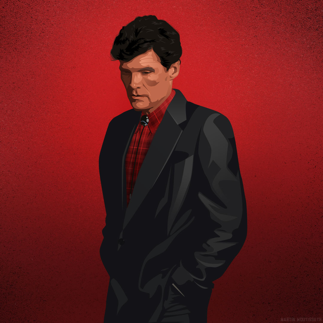
"I like to think of myself as one of the happy generations."
I spend lof of tries to make those donuts yummy. At the beginning, there were in many different colors, in vector shapes. In the end, I used digital brush over the past layer and I choosed only three types of donuts. Here in France, we don't eat much donuts, more croissants, so I try to make them very yummy like my american friend Ana offered me in Japan after been to Dunkin Donuts.
"Black as midnight on a moonless night."
Like Cooper, I drink a lot of black coffee, around three full mugs by day. I shall drink less for my kidneys.
Like Cooper, I drink a lot of black coffee, around three full mugs by day. I shall drink less for my kidneys.
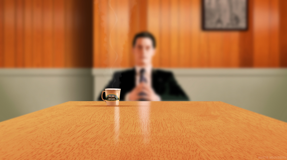
"I've had I don't know how many cups of coffee in my life, but this is one of the best."
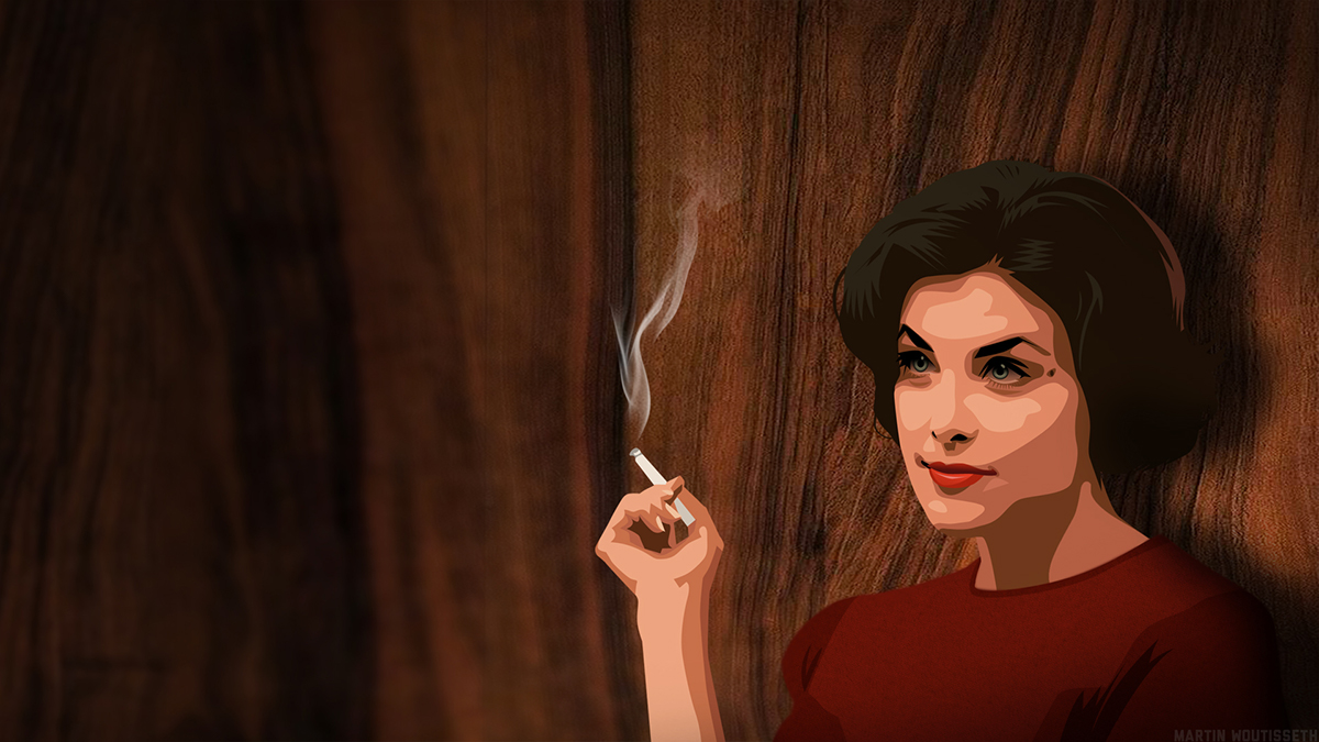
When i was teenager, I didn't know the show but I was already in love of Sherilyn Fenn. Audrey is my favorite character in Twin Peaks, she is so classy, glamourous and so on. I cannot understand Cooper but c'est la vie.
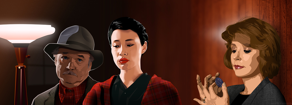
I spend also lot of time, from misc illustrations to match them in the same place with coherent light on their face. Sometimes, it is not perfect but I didn't get any shocking feedback about it.
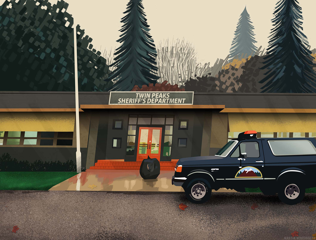
Do you remember the sequence with the camera leaving slowly a hole inside the Sheriff's department ? Amazing ! I wanted to use the same effect, but it would be too long. And I used already two zoom off in the beginning. A simple pattern behing Mike remember this plan to some people maybe. This illustration is very appreciated online.
"The only thing Columbus discovered was that he was lost ! "
Did you notify the spider inside the cage ? In the backward, Leo is missing.
Did you notify the spider inside the cage ? In the backward, Leo is missing.
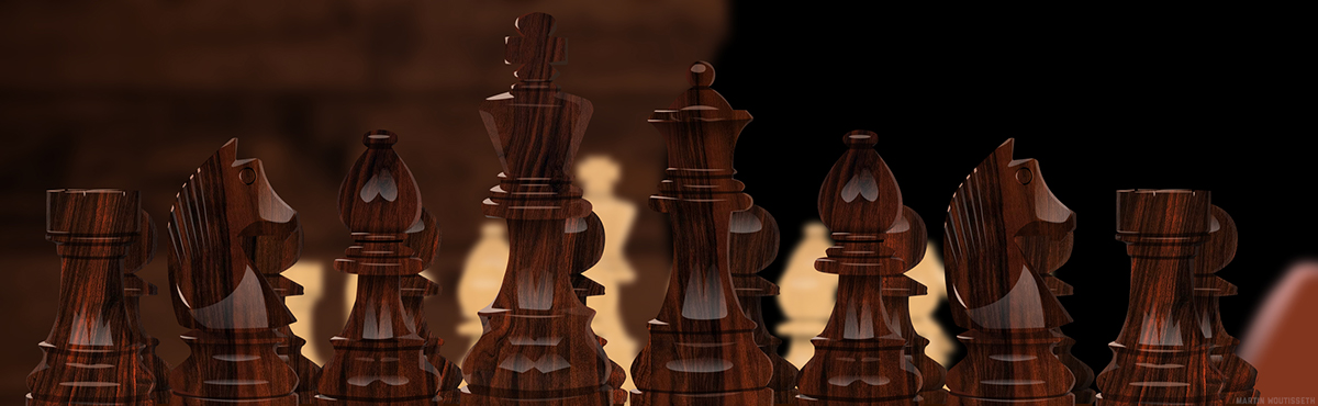
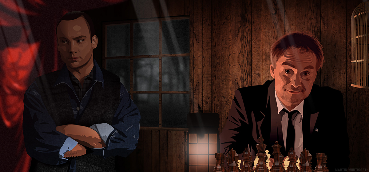
I wanted to bring more strengh to the elements and the symbol. Chess is the symbol of Windom.

A very personal composition, it remember be the most what I lived this year.

"The owls are not what they seem"
Idea cancelled to not spoil too much people who don't know TP yet.
Idea cancelled to not spoil too much people who don't know TP yet.
"It is happening again"
Portraits

"He is BOB! Eager for fun! He wears a smile. EVERYBODY RUN."

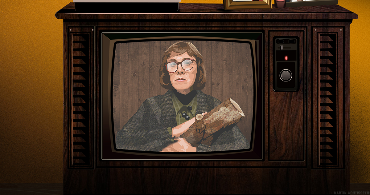
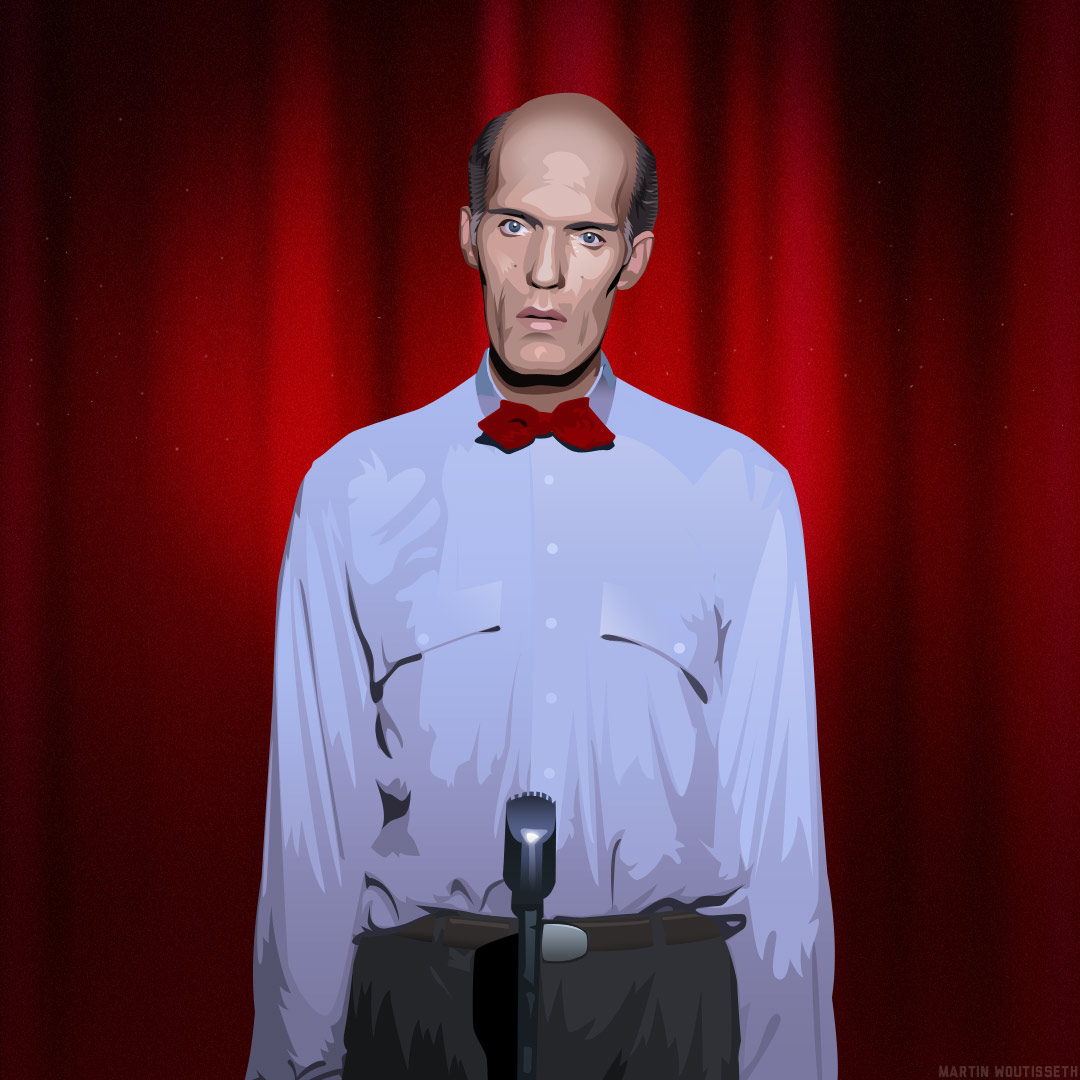
"I do not introduce the log!"

Isn't it too dreamy ?

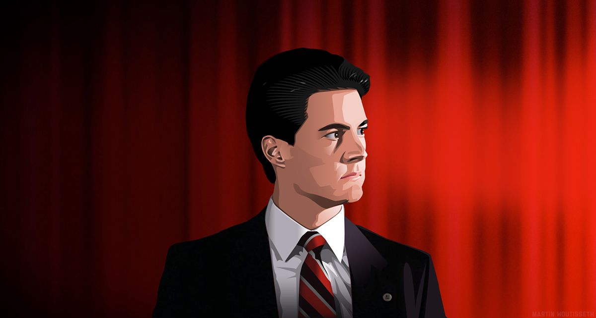
Benjamin Horne

Catherine Martell

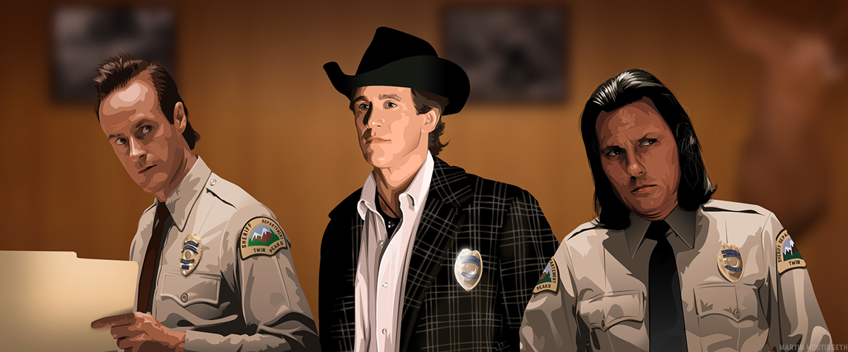
Deputy Andy Brennan
Ed Hurley
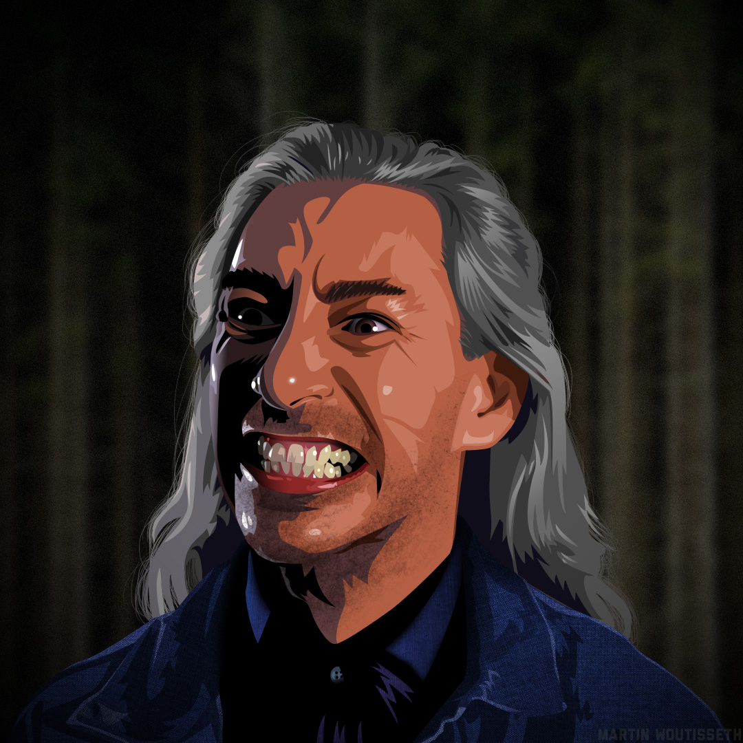
The Giant
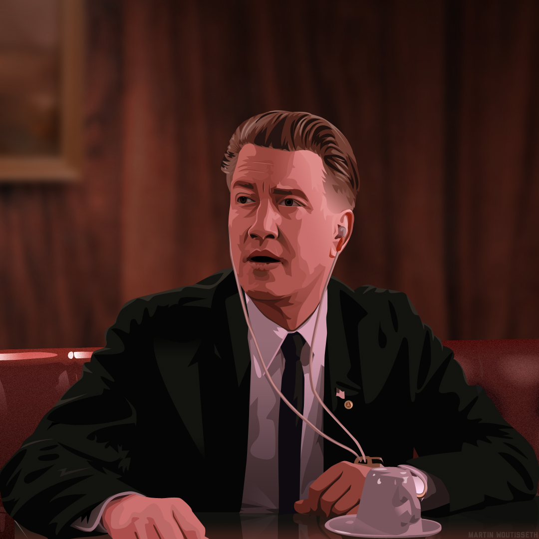
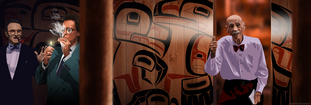
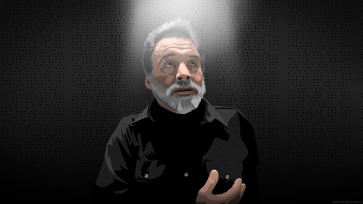
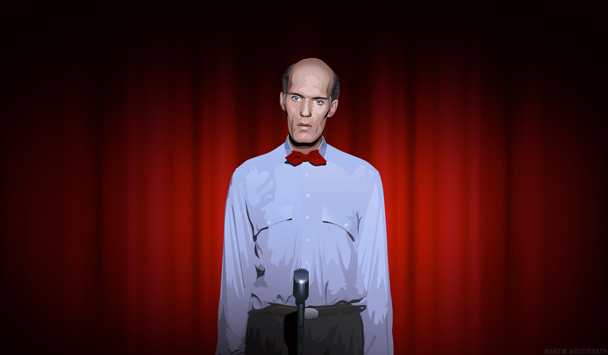
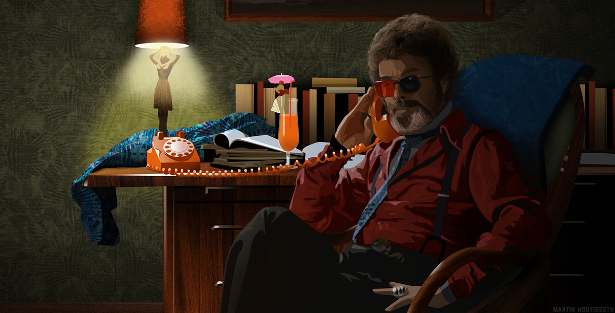
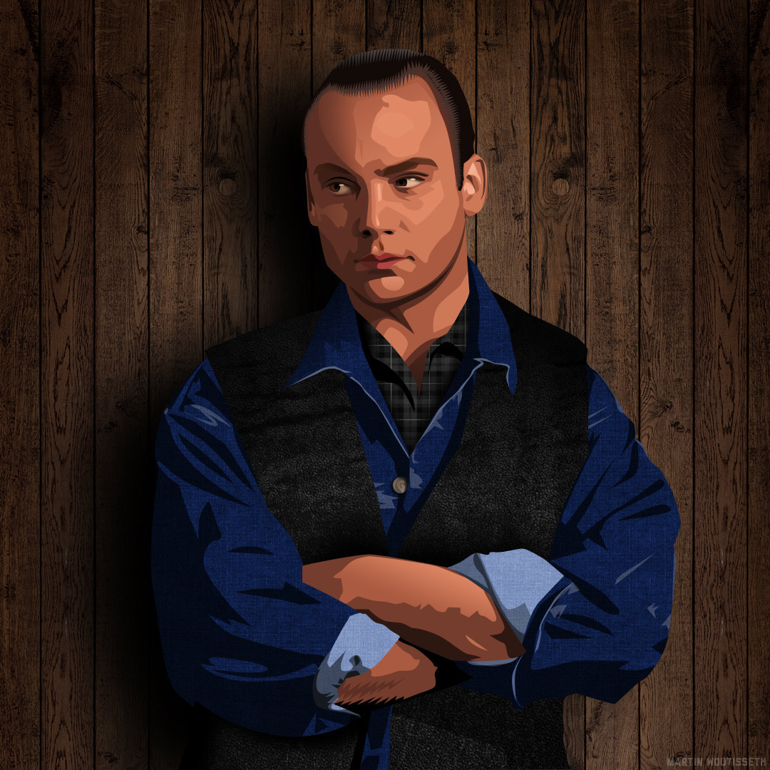
Gordon Cole

Deputy Hawk
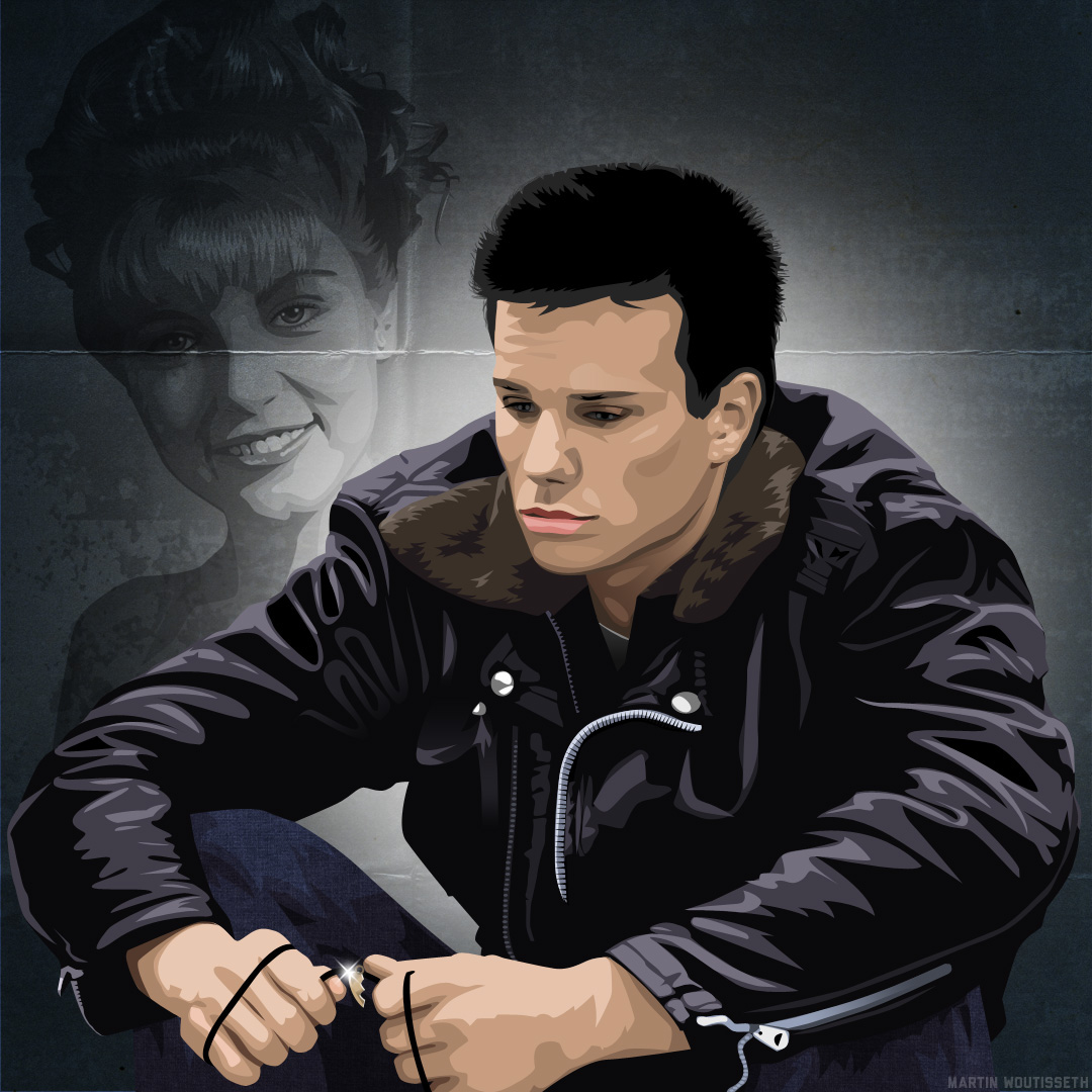
It remember me a previous illustration of Jesse Pinkman with his lost love, Jane in the background.
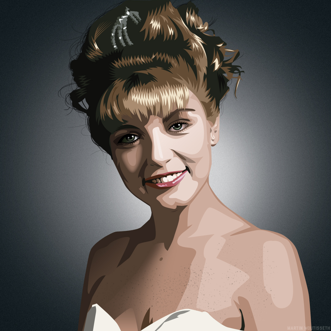
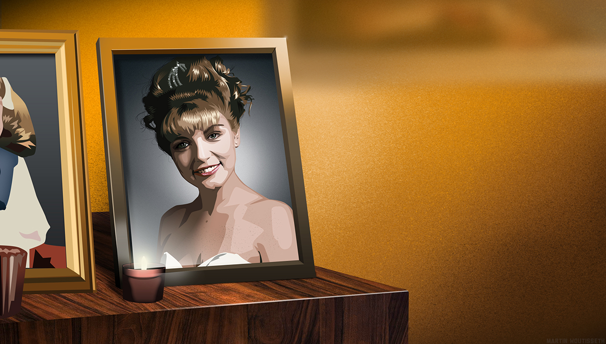
Laura Palmer

And one exact comment in YouTube:
"What I like about this is the eyes of the characters: you got them just right and thus their emotions come through just as they did in the TV show."
He is right, because the illustrations are not moving or very little, I like spend more time to catch the right expression of their thinking and what is actually in their mind. Here Leland Palmer
New shoes

I do not introduce the log

You'd never guess. There was a fish in the percolator.
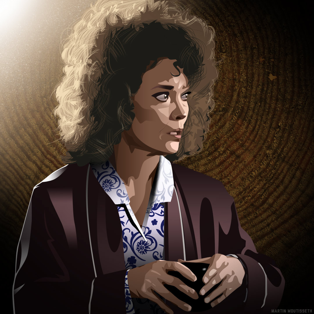
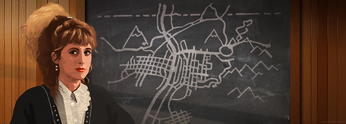
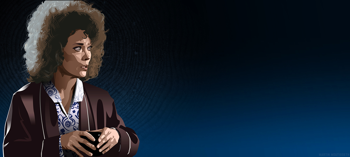
Sarah Palmer, the original idea of the trump showing her mental state while she lost her daughter, killed.
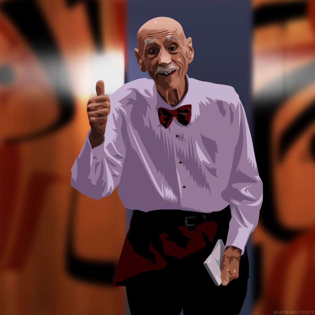
Elderly room service waiter
THANKS FOR READING GUYS !

