

Logos & Conditional image 2011 — 2021
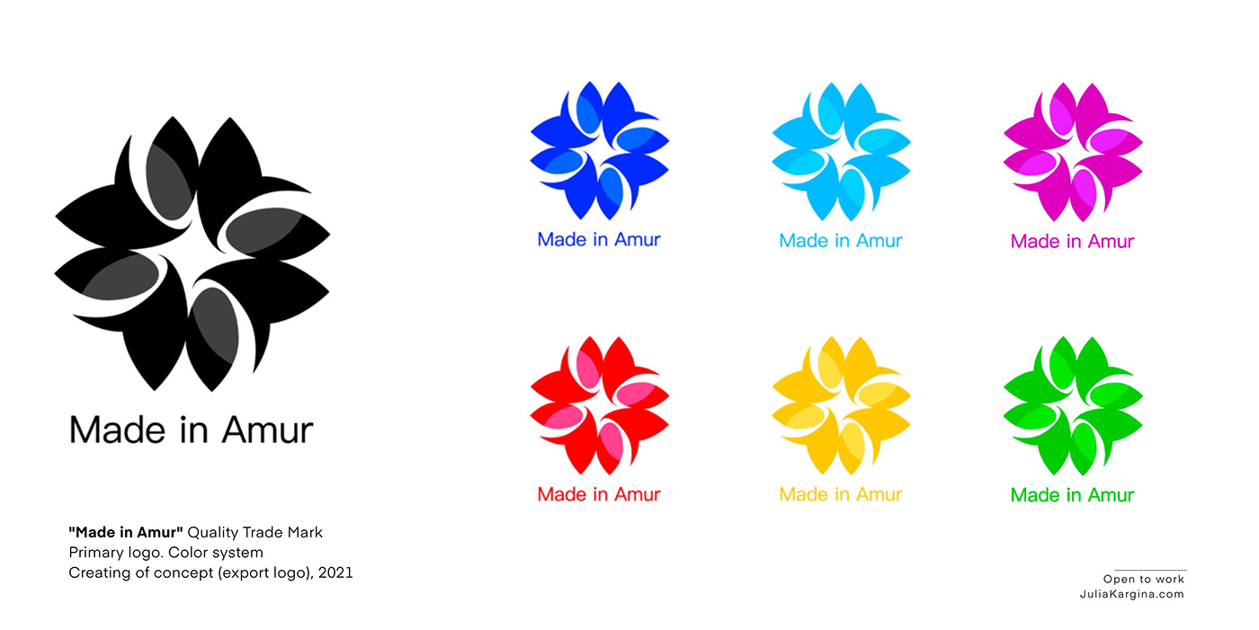
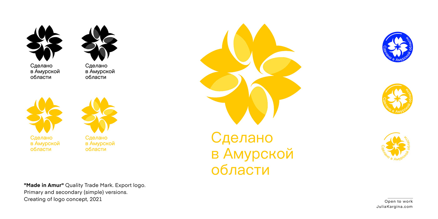
— Конкурсный логотип. Разработка Экспортного логотипа "Сделано в Амурской Области", 2021. Разработка кассы знака, торговой марки. Версия на двух языках.
— Сontest logo (tender). Creating of the Export logo (the new Trade Mark) "Made in Amur" (Region in Russia), 2021. Version in two languages.
Conception (words from the verse): — Fly, fly, petal, — Through the west, to the east, — Through the north, through the south, — Come back, making a circle.
The visual image of the export mark is based on the image of a flower with petals pointing in different directions (cardinal directions). The base of the petals forms a central, internal space - a landmark "North Star" with four rays radiating from the center — paths, creating a dynamic, open form of the sign.
The second associative row can be seen images of a wreath, wheat, grain.
The developed sign consists of simple, easily recognizable, memorable symbols. The used natural, naturalistic associative series emphasize belonging to the region of production of the export product.
The name of the concept serves as a positive motive and works on the memorability of the symbol of the target audience (manufacturers, entrepreneurs, consumers). Recognizability of lines from a book or a Soviet cartoon contains a resource for a wide palette to develop a color system for individual groups of goods, products or types of market.
Название концепции: — Лети, лети, лепесток, — Через запад, на восток, — Через север, через юг, — Возвращайся, сделав круг.
В основе визуального изображения экспортного знака использован образ цветка с лепестками направленными в разные стороны (стороны света). Основа лепестков образует, центральное, внутреннее пространство — ориентир «Северную звезду» с исходящими от центра четырьмя лучами — путями, создавая динамичную, открытую форму знака.
Вторым ассоциативным рядом можно увидеть образы венка, пшеницы, зерна.
Вторым ассоциативным рядом можно увидеть образы венка, пшеницы, зерна.
Разработанный знак состоит из простых, легко узнаваемых, запоминающихся символов. Использованный природный, натуралистический ассоциативный ряд, подчеркивают принадлежность к региону производства экспортного продукта.
Название концепции, служит позитивным мотивом и работает на запоминаемость символа целевой аудитории (производители, предприниматели, потребители). Узнаваемость строк из книги или советского мультика содержит ресурс для широкой палитры к разработке цветографической системы для отдельных групп товаров, продукции или видов рынка.
— Сontest logo (tender). Creating of the Export logo (the new Trade Mark) "Made in Amur" (Region in Russia), 2021. Version in two languages.
Conception (words from the verse): — Fly, fly, petal, — Through the west, to the east, — Through the north, through the south, — Come back, making a circle.
The visual image of the export mark is based on the image of a flower with petals pointing in different directions (cardinal directions). The base of the petals forms a central, internal space - a landmark "North Star" with four rays radiating from the center — paths, creating a dynamic, open form of the sign.
The second associative row can be seen images of a wreath, wheat, grain.
The developed sign consists of simple, easily recognizable, memorable symbols. The used natural, naturalistic associative series emphasize belonging to the region of production of the export product.
The name of the concept serves as a positive motive and works on the memorability of the symbol of the target audience (manufacturers, entrepreneurs, consumers). Recognizability of lines from a book or a Soviet cartoon contains a resource for a wide palette to develop a color system for individual groups of goods, products or types of market.

— Создание набора логотипов для новой торговой марки одежды и аксессуаров TM Shadow of Lady (касса логотипов, паттерн, бирка, 2021). Позиционирование для первичной целевой аудитории: "Красивый образ с большим теплом и комфортом". Бренд вдохновлен (ключевые слова): Русская литература. Тишина. Северное море. Аромат цветов. Мелькание ласточек. Вновь шторм и тишина...
— Creating logos set for a new Trade Mark Shadow of Lady, 2021
TM Shadow of Lady. Brending for a new Trade Mark of clothing and accessories. "The beautiful image with great warmth and comfort". Inspiration, tag lines: Russian literature. Silence. North sea. Aroma of flowers. Flickering of swallows. Storm and silence again...


— Логотип для новой торговой марки одежды Malika ICONIC, 2021.
Цветочная, растительная концепция и стилистика предложена клиентом.
— Creating logo for a new Trade Mark Malika ICONIC, 2021
M.ICONIC (clothing and accessories). Floral concept and stylistics image are offered by the client.

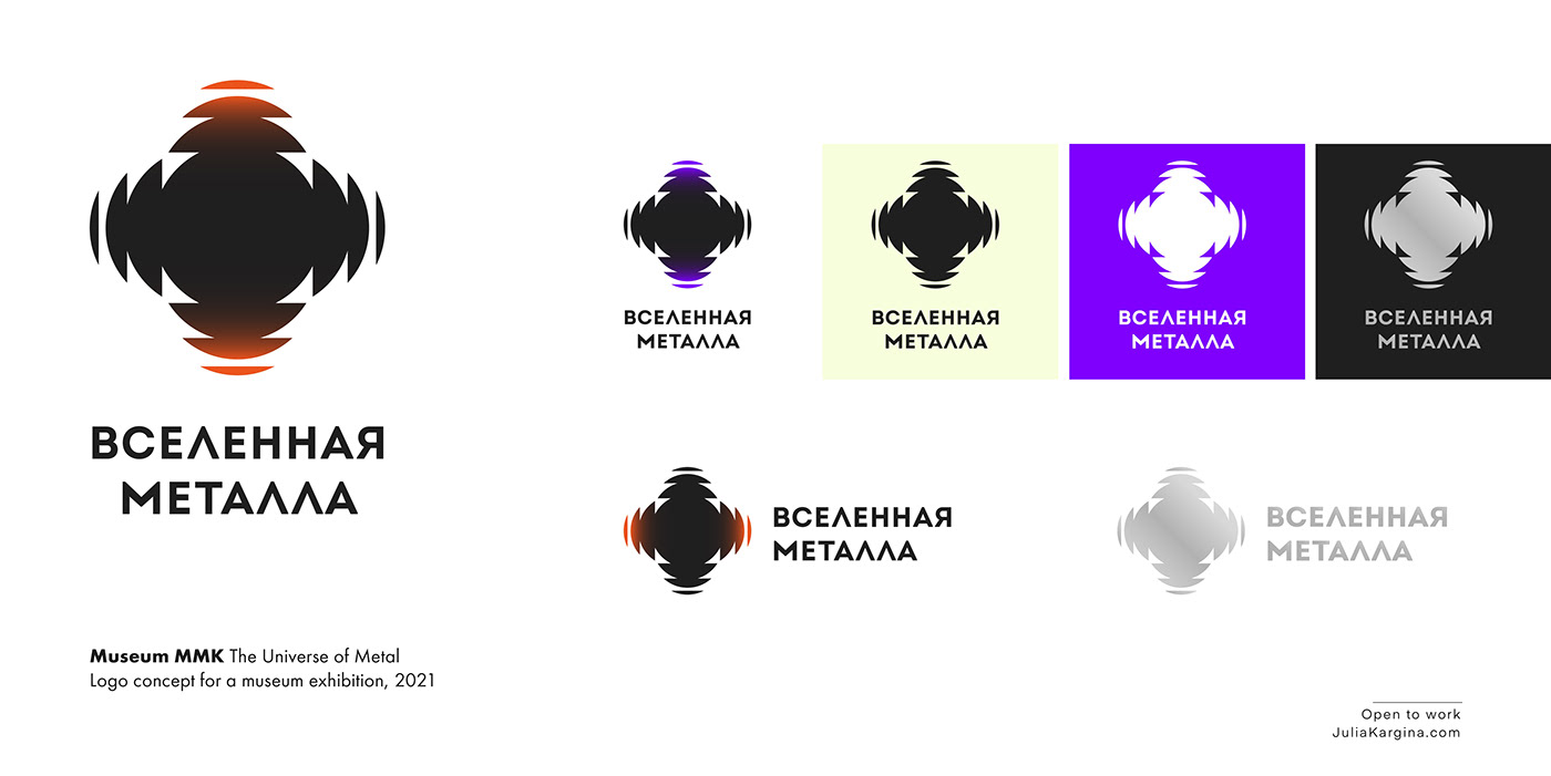
— Концепция логотипа для музея ММК. Экспозиция "Вселенная Металла", 2021
Образный ряд: металл, изготовление стали в доменных печах.
— Museum MMK, The Universe of Metal. Logo concept for the museum exhibition, 2021
Image — sign: metal, steel production in blast furnaces.
— TM JUDO Производство, поставка парфюмерных наборов (Гостиничный набор, Туристический набор, Набор для фитнеса). Концепция логотипа, цветовая система, 2021
— TM JUDO Production, supply of perfumery sets (Hotel set, Travel set, Fitness set). Conception of logo, color sistem, 2021

— Концепция логотипа. Ребрендинг ТМ ДЭТА Средства от насекомых (инсектициды и репелленты), 2018. ДЕТА – это бесцветная маслянистая жидкость с приятным запахом. Отпугивает и дезориентирует насекомых. Комары чувствуют запах этого вещества и активно избегают его. Содержит натуральные или синтетические вещества отталкивающего действия.
Концепция: АЭРОЗОЛЬ (спрей). В знаке изображен эффект направленного распыления, распределения вещества. В ассоциативном ряде, вы можете увидеть летающих насекомых; символ креста "против насекомых", а в белом, воздушном пространстве – очертание цветка.
— TM DETA Insect repellents, 2018. Logo concept (rebranding). Insect repellents (insecticides and repellents). DETA – colorless oily liquid with a pleasant smell. Repels and disorients insects. Mosquitoes smell the substance and actively avoid it. Contains natural or synthetic substances repellent action.
Сoncept of brand: AEROSOL (spray). The logo creates the effect of directional spraying, distribution of the substance. In the associative series, you can see flying insects; the symbol of the cross "against insects", and in the white, airy space, the outline of a flower.

Концепции логотипов (в студии, 2018)
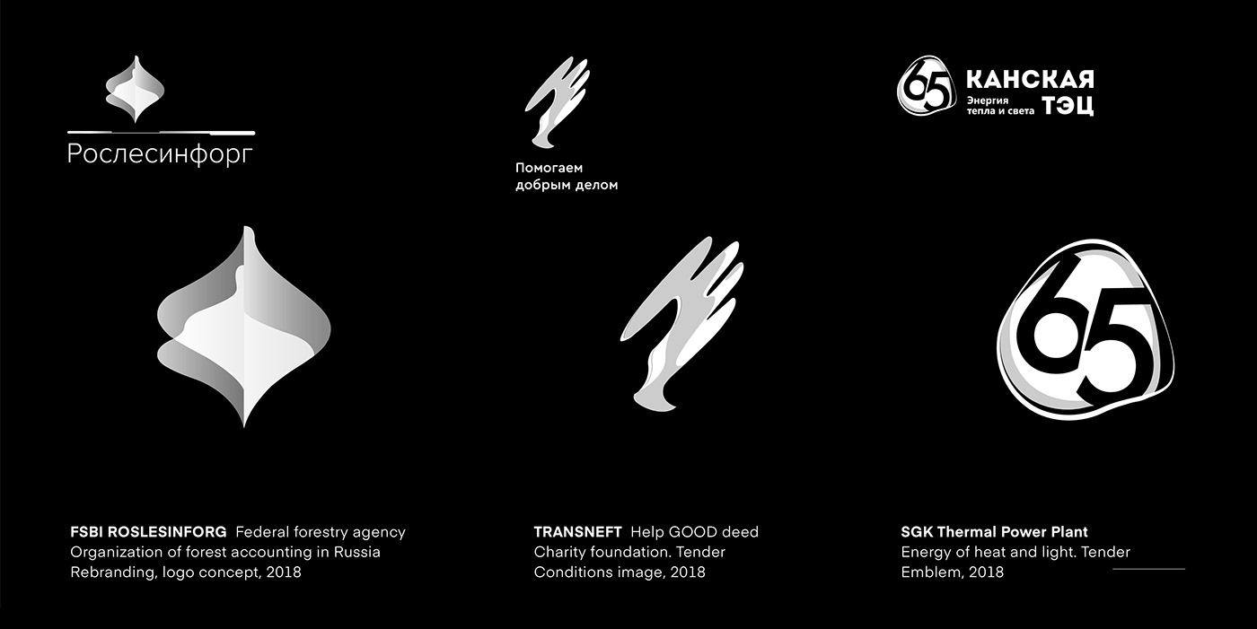
— 1. РосЛесИнфорг (Организация Лесоучета России). Федеральное агенство лесного хозяйства, "Навигатор в экосистеме". Концепция ребрендинга, 2018
— 2. ТрансНефть Концепция эмблемы мероприятия "Помогаем добрым делом" (Добро окрыляет). Тендер, 2018
— 3. СГК, Канская ТЭЦ Энергия Тепла и Света. Концепция юбилейной эмблемы, 2018

— AU
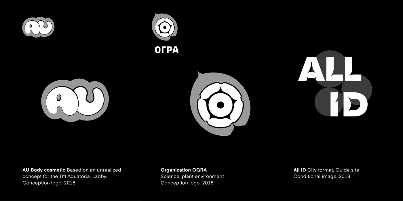

— Conditional image for the book, 2018
— Безнадежные живописцы, альбом. Символьное изображение для книги, 2018

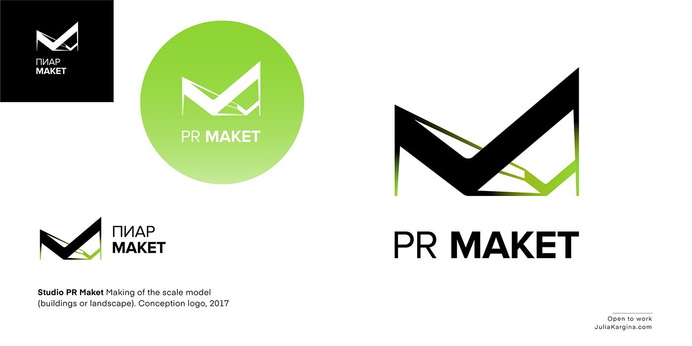
— Scale model, PR MAKET. Logo, 2017
1. We make scale models: Scaled-down copies og big ideas.
2. We are the starting point from which perspective begins.
3. We work whith people's attention and attract it.
— Мастерская по созданию моделей в Масштабе, PR-МАКЕТ. Логотип, 2017
1. Мы делаем масштабные модели: уменьшенные копии больших идей.
2. Мы являемся отправной точкой, с которой начинается проектная перспектива.
3. Мы работаем с вниманием людей и привлекаем его.

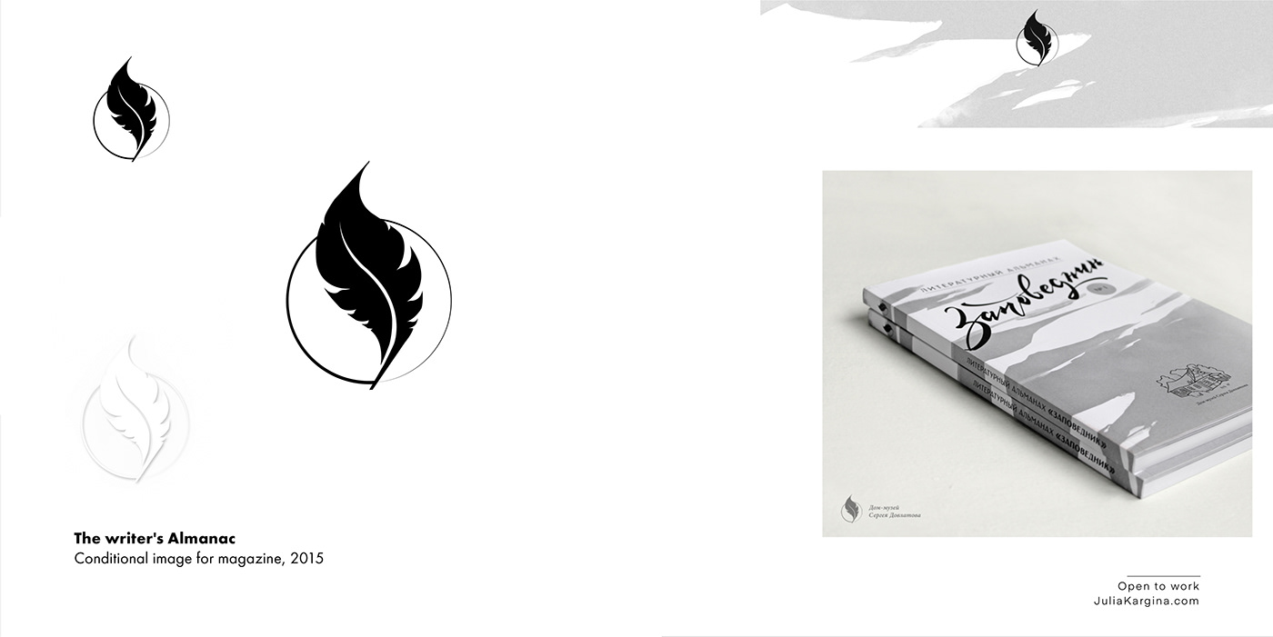
— The Writer's Almanac. Conditional image for the magazine, 2015
— Литературный Альманах. Символьное изображение для журнала, 2015
— AU Text
— AU Text
— AU Text
— AU Text
— AU Text
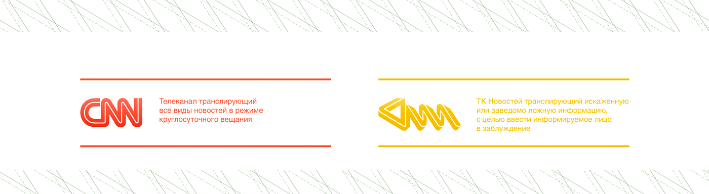
СNN | Деформация бренда, учебная концепция 2009
СNN | Defamation brand, learn conception 2009
The learning task. The creation of the "anti" sign to the selected brand.
RED SIGN. The brand conception: TV channel, broadcasting all kinds of news on a 24 hour broadcast. Analysis of image: The sign has three capital letters that are the name of the channel "CNN". The letter "C" has the image of an open sign that is associated with it, with the cable channel. Doubled and united the letters "NN" represent the rhythmic signal and the continuous transmission of information. The color red – the color of the call importance.
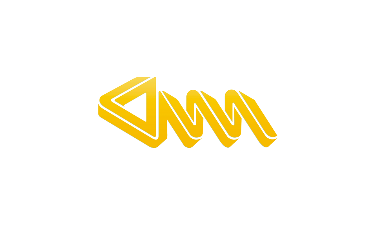
YELLOW SIGN. The brand conception (defamation brand): TV channel which broadcasts the distorted or false information, in order to introduce apprised a person astray. In the "defamation brand" was to save proportional of the sign-prototype and to leave three letters, with twice the graphical writing. In the creation of the sign, used the principle of "Impossible figure" (one of the types of optical illusions). The color yellow – the color of the "yellow press" specializing in the rumors, sensations (often imaginary), the scandals, the gossip. The work isn't propaganda.
soon...
an addition soon...


