
Background on edX: edX is an online learning collaboration between MIT, Harvard, and UC Berkeley, an open-source platform that puts interactive university classes online so that anyone in the world can enroll and take a class. I worked for a similar project at UC Berkeley that joined the edX organization in July 2012, thus several of my summer projects completely changed in July 2012.
A larger project that I worked on for edX was to investigate student interaction on the online education platform, where students were not face to face and could potentially be several continents apart. How could we augment the online learning experience through increased student interaction and participation around the content of the course?
A larger project that I worked on for edX was to investigate student interaction on the online education platform, where students were not face to face and could potentially be several continents apart. How could we augment the online learning experience through increased student interaction and participation around the content of the course?
The majority of this project involved early sketches and brainstorms, high-fidelity mockups, and a lot of front-end coding (haml and Sass) to create the interface design. Looking back, I should have paid more attention to user experience in addition to user interface design, and conducted more user research when doing this project, but the late start (late July when we joined edX) and rushed deadline (start of UC Berkeley's fall semester in mid-August), meant significantly less user research was conducted, and significantly more usability issues snuck into the design. This caused some UC Berkeley students, the first users of the platform (and my peers!), to be a bit upset until the next iteration of the discussion forums was deployed. Fortunately, the development and design team at edX and UC Berkeley worked well together to fix the problems of the first iteration, and by the time the online class went live (Sept 24), the discussion forums were significantly improved.
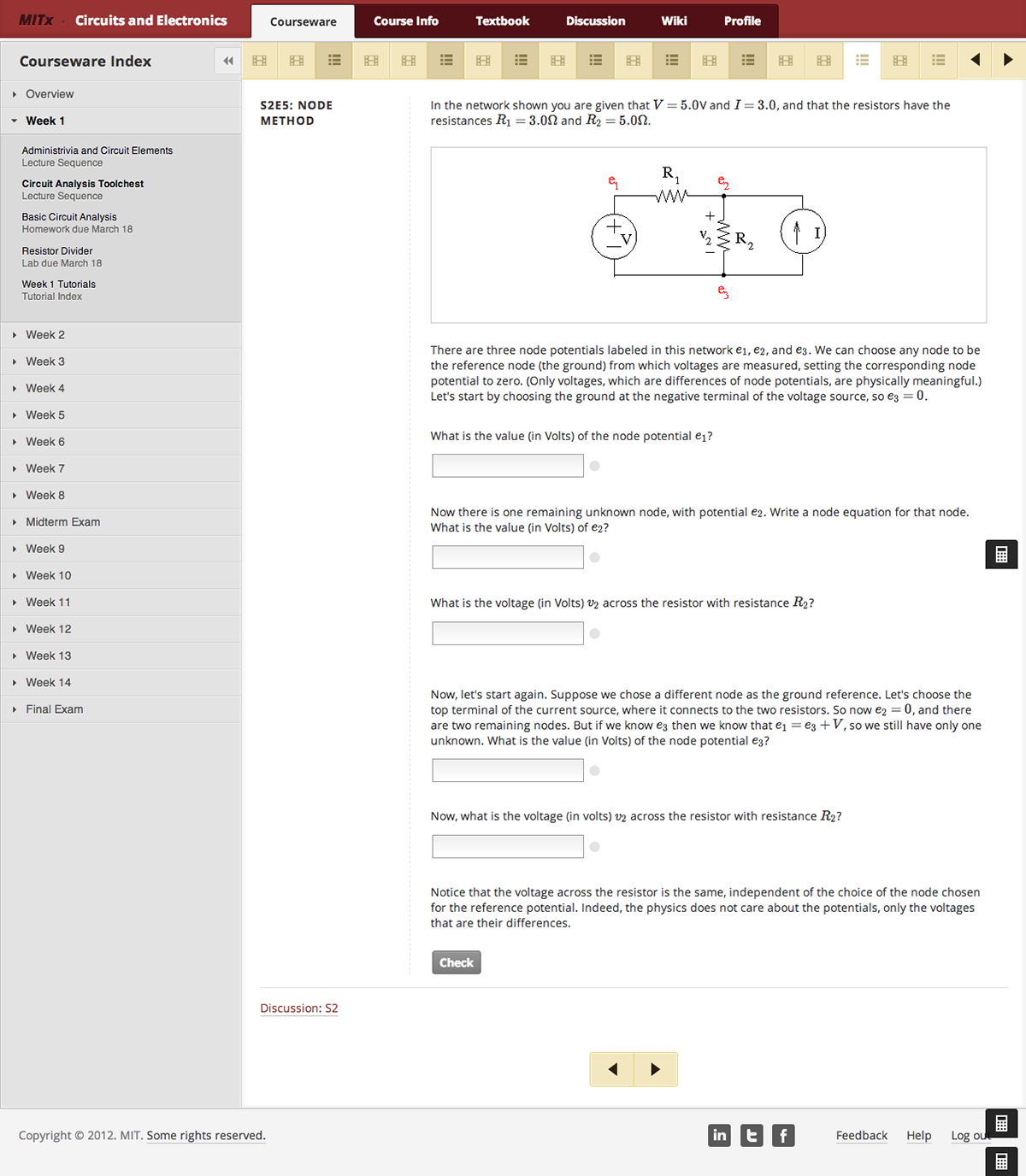
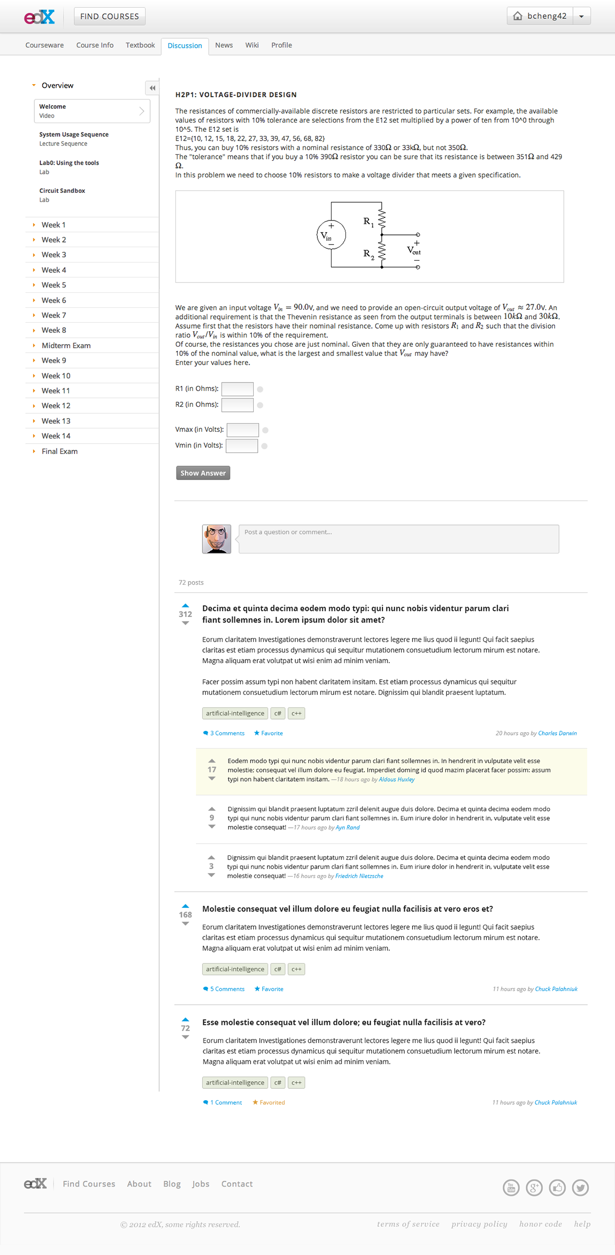
(Side note on edX course platform organization: edX courses are generally organized into several tabs. The two that are important for this project are Courseware and Discussion. Courseware pages are all the content for a course. For example, lecture videos, problem sets, interactive tutorials and labs, and projects, would all go in the courseware pages, which features a side navigation organized by week (see images below). The Discussion tab is a discussion forum that allows students to post comments and questions to be answered by peers and instructors.)
(Side note on edX course platform organization: edX courses are generally organized into several tabs. The two that are important for this project are Courseware and Discussion. Courseware pages are all the content for a course. For example, lecture videos, problem sets, interactive tutorials and labs, and projects, would all go in the courseware pages, which features a side navigation organized by week (see images below). The Discussion tab is a discussion forum that allows students to post comments and questions to be answered by peers and instructors.)
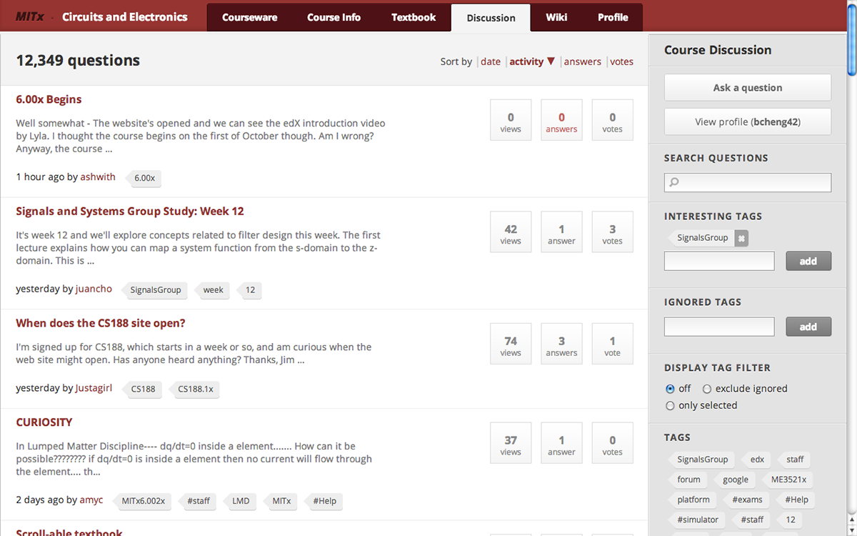
The existing MITx discussion forums from MITx (the first iteration of edX, Course 6.002x at MIT, Spring 2012), which was essentially a re-skinned Askbot service. It worked decently well, but we felt we could improve on the student interaction experience with a home-made system, which would allow us to also control the back end to better fit the course platform.
(In the existing MITx courseware) When viewing a lecture or homework problem on the courseware, there is a small link to the discussions about the problem at the bottom of the page, which would lead to a separate discussion page (see below).

(In the existing MITx courseware) Following the discussion link from a homework problem or lecture series would lead to this discussion page, sorted by tag on the specific homework problem or solution. While this format worked to an extent, as a student I thought this was less than ideal for a platform that is focused on courseware, and wanted to bring the discussions to the related course content.

An early mockup of a redesign using the old MITx layout, depicting a possibility for displaying the discussion immediately below a problem, so that students could interact and discuss in a content-focused way.
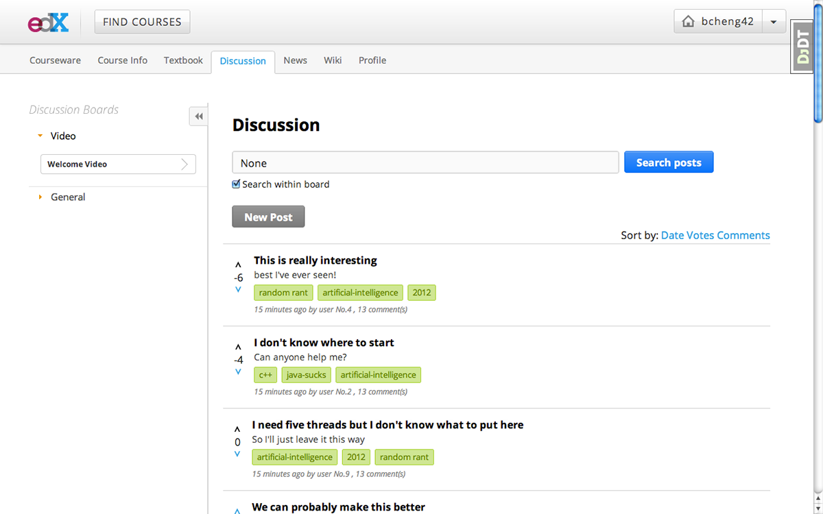
An early prototype, designed and built in front-end code (haml and Sass) to fit the new edX course platform. In this design the discussion forum is organized through "discussion boards" on the left side, which are organized by course content (lecture videos, homework sets, etc.)

More from the early prototype: Within the courseware, the discussion content shows up immediately below the course content (a lecture video in this screenshot), and students can create new posts and add to the discussion directly on the courseware page.
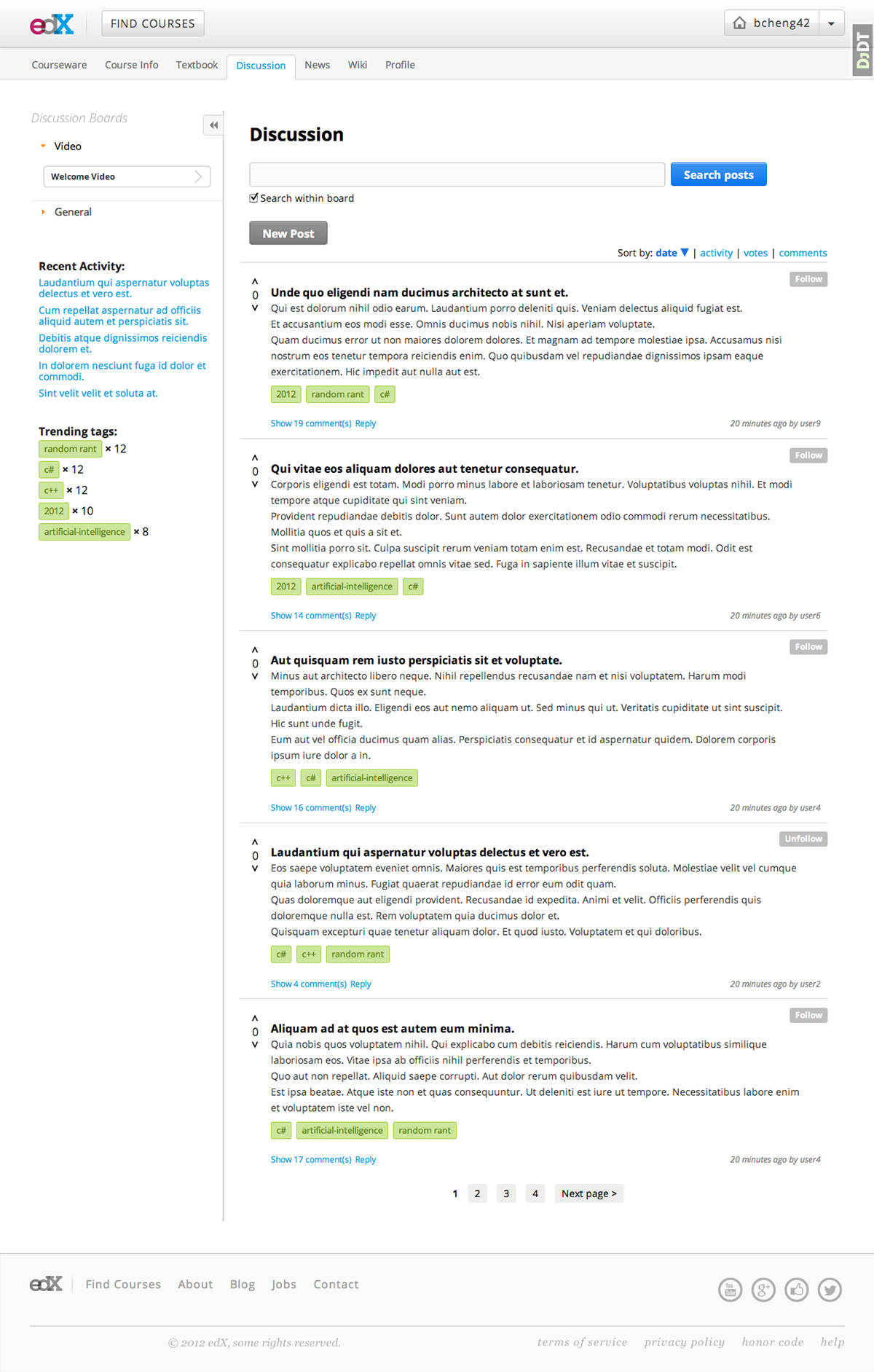
An improved prototype of the discussion forums, including pagination, sorting, nested commenting, and added navigation on the left that shows recent activity and trending tags. The navigation of forum design proved to be a very difficult usability and design challenge, as UC Berkeley students who were among the first users of the forum complained heavily about the difficulty of navigating through the discussion pages of the early iteration.
edX designer Tom Giannattasio and I brainstormed different ways to display the inline commenting (discussion comments that showed up below a lecture video or homework problem). Here is one where each page displays only one homework problem and all the discussion pertaining to that homework problem is displayed on the same page, immediately below the problem. Note also that instructor-endorsed comments are displayed as highlighted yellow.
Another idea that Tom and I discussed. If there were multiple homework problems on a page, should the discussion show up per problem in a discussion module? We did not prefer this idea because of the multiple levels of scrolling that would occur, but we recognized that this helped to conserve space and decrease clutter in the courseware pages.

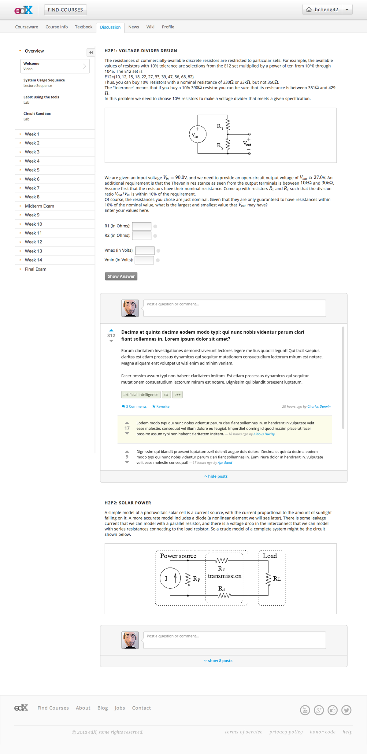
The latest iteration of the discussion forums, based on user feedback from UC Berkeley students in CS188, designed and built by Tom Giannattasio and Arjun Singh. The left navigation allows students to scroll through all the questions, choose one, and view it in the viewing pane on the right. Staff comments appear outlined in blue.
The latest iteration retains the early design decision to put discussions directly below related courseware, so that as students work on problem sets and projects, they can ask questions on the same page. The discussion below the courseware starts out hidden and is only expanded when the student clicks "show discussion," minimizing clutter while retaining ease of access to peer and instructor help.

What you'd see after clicking "show discussion." Every discussion thread can be expanded to view comments and replies, in an attempt to minimize clutter on the page.
What I Learned:
Online learning not only has very difficult pedagogical challenges, there are also very difficult technical and design challenges that go along with attempting to augment the learning experience online. UC Berkeley students (myself included) demand incredibly high quality when it comes to design and usability of the sites they use, and will gladly give negative feedback. When we choose to listen to this feedback, taking into account which design decisions are worth keeping and which should be thrown out, interfaces can be dramatically improved.
I also learned the difference between user interface and user experience design. Simply throwing Sass at something to make it look awesome is not good enough, even if I'm impressed by how much my front-end coding has improved. It is important to take into account usability issues, what students are looking for in a learning experience, and many other factors that contribute to the student user experience. Taking the time to do usability testing is worth it, because if the first group of users are the testers, and the product is a discussion forum, there are bound to be some ugly comments.
Though we've learned a lot through this project, by no means do I think we've optimized the student interaction experience. Online learning is a vast and confusing field, where much of what is being done is a bit of an experiment. There is still much to learn and much to innovate on in the realm of user experience in the online education world.


