


NUTRAMINO PROTEIN BAR RE-DESIGN
Nutramino is a danish sports nutrition brand for active men and women who focus on training and sculpturing their body – whether it is to be stronger, faster, leaner or bigger.
They have a passion for performance and sports nutrition which leads them to constantly raise the bar and only offer great quality and taste of their products.
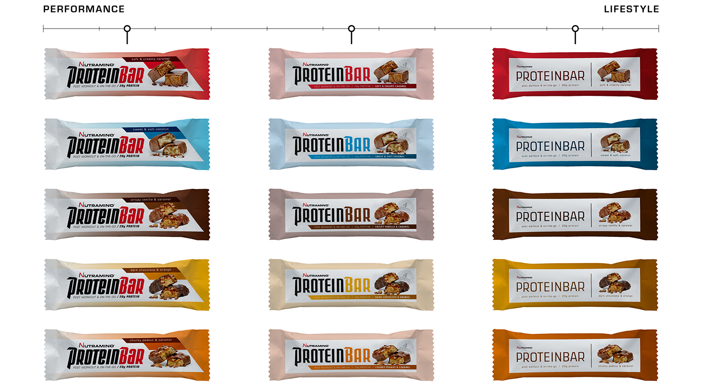
Nutramino is creating a new, smaller version of their protein bar and would like their design to have more of a lifestyle appeal. You can see the current design in the top image.
So I created different versions of each design to show how it could look with both performance, in-between and lifestyle appeal.
The logotype on most designs was created for this project by Allan Daastrup (OldTool)
The photos was shot by Morten Søby (SØBY's fotografi og film).
DESIGN 01
Bold use of bright colours – easy variant decoding.
Dividing the bar into two halves – nutrition left and taste right.

DESIGN 02
Playing with tone-in-tone prints and gradients.
The variant photo and name is placed sideways for easy decoding on shelf
(where the bars are often placed sideways).

DESIGN 04
Working with boxes – creating a fast look on performance and a simple on lifestyle.
Playing with gradients and using strong/weak colours.
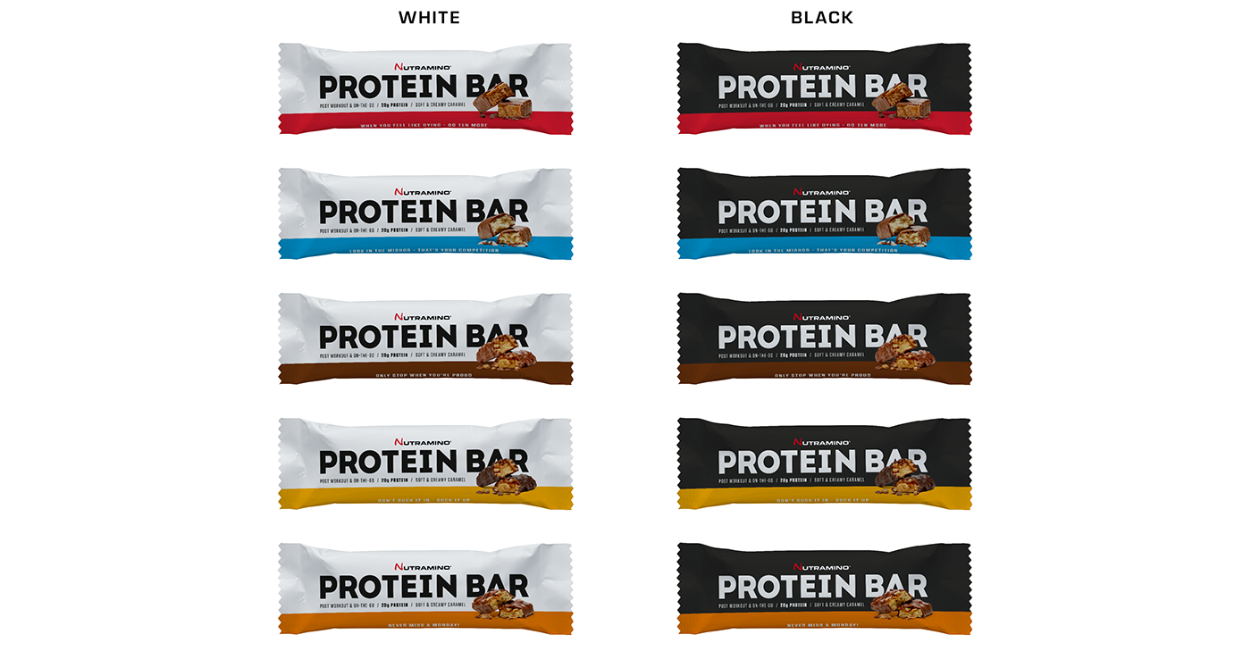
DESIGN 05
"Instagram" version with bold and triggering statements on the side.
The statements read:
WHEN YOU FEEL LIKE DYING – DO TEN MORE
LOOK IN THE MIRROR – THAT'S YOUR COMPETITION
ONLY STOP WHEN YOU ARE PROUD
DON'T SUCK IT IN – SUCK IT UP
NEVER MISS A MONDAY
THANK YOU


