PDX CyclingJerseys- Retro Style
Retro is allabout vintage and licensed imagery designed into fun & cool bicyclingjerseys and apparel for men & women. The inspirat
Retro is allabout vintage and licensed imagery designed into fun & cool bicyclingjerseys and apparel for men & women. The inspirat
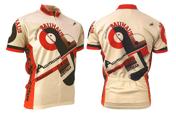
Art Deco Inspirations Abound
Aftermeeting with RETRO on their insights and branding objectives, the logo designbrief focused on Art Deco and vintage bicycling art, event posters and even eraarchitecture as a foundation for the Mark & first rounds of logo ideas.Vintage head badges, raised to a high art with imaginative themes and elaboratedesigns back in the day, also served as inspiration for logo exploration.
Aftermeeting with RETRO on their insights and branding objectives, the logo designbrief focused on Art Deco and vintage bicycling art, event posters and even eraarchitecture as a foundation for the Mark & first rounds of logo ideas.Vintage head badges, raised to a high art with imaginative themes and elaboratedesigns back in the day, also served as inspiration for logo exploration.
New Direction
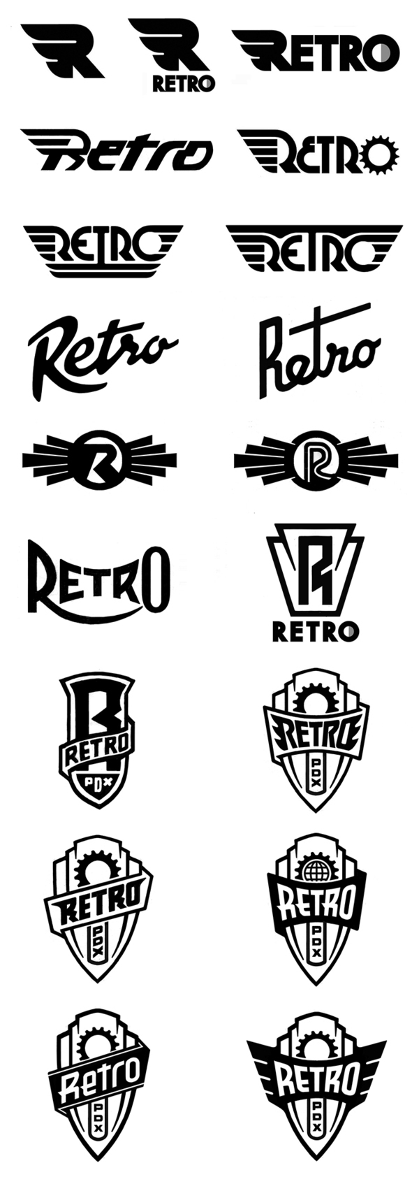
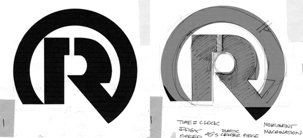
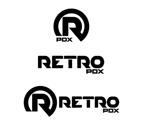
Looking through preliminary sketches from earlier rounds we stumbled back across this "R" that had been roughed out, but skipped over in the initial rounds, and it now really struck a chord with all of the group @ RETRO. We decided to pursue a new direction of explorations developing both this "R" icon and the logotype to go along with it. All of the objectives for the RETRO brand mark to achieve, and the emotional reactions to this "R" icon were identified and reviewed as additional direction for the next round of design development.
Looking through preliminary sketches from earlier rounds we stumbled back across this "R" that had been roughed out, but skipped over in the initial rounds, and it now really struck a chord with all of the group @ RETRO. We decided to pursue a new direction of explorations developing both this "R" icon and the logotype to go along with it. All of the objectives for the RETRO brand mark to achieve, and the emotional reactions to this "R" icon were identified and reviewed as additional direction for the next round of design development.
PDX Cred
"PDX" was introduced by us, as shown, in earlier rounds with a very distinct purpose. We presented the idea of doing the "PDX" as a lockup with the logo and logotype as a way to leverage the brand within the bicycling community, especially since RETRO was actively expanding into global markets. Dave was Creative Director for O'Neill Wetsuits and Sportswear in Santa Cruz, CA, and explained the reasoning to the idea as this; Santa Cruz is to surfing, what PDX is to bicycling. 'Nuff said!
The strength and stylization of the "R" icon demanded the use of a simpler font style for "RETRO" to be able to complement rather than compete. Even though simple, the logotype had to still be interesting enough to stand on it's own. We then tried to work the "R" from the icon into the "RETRO" logotype, and found that it worked well with the other letter forms as a consistent font. However, was using this "R" in the logotype too redundant when locked up with the "R" icon?
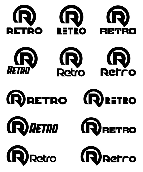
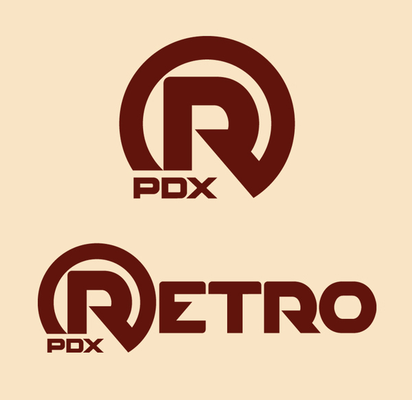
RETRO PDX Final Brand Mark and Lockup
Then we all talked about placing the "R" icon as the first letter in the whole name- not something we'd normally want to do in a logotype- but it worked really well. We've learned a long time ago that you never really know 'til you know...
Final art included the "R" icon with PDX lockup. Additional finessing of the letter forms with a radiused top that contrasts the sharp angles and echoes the feel of the "R" icon helped unify the letterforms as a font and added more uniqueness to the brand mark.
Super-stoked to partner with Roger & Gene @ RETRO on crafting their new brand mark. PDX ROX! Thanks again guys- time now to ride over and get that grilled gourmet Peanut Butter Thai Spice sandwich on 23rd! Oh yeah. Only in PDX...
Project Credits
Client: Retro Apparel
Design: Eric Ruffing (TRIGGERLABstudio) + Dave Parmley (Kustom Kult)
Production: Dave Parmley (Kustom Kult)


