


Yes, Joy
–
Brand development
Brand Statement
We are a passionate food blog/resource/party/club/caterer, that inspires, teaches and nourishes our audience. Food is fun, food is messy, food is art. Yes, Joy explores our love of food and is creative, entertaining, playful and a little bit cheeky. We make food with love, we over-excitedly write about food and we eat food with reckless abandon.
Yes, Joy celebrates what food can give us –
food is art
food is expression
food is nourishing
food is sexy
food is good looking
food is fun
food is entertaining
food is conversation
food is experimentation
food is creative
food is playful
food is the life of the party
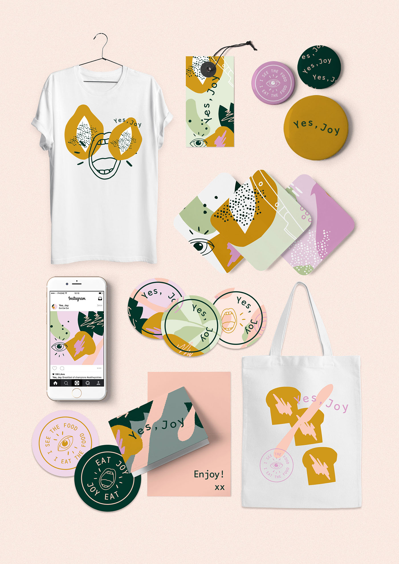
Why just one logo? ;)
Our brand is playful and creative, so why be limited to the way we visually explore our branding. We have a base style (fonts, icons, colours etc) which gives us consistency in communication and brand recognition, and then we get to have fun with it – unlimited layout options and we get to use them all!

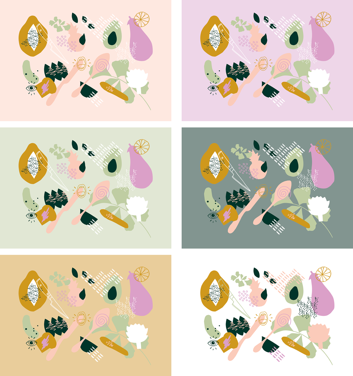
Colour Palette–
Our palette is a beautiful mix of colours that all evoke delicious food/lifestyle experiences. We have candy brights balanced with earthy tones – providing a good mix of ‘foodie’ colours –sweet, savoury, spicy, tart, bitter etc.

Food is art
Here we create a custom pattern that features abstract cutout cooking+food shapes – as well as our icons. The pattern has been simplified and created to feature the colour palette range. We incorporate items that are relevant to Yes, Joy e.g. bread, parsley/basil, cutlery etc. The pattern can be used as a whole or used as a base for creating multiple abstract visuals.

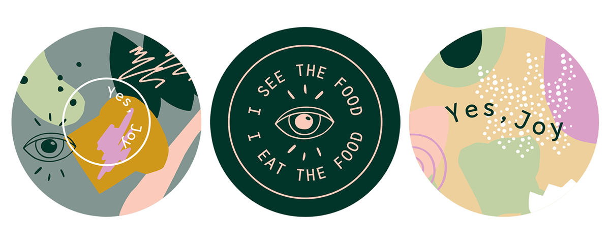
Taglines + Icons
Here we get playful with our range of creative taglines and icons. This featured selection is just an early range of ideas – we can have as many as we like!
Here we incorporate three icons to the Yes, Joy creative suite – a swirl, a mouth and an eye.
We have the opportunity to use these creative taglines either as a stand alone add on to our logo (e.g. just simple accompanying text underneath) or in a series of branded icons/stamps – pictured left.
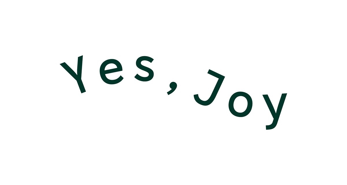
The font used is a monotype (typewriter/digital type style) called Grafista – it is a creative nod to both the typed word (our blog roots) and the digital age (online food ordering). It is a great complimentary font and works well with all of the wordmark options.


Creative exploration–


