


Logo
The logo communicates strength and reliability. Highly modular, built with elementary geometries is readable even at very small sizes.

Cover
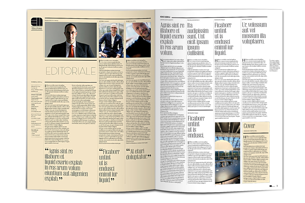
PROJECT: During 2011 ElicaNews has been completely renovated from an aesthetic point of view-graph. The format has been expanded (A3) giving a cut closer to the “magazine”. Starting from the cover, the policy is to interpret it differently every time the issue of the publication reflects a major theme of particular relevance in content. The layout has been redesigned to ensure greater coherence graphics, simplicity and readability of the sign. The result is to give a stronger identity and strength of expression, in line with the Group’s values.
DIMENSION: 29,7 X 42 cm (A3)
FONT: • Lyon Display / Regular (Kai Bernau) • Giorgio / medium regular (Christian Schwartz) • Verlag
Each cover is typographically interpreted in line with an internal argument at House Organ.
DIMENSION: 29,7 X 42 cm (A3)
FONT: • Lyon Display / Regular (Kai Bernau) • Giorgio / medium regular (Christian Schwartz) • Verlag
Each cover is typographically interpreted in line with an internal argument at House Organ.

EN1 /// BREAK WITH THE PAST ///

EN2 /// SENSORIAL ///

EN3 /// THREE-DIMENSIONAL ///

EN4 /// DESIGN ///

EN5 /// INFOGRAPHIC ///

EN6 /// EXCELLENCE ///

EN7 /// SYMMETRY ///

EN8 /// TEAM SPIRIT ///

EN9 /// RENEWAL ///

EN10 /// PERSEVERE, PERSEVERE, PERSEVERE ///

EN11 /// THE RISK REWARD ///

EN12 /// WORK TO TARGETS ///

EN13 /// AIM FOR THE IMPOSSIBLE ///

EN14 /// MANAGE PEOPLE BECAUSE THAT THEY CAN MANAGE THINGS ///

EN15 /// BREAK DOWN THE BUREAUCRATIC MENTALITY ///

EN16 ///INNOVATIVE THINKING///
Layout

© All rights reserved to Elica S.p.A.
Thanks for appreciating


