British Airways' redesign
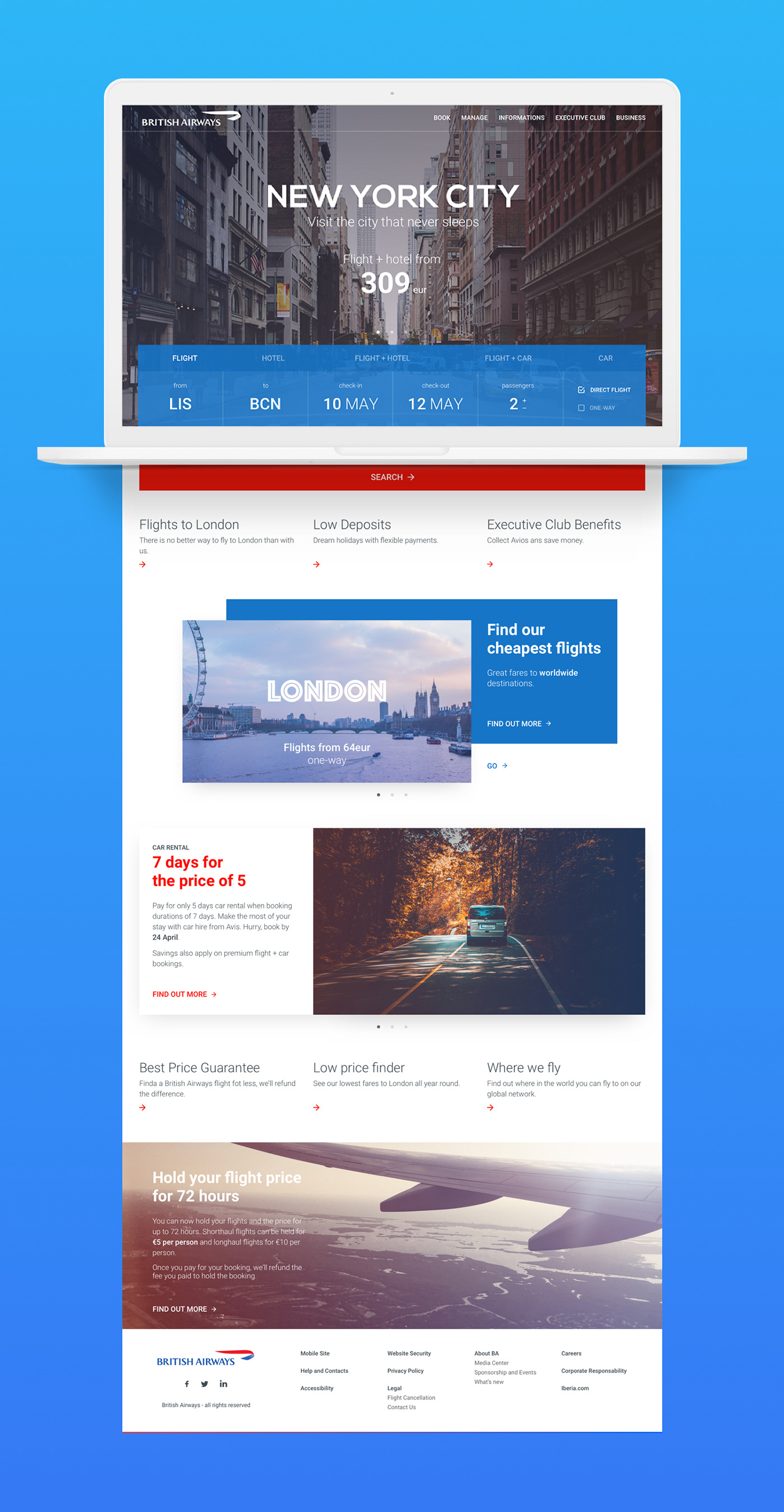
Concept I saw British Airways' website and thought it could look a lot better. It's confusing and unapproachable. British Airways deserves a better looking skin.
The ideia was to simplify all that information. We now have a first glance with good images, bold typography and information that matters.
Note The photographs used are from pexels.com and unsplash.com
JM Graphic and Web Designer © 2017


