MT-Trans
Corporate identity for a young company which specializes in renting buses and transport services.At the first meeting the customer defined his idea. He needed a pure logo without grading and effects. We were talking only about simple signs ( the sketch below)

During the next meetings the customer changed his mind and suggested different directon of our work. That’s how rised horse, Pegasus theme.

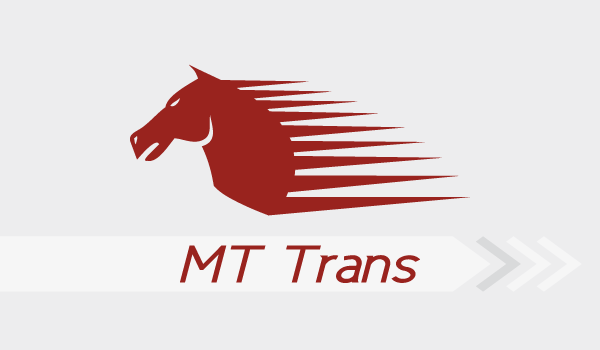
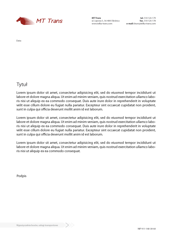
At this stage I suggested a combination of both visions. I’ve simplified the project by removing wings and adding mane. Through that the logo became more dynamic and it refers to company’s profile. Below I present result of the work.


Thank you for watching!
If you like it, please push the "Appreciate" button.
If you like it, please push the "Appreciate" button.

