Type Design (Devanagari Script)
Graduation project
Graduation project
The proposed project was undertaken under the guidance of Prof. Mahendra Patel. A Type Design Development in the Devanagari script based on the famous historical type design ‘Univers’ designed in 1957 by Adrian Frutiger.
This project offered me a great scope for learning mainly the details that undergo in making a typeface.
Time was a big deceiving factor. In the beginning it seemed sufficient enough to achieve the set target but I soon realized the complexity and numerous possibilities towards refinement, which just seemed endless.
I chalked out a working system which could help me understand my objectives as well as give me key directions to carry out the tasks on hand.
Most of the type designs are done for a specific use or project, this one was planned to create digitally outlined fonts with family of weights for general use. I completed the normal in weight and will now be taking it forward to build it for other weights.

Typography, like language is more important to me for what it perceives to be than for anything it accomplishes on its own.
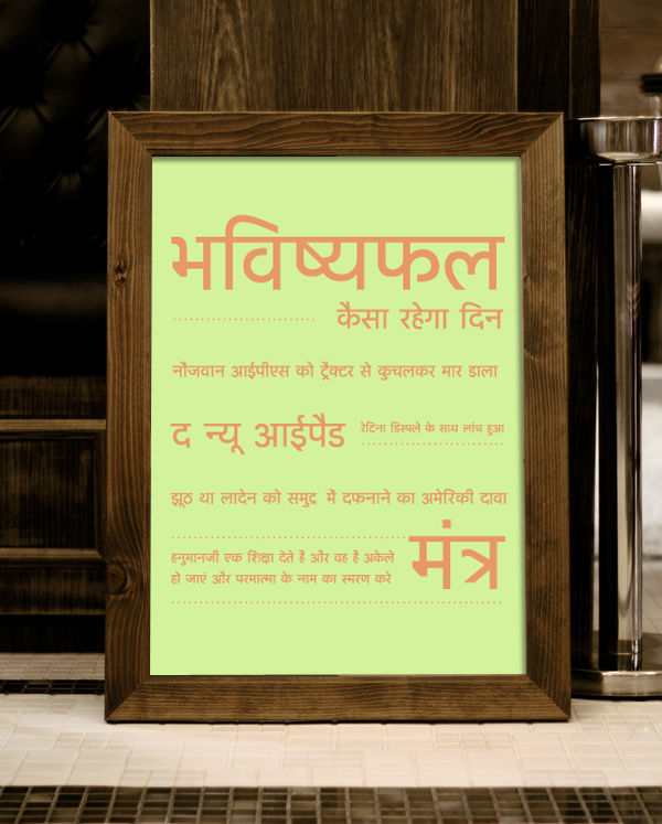
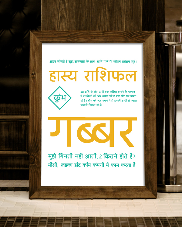


I chalked out a working system which could help me understand my objectives as well as give me
key directions to carry out the tasks at hand.
key directions to carry out the tasks at hand.
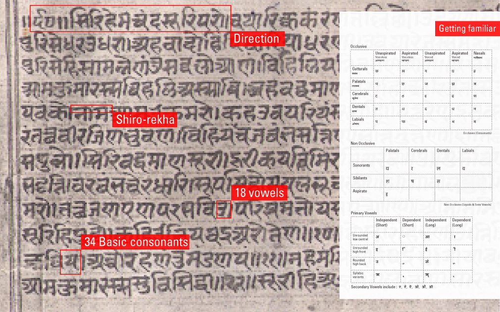
One of the most widely used script of India is the Devanagari script. A script which allows writing in over more than 25 languages some of which are Hindi, Marathi, Nepali & Sanskrit. Devanagari originated from the Brahmi script.
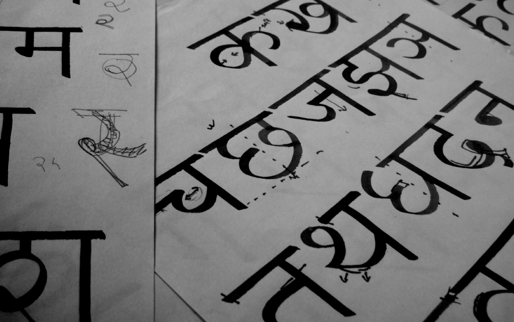
Study of Devanagari letter forms: Practicing with the original tool ‘Reed’
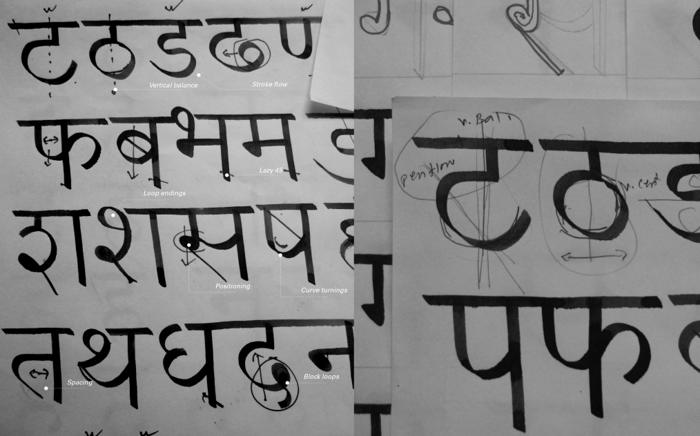
I started with all the basic consonants at first which helped me understand the basic structure and got me sensitive
towards the characteristics of each of the individual letter forms.
towards the characteristics of each of the individual letter forms.
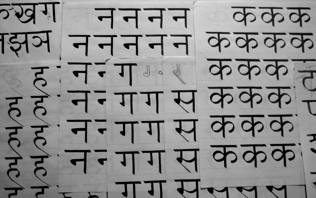
I was down with about 30 sheets to now realize that I had finally started to some what achieve the basic structure, started judging the letters on the basis of aspects like stroke of the pen, spacing, proportions, joints & endings etc.

Anatomy of the Devanagari Script
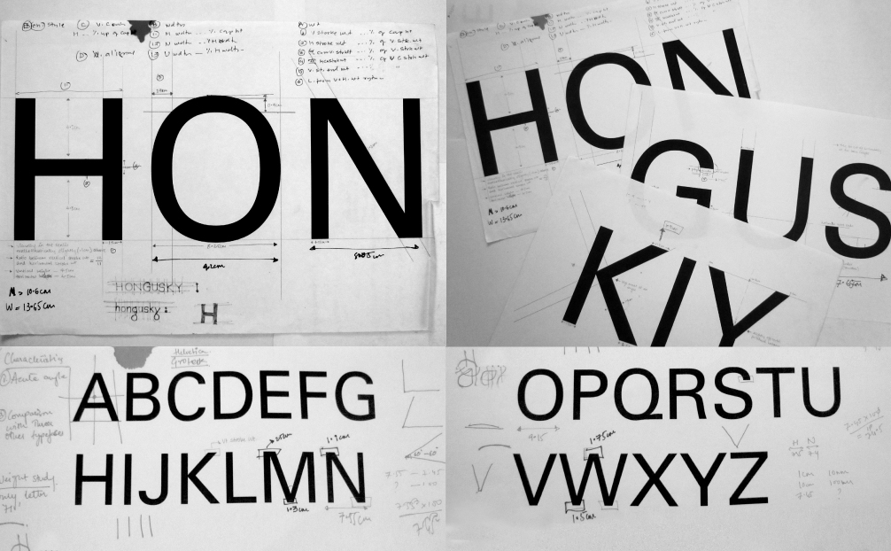
I had to simultaneously dig into details involved in analyzing the base design type - Univers : designed by Adrian Frutiger in 1956 which was released by the Deberny & Peignot type foundry in 1957.
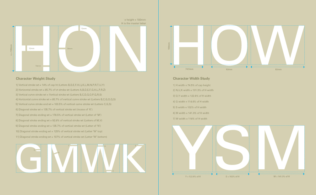
The analysis of Univers. Scrutinizing through the method of hongusky.
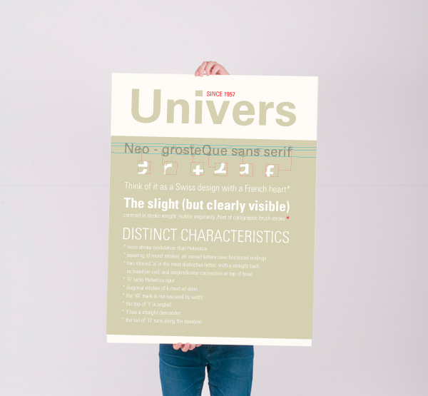
A poster depicting the distinct characteristics of the typeface Univers
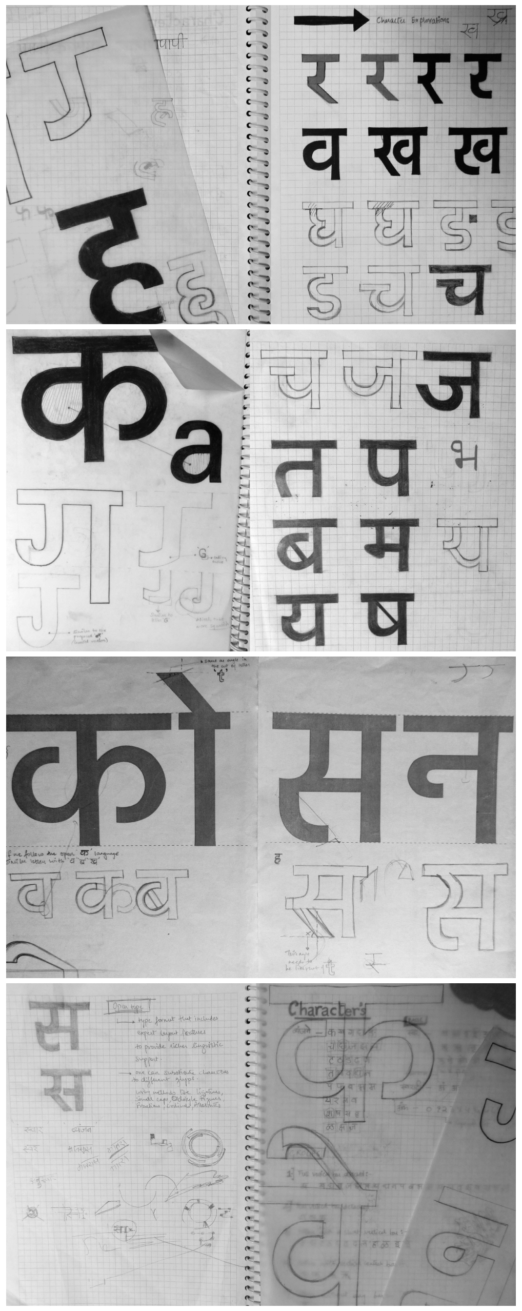
Learning and exploring the basics of type design with a few representative letters. Taking inspiration from structures studied from existing Devanagari typefaces such as Mangal, Kruti Dev, Pitara and Fedra, I began experimenting with different approaches of stroke weights, curve endings, joints, loops etc.
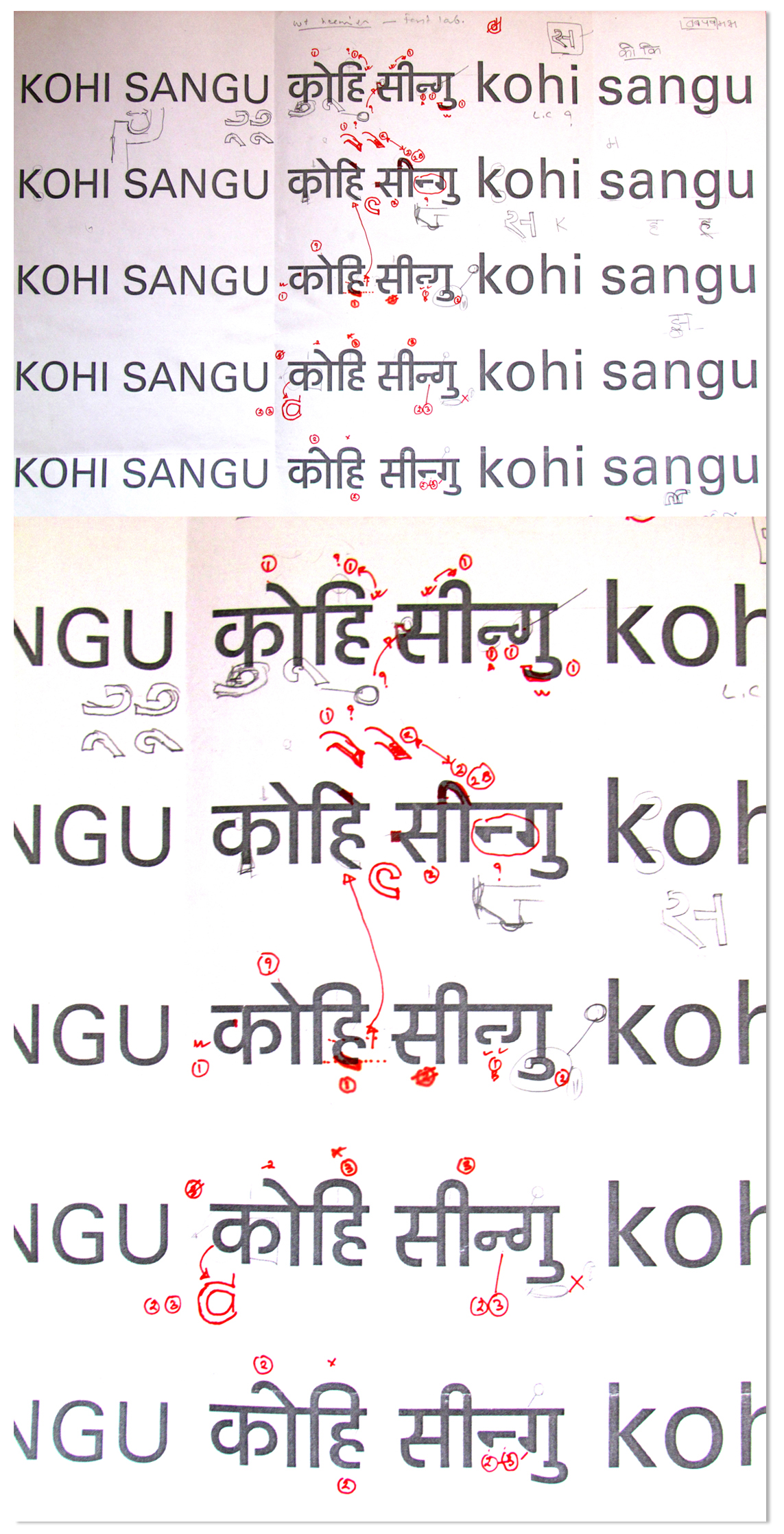
Forming various systems : To come to a set conclusion with the explorations
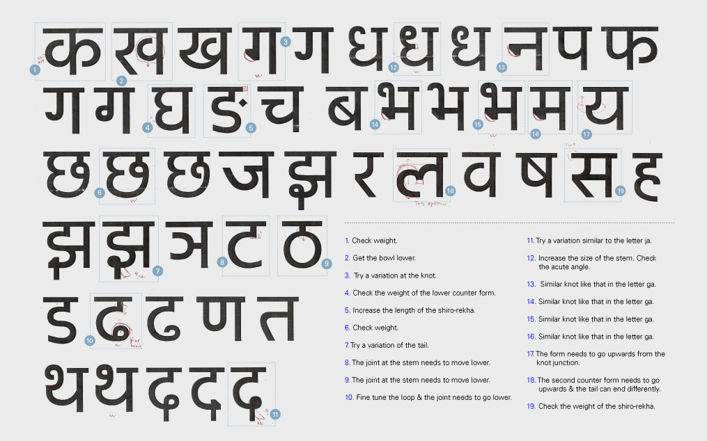
An in depth analysis and construction of all the basic consonants, vowels, matras and swaras.
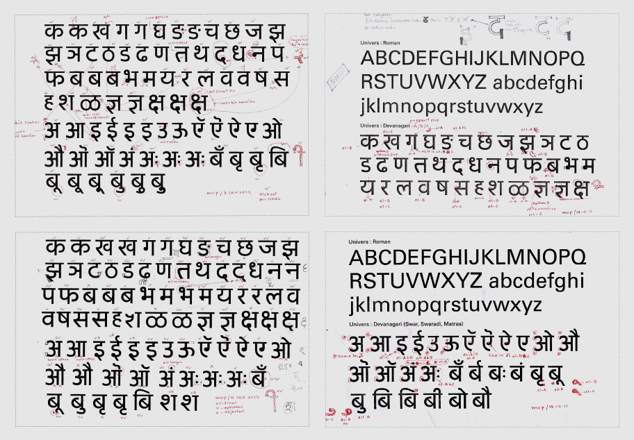
Drawing comparisons with the base design
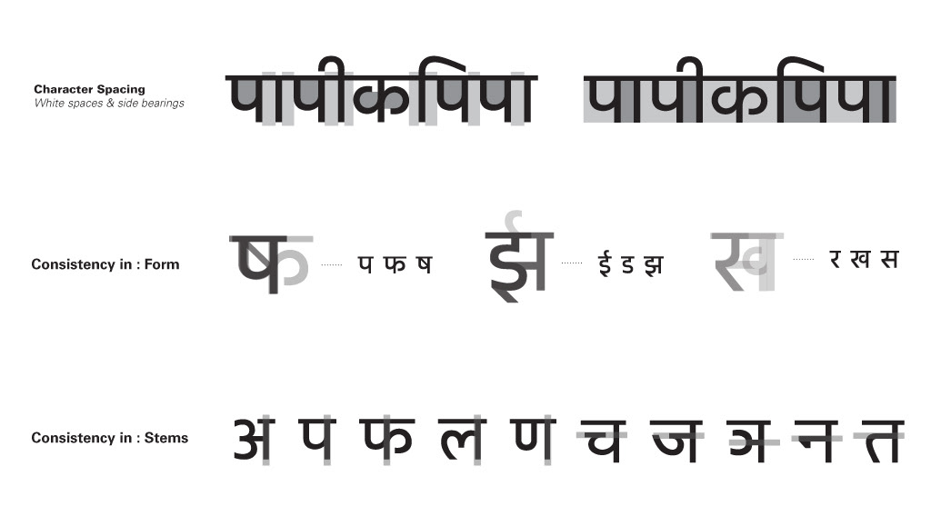
Character spacing and consistency in design: Fulfilling two important prerequisites of
typeface design: Legibility and Readability.
typeface design: Legibility and Readability.
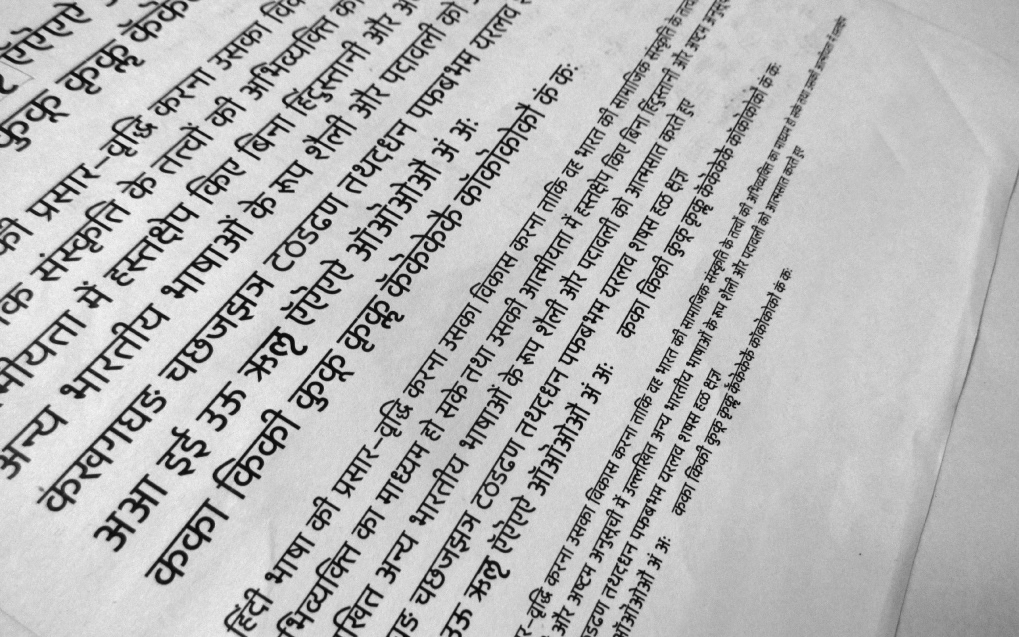
Text Trials & User Testing : Using proposed design to bring out its effectiveness.

Sample text in point sizes 30, 24, 18, 14, 12, 10, 8 and 6 to understand the readability & legibility while scaling.
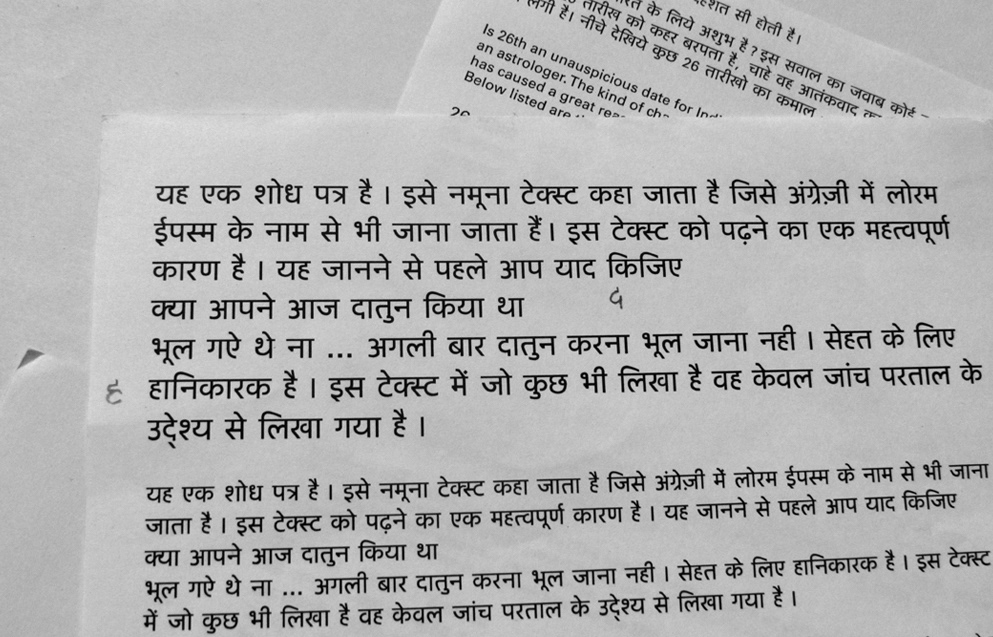
Validation through the process of user testing. User's : Designer's, Students, Local Hindi speaking & reading people.
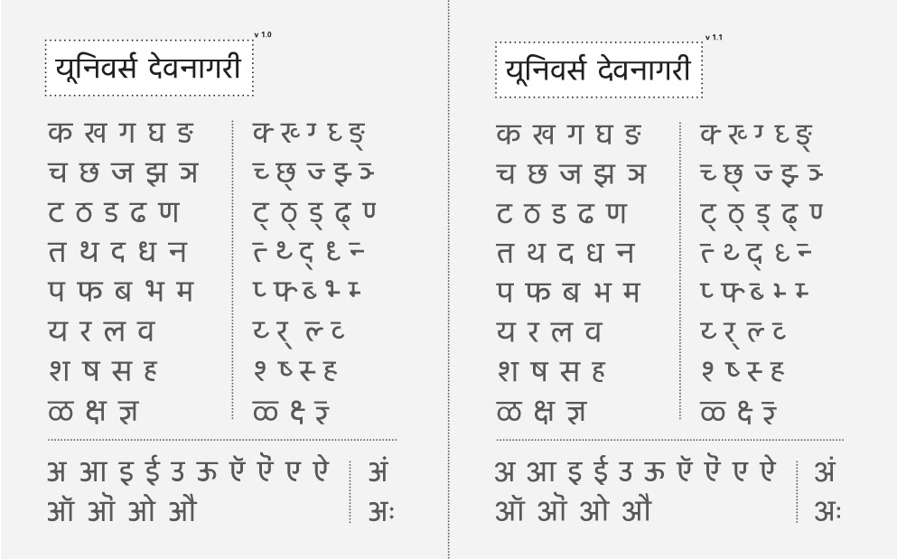
Detailing feedback : Two versions were created to compare the alternatives proposed.
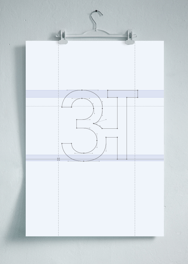
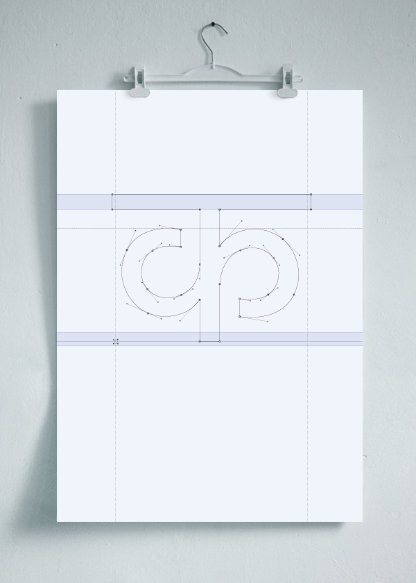
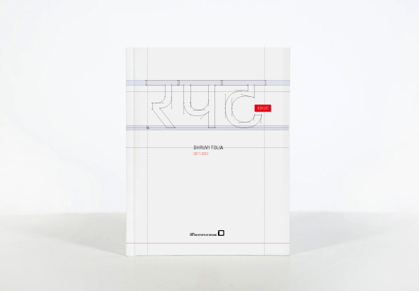
A detailed documentation of the entire process and methodology is available for reference.
Click the link below to view the documentation.
Click the link below to view the documentation.


