+ RE:BRANDING TORONTO HIGHSCHOOLS
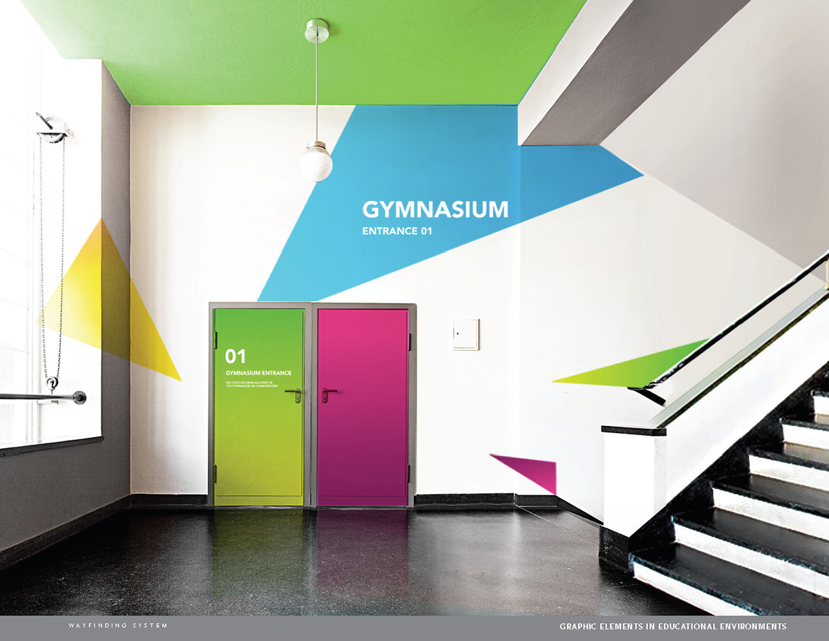
Research and design project that investigates how design can improve student’s quality of life in highschools. Not just in terms of the built environment, but also through effective communications and school’s powerful sense of identity. Well designed environments and communications in highschools will have a positive
affect on everyday lives and will be a major investment in productivity, efficiency and well-being of the
students and staff.
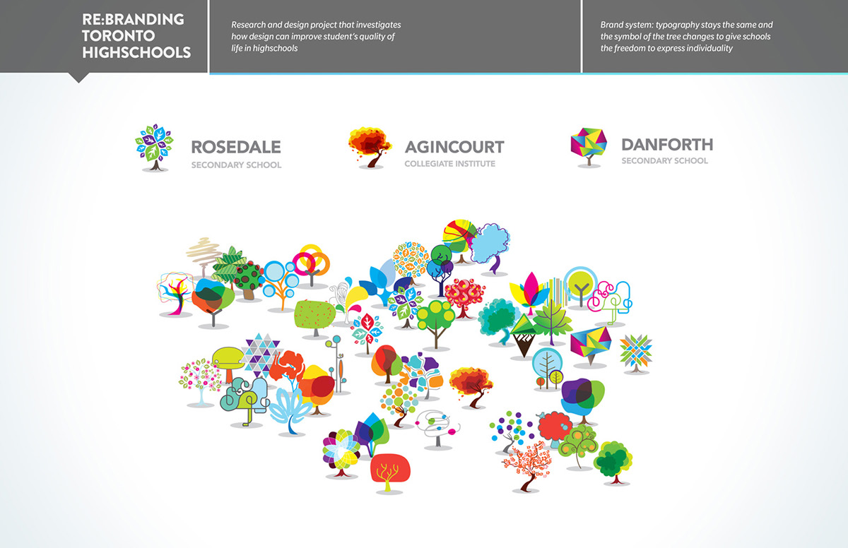
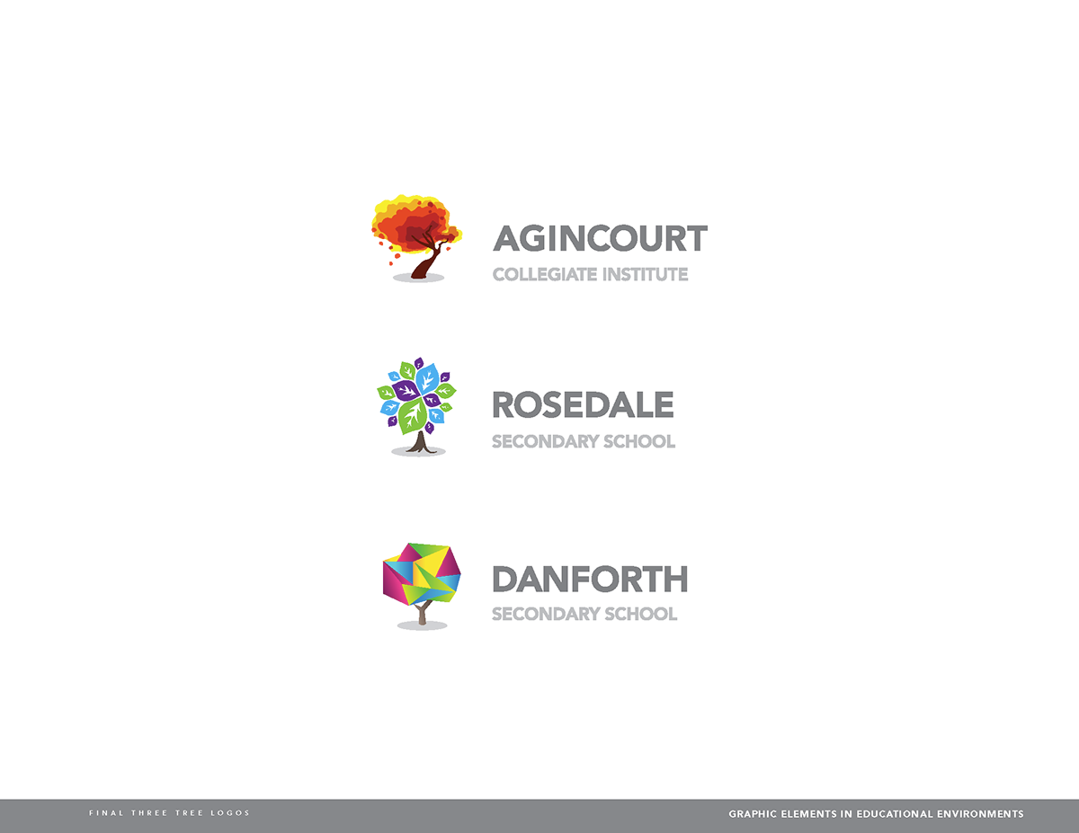
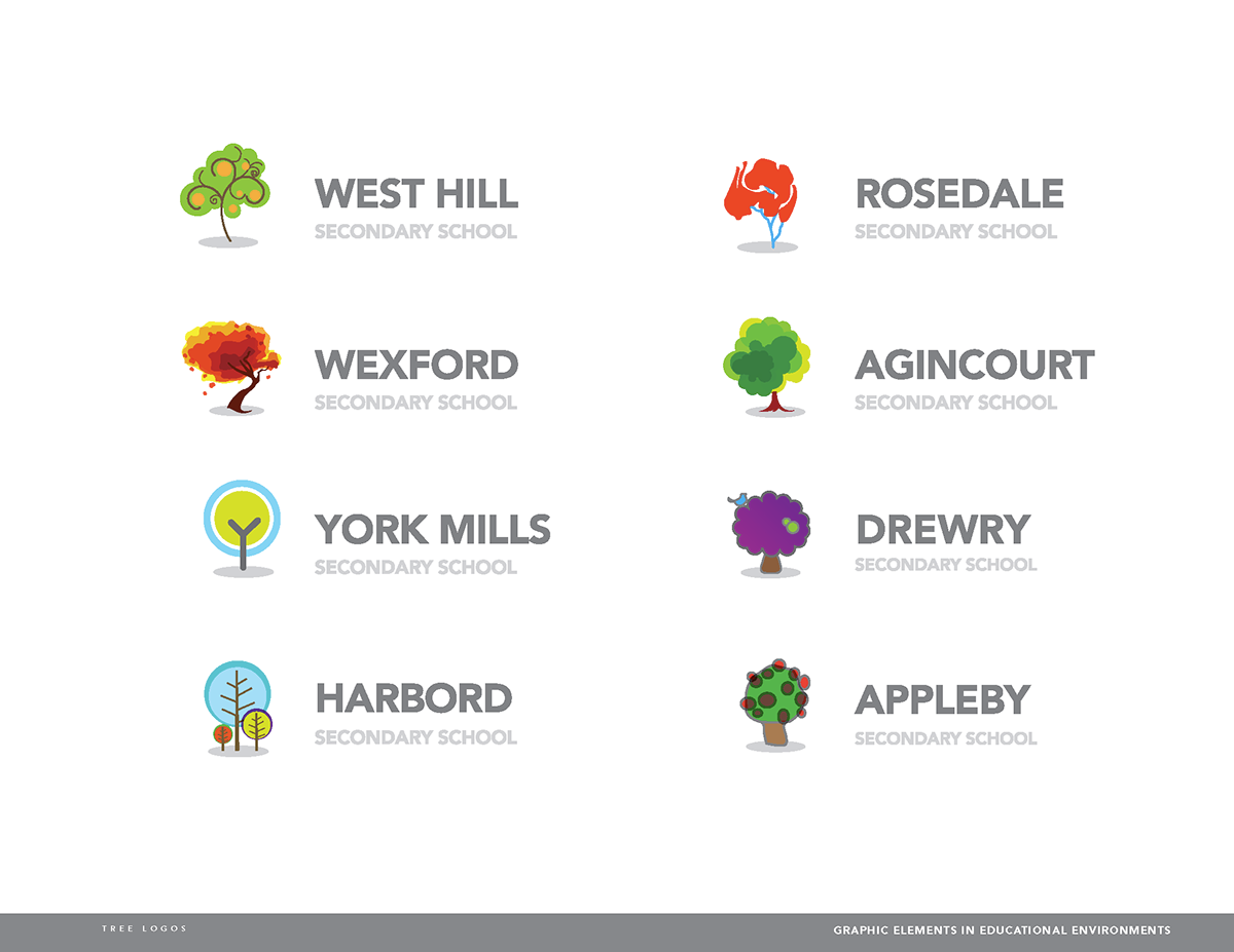
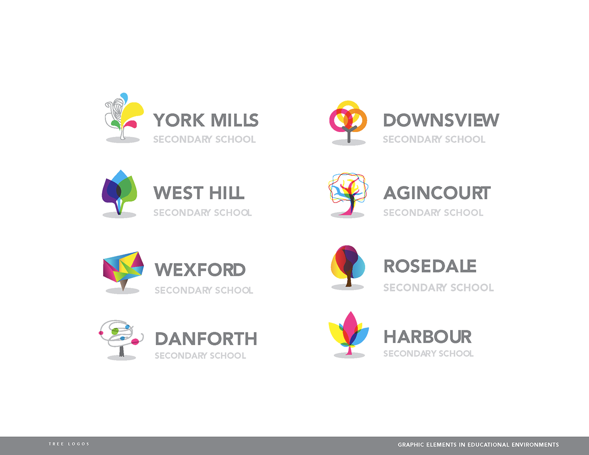
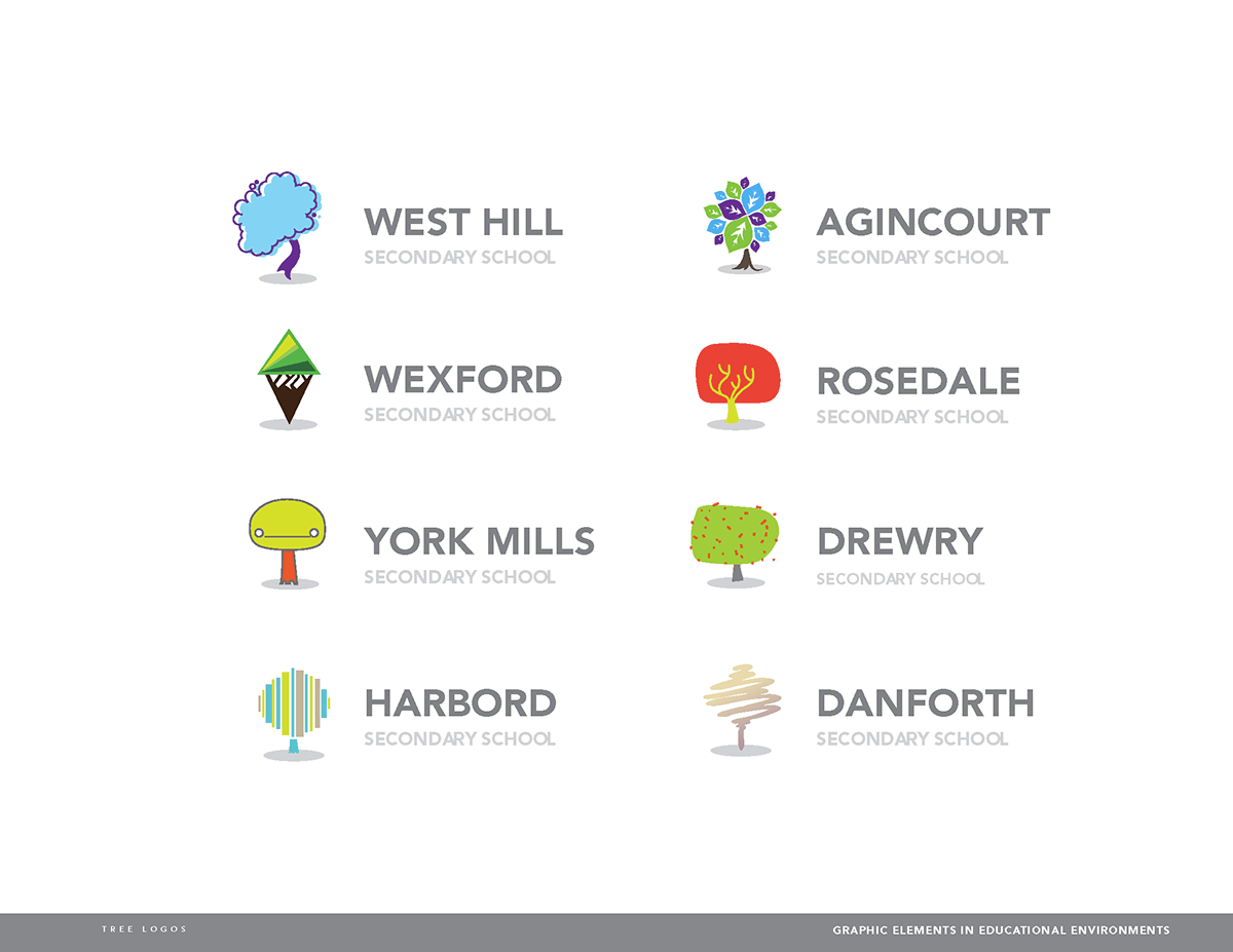
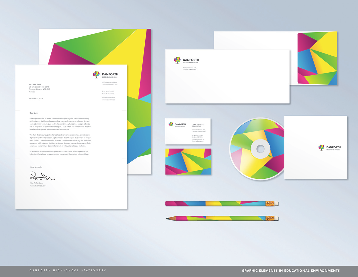
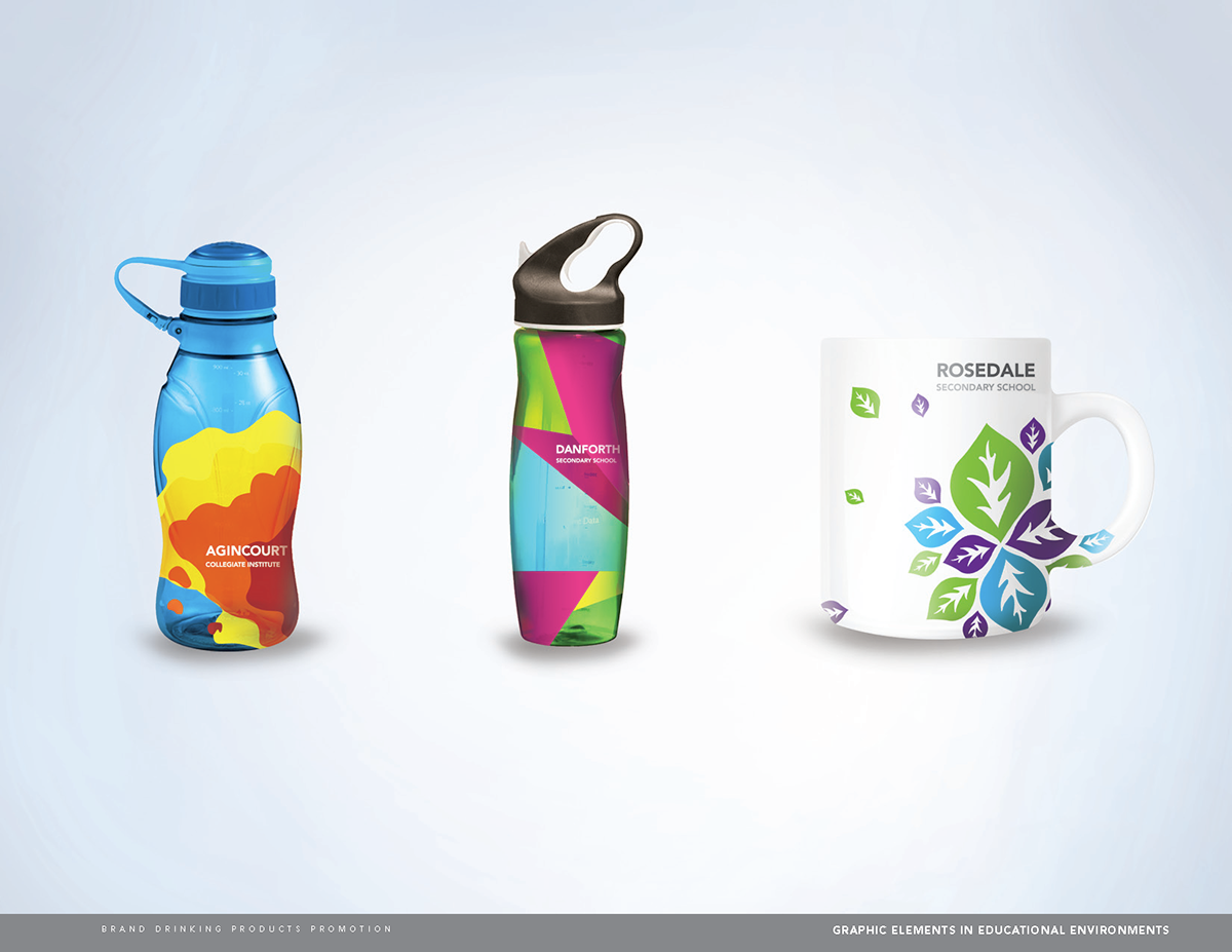
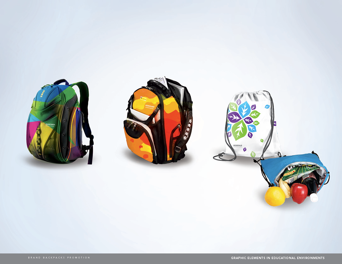
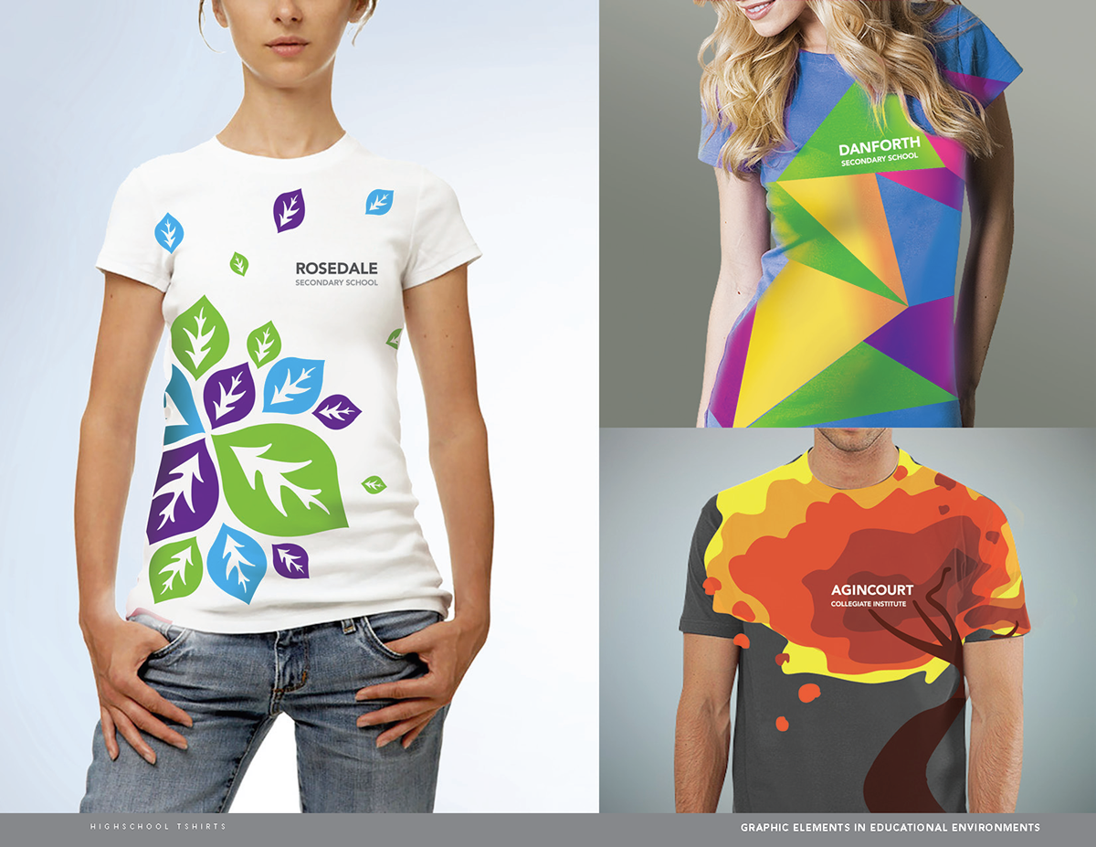
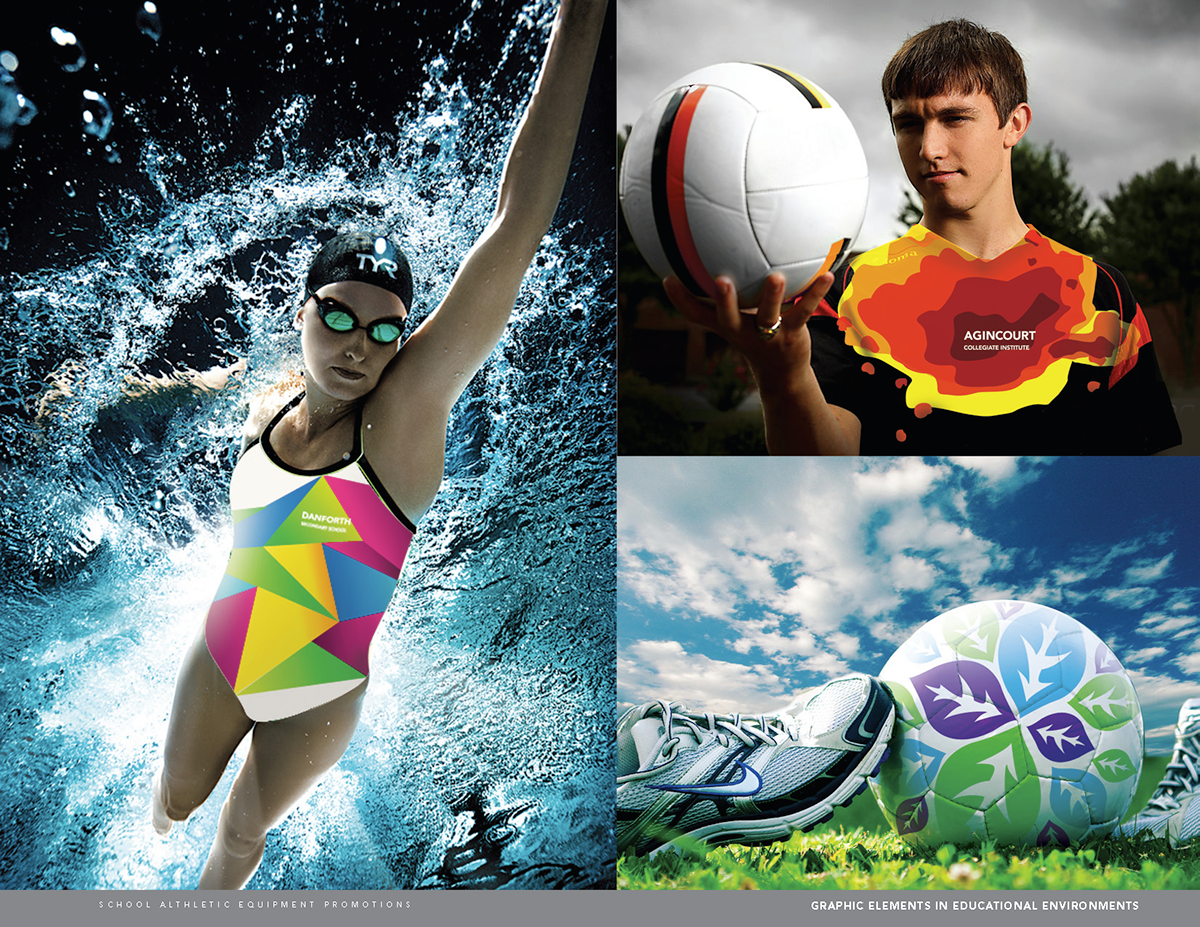
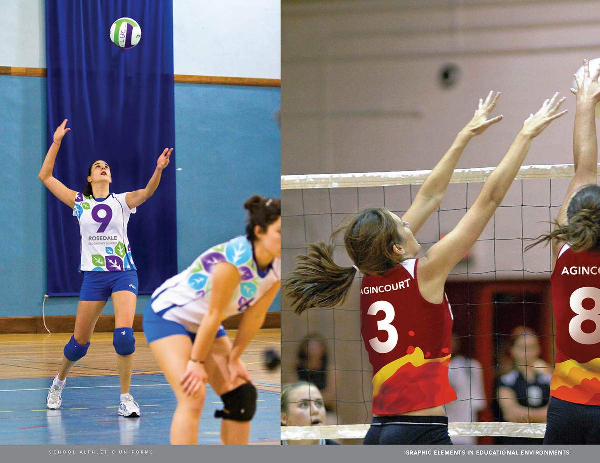
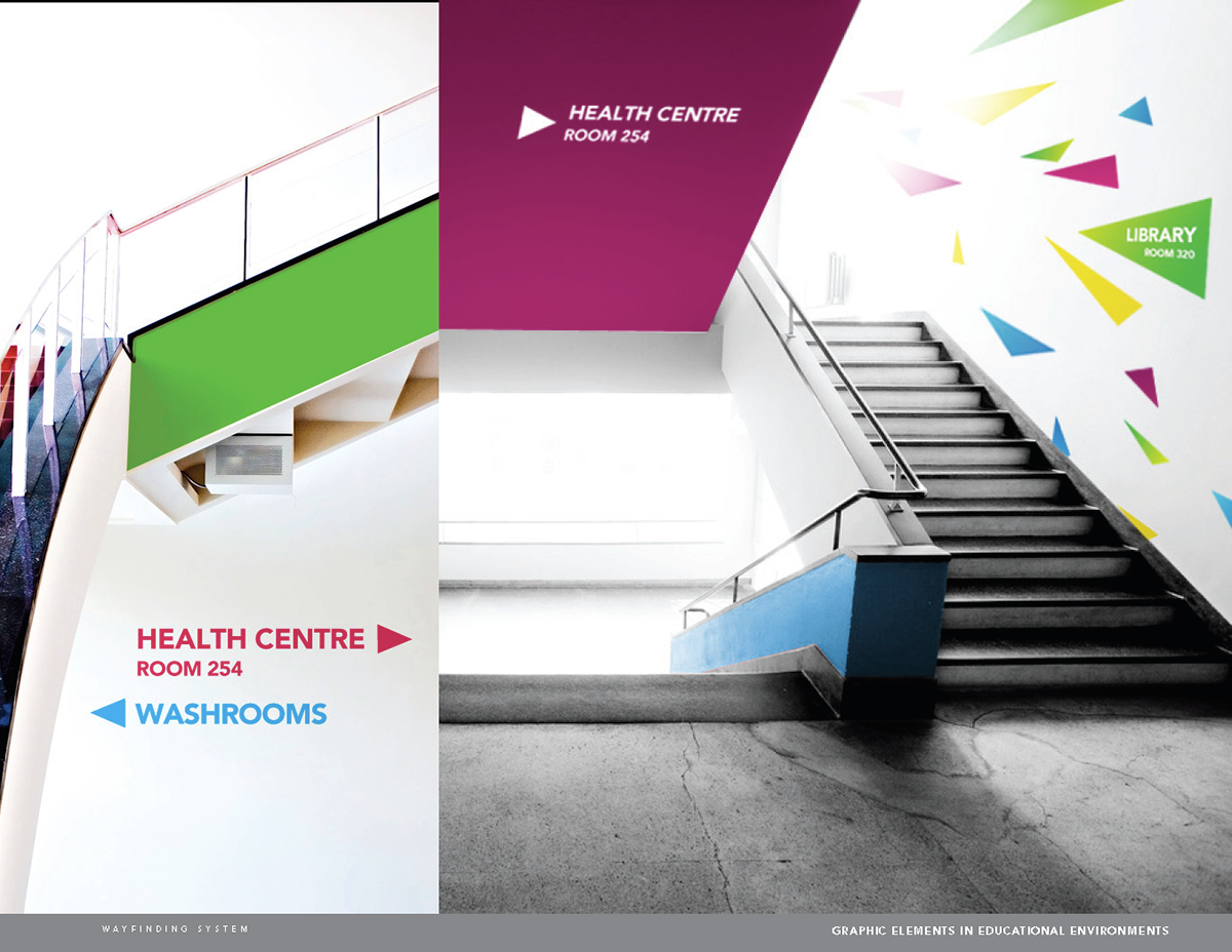
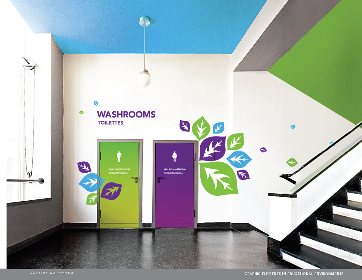
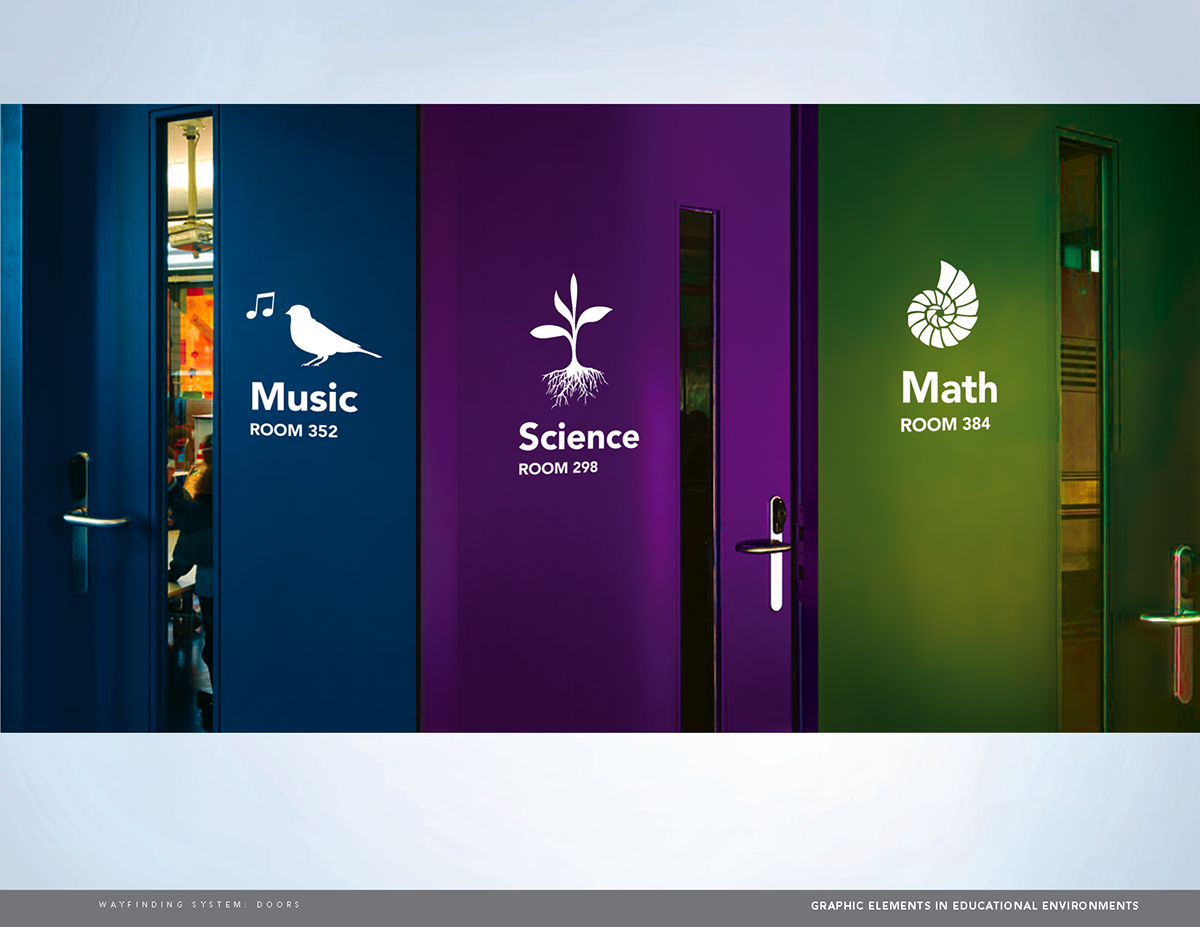
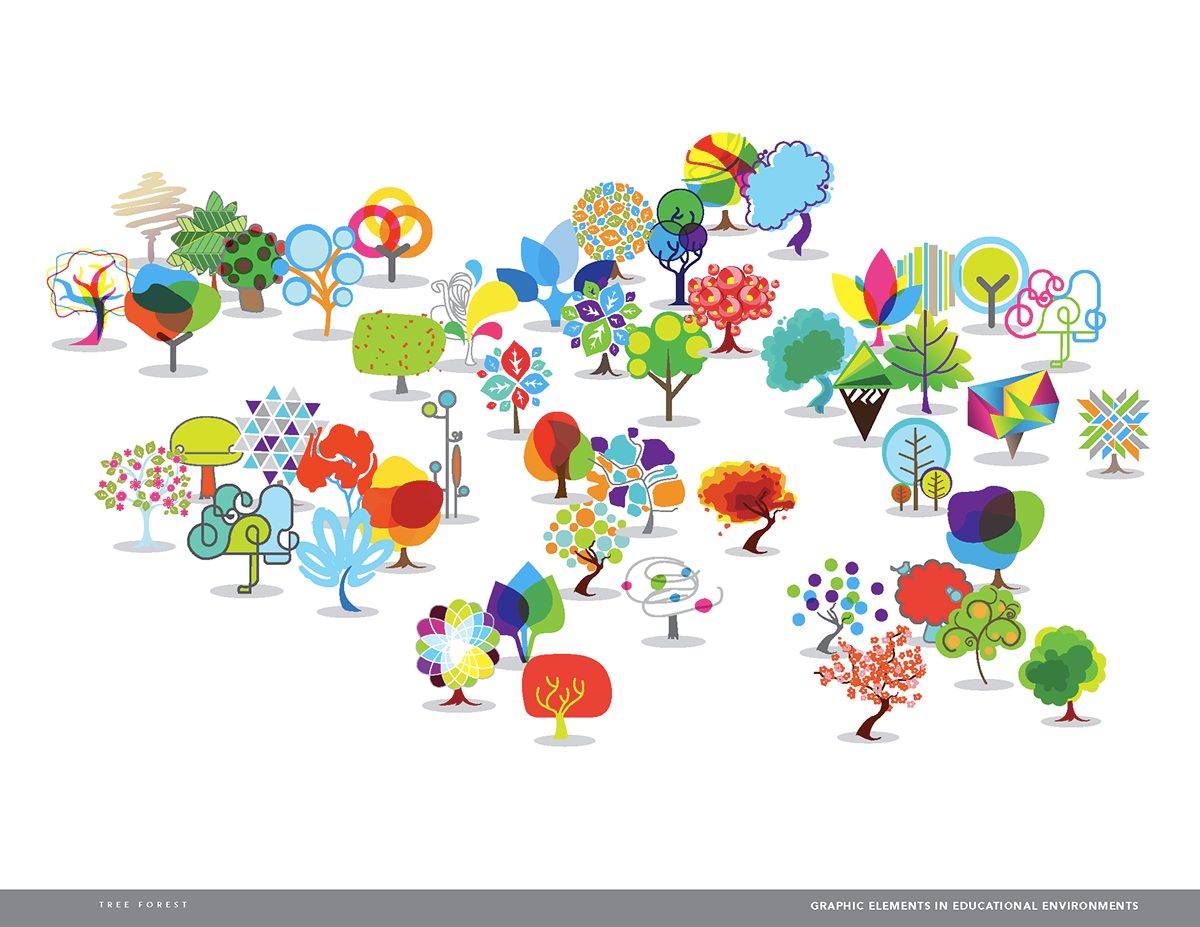
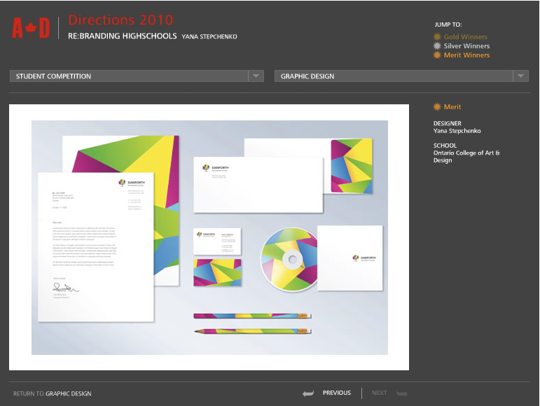
My final concept uses trees as a common symbol. I branded highscools in a system where the typography stays the same throughout and the symbol of the tree changes to give the schools the freedom to express their individuality. Trees are a symbol of growth, transformation and maturity, going from one stage to another, much like the students. I chose three schools to show how the brands can really become alive. The world is rapidly changing and schools need to be more relevant to the current time. Old ways of thinking should be disregarded in order to create environments where student’s talents can really flourish.
affect on everyday lives and will be a major investment in productivity, efficiency and well-being of the
students and staff.
My final concept uses trees as a common symbol. I branded highscools in a system where the typography stays the same throughout and the symbol of the tree changes to give the schools the freedom to express their individuality. Trees are a symbol of growth, transformation and maturity, going from one stage to another, much like the students. I chose three schools to show how the brands can really become alive. The world is rapidly changing and schools need to be more relevant to the current time. Old ways of thinking should be disregarded in order to create environments where student’s talents can really flourish.