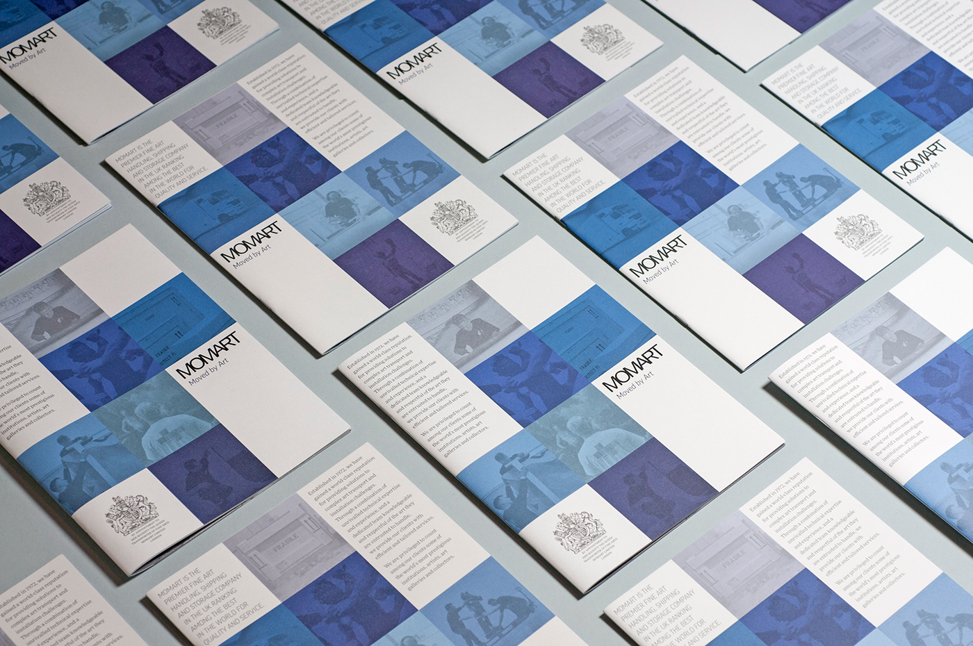
The objective for designing Momart's generic brochure was to create a piece of collateral that could be used to introduce the art transport, storage and art handling services of the company to potential new clients from both public institutions and commercial gallery markets. The flexible box motive on the front cover acts as a placeholder for a selection of images, while being a strong mark allowing to immediately recognise the Momart branding.
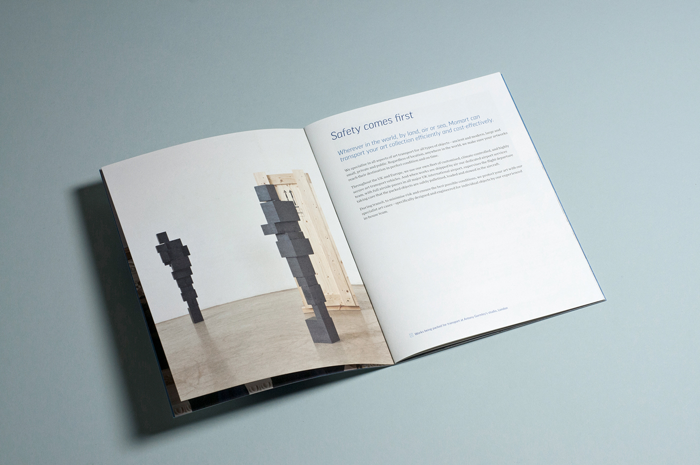
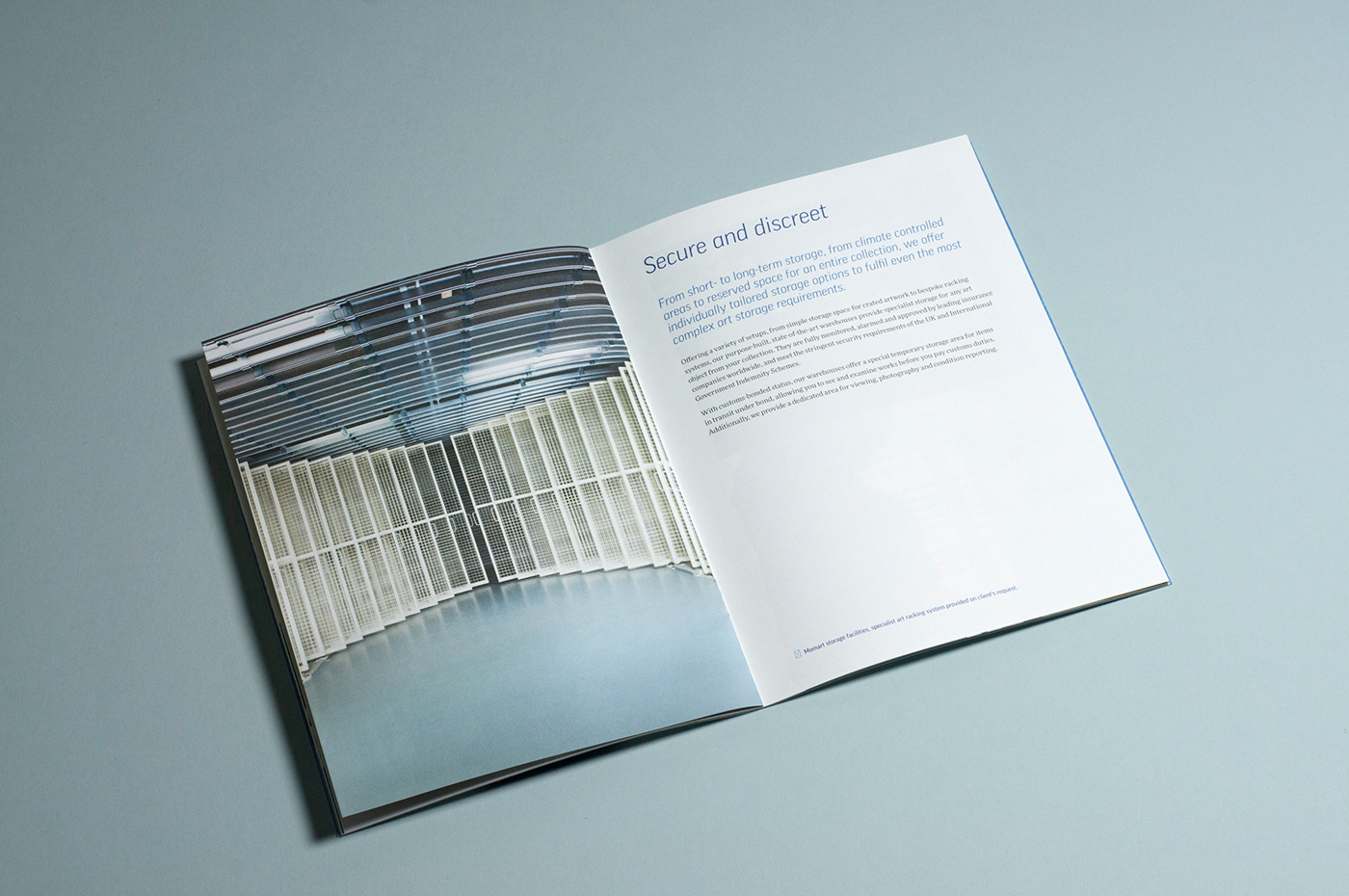
The brochure is light in copy and relies heavily on consistent images depicting Momart's team at work during various projects. A selection of short case studies and testimonials from clients adds credibility to the descriptions of services that the company offers.
The intension behind the use of an adjustable symbol is primarily to demonstrate Momart's ability to adapt to any situation and space. In some applications, such as the brochure cover, we decided to extend the symbol and use it in full bleed to create a versatile Swiss grid system, enabeling each element — text, logo, Royal Warrant crest, strapline and photos — to be arranged and laid out effectively. The brochure cover suddenly enhances the idea of adaptability by allowing a large amount of design variations and layout possibilities.
We have used one of the largest font family available, FF Good and FF More, designed by the Warsaw based type designer Łukasz Dziedzic in 2008–2010. Łukasz Dziedzic built FF More serif to work alongside his FF Good sans serif typeface, resulting in a powerhouse superfamily, versatile in both its function and aesthetics.
Photography: Stephen Morgan and Ben Quinton