Cart oy
Logotype design
Logotype design
The logotype must be representative of a series of paper toys that
the company the Cartotecnica Cambianese wante to bring to market, starting first with the series of warplanes (see project "Cartoy packaging aerei").
The name of the logo must recall the essence of the products to mind the essence of the products: toys make of paper and cardboard.
So Cartoy is a simple and easy world to remember because of it's sound.
We can also notice that breaking down the word CARTOY we can obtein that CART stands for CARD and TOY, which is an English word is going to TOY.
The first proposals for the brand, reflect the colors of the company but I decided to discard this type of graphic and focus mainly on the meaning of the word "Cartoy".
The brand that was chosen, has a simple and irregular graphic that constantly recall the stroke of a brush to mind, as if it were drawn or painted by a child. While the color used is a bright hot orange that indicate the liveliness, the emotions as a child while is playing, building or creating. On the top of the logo we can notice a paper plane, toys: paper airplanes of World War II, that are innovative in terms of technic and communication.

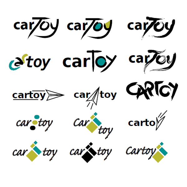
first drafts

logo approved


