STATTLESHIP
YFL –Youth Fantasy League
A youth fantasy sports league (6–10 years old) in the form of an online trading card game, powered by real-time and historical sports data.
Design Goal: Design a trading card gaming experience for American football fantasy.
Business Goal: First round pitch deck for Draft King, focusing on the match section.
Target Audience: 6–10 years old kids, dads-who-love-sports
Platform: iPad
Time: 1.5 weeks
Design Process
1. Problem & Concept Definition
2. Research
3. Wireframes
4. Look & Feel
5. Reflection
1. Problem Definition
How can we create an exciting gaming experience for 6–10 years old kids that also appeal to the dads-who-love-sports, demonstrating the power of Stattleship as an educational platform?
Concept
Simple. Because kids.
Engaging. Because it's a game.
2. Research
Since I know close to nothing about American football, football fantasy, nor have I ever collected sports trading cards, I spent the first day watching American football, understanding the rules, teams and key players, signing up for a fantasy football league and finally playing Hearthstone (a popular trading card iPad game). A lot of my coworkers are football fans, and I learned a lot just by chatting to them about their experience.
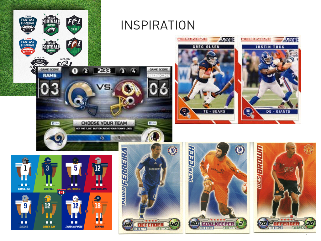
Finally, I did a competitive analysis of sports games, children games and trading card games on iPad to understand the mechanics and spirit behind them.
Finally, I did a competitive analysis of sports games, children games and trading card games on iPad to understand the mechanics and spirit behind them.

I felt like I was enjoying Hearthstone a bit too much by the end of the day.
3. Wireframes
The next day, I wrote up user stories and information architecture (user avatar, rating system, scores, etc.) based on my research on trading card game mechanics and what I have experienced with Hearthstones. From there, I sketched out a few wireframes of the match experience. However, how I interacted with gaming might be different from 6–10 years old kids.
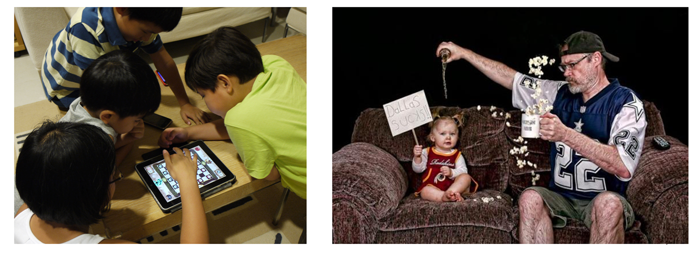
I wanted to learn how kids actually interact with their iPad and play games, so I asked my coworker to let me tag along to his son's elementary school and handed the kids an iPad with Hearthstone open. What I noticed was that instead of thinking and choosing for a long time, kids would tap almost randomly and repeatedly on the screen, and get excited whenever there was a reaction. I realized my initial wireframes were too complex. Back to the starting point!
Lesson: Do user testing as early and as often as possible.

My second round for wireframes consisted of a simplified layout and big CTA buttons.

4. Look & Feel
Our first check-in with the clients was the next day. Since our clients were not familiar with the underlying structure of the design (wireframes in this case) to imagine the visual outcome, it was important to present our work in a way that could communicate our design goal. Therefore, I made an MVP (Minumum Viable Product) of the concept with a look & feel inspired by my previous research on sports game and collectible sports trading cards.
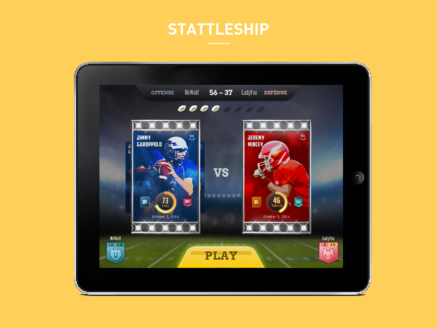
First-round mockups:

Match interface
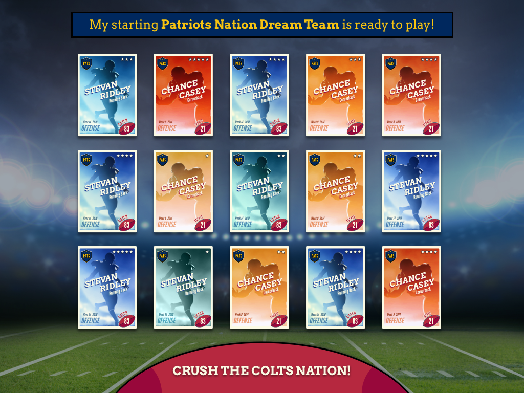
Deck building

Progression of card levels
The first review went great and the clients were pleased with our simple, straightforward UX approach. They gave us feedback on a few design elements, and as the conversation carried on there were new ideas generated, such as avatars for players, scoring indicator, round indicator, etc. Since the business goal was not to produce a full-fletched, functional game but to have an initial pitch deck for investors, the clients wanted to focus on the look & feel of the card design.
I have learned that in certain niche cases like sports, the visual design has a strong impact on the experience itself. There were constraints and parameters we had to follow due to copyright from National Football League (NFL) for the visual design, such as no players’ photos, team logos, mascots, colors, etc. Below were a few iterations for the card design:


However, due to the tight deadlines that our clients faced before their meetings with investors, it was impractical to go with extremely customizable design (illustrations, silhouettes, etc). I decided to go with a more simplified design version that clearly displayed the important elements, respected all the constraints outlined above, and was easily implementable with code.


The final deliverables consisted of two high-fidelity mockup screens, documented and all assets exported to Zeplin for implementation.


5. Reflection
This was my very first UI/UX project where I was a sole designer after joining Intrepid. Looking back, there were many things I could have done better. Most importantly, I would have followed a more structured UX design method. It was important for me to have done user testing before doing the first round of wireframes and to learn how kids actually interacted with iPad. If there were more time, I would have liked to further develop the information architecture of the game before designing the look & feel. I would have also liked to focus on the educational part of the game design, as it is part of our original App Concept.
Overall, it was a great experience and I have learned a lot about football, football fantasy and game design in 1.5 weeks!


