Logo Design and Branding
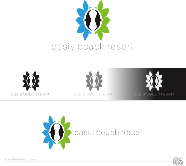
I started sketching and putting ideas down on paper and finally found my direction for the logo which was inspired by a seashell which ultimately represents the "O" in Oasis, with a couple of teaks in adobe illustrator I managed to refine the shell. The blue, green colours and shapes on either side of the shell completed the logo mark and the colours represent relaxation, rejuvenation and growth. The blue also represents the sea and the green represents land... Relaxation on land (In the resort-massages, cocktails by the pool) and relaxation in the sea (Swimming, jet skiing, on a boat) these are some of the activities the resort offers.
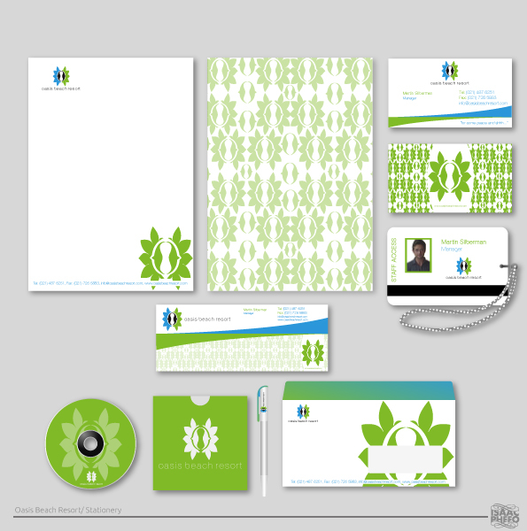
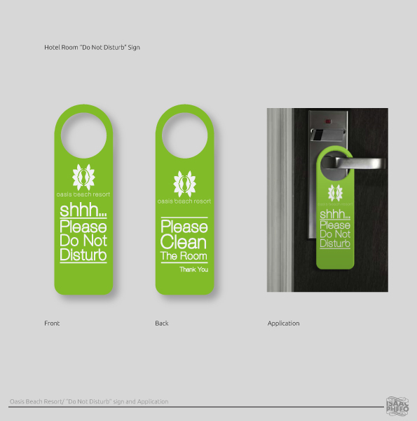
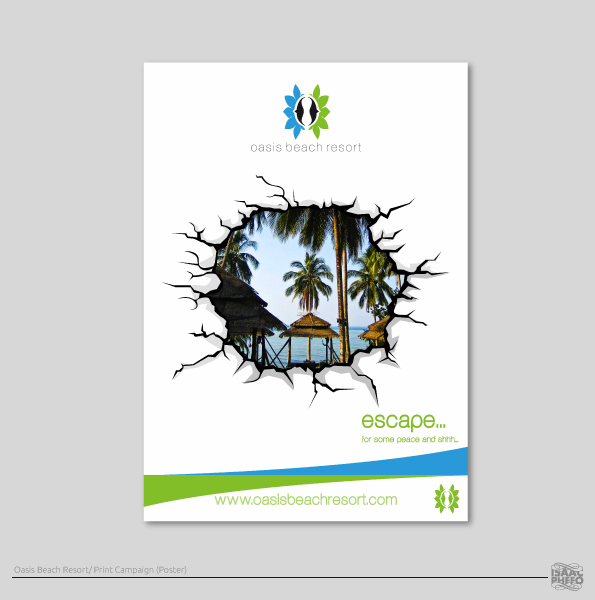
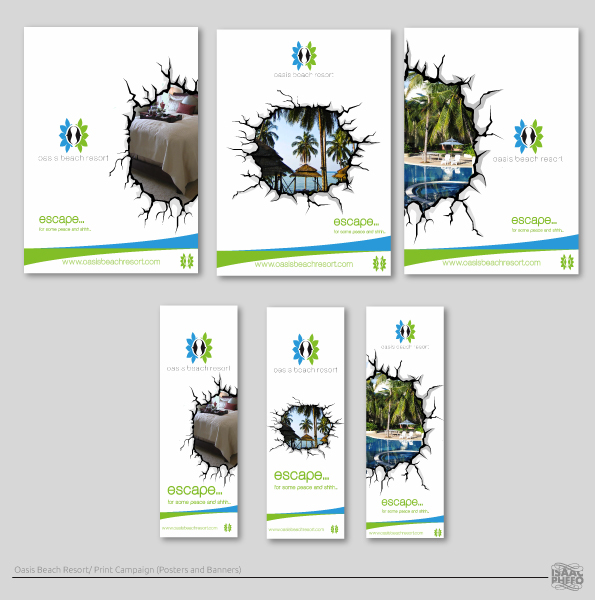
Satisfied with the logo mark, I went on a hunt for the perfect typeface that would complement the mark. The typeface that I used is AovelSans-light. Satisfied with the logo as a whole, I moved on to the next step and created stationery including a staff access card and Do Not Disturb sign for the beach resort followed by a print campaign consisting of posters and banners.
The print campaign tied in with the slogan which is "Oasis Beach Resort - For Some peace and Shhh.". The Campaign is titled "Escape" and merged together with the slogan became "Escape, for some peace and shhh"
The print campaign is inspired by one of Banksy's pieces done on the berlin wall.
Enjoy.