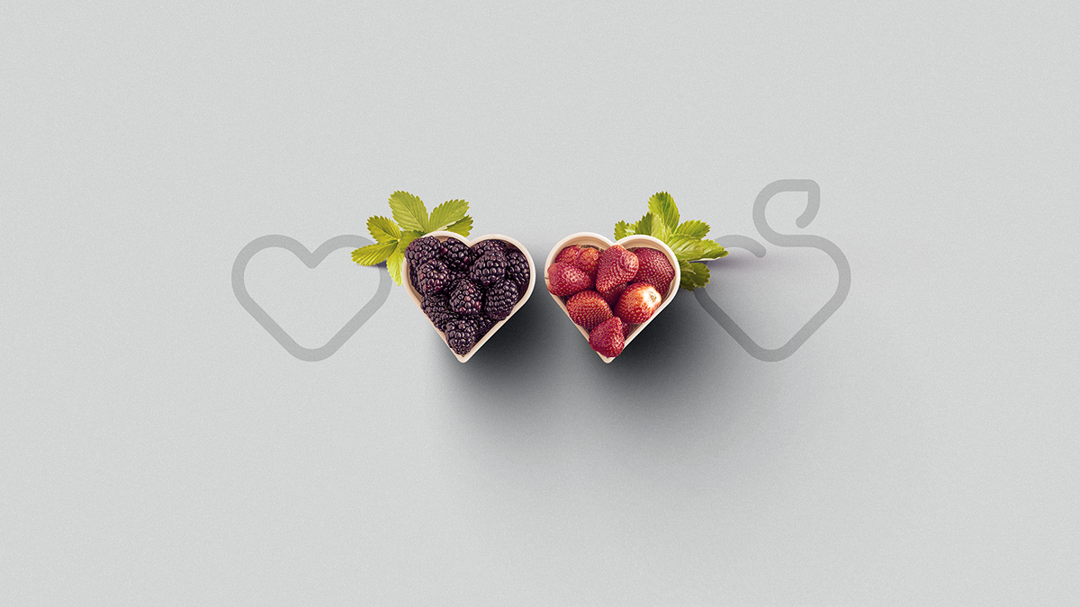
Sabores Vermelhos grows blackberries and organic strawberries and sell them on a large scale, either fresh or frozen. In the future, the company pretends to form some partnerships and develop and commercialize other kinds of products such as juices, ice creams, jams, cakes and cookies, all of them berry related.
With a light and simple communication, the company wants to show the benefits of its organic products for a contemporary public, understood as more informed, open to new tendencies and that has a good life quality as a priority.

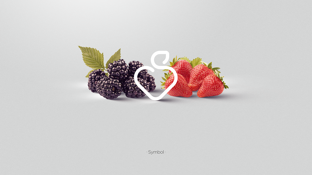


Sabores Vermelhos' visual signature is contemporary because it’s simple,
It’s light because it has fluid lines and subtle color transition;
It’s strong because it brings meanings that refer to its products and their benefits.


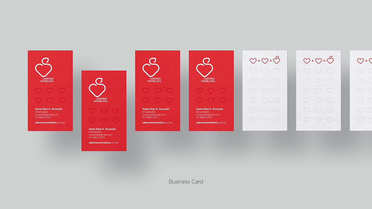
To form the visual identity, it was defined a graphic pattern that tries, in an abstract way, to copy the farming fields.
The shape (organized hearts, aligned side by side) isn’t related to any specific product, although it reinforces the brand’s essence - products grown with love for a healthy life: