Mottis Collateral
Business cards and stationery
Business cards and stationery
"Mottis is motion. It’s energy with direction. Progression with purpose. An unapologetic rejection of the tired, the cliched and the expected. This is who we are."
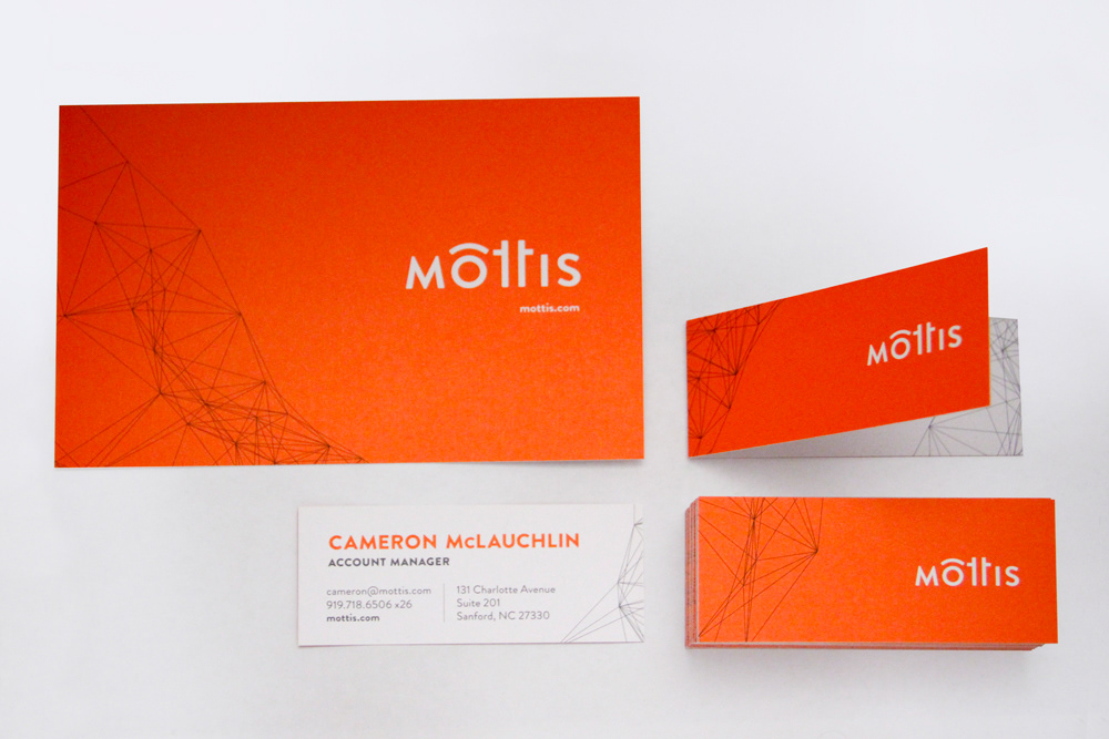
In March 2012, the agency I work for, Kelly MarCom, renamed and rebranded itself Mottis, a move to separate ourselves from the past. Utilizing the bright, sun-kissed Pantone Orange 021 and our line art that reflects our adaptability and originality, I art directed our brand stationery. Each team member's two-color business card is unique, featuring a different cross-section of the line art, representing his or her personality. Some of the cards are folded in half, adding a place for scribbles and notes. Available to everyone is use of the notecards, for much-appreciated, handwritten notes to clients, partners and friends of Mottis.
Font: Brandon Grotesque