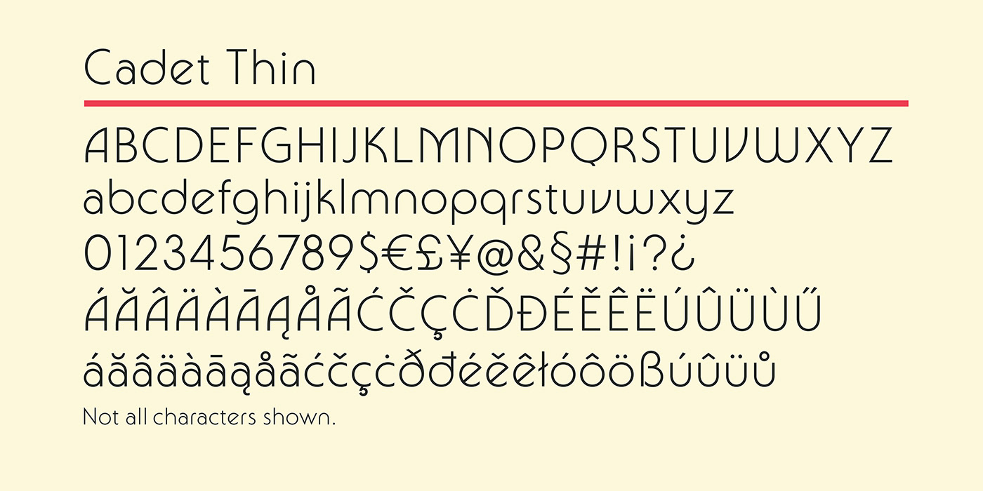
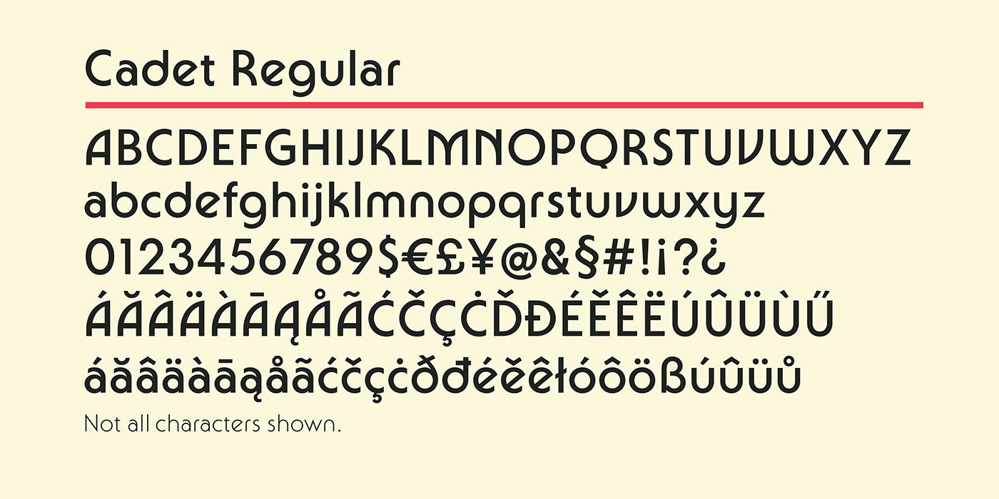
Cadet began as a study of the Bauhaus type styles of the 1970s, descendants of Herbert Bayer's experimental designs of the 1920s. Based purely on straight lines and perfect circles, these designs and their imitators flooded the market in the ‘70s and reached such ubiquity that today they’re strongly associated with that era. While many digital revivals of varying quality are readily available, their overuse and familiarity tend to limit their appeal.
What I set out to achieve with Cadet was a design that retained much of the character and charm of the style but stayed rooted enough in traditional sans serif forms to avoid becoming overly decorative and abstract. The hope was that this approach would maximize its utility in a contemporary context. Cadet is not based on or inspired by any single typeface but is instead an amalgamation and refinement of some of my favorite elements of the style. Some clear points of reference are Busorama (1970), Marvin (1969), Pump (1970), and Kabel (1928).
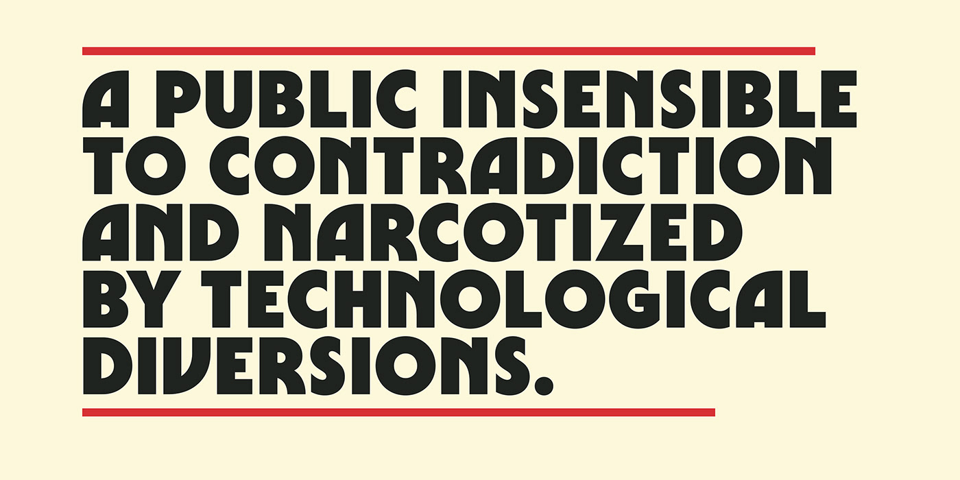
While Cadet may at first appear to be constructed with perfect geometry, subtle adjustments have been made throughout in order to get more natural, smooth, and well-proportioned letters.
Also, in order to add some versatility I’ve included a number of stylistic alternates to certain letters. These can be used when a layout or certain letter combinations call for more traditional sans serif forms. They can be accessed through the “OpenType” panel in Adobe Illustrator by simply selecting your type layer and pressing the “Stylistic Alternates” button.
Cadet was completely drawn using the application Glyphs. Work began in August of 2014 and was completed in March of 2017. It includes a thorough collection of accented letters for extensive language support.
Cadet can be purchased here: