The assignment was to design a typography specimen for a given typeface. Palatino, as I discovered during the investigation phase of the project, is a font which has spawned numerous alternative versions, each slightly varying height, weight and serif finishes. The most notorious version being that which was bundled in Microsoft Office (Monotype Book Antiqua).

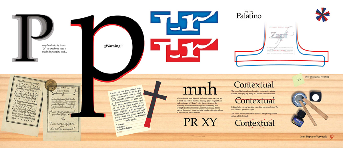
Designed to be a fold out poster, the bottom half of the interior details some of the typeface´s history.

The top half of the fold out poster represents an initial attempt at highlighting the subtle variations between the orginal Zapf-Linotype versión and its alter ego Monotype Book Antiqua.

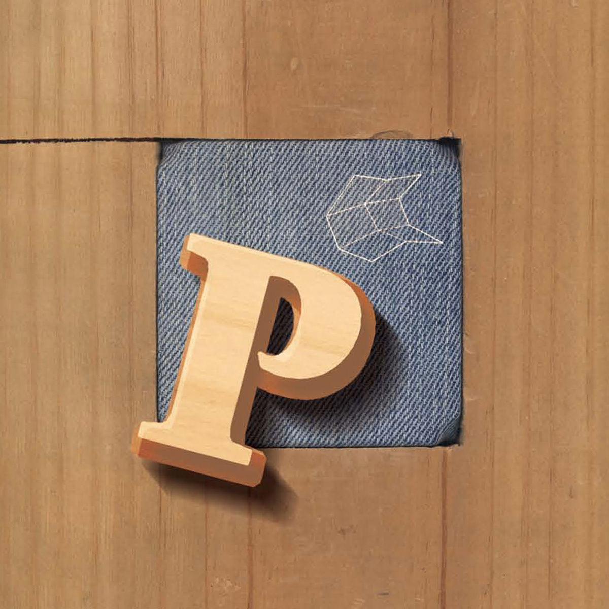
You may notice that the photograph and the image above it aren´t identical. I wasn´t really satisfied with how the end result was turning out and due to time constraints on the one hand and time management issues on the other, I was left making changes till the very end.

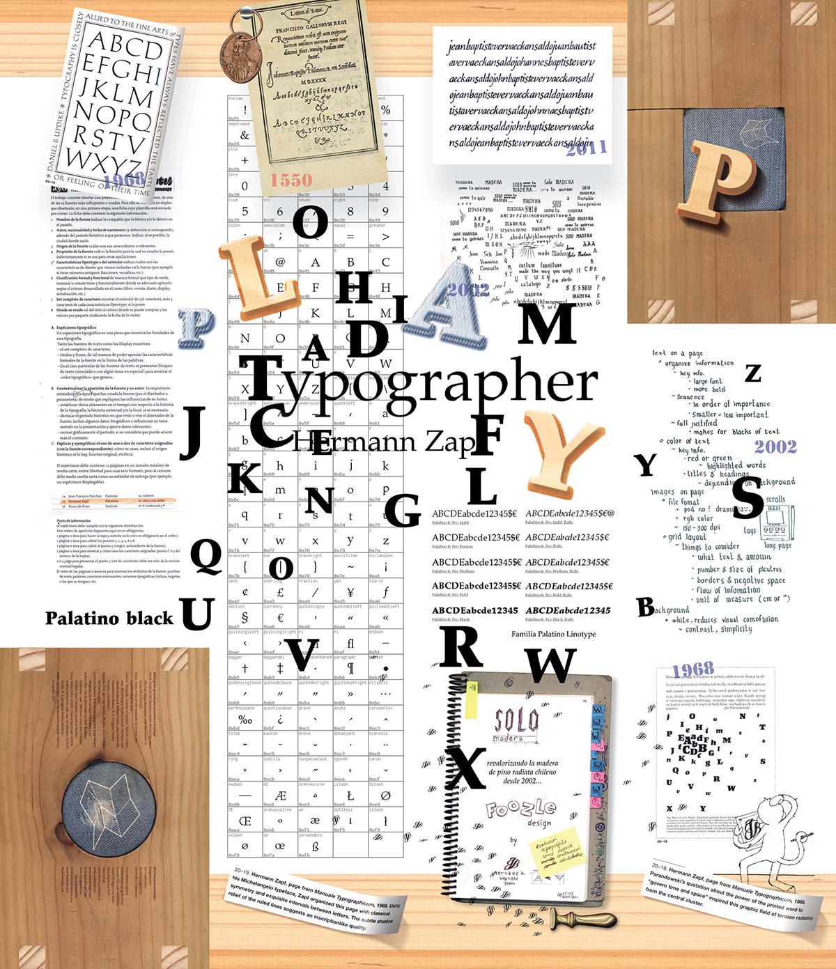
The poster view of the specimen was my attempt to have fun with the font I suppose. I was fascinated, at the time, by the idea that Zapf had named the typeface after a master of calligraphy, Giambattista Palatino and the similarity to my first name and a previous calligraphy experiment I had done writing my name in different languages.

At one point during the project, I even tried to link it to another project I was working on for another course. Having to deal with two sets of different objectives however, turned out to be more than I could wrap my head around and the reason I think the "end product" is a mis-mash of ideas that hardly seem to tell any sort of coherent story.


