Trooroom
Design report.
Design report.

Trooroom is an avatar driven social web tool that provides the urban demographic, particularly bloggers, start-ups and creatives with a personal room to collect and exhibit anything in one unique, accessible place. They can then share their Trooroom via a URL. Unlike virtual reality sites Trooroom is “Troo”; it represents your reality rather than an excuse to escape it. It makes browsing and uploading more visual, expressive and simple.
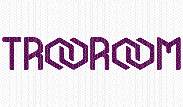
The name ‘Trooroom’ is memorable due to its “Vowel Rhyme”, the name given to the repetition of similar vowels in stressed syllables of successive words. The “roo” in rooms defines the “roo” in “troo” making the overall name visually memorable and attractive, as well as allowing it to roll off the tongue. The word “troo” is urban slang for true, which fits the urban demographic that will make up the majority of ‘Troorooms’ users. In urban slang, “troo” is also used to replace many positive words such as cool, peace or word, giving a positive feel to the name ‘Trooroom’. The name isn’t just an attractive name; it also expresses what it is that ‘Trooroom’ is about. The brand is based around an isometric grid: “(n) A network of evenly spaced lines drawn at 30, 90, and 120 degrees.” The isometric grid represents a network, the same way a web represents the internet. The triangles within the isometric grid also appear like the polygons used to create 3d renders in programs such as Studio Max, the same program used to create the environments within Trooroom. Isometric grids are used to illustrate plans for many things, including room plans, they are called isometric drawings. “Isometric drawings are 3D drawings. They show three sides, all in dimensional proportion, but none are shown as a true shape with 90 degree corners. All the vertical lines are drawn vertically but all horizontal lines are drawn at 30 degrees to the base line. Isometric is an easy method of drawing 3D images.” The use of the 30, 90 and 120 degree angles will become a strong part of the Trooroom brand.
The typography for the logo is built within an isometric grid to give a 3D dimensional feel to the brand; the logo isn’t designed to look overly rounded and complex as neither is the 3D used within the Trooroom environments. The appearance of the logo and 3D will become a style rather than appearing as though the environments are dated. The paired Os are interlinked creating the Trooroom icon which represents the connectivity of people within Trooroom as well as the links between the windows in the user’s personal rooms and whatever room or URL they have linked them to. As the Os are built within the isometric grid, they appear to be 3D rooms.
Several different colours are use to give the feel of depth and light to the Trooroom icon, they are then used throughout the brand and website along with the specified angles. These colours are used as they are a contrast from Facebook and other social media that usually use blues, they use blue as it is often seen as the most clickable colour on screen and social networks contain allot of clickable content. A majority of Troorooms clickable links will be image within the 3d environment so using blue was not necessary, bright blue was originally used as a base colour and a darkening blending mode was applied but as blue takes up the most space in the colour spectrum, all the colours produced were shades and tones of blue. Orange was also attempted as a base colour, due to the way complementary colours and the colour spectrum work dark greens are produced to complement and give the appearance of light and depth to the shape, the same went for yellow, this appeared to natural for a 3d social network. This only leaves the red and purple tones, red was a prime choice from the start as it contrasts yet complements Facebook but can occasionally appear aggressive as red is often seen as a warning or a sign for danger. The burgundy colours added to the soft red give a feel of warmth that goes well with the Trooroom theme of having your own room, in which you should feel warm, safe and comfortable.
The font Verdana is used as the brand font as it is a web safe font renderable on almost all operating systems, this multifunctional use match the aim of the 3B browser used to run Trooroom. It is also a particularly legible sans serif font good for onscreen body copy so that Trooroom can explain itself as clearly as possible.