12 min read
01 Company Overview
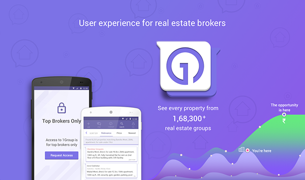
ii5 designs and builds technology that is practical, intuitive, and effective without attempting to modify user behavior. This technology caters consultants, allowing them to market properties, find properties, and close deals.
I worked for ii5's debut product 1Group to address and eliminate the problems of an outdated real estate ecosystem in India, including misleading information, misaligned interests, and minimal transparency and accountability.
01.1 Product Objectives
In India, agents are numerous, with over 1,000,000 urbanized agents. Brokers are the primary source of accurate property listings. ii5 met 75+ brokers with broad demographics to study their market practices and biggest challenges.
We believe Indian real estate brokers are undervalued, underserved, and a multi-billion dollar asset can be obtained by solving one of their immediate problems.
• Brokers don’t have an easy way to find properties
• Brokers don’t share addresses and only take trusted parties for viewings
• The basic technology is insufficient
• Brokers don’t use portals to find properties
• They populate portals with fake listings
• They keep accurate listings to themselves
• Besides talking, they primarily do deals by texting
• WhatsApp is their current market place
• It's overwhelming especially since brokers are often in 20 - 40 chat groups
• WhatsApp is not built for property deals
Our solution is to build 1Group to market properties, find properties, and close deals.
01.2 Product Approach & Team
At ii5, we follow agile methodology than waterfall that can help us to build and test product ideas quickly to reduce the overall development time. I worked closely with CPO, PMs, CEO, UI Lead, City Managers, Ambassadors, Development team, Sales and Support team throughout its products sprints.
01.3 Business Requirements
All real estate brokers should get direct access to unique properties. Our solution for property brokers to make sharing of inventory and requirements faster and better. The app should solve the followings...
• Access all nearby latest property messages within a single group
• Intelligent real time feed of the properties you’re looking for
• Auto-import contacts into 1Group
• Get personalized property database
• Brokers have to register and verify their mobile number to use our app
• Get only the messages that matter the most using filters
• 1:1 chat with brokers with full privacy for business
• Save requirements as alerts
• Create property; less work than posting to WhatsApp
• Earn, and increase your broker network connections via referral
• Save and share real estate properties that are posted by other brokers
• 8+ regional offices having 20+ city managers for training and management
• 200+ ambassadors would be hired for sales activities
• Finally, it should just replace WhatsApp
• Most likely our app should run smoothly on 2G network
02 Discovery - Users in Context
02.1 Survey
“Design is not about reinventing the wheel.” Instead of creating a new system or a platform for users to teach and show how it works it’s better to use an existing they’re used to. Think of Bootstrap, Foundation, or even an isometric grid sheet for an example.
Helping real estate brokers to give what they need. A system that can help to connect all real estate brokers in one place, something that is easy to use, search latest properties, can have custom filters with nearby localities, and so on.
But, the question is "are we sure yet?"
Let's validate quickly within a week of time—what % of our hypotheses are true by conducting a survey.
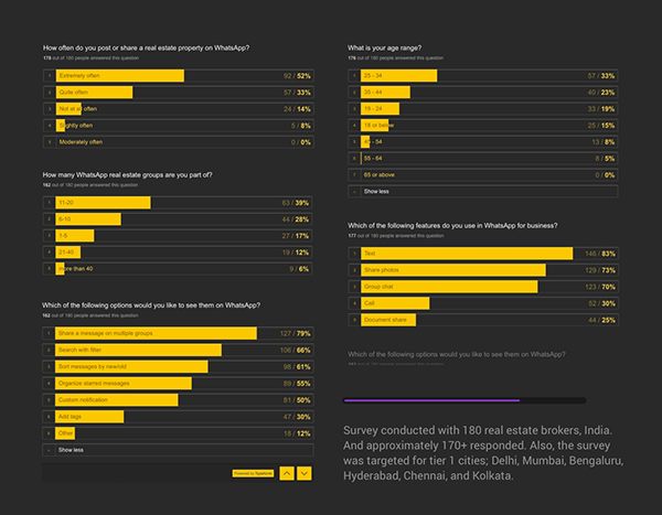
We're damn happy to see the amount of results from the survey as based on the results, we can go ahead with talk with some of those users via user interviews or contextual inquiry; if time allows. The above survey helped us to narrow down the primary age group, what they really do on WhatsApp, how much time they spend on, what are some of the features they use on daily basis, and what do they expect as the outcome to leverage their current experience.
Since we're following agile having a very strict deadline, I thought it's better to test our existing designs which were done much before.
02.2 Competitive Analysis
We studied & analyzed some of our competitors including BroEx and PlaBro, and submitted a detailed report having checklists to our management team. However, it's not possible to extract those details to present in here due to NDA; I don't mind talking about in person.
02.3 Heuristics Evaluation - current designs
We can’t just proceed with the designs and launch without even knowing how many real estate brokers are going to use this app, and why? After getting the survey results, and talking with our product team, we decided to conduct an expert review (heuristics) to evaluate our existing designs, which can help us to identify some of the usability issues first.
The heuristics evaluation report has been captured using Airtable as you can see below. However, you can view its detailed report on Airtable as well.
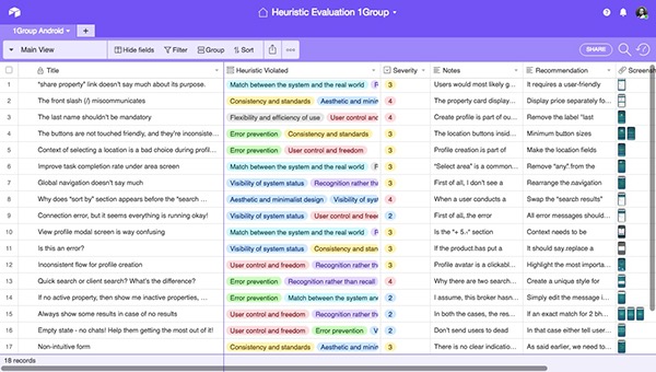
Based on the results, we had a long discussion with our product team, it was decided to get more insights from existing users without extending our product launch date. It’s like think out of the box but act within the box.
So we created a sprint that applied to both design and our development team to work on the suggestions based on the heuristics test. While the changes were in progress, we utilized the same time aka sprint to conduct contextual inquiries.
02.4 Contextual Inquiry
After receiving a good amount insights via survey, we need to observe how they perform some of the tasks specifically at their workplace. This can help us to understand their mental models, how they post & manage properties, how technically good they are when it comes to technology, and to understand their behaviors & motivations.
With the help of our city managers, we planned and shortlisted 10+ brokers (due to lack of time) who specifically fall into our product's primary users. The entire planning, shortlisting brokers along with their availability took 1 full day. Ah! We only had 4 days to complete the observations.
Observational Research Insights
We came up with some qualitative insights just after the contextual inquiry session and after talking to 10 real estate brokers within 4 days. The following points can help us understand brokers’ major pain points and primary goals.
• Brokers don’t want to leave WhatsApp but they don’t mind trying
• How about having all groups in one and reduce the copy+paste same properties on multiple groups
• Provision to save all your favorite properties
• Search properties with filters
• Synchronized properties; think about google bookmarks across all your devices
• Get instant notification based on what you searched or still looking for
• Unable to filter similar properties/localities/cities
• A messenger groups like WhatsApp can’t have more than 500 members
• Can’t set alerts/reminder for specific properties
• Messengers are not designed by keeping a specific business in mind. For instance, one can’t create a property post using WhatsApp
• All favorite properties/discussions/person chats are mixed up and can only be accessed under starred messages via WhatsApp's main menu than within a group
02.5 Affinity Diagram
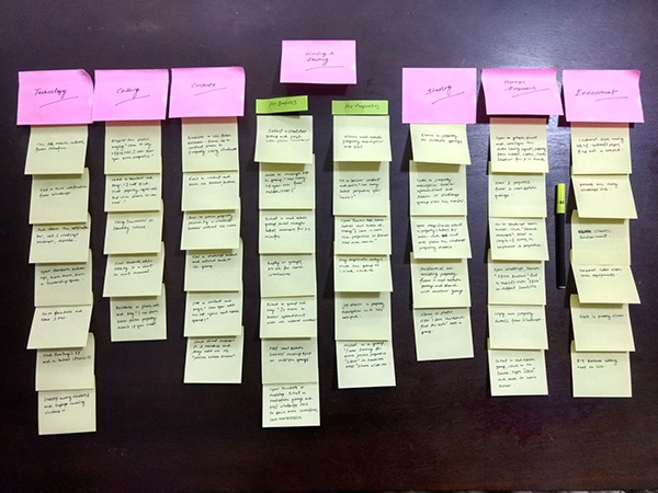
Due to lack of space, we converted the above diagram and expanded into digital format so that we could share them with our stakeholders at any time. You can go through our agile story map later in the process.
03 Explorations
03.1 Persona Model
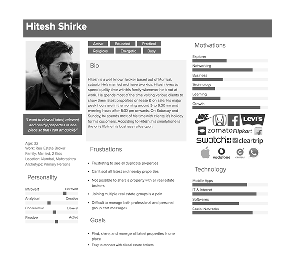
We're no longer going to say all users, or in fact when we say "We don't think our users would like/use/understand our product." That's one of the reasons why we need to develop our persona model that can help our product team to match every user story we try to solve in line with our business requirement, and of course. We've developed only a primary persona based on the insights we gathered during our discovery stage; primary age group, motivation, frustrations, computer literacy level, social media, and based on their primary tasks.
03.2 Red Routes - Design for the most common use case
As you know we’re going to design our product that should fulfill our primary persona than all users. In order solve our users' goals, we will be defining and prioritizing the most critical user flows along with rest of our flows to match our primary persona. We’re going call these important or critical user flows as red routes as identified by Dr. Travis as he pointed the analogy of the red route lanes could also be used for websites and mobile applications.
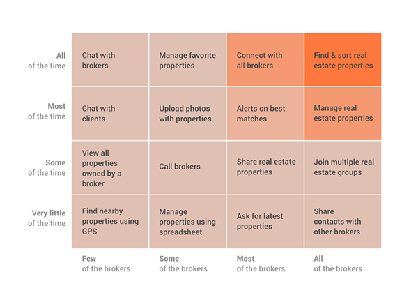
Also, since we’re going to use the agile methodology for our development team we make sure we combine all user goals of our primary persona and break them into a series of user stories. Later, we'll try to match the user stories with our business requirements without forgetting its feasibilities, which is really an important factor for shipping.
03.3 User Story Map
We combined all user stories and stacked them as activities from red routes, broke them into tasks, and a series of user stories respectively. By the way, the original agile storyboard was created and managed using Jira that was linked up with Trello boards to add, modify and track stories as we worked along with our development team. Also as said before, and due to NDA, I couldn’t show the actual files via Jira and recreated the entire map as shown below.
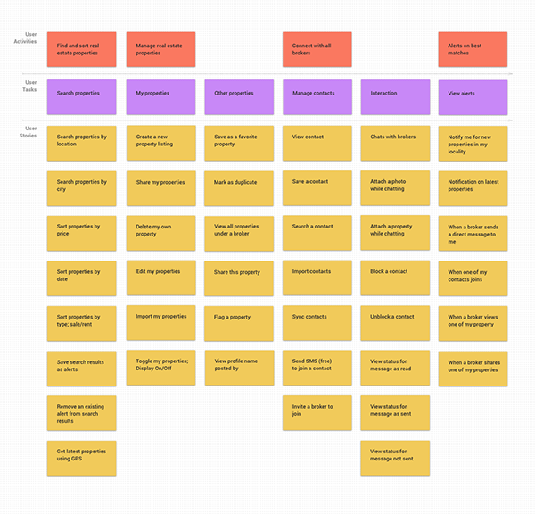
Apart from these, we kept a series of user stories inside a backlog for later sprints due to development constraints. As per the business objectives and timeline, we’re supposed to go for a beta launch having an invite code to test the product to capture more insights from some of the brokers before we go ahead and launch its public version.
04 Information Architecture
Nothing like having a round of whiteboard sessions to churn out ideas, data, user flows, messages, information, user journeys, problems, and so on as quickly as possible, and with the help of our core product and engineering team. We also asked our city ambassadors, sales and marketing managers to be present during the whiteboard sessions in order to get feedback as quickly as possible.
04.1 Sitemap
The sitemap could help us to think out loud by keeping the structure as simple as possible from both implementation and usage standpoints. With the help of sitemap, we could think of our mobile app's structure overhaul.
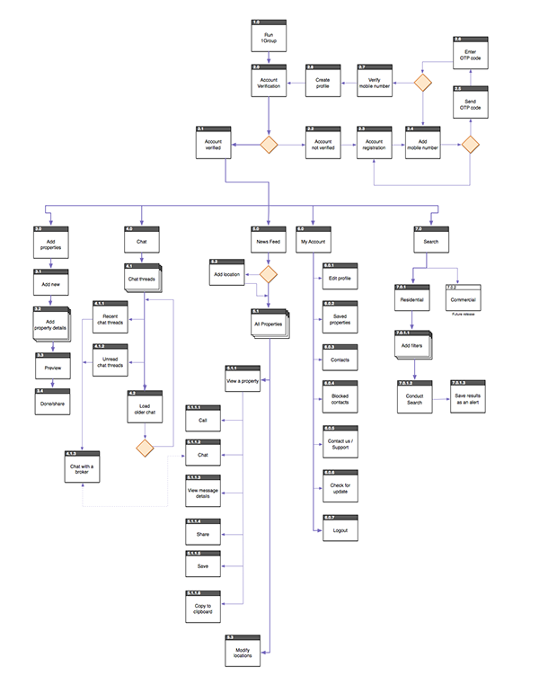
From both our sitemap and user stories, we developed almost 35+ user flows, but it's way difficult to show them all in here than a few. Again, some of the information in here has been modified due to NDA, you know what I meant. These are high-level flows and developed by taken inputs from both engineering team and CPO.
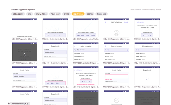
04.2 User Flow - Broker Verification
To save time, we used the actual design screens done using Sketch having their unique numbers for reference and created all the flows using Lucidchart. The following screenshot shows the user flow for broker verification.

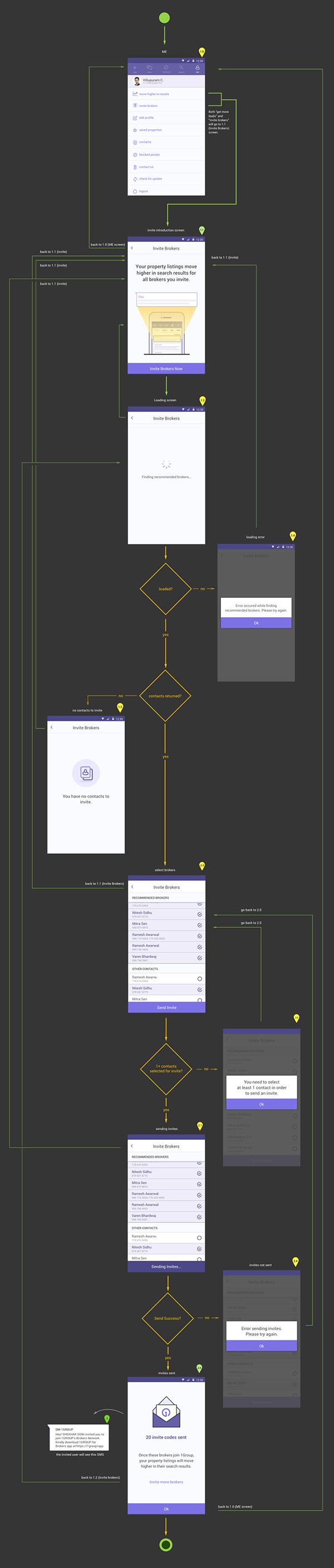
04.3 User Flow - Referral
Here, the following screenshot shows the referral flow where a broker can invite new members to join 1Group, and improve his profile visibility than the rest. He will also get the notification when these new members install the app, register their profiles, and join the 1Group app.
04.4 User Flow - Remove a property
Remember we conducted a heuristic evaluation for our existing design? Our designs have been updated based on the list of submitted suggestions in the meanwhile. As you see below, this particular flow shows what happens when a broker tries to remove his own property?

05 Design
This is not exactly the design stage, so don't be surprised to see its title. As you know we're working on multiple things at the same time being part of our agile workflow; design, development, integration, content strategy, digital marketing, users' feedback, and a lot more. However, let me take you through some of our design phases we went through.
05.1 Sketches
Well, I've no access to show any of our sketches we did in the past, or during the process. Also, I've lost my sketchbook having 600 pages in between; it was holding a huge amount of notes, observations, wireframes, and flows. But, we have to move on...
05.2 Style Guide
This is our UI Style Guide we talked about as part of my suggestions while conducting heuristics evaluation, remember? We shared this style guide with our development team for reference.

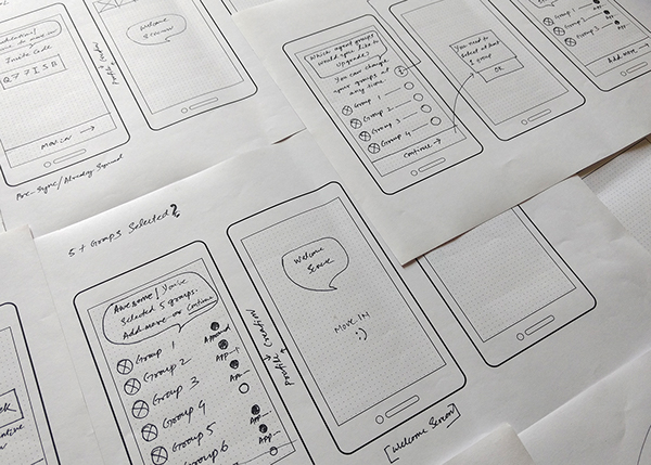
05.3 Paper Sketches
Few sketches on paper we worked upon in case of referral flow.
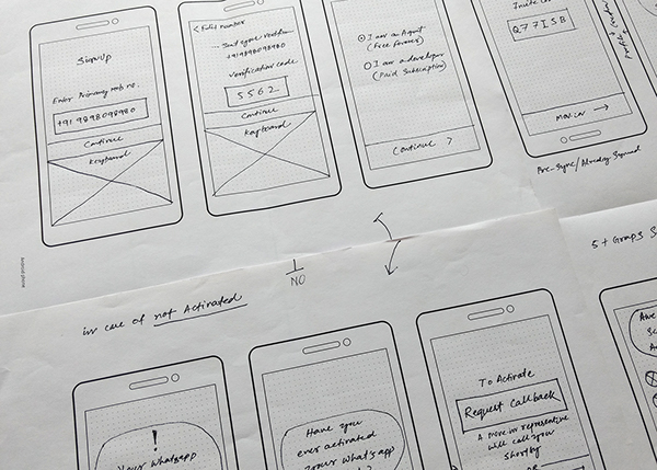
The following sketches show the selected number of groups before one can send invites, and what would happen after sending the invites.
These sketches show here how our support team gets notified when brokers try to verify themselves. Our support team will call them to verify their identities accordingly in this case.

05.4 Themes
Giving our app an unique identity was one of the decisions made by our management team when it comes to its USP. We explored view themes and presented to our management team, and few brokers. But, the highest number of votes we received from these themes was not other than the purple theme; it's unique, corporate, and futuristics.

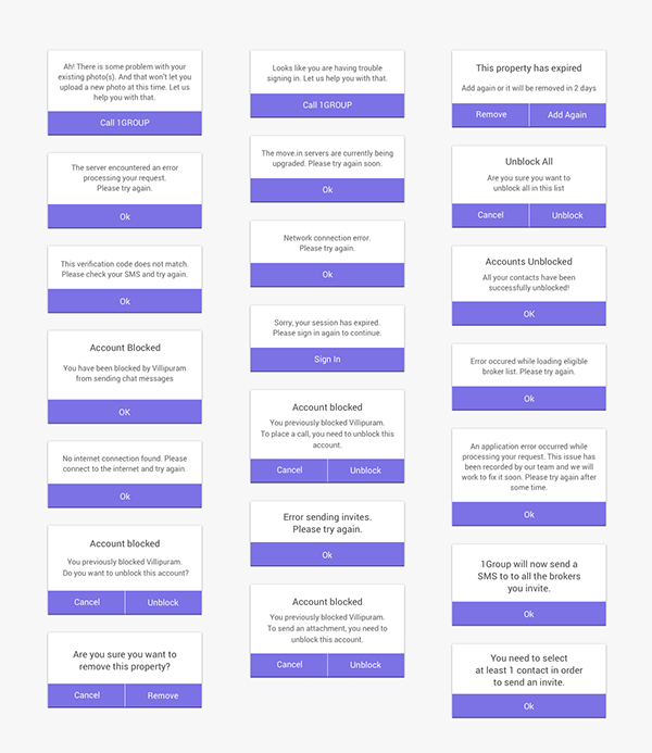
05.5 Messages
Nothing like coming up with intuitive messages throughout the app when it comes to replacing all system generated error messages. Also, as a suggestion we talked about it during heuristics evaluation. We didn't want our users (primary persona) to react what to do when a system says, "404 page not found!" We wanted them to take the right actions as they appear; these are some of the examples what they will see on most of our app screens.
05.6 Empty States
What are empty states? An empty state is just like a dead end, or you can also call this as a base; a user will see nothing on a chat page if he never interacted with anyone, before. In this case, and technically, he has no active chat threads presents. The following examples show some of our empty-state screens applied throughout our apps.

05.7 Remove My Property

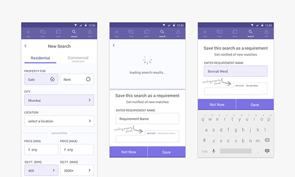
05.8 Search
Search is one of our user's primary goals. One can input its requirements and search, and save this search results as alerts as you can see below.
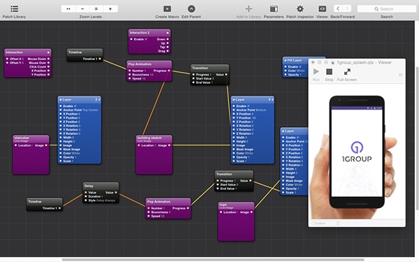
05.9 Prototyping
As a designer, no more static designs are concerned. We made sure we design and make click-through prototype that's intuitive and deliver to our engineering team as a live reference that can help them to ship our products way better and faster. We used Facebook's Origami because it would export its code in native formats. By the way, it took us some time to learn how Origami works, but I think it's great.
Shows how to add/remove localities.
Every time we design something on Sketch, we made sure those assets were delivered to our engineering team with the help of Zeplin. Zeplin is really great as it converts all units from PX into DP for android development, and same thing for iOS as well by converting PX into PS. Also, Slack helped us to communicate, share, and collaborate ideas across all channels of ii5.
06 Beta Launch
There is nothing called a 100% final product. And if we would have waited to keep fixing, I guess we wouldn't be able to ship our product; ever. That's how our beta product launch came into place & as per the deadline, and of course. We knew we did a lot of work starting from research, observation, analyzing, designing to testing prototypes so far. If things are fine, we'll go ahead and make it live for few brokers as beta launch.
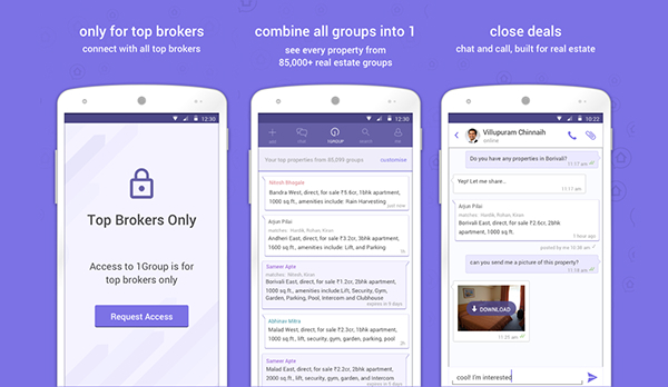
The following value proposition screens were specifically designed to upload for Play Store.
06.1 Digital Marketing Promotion
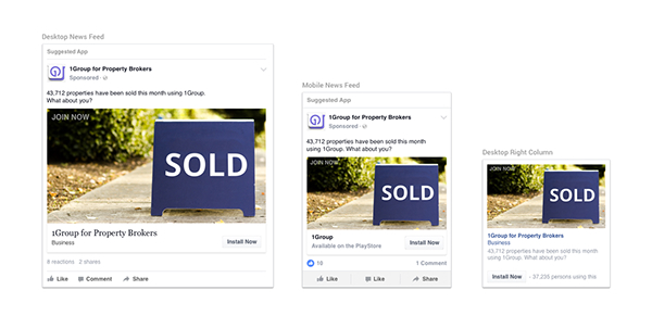
It's exciting to work along with our CEO to leverage our product reach via digital marketing. We did multiple Facebook Ads to target specific brokers who're part of our primary persona; we defined earlier. 1st, we wanted them to view our ads, and this couldn't have been done without adding their mobile numbers we collected via city ambassadors. 2nd, we wanted to reach new brokers to view our TV commercial, Ad copy, and download the app.
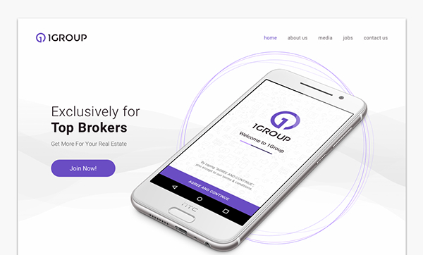
Also, I worked on Google AdWords to target potential brokers who can read the message and then land on our website's landing page for more details.
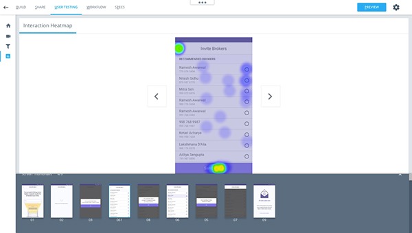
07 User Testing, Analysis, and Feedback
User testing was a continuous process during our product development, and throughout its stages. CanvasFlip helped us to test critical interaction flows during prototyping such as drop off rate, avg. time spent, task completion rate, and heatmaps.
Well, it wasn't limited to tools. Because, in order to make our product better, we decided to get feedback from multiple sources including help desk team, sales team, city ambassadors, feedback via Play Store, and support emails.
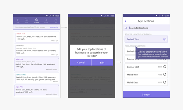
For instance, we found x number of brokers were not getting properties listings on the news feed, and the problem was due to their missing localities. So we fixed it by giving location choices as you see below.
07.1 Updated news feed design as per feedback
08 Launch
1Group was released in beta on October 15th. Within 24 hours of release, it acquired 100,000 properties from over 35,000 brokers across India. It raised over 6m USD in pre-series A convertibles prior to launch.
So was it the end of our project? And do you think we have put a period to the end! Well, the answer is no. This wasn't a step for our project sign off. UX is an iterative process of learning, measuring and building as a continuous loop. Every time we find a problem from our primary users, we try to match with our business requirements and objectives as overhaul and strive to solve it in order to improve the over experience. That's what product design all about.
09 Let's measure
But, we can't do any better without measuring what we build; every time. We measured the % of success rate to match with our primary objectives and business requirements we had set up earlier. Also, due to NDA, I've tweaked the following metrics a bit different than its original.
🔥 Performance Metrics
• Crash rate reduced to 1.4%
• App load time decreased to the average 4 sec from 9.6 sec; 58.33% improved
• Profile creation time reduced from the average 0:03:24 to 0:01:46; 51.96% improved
• App load time decreased to the average 4 sec from 9.6 sec; 58.33% improved
• Profile creation time reduced from the average 0:03:24 to 0:01:46; 51.96% improved
🔥 Engagement Metrics
• 4.2 min average time spent; 31% improved
• Searching Properties increased by 23%
• Request for support button reduced by 12%
• Rate of search alert creation increased by 27.3%
• Rate of property creation listings dropped by 2%
• Searching Properties increased by 23%
• Request for support button reduced by 12%
• Rate of search alert creation increased by 27.3%
• Rate of property creation listings dropped by 2%
🔥 Business Metrics
• 45,700+ App installs via PlayStore
• 80% conversion/visit ratio when it comes to opt-in new brokers via ambassadors
• 812,000 unique real estate property listings from 20,000+ brokers
• 80% conversion/visit ratio when it comes to opt-in new brokers via ambassadors
• 812,000 unique real estate property listings from 20,000+ brokers
Expanded coverage from our initial 4 cities to 9 cities.
*As you know most of the details have been tweaked due to NDA. Also, the latest app via Play Store utilized Google's Material Design.
...............