
Champion Brand Uplift
—
Background
Champion wanted to add a new layer of depth to their brand communication by reinforcing the original brand platform with a new product focused message.
Technology advancements have allowed today’s engines to become smaller yet more powerful and efficient. This downsizing is a technical challenge, and as a consequence, having the right lubricant is more important than ever to ensuring theses engines deliver the high performance expected of them.

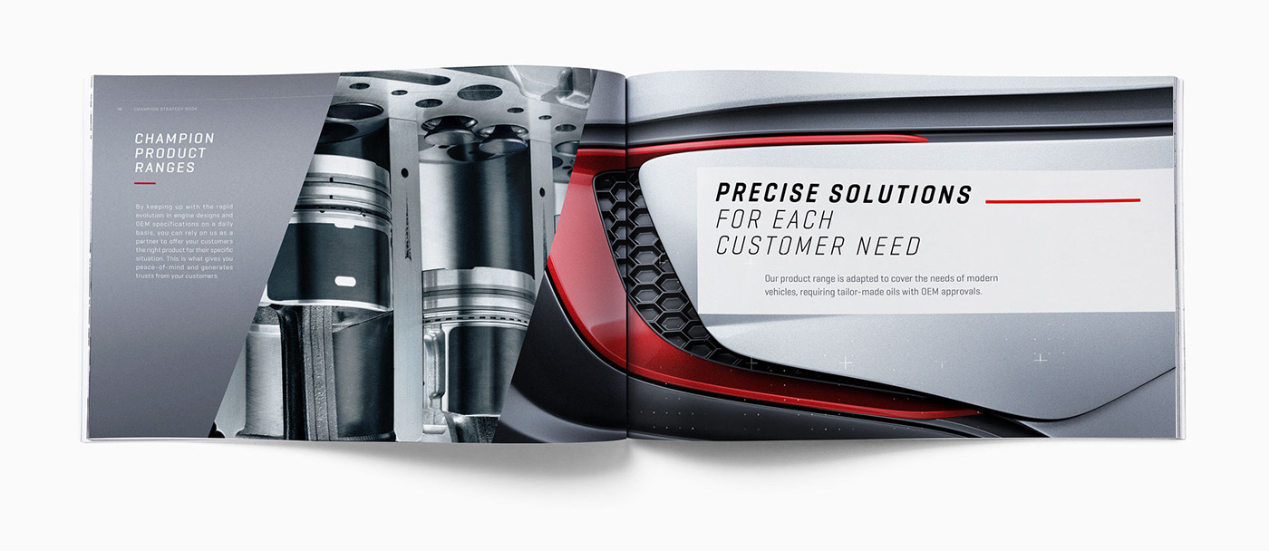
The product Message
—
We build on the existing Champion branding, and integrate a new technical aspect: Champion Lubricants are especially formulated to deliver maximize engine performance in the most extreme conditions. We needed to change the customers view on the brand and make Champion lubricants represent concentrates of technology and innovation.

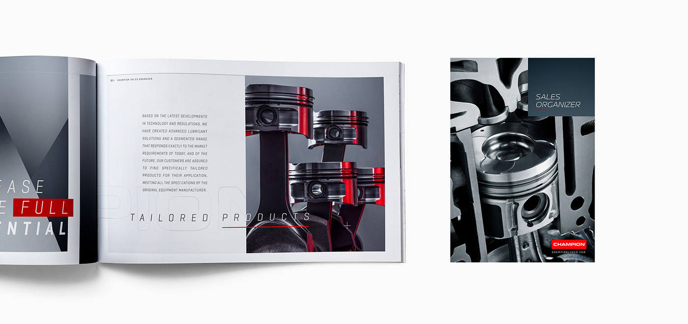
The visual expression
—
To achieve this, we decide to show people the heart of the machine thereby directly showing the extreme forces, high levels of pressure and temperature and stresses supported by the oil. We therefore produced a series of images showing the explosion inside the engine.

Show the unseen
—
The most difficult part was finding visual references, as the explosion always take place in a closed chamber, so nobody has ever been able to shoot this process.
The solution was to create visuals that were removed from reality and to just express the feeling of the combustion chamber in a more impressive way.
We cut the engine up into several parts and shot the fire explosion separately. The result is a unique set of photos that really express the energy, the extreme pressure and intense heat that is generated in an engine.


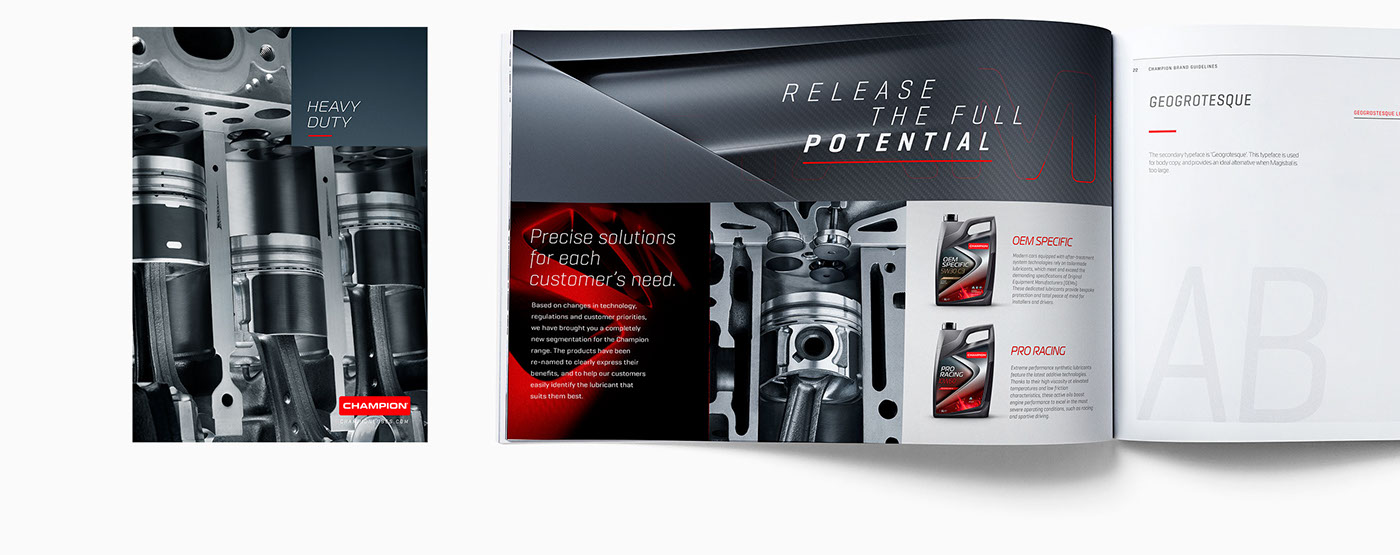
Deliver a full brand story
—
The combination and juxtaposition of these new images with the previous imagery of the “extreme roads” now delivers the full story the brand wants to communicate. There’s now a contrast with what’s happening outside vs. inside. The product is the bridge that allows the engine to perform beyond the ordinary.

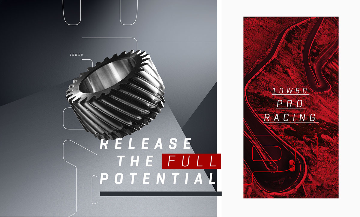
The graphic language
—
In parallel to the new photography, the graphic identity was also reviewed to deliver a style that was closer to the sharper innovation message.
The brand typography has therefore evolved, as has the colour palette. It includes new tones that give a more sophisticated look and feel and now evoke metal paint colours like the new blue grey pearl found on new cars.
New graphic backgrounds were created for the layouts of all the POS and print materials.
Not merely simple graphic images, they were made to evoke new car designs and prototypes using extreme close up of aerodynamic parts. All the visual expression of the brand platform has been condensed into these backgrounds.


A full branding experience
—
Conceived more like a real expo or retail shop rather than a traditional booth, the Champion stand at the big Automechanica trade fair in Frankfurt was totally disruptive and offered a surprise to the entire industry Visitors were invited to discover all the different facets of the brands, from the presentation of products through to the communication. Everything was choreographed to demonstrate the strength of the brands and their totally innovative approach to the sector. All aspects of the communication and visual language of the stand were designed to offer a full and consistent brand experience.


