
Buel
Creating a brand identity design for a rope access special who service the industrial infrastructure of Australia.
In Australia’s mining and resources sector, maximising a return on assets whilst maintaining a safe working environment is critical to profitability. Buel (originally called PRA Global) provide specialist rope access climbers who assess, maintain and repair critical infrastructure in hard to get to places. PRA Global had earned the respect of clients and were well known for safety and reliable, however their brand had limited appeal and did not stand out against competitors...
Be seen, be safe, be Buel
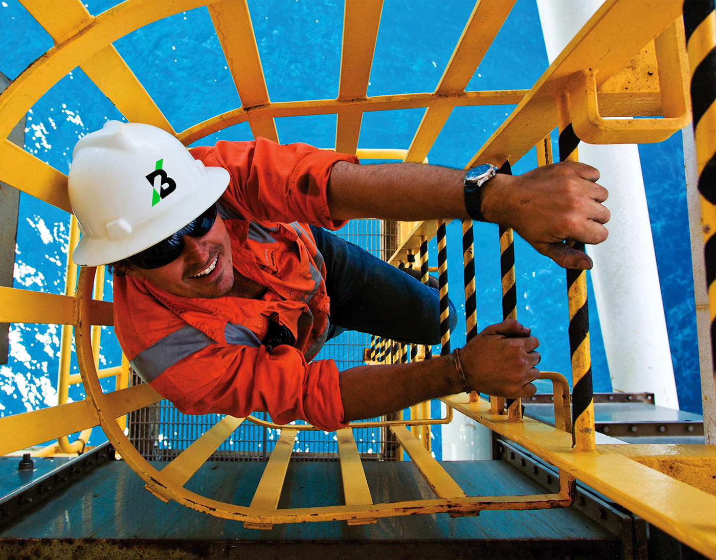
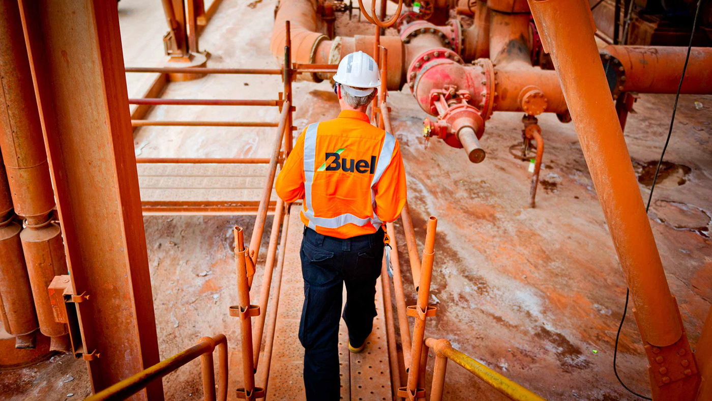
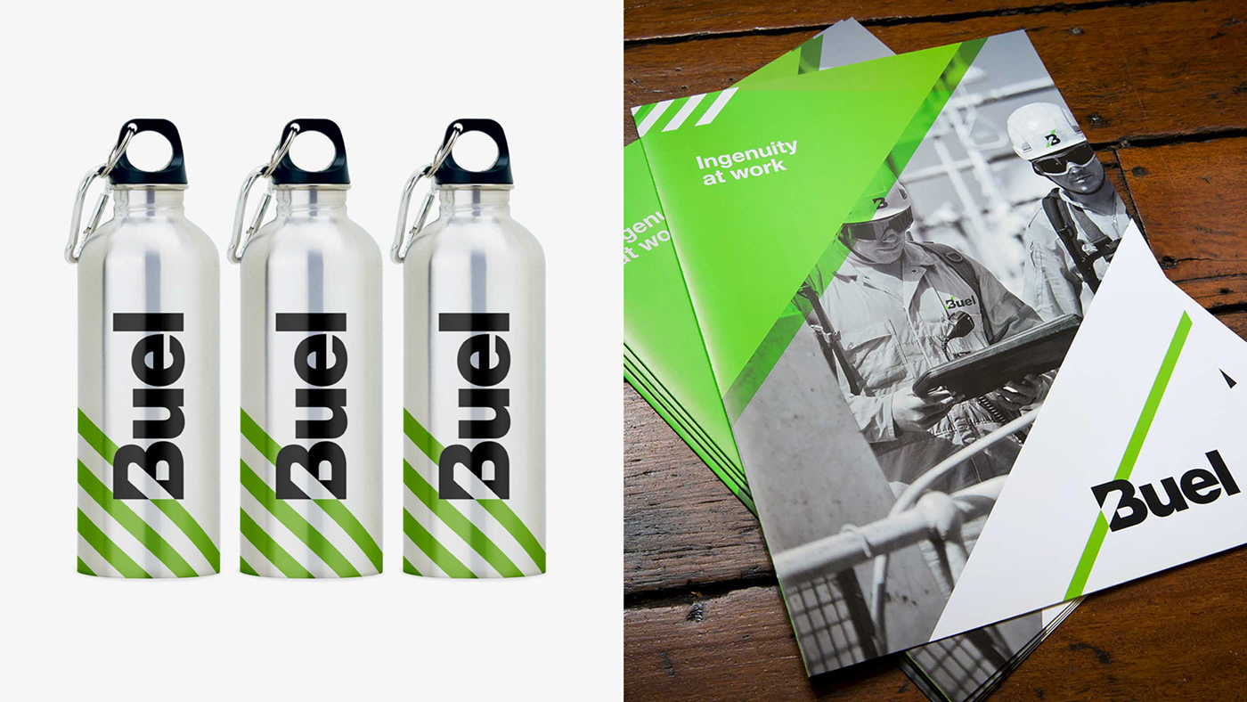
Workplace safety is of paramount importance in this industry. When dangling from a rope amongst the massive infrastructure and machinery of Australian heavy industry, often in remote areas, it is essential to be visible at all times. If you can be seen by others, you can stay safe. This was also important to customers as accidents are expensive, time consuming and can cause even more complex problems than the original issue that needed fixing. Understanding the role health and safety played with the industry shaped our design thinking with a new brand identity inspired by the hazard warning symbolism (such as chevrons and fluorescent colours) seen across the industrial landscape.
Fuelling boldness
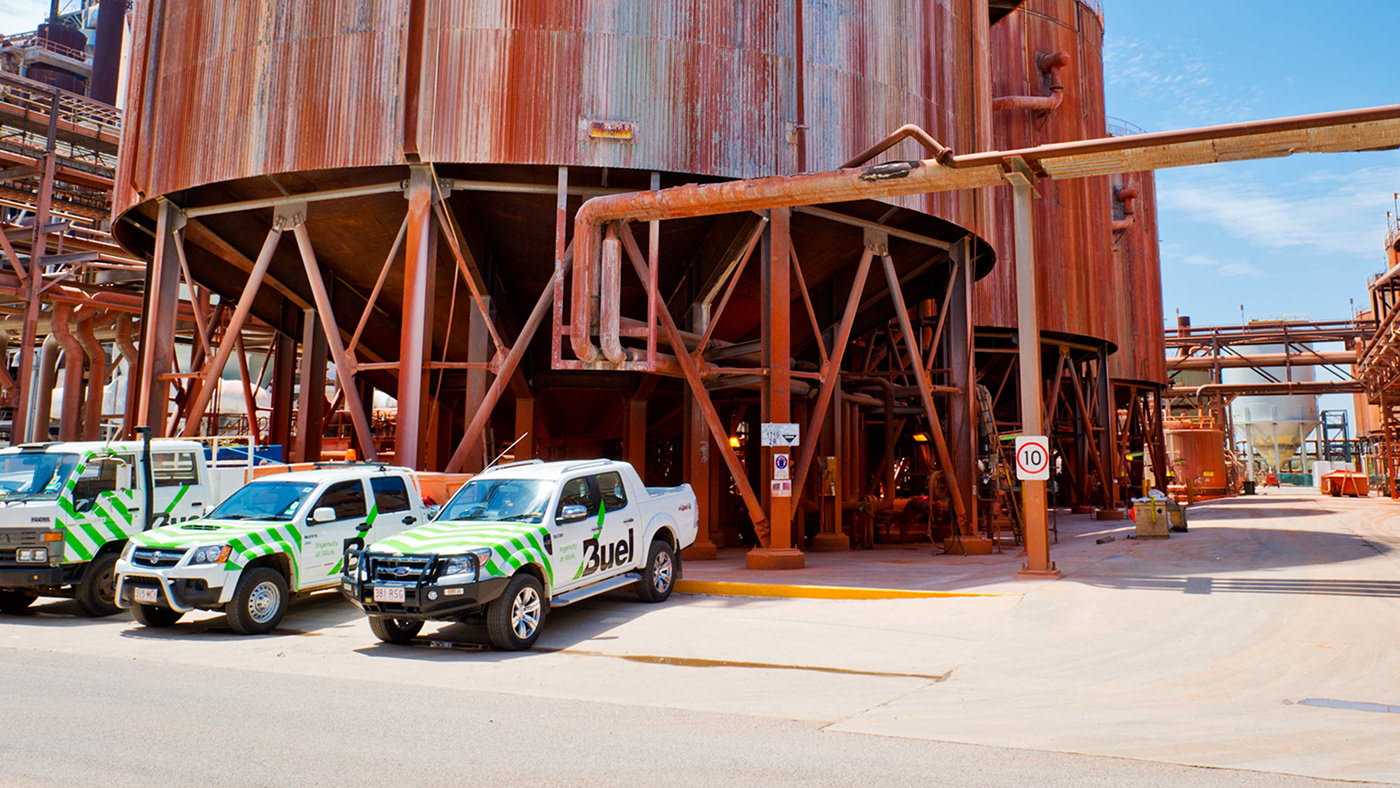
The strategy centres around how they perform for clients with ‘ingenuity at work’. This inspired the new brand name Buel which has a powerful phonetic quality created by combining ‘b’ for ‘bold’ with ‘fuel’ (as in fuelling innovation). As a four letter word Buel lends itself perfectly to big bold industrial style letterforms. Our new chevron icon strikes through the capital ‘B’ which is designed to suggest the heights they go to for clients. We built flexibility into the device so it could expand, grow and animate according to application. All brand styling was designed to be super bold for maximum impact and visibility, selecting a vibrant green brand colour to contrast with the orange safety gear and the red earth of the Australian outback.


Thank you!
Your likes and comments
are much appreciated.
Based in Sydney, Australia
we work on projects big and small
all around the world and we’d love to
talk to you about yours.
For all project enquiries
media and PR requests
or job opportunities, please